We’ll always love a white wall for its clean and crisp look, but sometimes you want something with a little more oomph. Teal, in shades as electric as the Caribbean Sea and as deep as the evening sky, certainly fits the bill. We tapped some of our favorite designers and tastemakers for their favorite takes on the hue.
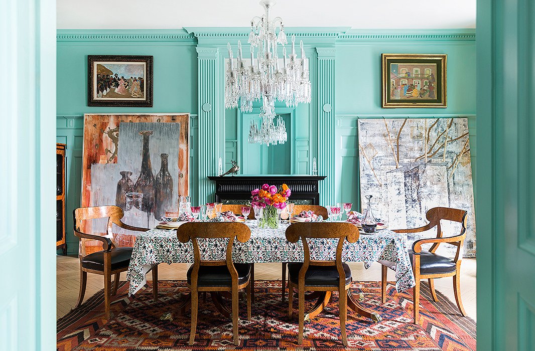
Photo by Lesley Unruh
The Scene-Setter
The color: Capri Seas by Benjamin Moore
Roller Rabbit founder Roberta Freymann is beloved for her line’s bold and colorful block-printed designs, the ethos of which extends—in a playfully refreshing manner—to her entertaining spaces. “I always paint my dining rooms a fun color,” she says. “Dinner parties should be fun, and so the color on your walls should be fun too.” We can’t argue with that logic!
How to bring the look home: You don’t have to go bright teal as Roberta did, but if you want to make a statement, dare to go a little bit bolder than you might be comfortable with. “In the dining room, you don’t have to be so careful. When you’re entertaining, your surroundings should be entertaining,” she says.
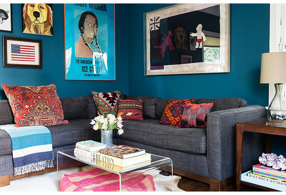
Photo by Nicole LaMotte
The Masculine Mix
The color: a custom blend by Farrow & Ball
Lizzie Garrett Mettler chose a deep teal for the walls of her den to create a contrast between this space and the other rooms in her home. “The rest of the house is so white. We really wanted to do something fun here,” she says. In fact, the room itself is a contrast, pairing modern with vintage, light with dark, and masculine with feminine.
How to bring the look home: If you can’t find a ready-made paint you love, try experimenting with custom blends. It can be a tricky task to navigate alone, so check in with the color expert at your local paint shop or an interior designer for extra guidance.
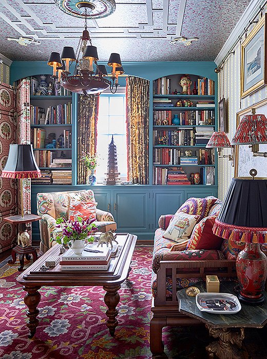
Photo by Tony Vu
The Historic Hue
The color: Spotswood Teal from Benjamin Moore’s Williamsburg Paint Color Collection
Designers Jason Oliver Nixon and John Loecke of the firm Madcap Cottage landed on this dusty teal for their sitting room in part because of its ode to the past. “The historic yet forward-thinking hue added a cool splash of moodiness to a former office, helping transform the space into what we now call the Opium Den,” Jason says. “It’s a room in which to linger, savor, and languish.”
How to bring the look home: A bright wall color can absolutely complement a room filled with multiple motifs and a heavy palette, so long as the intensity of the shade is toned down, as seen here. “In a heady, pattern-rich space, the cool blue helps ground the mix of prints,” Jason says.
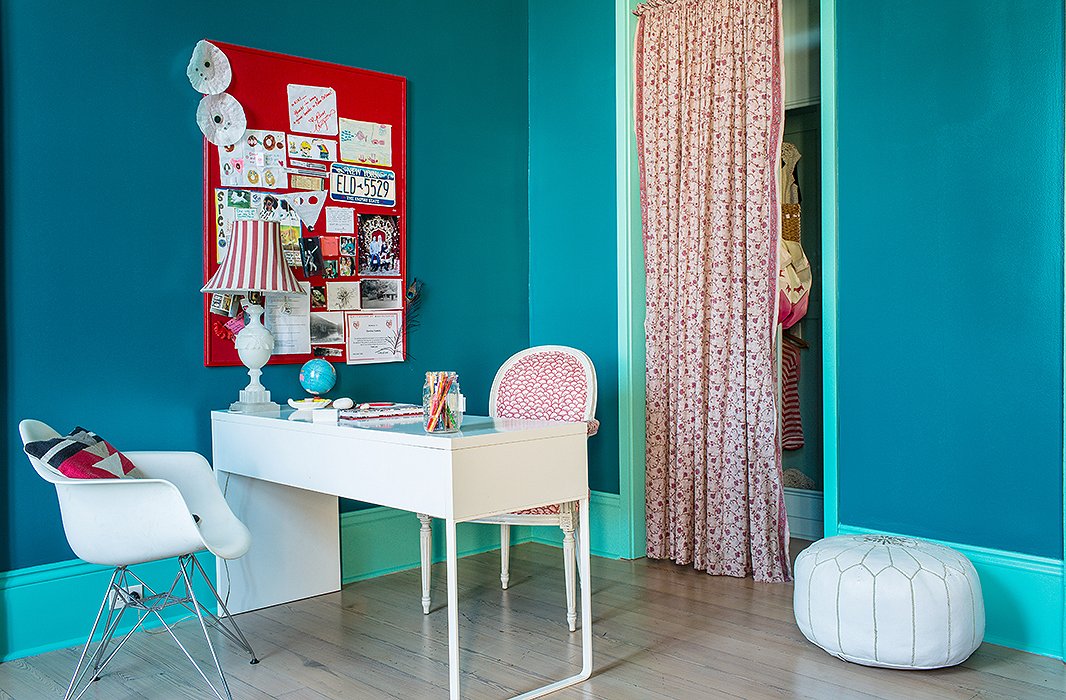
Photo by Nicole LaMotte
The Travel-Inspired Duo
The color: Largo Teal by Benjamin Moore on the walls, Miami Teal by Benjamin Moore for the trim
When designer Sara Ruffin Costello moved into her New Orleans home, her young daughter’s bedroom was all-white with blue closet interiors—prompting her daughter to wonder, “Why just the closets?” The two decided to blanket the entire room in tones of teal, the saturated colors inspired by a trip Sara took to Frida Kahlo’s Casa Azul in Mexico City.
How to bring the look home: Try contrasting trim and wall colors for a delightfully unexpected look that will feel right at home in a kid’s room, where play is a priority. “The darker color envelops the room—it’s actually quite soothing—while the lighter teal transmits a little crackle like a bolt of lightning,” Sara says.

Join the Discussion