Renovating a 100-year-old Houston home for a color-loving client and her growing family was not an easy feat, but it turned out to be a dream project for designer Elizabeth Mollen. “I love to mix old and new,” says Elizabeth, whose grandmother was an antiques dealer and passed on a deep appreciation for vintage treasures. Elizabeth went on to work in fashion and textile design before launching her own firm, Stone Textile Studio, in Austin, TX, focusing on interiors as well as modern mosaic-patterned fabrics, tile, and wallpaper.
The biggest challenge: making sure the space flowed. “Since it is an old home the layout is different than what we are used to working with—a lot more choppy and smaller rooms,” Elizabeth says. In addition to opening things up, she also restained the floors and made cosmetic updates to the kitchen and bathrooms, all while maintaining as much of the original charm as possible. “We wanted to enhance and give new life to the home’s original details,” Elizabeth says. “Working on an old house like this one and bringing it back to life with pattern and color has been very rewarding.”
Read on to tour the finished space, then shop the modern-meets-classic look here.
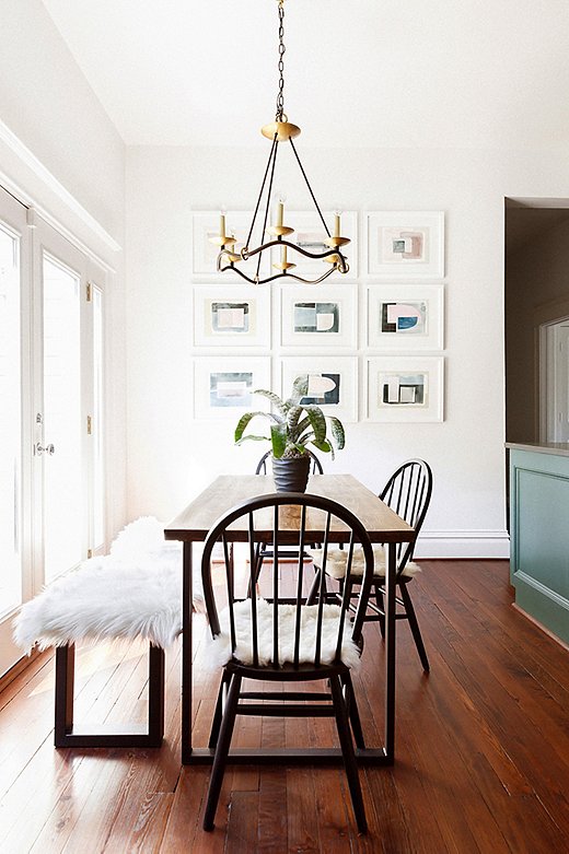
In the breakfast room, Elizabeth paired timeless Windsor chairs with a modern table and bench, topped with a sheepskin for coziness. Visual Comfort’s Choros chandelier draws the eye up, emphasizing the high vaulted ceiling, while the artwork picks up on the color of the adjacent kitchen cabinets.
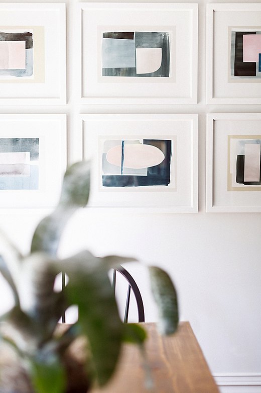
Hung in a neat grid, this set of nine abstract prints has the impact of a single large-scale work. “I love how the kitchen and breakfast area turned out,” says Elizabeth. “The space is bold yet calming at the same time.”
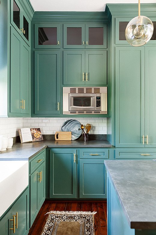
The kitchen was small but got plenty of light, so Elizabeth suggested a daring dark-green paint color. “I loved that my clients took some color risks and stepped outside the box,” says Elizabeth. “It was so fun seeing the kitchen transform.”
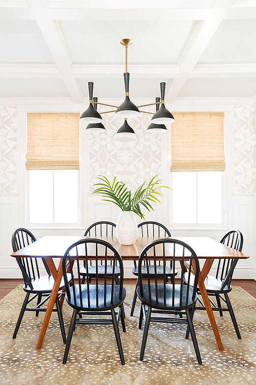
Elizabeth’s penchant for pattern-mixing is on full display in the dining room, where she paired Stark Studio’s Fauna Rug with her own Mosaic wallpaper. “I love mixing larger prints with smaller ones,” says Elizabeth. “The rug is a classic, and we knew we wanted to do something more graphic above the wainscoting on the walls. I love how they are both so neutral but make a great statement.” The black-and-gold chandelier (similar here) adds a touch of mod.
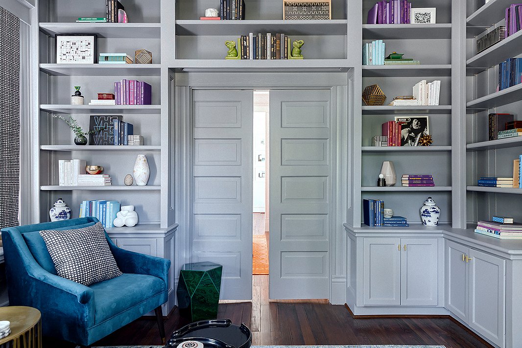
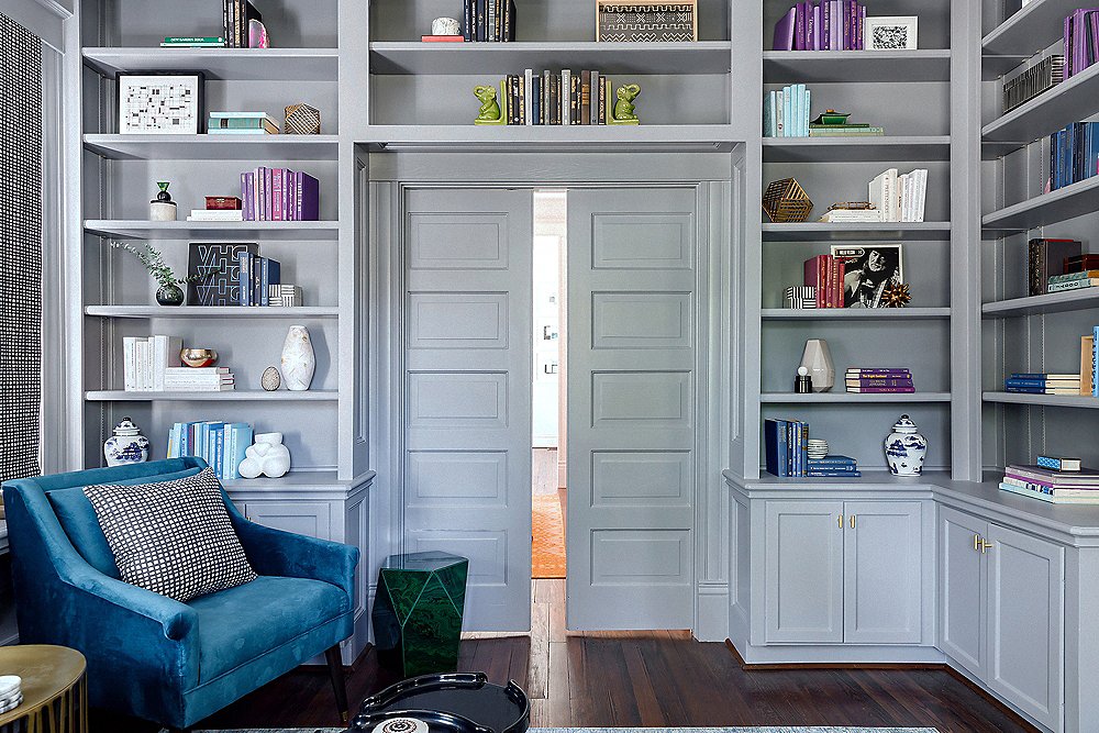
“My clients loved the charm in here,” says Elizabeth of the library, which is right off the home’s foyer. “It is the first thing you see when you walk in, so we wanted this room to pop.” She painted both the entry and the library a lush gray, carrying the color onto the bookshelves, doors, and moldings to create an enveloping feel. Blue and purple accents complement the paint’s cool undertones.
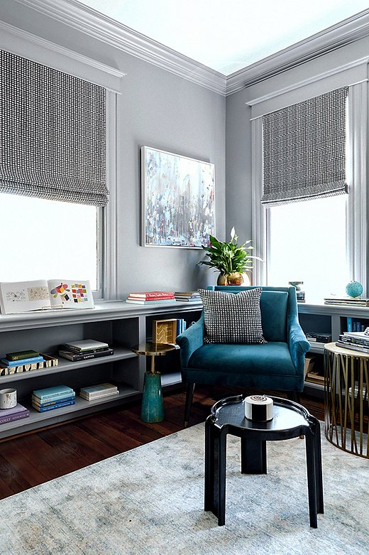
Elizabeth likens the library space to a “modern-day parlor.” Complete with comfy seating and plenty of places to rest a drink, the space is “great for entertaining as well as relaxing after a long day.” The multitone rug and the abstract artwork—Dark & Stormy by Michelle Armas—add subtle dimension to the room.
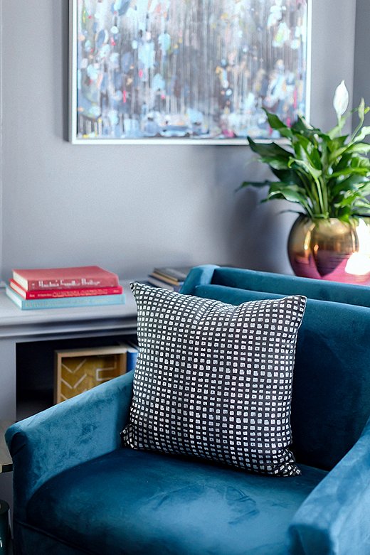
A pillow in Stone Textile Studio’s Color Grid Print fabric tops a teal-velvet accent chair found on One Kings Lane.
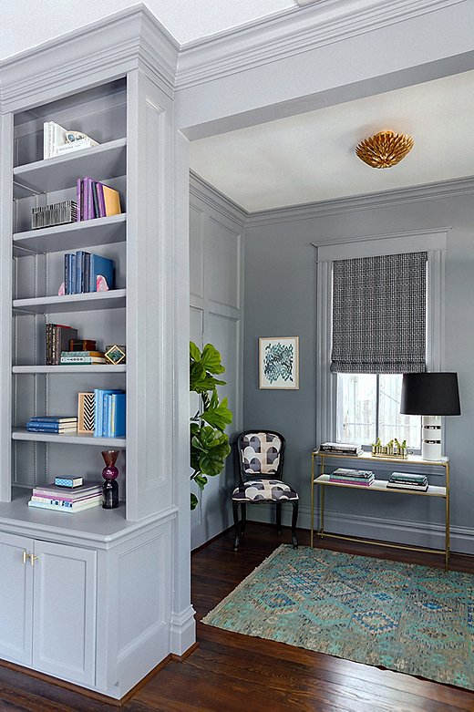
The Roman shades in the entryway and library are also in Elizabeth’s Color Grid Print fabric. “I love how they pop against the wall color,” she says. “We wanted the textiles to be rich and had fun with mixing textures.” A kilim rug adds even more pattern, and a gold flush-mount fixture lends a touch of glamour.
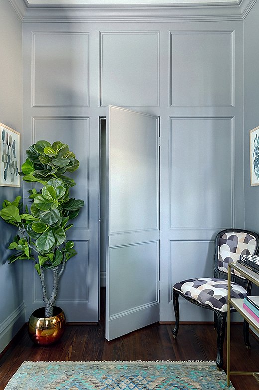
The entryway’s far wall boasts beautiful paneled molding—and a cleverly concealed powder-room door. A Louis-style accent chair updated with a geometric print provides a spot to drop bags or to perch while putting on shoes.

We wanted to enhance and give new life to the home’s original details.
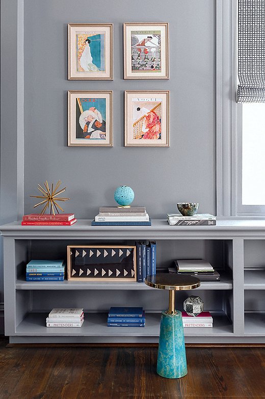
Stacks of books give the shelves a cool color-block effect. The framed illustrations above are in keeping with the home’s vintage-meets-modern vibe.

Designer Elizabeth Mollen of Stone Textile Studio in front of her Mosaic wallpaper.

Join the Discussion