For One Kings Lane staffer Ari Hershey, moving into her own studio apartment after years of sharing apartments with roommates meant it was finally time to create a space that’s truly her own. But with its compact square footage and boxy layout, the place presented a major decorating challenge. “Since I live in a studio, I wanted there to be some sort of separation between the living and bed areas that still felt stylish and pretty open,” Ari says. “I didn’t want to add anything that would close off the space.”
Step in One Kings Lane head stylist Anthony Santelli, who transformed the studio with distinctly defined spaces that feel warm and inviting thanks to a few coats of paint and a handful of small-space solves. “I had an idea of what I wanted, but Anthony really helped me rethink and realize the potential of the space,” says Ari. “I wanted the apartment to feel chic and inviting but also visually cohesive. There was a warmth and a visual flow that was missing originally. I think we were able to solve all that—and in clever ways without a huge renovation.”
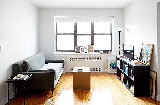
The Living Area Before
“Everything was on the same eye level in Ari’s living space, which made it appear empty and more like a box,” says Anthony. Aside from the velvet settee, there was no place for Ari to sit and work or eat. Plus, while there may be plenty of natural light during the day, the apartment turns dark at night, so a single floor lamp isn’t sufficient. “I wanted to make sure the space was comfortable but also stylish and catered to her life,” says Anthony.

Since I live in a studio, I wanted there to be some sort of separation between the living and bed areas that still felt stylish and pretty open. I also needed a place to sit, work, and eat.”
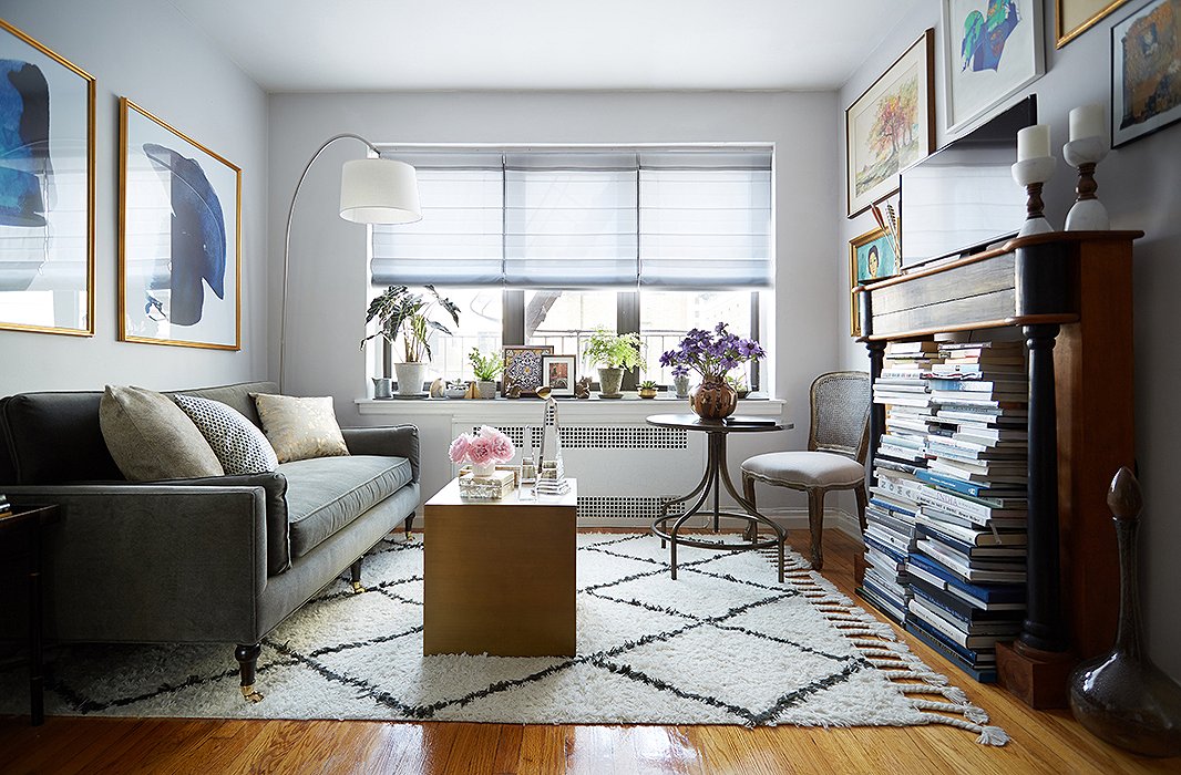
By simply adding a table and a chair in the corner, large-scale art, and a tall decorative mantel for books and the TV, Anthony reimagines the living area as a warm multipurpose spot with ample lighting and seating.
Creating an All-Purpose Area
First, to create extra seating, Anthony opted for an armless upholstered side chair rather than a club chair or a pair of seats. “It’s much easier to move around and can actually help save space in a small apartment,” Anthony explains. He paired it with a vintage outdoor bistro table that he found—and which Ari loves—so that she now has a place to work, eat, and even set up a bar (the table’s height is adjustable) when entertaining. A cube coffee table Ari already owned easily serves as an extra seat or surface. “The space doesn’t feel as if it’s only for lounging now,” says Ari.
Shop the Look
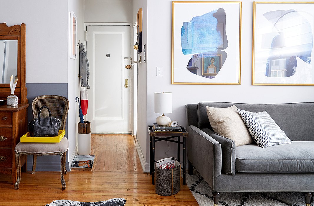
The narrow entry hall meant that organization and storage were key to keeping clutter from spreading into the other areas of the home. The hooks and catchalls make perfect checkpoints for when Ari leaves and comes home.
Go Big on Entry Organization
As a way to increase storage in the narrow entry hall, Anthony looked to maximize the vertical wall space: A double row of hooks behind the door creates a system with the “lower level for bags and the upper level for jackets, so it’s all more spread out,” he says. “We also created a DIY magnetic board to hide the circuit breaker in the entry hallway.” Beyond that, catchalls ranging from a floating shelf and a bag drop to an umbrella stand and a tray for the day’s shoes minimize clutter.
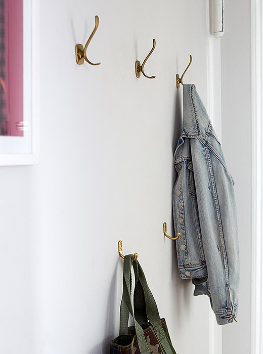
A double row of vintage hooks lets Ari hang her coats above and her totes and bags below.
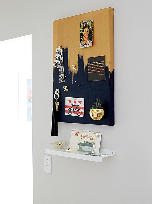
Anthony created a DIY magnetic board and a slim shelf for Ari to set her keys and hang reminders. The board also cleverly conceals the apartment’s circuit breaker.
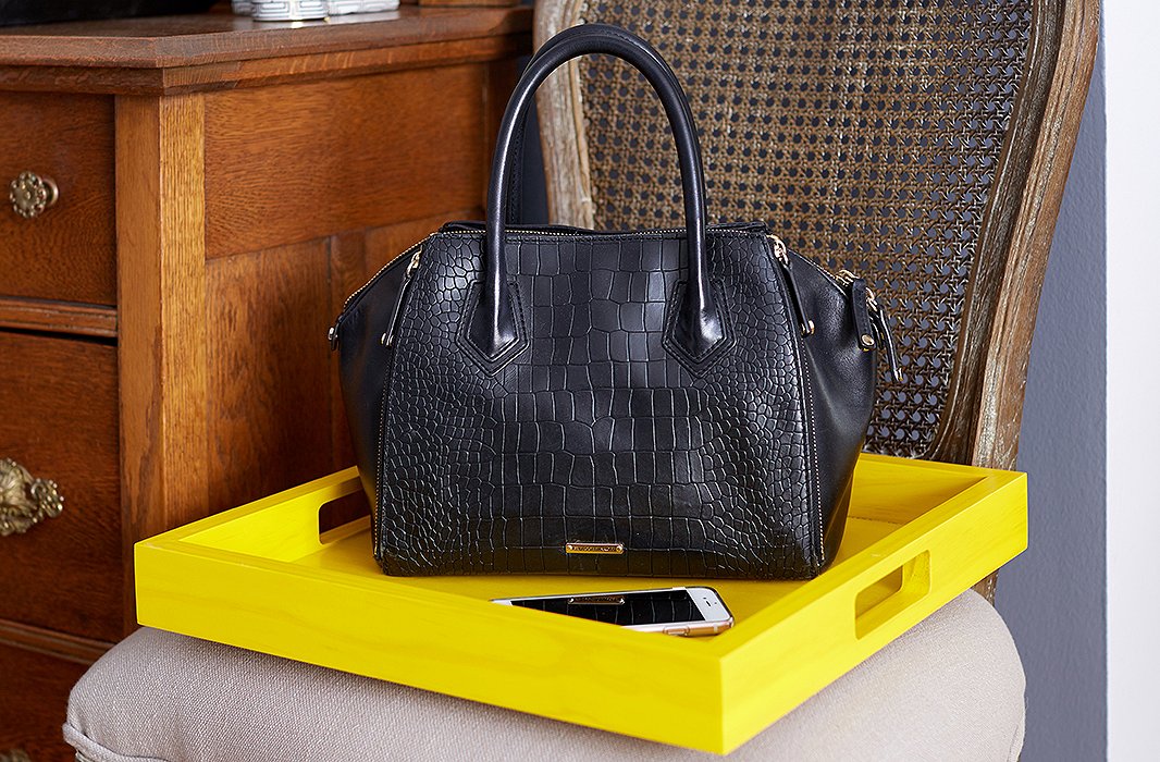
Just off the entry hall, a bright lacquered tray functions as a catchall and bag drop.
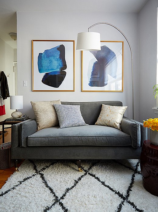
A Moroccan rug along with a streamlined arching floor lamp and graphic art help anchor the living area as a distinct space.
Add Some Large Accent Pieces
To anchor the living area, Anthony laid down a fluffy Moroccan rug that lends an enormously welcoming vibe. “The Moroccan rug feels casual, and the shaggy texture is a nice counterpoint to the velvet settee and its slight shimmer,” he explains. “We then added the arc lamp, a table lamp, and candles to spread the light around at all eye levels.” And to truly set the living space apart, Anthony went with a seemingly counterintuitive approach. “Large-scale art in a small space like this apartment can actually help draw the eye up, making the space appear more spacious,” he says. “We went with a diptych for the symmetry and visual cohesion.”
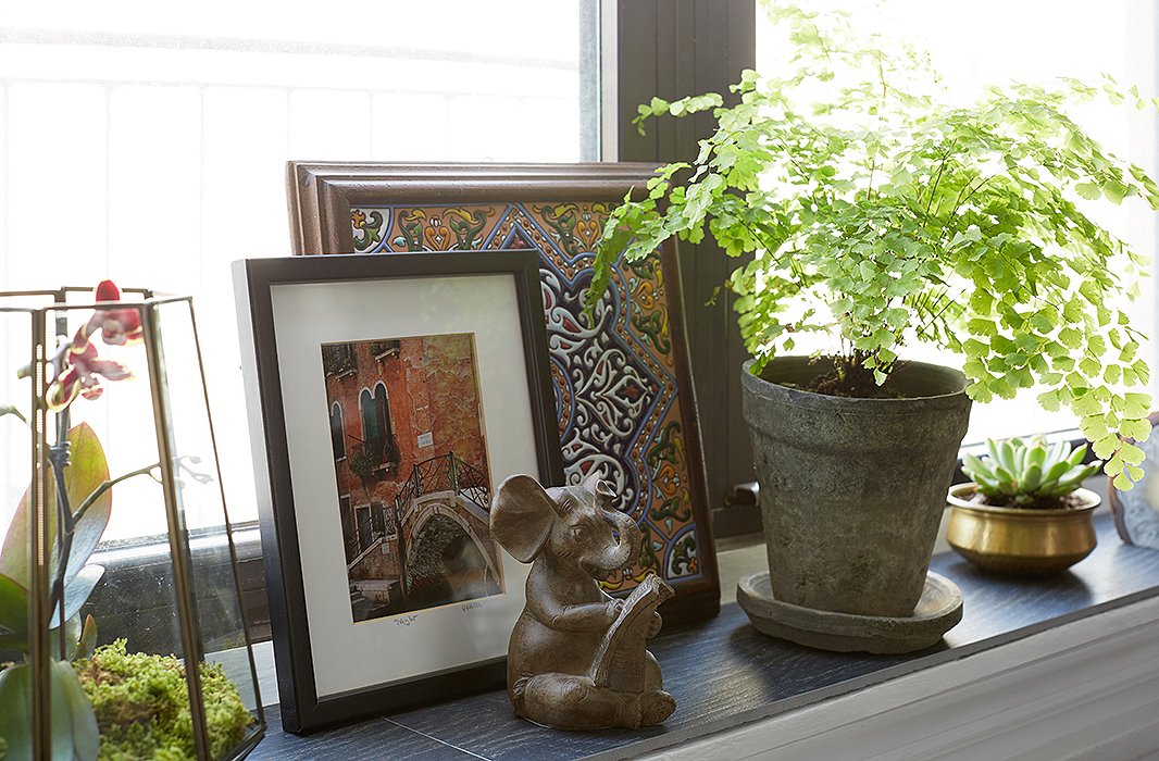
The windowsill has become a revolving showcase for Ari’s travel photography and finds as well as a mini indoor garden for lush greenery. Floor tiles, cut to size, were placed atop the sill.
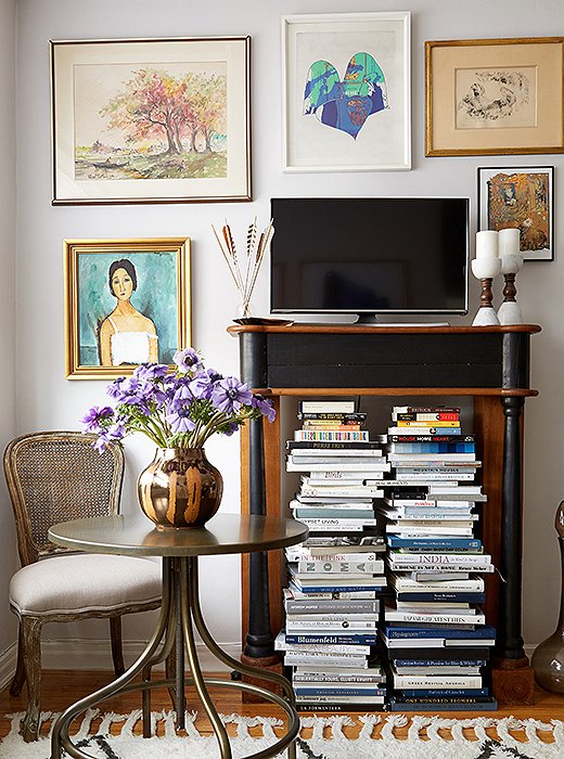
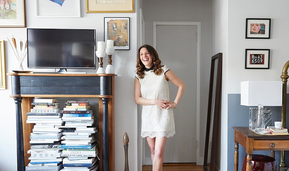
A vintage bistro table serves as Ari’s worktable, dinner surface, and bar when hosting friends; Anthony brought in an ornate wood mantel that elevates the TV while holding Ari’s books.
Cleverly Mix Old and New
“Ari’s apartment needed a focal point and some interest, and the mantel created instant architecture for the living space,” says Anthony of the decorative piece, which exudes vintage allure. “The natural wood tones tie back to her vintage bedside table and dresser, while the black-painted accents tie in nicely to the charcoal floor tiles on the window ledge.” To divert attention from the TV that rests atop the mantel, Anthony surrounded it with a gallery wall of new art and old paintings from Ari’s grandmother. “I love how the TV recedes a little and isn’t the focal point as much,” says Ari, who also enjoys giving her grandmother’s art pride of place. In another genius move, Anthony tucked away wires and cords behind stacks of books inside the mantel, which also functions as an unconventional bookcase. “We left enough room around the books so that you can still reach them,” he adds.
Shop the Look
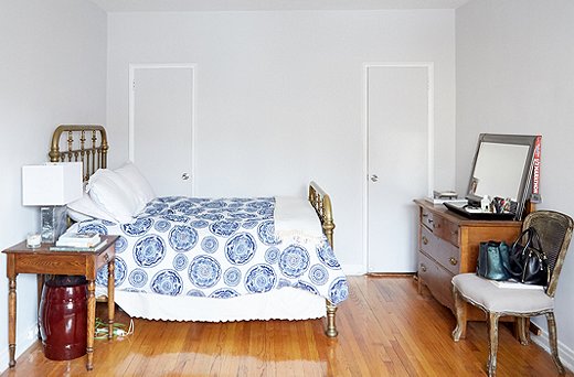
The Bed Area Before
While Ari’s layout for her sleeping quarter worked perfectly, the space didn’t feel distinct from the living area. It also lacked the sense of ease and serenity that she desired. “It needed to feel simple and calming to me, but I also wanted things that would tie in with my vintage pieces and what I already had,” she says.

The sleeping area needed to feel simple and calming to me, but I also wanted things that would tie in with my vintage pieces and what I already had.
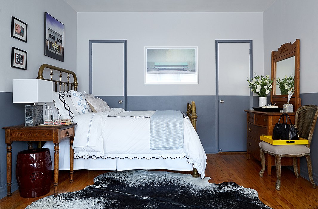
Painting the lower portion of the walls a darker color helps tie together the bed, the bedside table, and the dresser, which are all vintage pieces Ari inherited from her mother.
Embrace Contrast
It was no easy task carving out the bed area to feel both separate from the rest of the studio and visually cohesive. “The bed, bedside table, and dresser all felt very separate despite being part of the same ‘room,’” says Anthony. “I knew the only way to tie them all together and give the space a sense of separation was to use paint all the way around.” He also opted for modern photographs in the sleeping area rather than portraits and abstract paintings, along with a luxe hide that is a striking counterpoint to the living area’s shaggy Moroccan rug.
Shop the Look
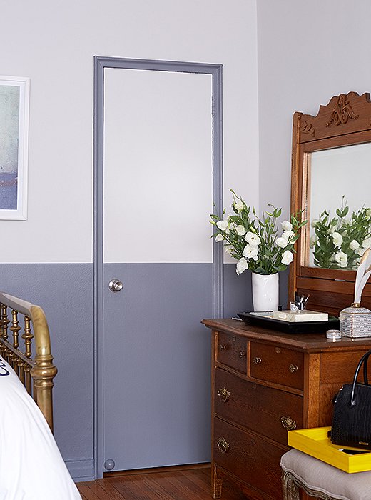
Anthony painted the closet door frames and the lower half of the walls a serene ocean blue to define the space.
Define an Area with Paint
As a way to delineate the sleep space from the living space, Anthony painted the lower portion of the walls surrounding the bed a soothing ocean blue. “We didn’t want to close off the space with curtains or a divider, which would’ve made it feel even smaller, so the solution was to paint halfway up the wall,” says Anthony. “The existing wall color was a light gray, so we chose this lighter blue color for a nice calming blue-gray complement.”
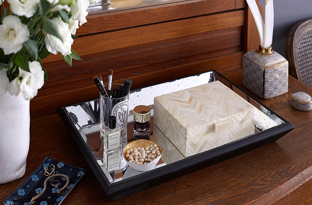
A mirrored tray corrals the candle vessel that holds Ari’s makeup and a mini catchall in which she stashes jewelry. The horn box holds other accessories and keepsakes.
Display (Only) Everyday Essentials
With a dresser and two closets, Ari had ample storage. But to minimize visual clutter, “only display what you use every day,” says Anthony, who created a centralized storage spot in a deep mirrored tray for Ari’s frequently worn accessories. “We used a candleholder for her makeup and pretty dishes, vessels, and a horn box for all her necklaces, rings, and other jewelry. When you have an open bedroom space, decluttering is important to keep the overall space feeling organized and airy.”
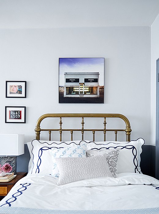
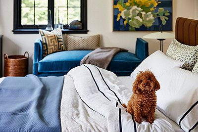
The vintage brass bed has an alluring aged patina. It’s offset by navy-embroidered Matouk sheets, a photo by Gray Malin, and small-scale art.
Finishing with Small Touches
To further cozy up the bed, which Ari inherited from her mother, Anthony brought in embroidered Matouk sheets and bedding in a range of blues and grays that tie back to the wall colors. “The bedding has a hotel feel to it against the brass patina of the bed,” he notes. He also added contemporary photos and small prints just above the painted line, an effect that tempts the eye to look up but doesn’t overwhelm the space. “Unlike the living area, we kept to a few photos—just enough to add some warmth and personality to the wall.”
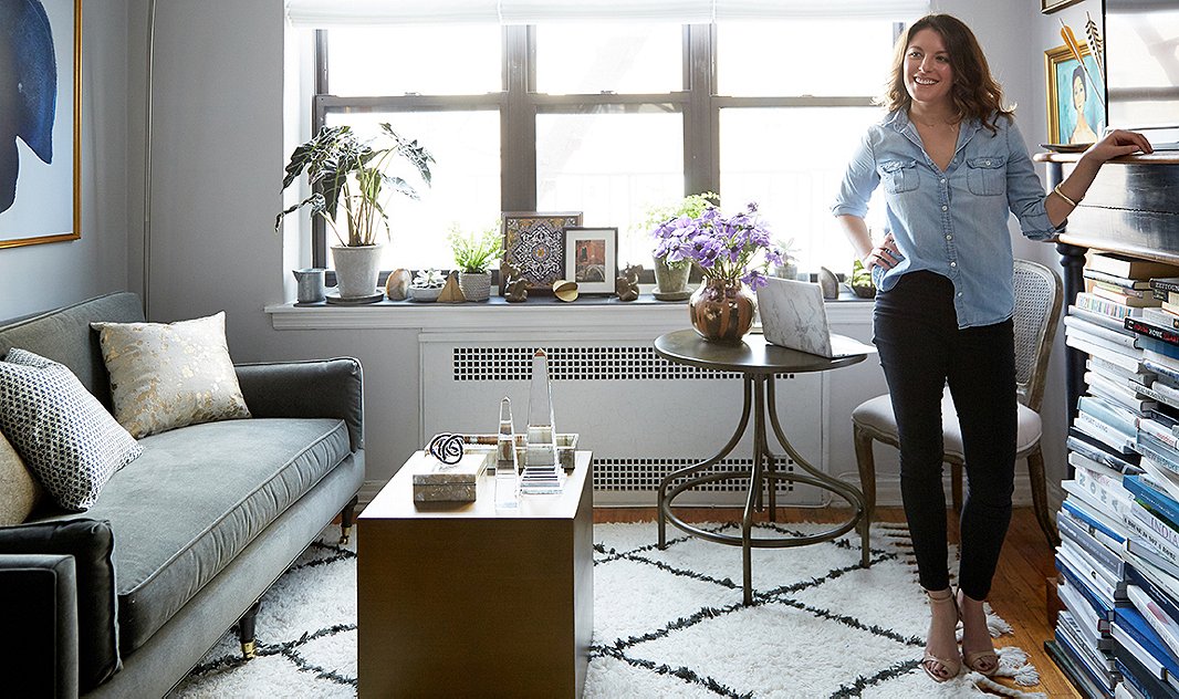

I had an idea of what I wanted, but Anthony really helped me rethink and realize the potential of the space. Each area feels cohesive but also distinctly its own with a mix of my vintage pieces. I use every inch of my studio now.

Beautiful, especially love the artwork!
Really pretty. What are the paint colors?