“New Orleans is a social city,” says veteran decorator Thomas Jayne. “It’s less about making a fortune and more about being with people and human interaction.” And Thomas’s cozy setup—he and his husband, Rick Ellis, occupy the parlor level of a circa-1836 townhouse in the French Quarter—allows him to rub shoulders with his like-minded neighbors. “It’s like a little art collective—more of a commune than a condominium,” jokes Thomas, who is based in New York but visits his Southern second home every six weeks or so and “always for Christmas, New Year’s, carnival, and August’s Antiques Forum.”
With its breathtaking 19th-century architecture, New Orleans is the ideal home away from home for the decorator, who is renowned for his livable spaces imbued with history. “When it comes to decoration, I’ll look at an environment and extrapolate from that rather than override the local aesthetic,” Thomas explains. This contextual approach doesn’t limit his singular vision but serves to inform and deepen it—as you can see from his own intriguing home.
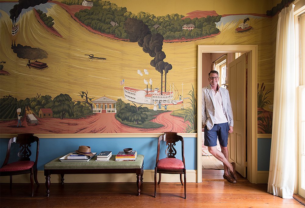
“Creole revival” is how the designer loosely describes his NOLA pad, which is perhaps his way of saying that it’s masterfully mixed-up. Thomas’s parlor room wall features a scene based on illustrations from a favorite childhood book of his, The Story of the Mississippi, while neoclassical furnishings (of a style that would not have been out of place in the French Quarter more than a century and a half ago) and a smart and lively palette ground the space. “The colors are very Creole,” says Thomas. “But there are European and Caribbean elements too.”
While it’s easy to be wooed by his many conversation-starting objects—be it a drawing by late New Orleans artist George Dureau or a collage made of book bindings from the decimated Baghdad Library—it’s not the contents that lend the space its beauty but rather Thomas’s overarching, timeless approach. “I’m not one of those designers who feels the need to go through radical redecorations,” he says. “It’s best to let things age.” Certainly the same can be said of New Orleans, which, Thomas points out, will celebrate its tricentennial in 2018. After all, the apartment is really a love letter to the decorator’s adopted city. “I want people to know that New Orleans is all that it’s cracked up to be,” Thomas says. “That’s for sure.”
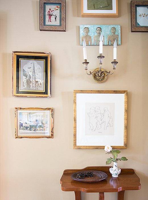
Just off the entry, a simply gathered display shows how Thomas is not rule-bound when it comes to hanging art. “Sometimes it’s great to have symmetry, and other times it’s better to break it. I don’t worry about things matching but about establishing some visual relationship, whether it’s based on color, scale, or shape,” he says.
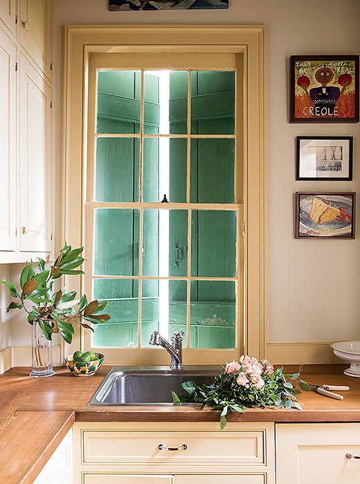
The kitchen is located just off the front door, and as it’s a working space, Thomas chose not to overemphasize it. “We wanted it to look more like a butler’s pantry than a kitchen—small and functional,” he says. “The wood countertops and cabinets relate to the antique doors in the house. The genius is that it doesn’t catch your attention; you walk by quickly and enter the mural room.”

I want people to know they don’t have to have a big home to have a nice home. I think people get disillusioned and quit trying because they don’t have enough house to decorate.
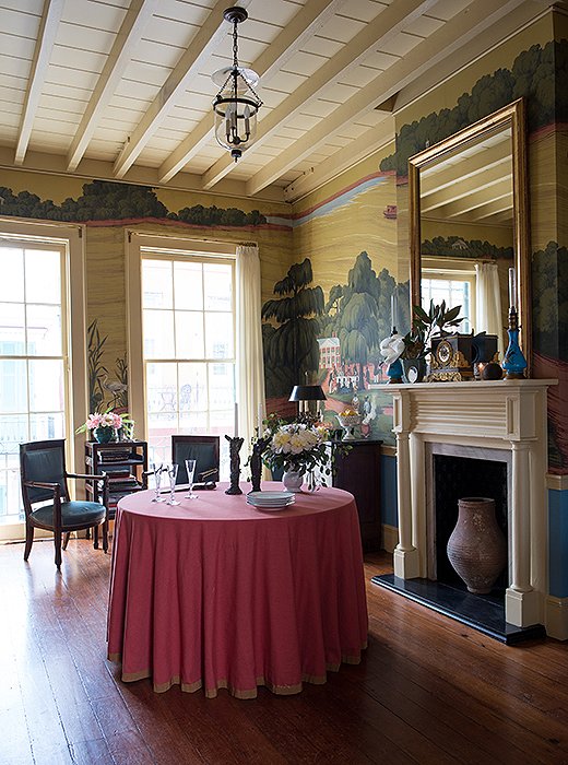
Thomas set up the parlor room to function like a salon, with the furniture positioned around the edges, as was the custom in homes in the past. “It’s a multipurpose room,” he says, noting that the table can easily be moved. “We’ll have drinks before dinner here and do projects on the round table—everything from making Mardi Gras costumes to little art projects.” See similar skirted round tables here.
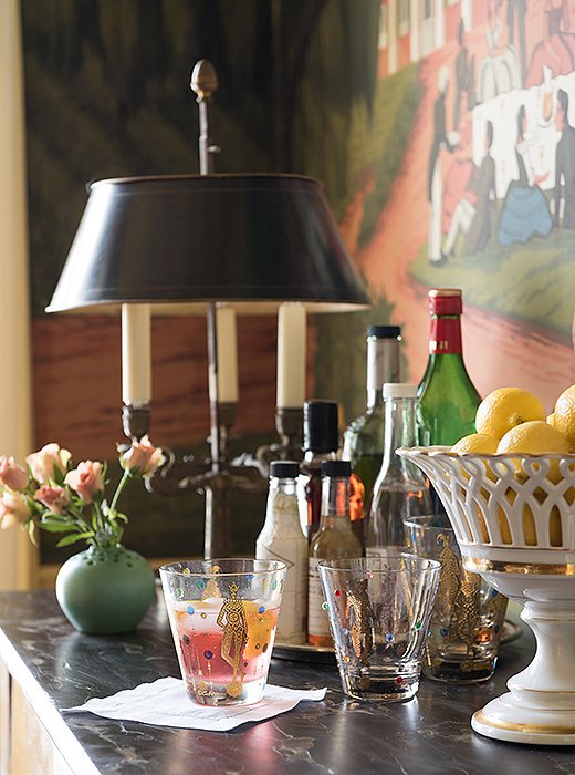
“Everyone drinks bourbon in New Orleans,” says Thomas, “but there’s also appetite for rum punch and lemonade with liquor.” When it comes to entertaining, the designer maintains his mix-and-match philosophy. “Some of our pieces are old; others are contemporary,” he says. “It’s great to have a group of things that work together, so when you go to have a party you don’t have anxiety about your dishes. We can entertain for up to 25 people without thinking about it.”
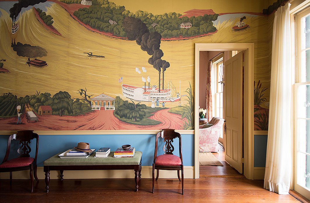
“Color is a good way to take a risk because if you fail, it’s easy to fix,” says Thomas, who chose a bright cobalt hue for the area underneath the parlor wall’s whimsical storybook-inspired mural. “It was fine without it, but we wanted to punch it up, and the blue made it more exciting.”

I’ve always had a penchant for scenic wallpaper. When we got the apartment I realized it would be remarkably pretentious to put up 17th-century French scenic paper, so I sought out alternatives, and de Gournay suggested we do some American scenes.
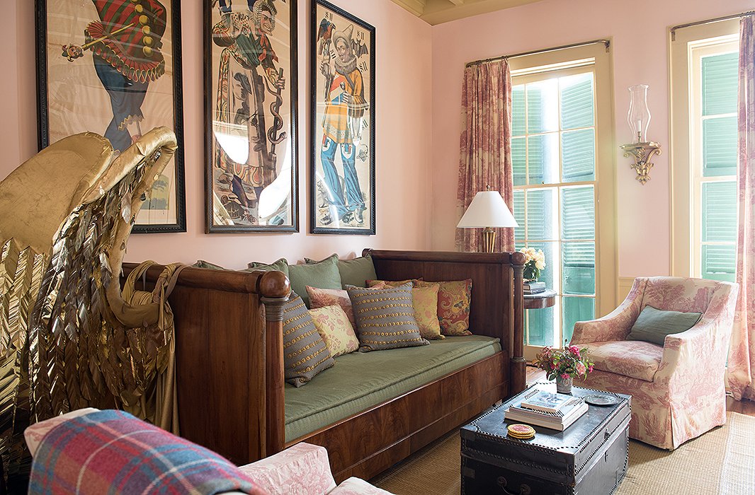
Considering Thomas’s academic training (a master’s degree and fellowships at the Metropolitan Museum of Art and the J. Paul Getty Museum, among other institutions), one might suppose his home is packed with museum-quality pieces. But, he demurs, “I was careful not to put anything too valuable into this house.” Still, he does admit he might weep over the loss of the portrait Don Bachardy did of him, which hangs in the living room, or his prized glazed 18th-century Chinese vase.
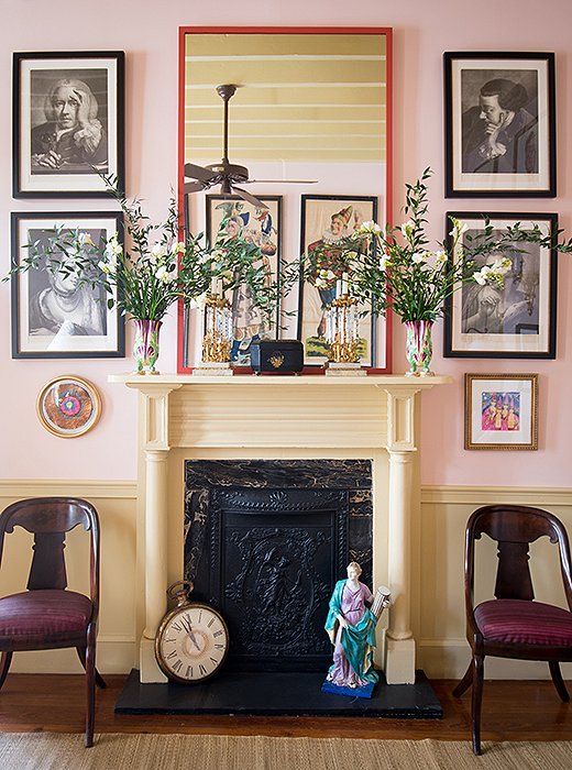
The handsome living room mantel, framed by Thomas Frye mezzotint prints, makes for a graceful home to a myriad of objects, ranging from a 19th-century sculpture to the oversize clock left over from a “Father Time” Mardi Gras costume.
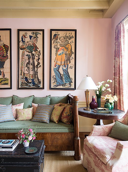
Woodblock prints from southern Germany, featuring carnival characters and purchased from Virginia’s lauded Black Dog Gallery, play well against the living room’s pale pink walls. Beyond their decorative appeal, Thomas appreciates that Germans, like New Orleanians, celebrate carnival (or Karneval or Fasching, as they call it there).
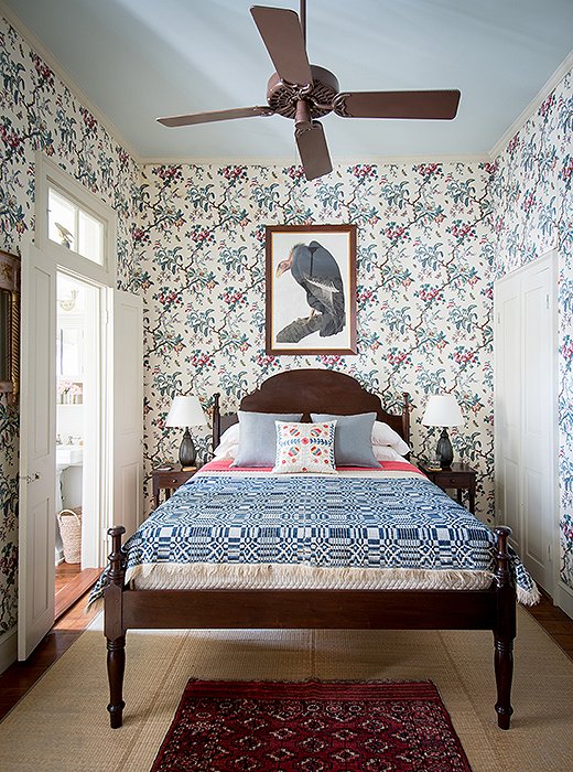
Thomas has had the quilt topping the Creole-style bed (designed by Harrison Higgins after an antique owned by Peter Patout) for ages. “It was in my room when I was 12,” he reveals. After reading a book on the history of the White House, the future designer painted his room red to resemble the Lincoln Bedroom and topped off his bed with this very quilt.
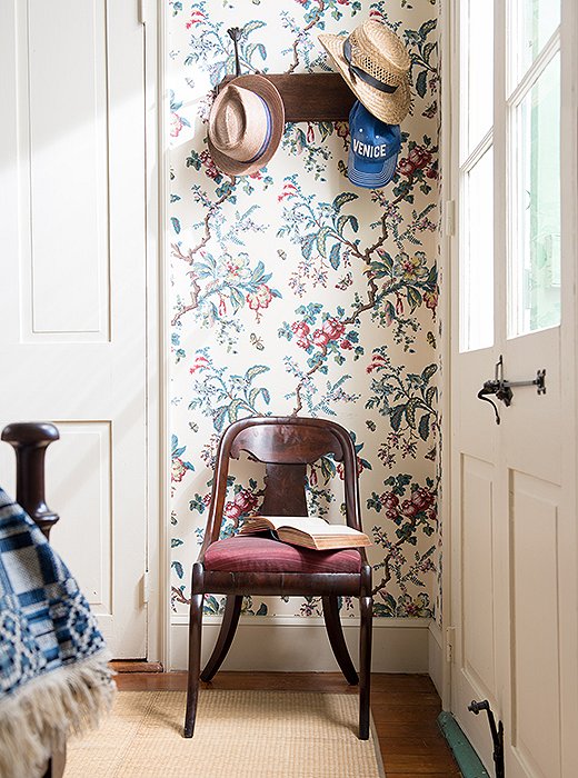
The Butterfly Chintz wallpaper produced by Adelphi Paper Hangings, a company specializing in historically accurate custom papers, is “a hand-blocked copy of an antique French paper in the collection at Colonial Williamsburg,” says Thomas. He used it for a home he restored in Virginia before covering his own bedroom with it. “I remember saying to my colleague, ‘Can I get away with this? Is this oppressive?’ It’s a good example of taking a risk.”

The wallpaper [in the bedroom] makes you feel like you’re in a jungle. I put the scary Audubon print of the condor over the bed to offset the saccharine quality of the paper. The paper is feminine, and the condor is masculine—there’s duality.
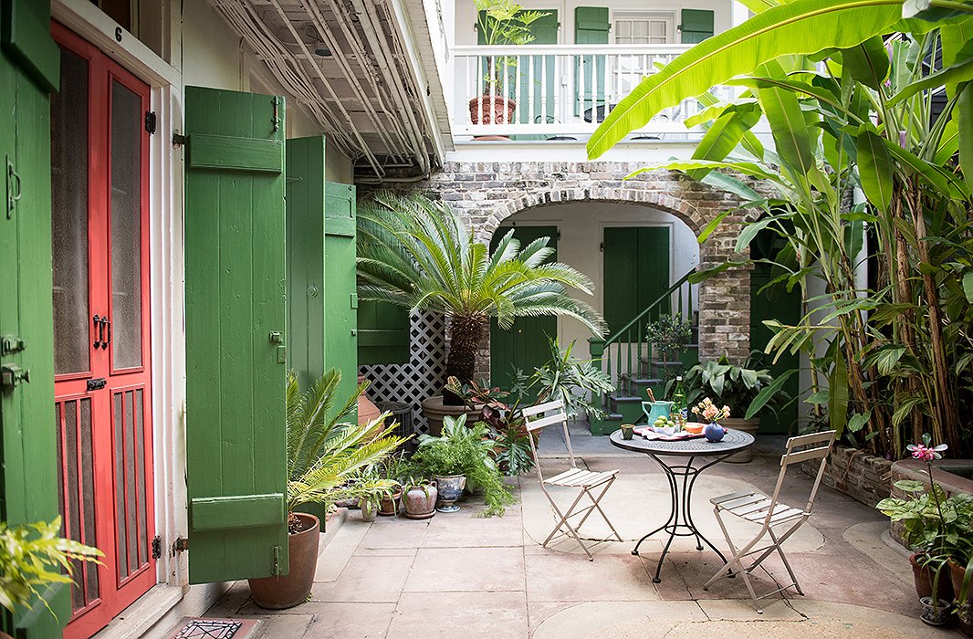
Though tiny, the home does allow for both indoor and outdoor entertaining, and the lower courtyard has seen its share of soirees. “We give a few kinds of parties,” says Thomas. “If Rick, who is a great food stylist, is here, we’ll do a buffet supper. Or we can host a sit-down dinner for six or eight. But if Rick isn’t here, I’ll have a drinks party and I’ll serve potato chips.”
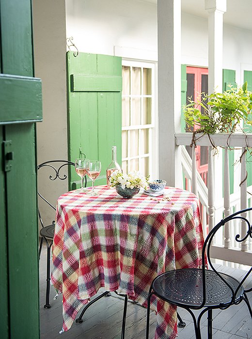
Thomas and husband Rick use the upstairs terrace frequently. “We can host a sit-down dinner or stand-up cocktail party here, or we’ll just sit and enjoy the outdoors.”

Designer Thomas Jayne in his home’s lush courtyard.

I want people to know that New Orleans is all that it’s cracked up to be... It’s less formal all over the country, but in New Orleans, if you have people for dinner, they’ll invite you to dinner. That old-fashioned tradition is maintained.

I adore the styling of your home and descriptions of your beautiful second city. Thank you for sharing your world with us!