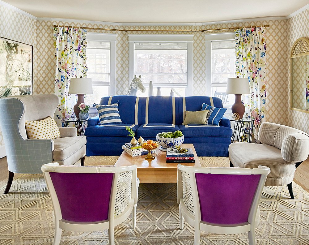
Sometimes you just get lucky. You find the perfect house or the perfect sofa. For Virginia Toledo, it was the perfect fabric. “It literally blew my mind,” says the New Jersey-based interior designer and one half of the award-winning Toledo Geller interior design firm. Swiss fabric house Christian Fischbacher’s Midsummer Day (seen in the curtains above) stole her heart as soon as she saw it. The bright, cheery print represented everything she wanted in her own home, a 1920s American Foursquare.
“From the very beginning, I said I wanted it to be a happy home,” Virginia says. With the help of her partner, Jessica Geller, she set about designing her house through the lens of this Midsummer Day.
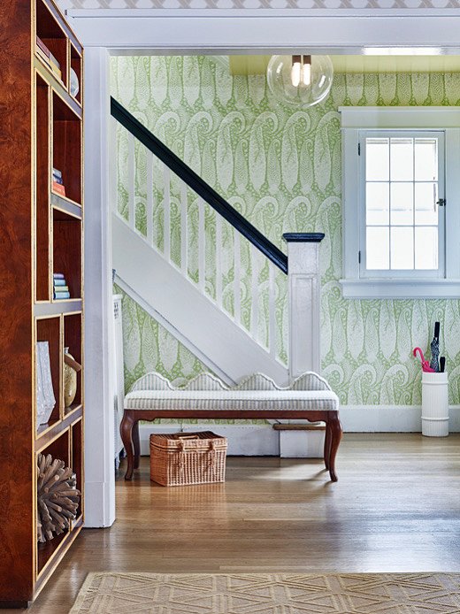
Large-scale paisley wallpaper sets the scene in the entryway. “I wanted it to feel enchanting, so I knew that we needed an oversize wallpaper in there,” says Virginia.
As the name suggests, an American Foursquare is typically symmetrical, with four rooms stacked on top of four rooms. These homes were a bit ahead of their time in that they have an open concept floor plan, something Virginia wasn’t too thrilled about. “I prefer homes that have rooms, closed-off rooms,” she says. “I wanted each room to have its own distinct feeling, but because these rooms are rather open to one another, you see every room from wherever you stand.” A unique design challenge presented itself: How do you create distinct moments but have everything act as a cohesive unit? “If there was ever a time we could experiment, it was in our own homes,” she says.
So she got to experimenting. Then the crushing weight of too many possibilities settled in. “There’s always a feeling that a better product, a better material, or a better light fixture is going to surface in the next week or month, and then I’m going to regret the decisions I made,” she says.
Luckily, that iconic Fischbacher fabric was there to guide her choices.
Virginia knew that she wanted to make a statement from the street, so first on the docket was finding a door color that would let neighbors and passersby alike know more about her personality. She pulled an electric green from the fabric. “It worked,” she says. Compliments began rolling in, and Virginia continued on her colorful walk through the house. She wanted to make the small foyer feel grander, so she added wallpaper and lacquered the ceiling in a cheery yellow. And in the living room she showed off her beloved fabric by way of drapery.
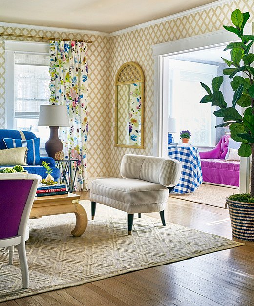
Christian Fischbacher’s Midsummer Day fabric laid the groundwork for the home’s color palette. Virginia took inspiration from the mix of blues, purples, and greens every chance she could.
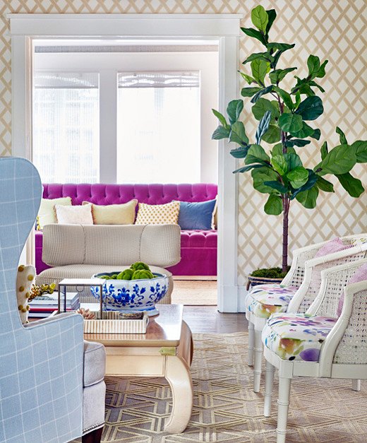
Virginia pulled the same purple from the living room chairs to a sofa in an adjacent sitting room. Continuing the color story throughout the house makes things feel cohesive.
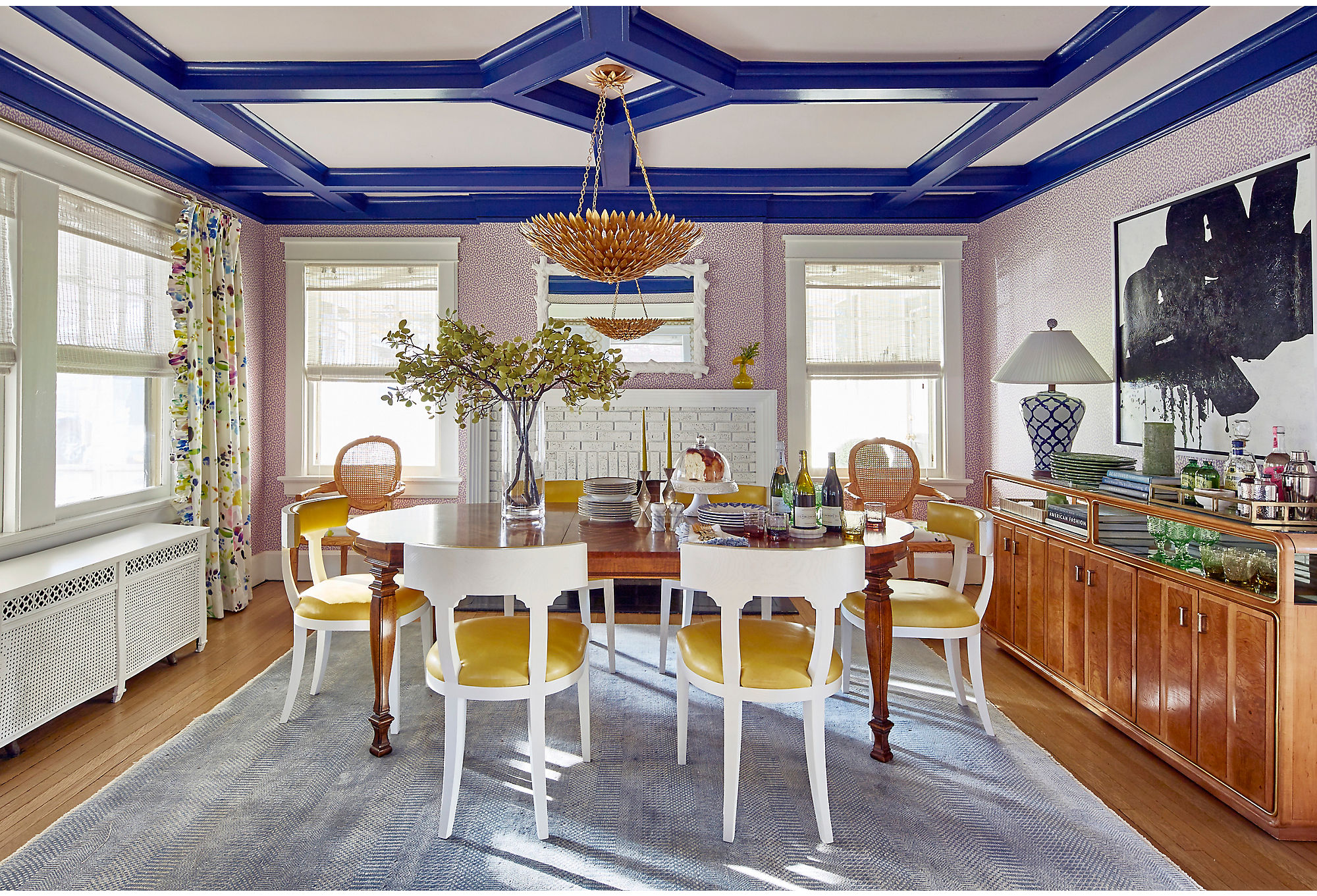
The dining room stuns in an array of color. The ceiling’s trim is Blue by Benjamin Moore, while the rest of the room is draped in complementary lavenders and yellows. The yellow seats are an exact match for the yellow lacquer on the foyer’s ceiling. Find an identical light fixture here.
Virginia considers herself somewhat of a modernist, “but soft modern, in the way the Swiss do modern,” she explains. Even in a home as colorful as the one she was dreaming up in her head, she wanted to ensure that form and function didn’t get lost in the mix. In the living room, this translated to overstuffed chairs with modern lines and a bit of caning. Her beloved color palette wasn’t lost in the space either. The sofa was upholstered in a happy blue and tempered with white trim, while the chairs opposite the sofa were given a dash of brilliant purple. Everything else, including the patterned wallpaper, remained neutral.
In the dining room, which also features Midsummer Day curtains, Virginia played up the home’s architecture by painting the ceiling trim an electric blue. The rest of the ceiling was painted a soft lavender as a quiet foil to the purple wallpaper.
“Everything’s like this ping-pong situation,” Virginia says, referring to the bouncing between colors and patterns that, almost counterintuitively, creates a beautiful harmony.
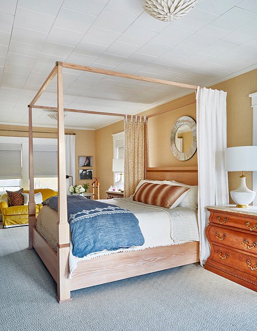
The whitewashed wood bed frame speaks perfectly to that Swiss modernism that Virginia loves so much.
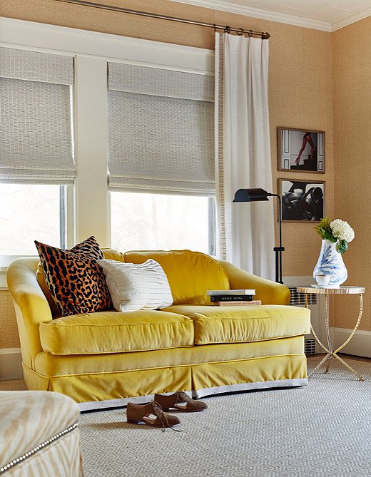
Virginia bought this sofa on Craigslist, then had it recovered. When her upholsterer saw the vivid yellow fabric Virginia selected, he jokingly called the piece a “Willy Wonka sofa.”
Virginia continued to mix things up with the furniture throughout the house. “Thrifting is my therapy,” she says. She spent hours in vintage stores and hunting through Craigslist and eBay listings. Most of the furnishings in her master bedroom, for instance, were found online.
Each piece has a story, but none more adventurous than her rescue mission for the dining room table. “It seemed sketchy from the beginning,” she says with a laugh; after she and her husband pulled up to an abandoned-looking house at dusk, had an unusual short conversation with the owners, and endured a frustrating logistics issue, Virginia found herself in possession of an oversize antique dining table.
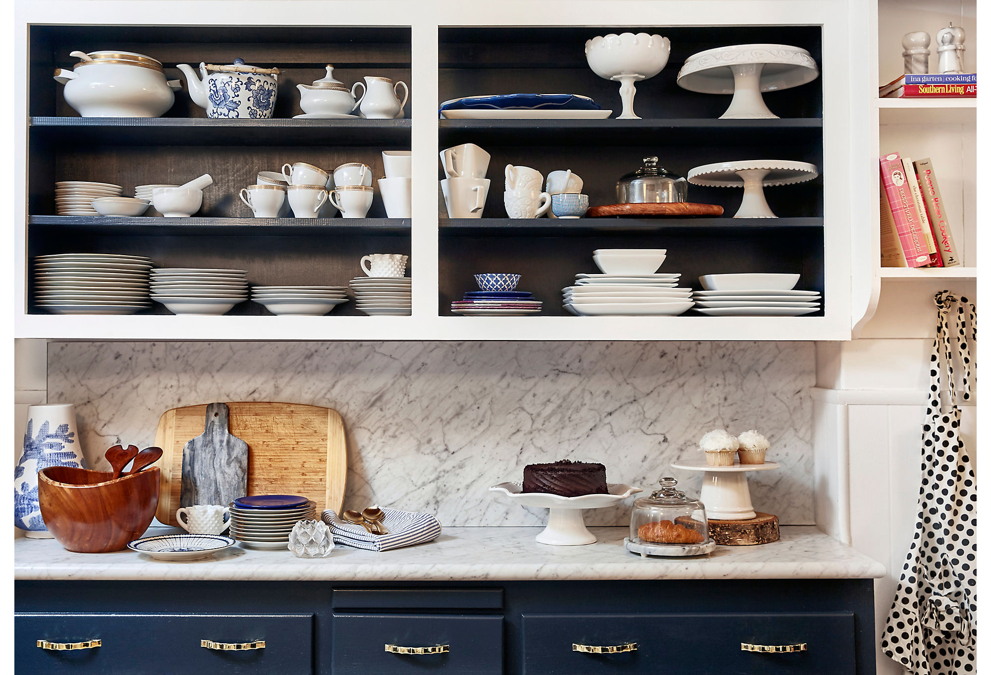
Virginia went for a classic palette of blue and white in the kitchen. She used open shelving to display her sets of tableware.
From the beginning, Virginia wanted her home to be a space where her entire extended family could feel welcome and at ease. It was the people who were going to fill the home with joy. The fabric she fell in love simply provided her with the perfect paintbox to play with.
Explore more home tours →
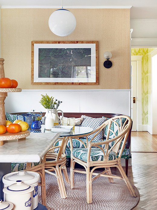
Virginia is not afraid of pattern. The paisley fabric in the breakfast nook echoes the wall covering in the entryway.


Join the Discussion