We’ll be the first to admit that, while simple in theory, making your home feel both sophisticated and livable is not so simple in reality. Should my chairs match exactly? Where do I start with mixing accents? White upholstery—seriously?
In a quest to demystify that effortless look we love, we turned to veteran decorator Windsor Smith. With a client roster that includes Hollywood moguls and celebrities such as Gwyneth Paltrow (her neighbor), Windsor has a masterful eye for thoughtfully arranged rooms and fresh color palettes, coupled with an elegant and at-ease approach to the modern home that feels none too precious. We stopped in on Windsor’s L.A. home, where her refined-relaxed aesthetic is laid out to stunning effect. Here she breaks down the elements and tells us how to master that imperfectly polished look in our own homes.
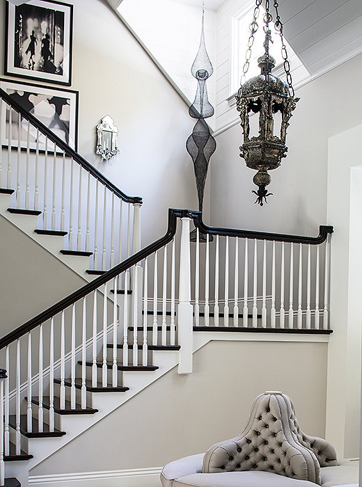
Sculptural designs are a key presence in Windsor’s home, where a Venetian silvered lantern, a curvaceous hanging sculpture, and a tufted borne welcome guests in the foyer.
Lesson No. 1:
Combine Similar Shapes and Silhouettes
“I love great shapes and interesting silhouettes,” Windsor tells us. “So I tend to be drawn to sculptural objects.” Case in point: Her high-ceilinged foyer is a stunning display of dramatic forms and flirtatious silhouettes that command the eye, including the voluptuous tufted borne, the sinuous hanging sculpture, and the Venetian silvered lantern dripping with timeworn patina. While each piece stands out as singularly beautiful, together they add up to a look that’s artful and rich with personality. It’s our idea of an elegant yet playful design mix of streamlined, sumptuous, and salvaged elements. To recreate an equally layered and cohesive look in your home, try combining vintage finds, upholstery, and modern pieces that share similar shapes or curves.
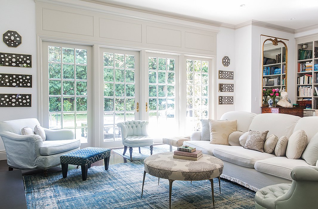
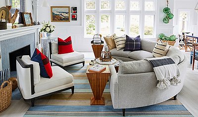
The living space in Windsor’s home is anchored in a blue-and-white palette that feels light and modern, thanks to a faded overdyed rug and crisp upholstery. Pale sage chairs add to the soothing ambience.
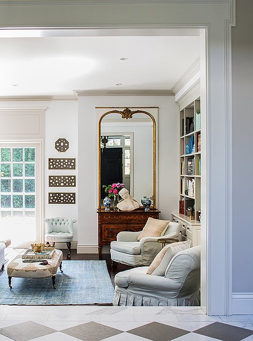
Snowy white walls provide the perfect blank canvas for a formal vignette topped with a classical bust and a mirror as well as for monochromatic art panels and colorful books.
Lesson No. 2:
Opt for a Soft Palette to Ease and Enrich
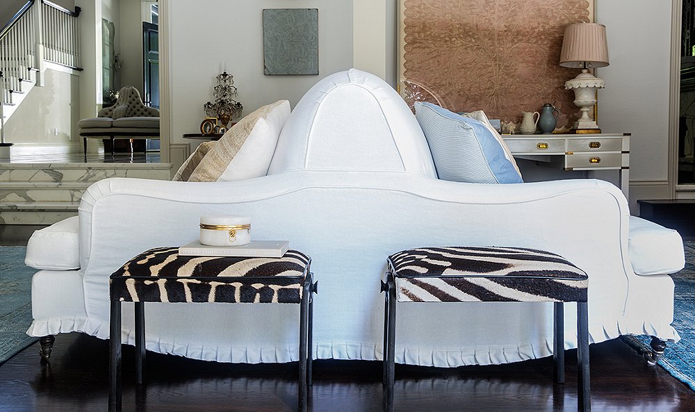
Windsor uses soft tones to achieve a serene, airy atmosphere. She opts for practical upholstery with equally soft lines that is in keeping with the simple backdrop, big on ease. “Prewashed linen slipcovers are a must in my world,” she says. “I like the freshness and relaxed nature of them. They always find a way to deconstruct a room that by design is more fancy.” To play up the ease of her living area’s white palette, Windsor brought in furnishings in pale tones (the gray-sage chairs) along with pieces that have white accents (an indigo ottoman with white stitching, a washed-blue overdyed rug). The result is a color scheme that opens up the room while bringing focus to rich vignettes such as her classical console display. “Objects can be seen more clearly in a more restrained palette,” she says. Our takeaway? Keep furnishings to soothing hues and neutrals to maintain a calming, cohesive look that will naturally lend itself to showcasing standout decorative moments.
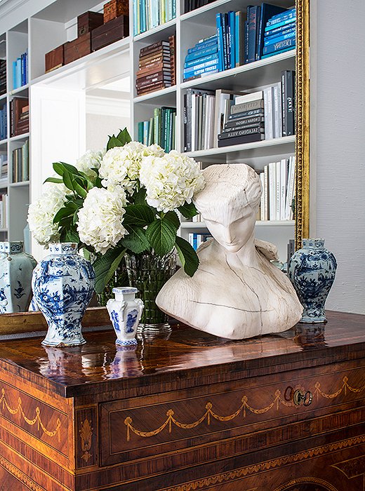
A substantial bust offsets ornate chinoiserie vases and intricate marquetry motifs for a balanced effect.
Lesson No. 3:
Mix Time-Tested Pieces with Abandon
Furnishings and accents that have stood the test of time share a sense of history and have natural affinity, making them easy to mix and match. For Windsor, that meant grouping blue-and-white chinoiserie (“I’m a sucker for pairs of things”) with a gilt-frame mirror, a classical chest, and a majestic bust marked with the passage of time. Arranged together, these pieces make an eye-catching vignette. “I love objects that evoke conversation and things that have a clear history,” Windsor says. “You can play up these objects by placing them in great lighting if you want them to stand out.” Try grouping objects and motifs that have historical and classical roots. Chances are, they’ll come together for a display that feels both effortless and surprisingly elegant.
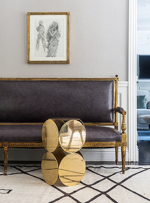
Gold finishes, ranging from polished to beautifully tarnished, act as a unifier that makes this seating area shine.
Lesson No. 4:
Play with Varying Gold Tones
In a spacious corner, Windsor brought together gilded furnishings and gold finishes to create an exquisite resting spot. Despite the designs’ wide-ranging styles (“I’m attracted to pieces that have an air of sophistication and that have a naive, playful quality,” says Windsor), the modern side table alongside the classic settee and art frame are brought together by their golden glimmers. The gleam of gold both highlights the details of each piece and gives the overall arrangement a delightfully unexpected but cohesive look.
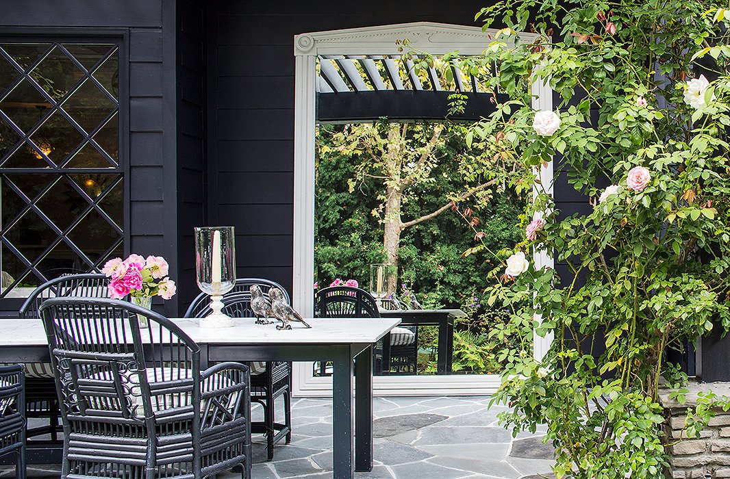
An oversize statement mirror sets a grand tone in the garden, amplifies changing daylight, and magnifies the surrounding lush greenery.
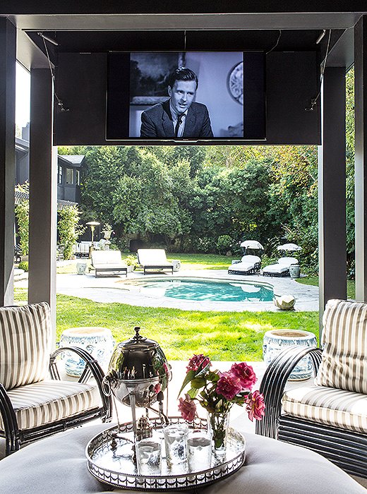
Indoor luxuries big and small—a drop-down movie screen, a silver tray topped with fresh-cut blooms—make the pool pavilion especially comfortable and welcoming.
Lesson No. 5:
Be Bold
Windsor is one for easy decorating additions that make substantial statements—a gesture that extends to outdoor spaces. “I love the idea of placing something grand-scale in the garden,” Windsor tells us. Her grand-scale moment comes in the form of an expansive leaning mirror picked up at the Brimfield flea market and used as “a porch pediment,” she says. While certainly a daring decorating move, the classical mirror infuses her garden with an element of surprise that sets the space apart. “Often you find those best juxtapositions when you just buy what you love and move it around until it finds the perfect placement,” she says. Sometimes it’s not about finding the perfect object to complete a room but finding the perfect place for a piece you love.
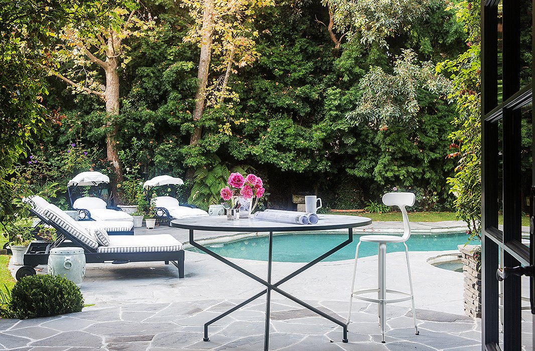

When I come home, I want to decompress. I prefer a palette of blues and grays in my own home for their relaxing nature, and because they’re the perfect backdrop for a more collective approach to interiors.

Love the slipcovers, but I have personally found that white linen slipcovers yellow if dry-cleaned, and ravel away (yes, even if seams are serged) if washed. And then there is the issue of color transfer if someone sits down wearing dark jeans. The mirror in the garden is interesting, but my practical side wonders how one keeps it clean on a daily basis. Outdoor spaces (even screened porches) get dirty SO quickly and are always a major chore to keep cleaned. I remember my mother cleaning our screened porch multiple times daily as we lived in windy Kansas and dirt was always blowing.
interesting seating configurations