Gone are the days of the all-in-one dining set. In stylish dining rooms across the country, designers are juxtaposing two, three, or even more chair styles to create an entirely custom, eclectic-chic look. But the freedom to mix and match can also be daunting: When the options are endless, where do you start? Below, we’re breaking down some of our favorite mismatched-chair success stories. Read on and get inspired to mix things up.

Head of the Class
To ease into the mismatched look, consider changing up just the two chairs at the ends of your dining table. While more interesting than a matching set, the result will still be symmetrical, giving your dining space that gracious, classically composed look.
In the example above, a pair of slipcovered armchairs anchor the ends of the table, complemented by six Louis-style accent chairs at the sides. Neutral hues and complementary shapes make the pairing sing: Brown leather adds richness to the pale linen, while the softly draped slipcovers contrast beautifully with the Louis chairs’ tailored lines.
Note: In all dining-chair combos, the biggest concern is seat height. As long as that’s equal (so diners are all at the same level), you’re free to mix and match styles with abandon.
Round It Out
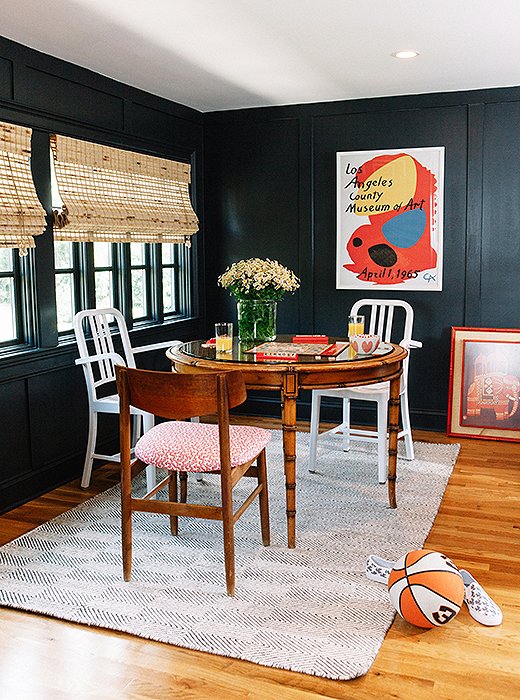
A round table frees you up to get even more creative. We love this playful trio, composed of a Danish-modern wood chair and two aluminum Navy chairs. One picks up on the warm wood tone of the table, while the others add a bright metallic touch against the dark walls.
What makes the mix work? Clean lines and gentle curves—and a shared modernist sensibility—help to visually tie these pieces together.

Close Complements
Instead of going for a strong contrast, choose two just-different-enough styles for a subtly intriguing yet still traditional look. Here, the four ornate cane-back chairs and two fiddleback styles seem cut from the same cloth—they mesh seamlessly without matching perfectly, thanks to their shared color, graceful curves, and gold detailing.
An Easy Gathering
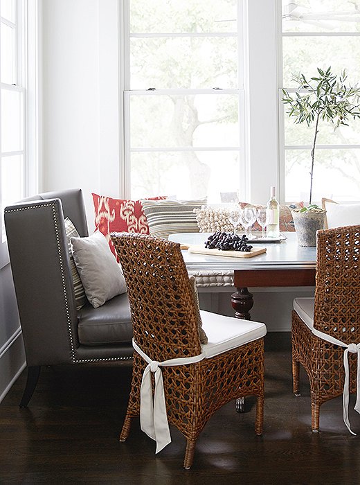
Counting the cushioned banquette, this cozy breakfast nook features three types of seating, yet the mix feels relaxed and comforting rather than chaotic. The key is the right combination of shapes and materials. The backless banquette is neutral and unobtrusive, while the deep-seated slipper chair and the woven rattan accent chairs share a clean, squared-off silhouette.
Another unifying force: an abundance of textiles, including pillows piled atop the banquette and the slipper chair as well as gracefully tied seat cushions. All these plush accents—in repeated fabrics, no less—give the mix an inviting, cohesive softness.
The Power of Paint
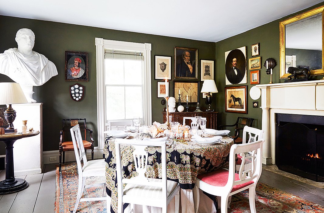
If you’re the type who can never resist snapping up a lone chair at a flea market, consider this approach: Paint an array of mismatched wooden side chairs the same color. Voilà—instant dining set.
We love how a coat of matte white paint not only gives the chairs here a cohesive look but also creates a graphic, almost stark effect, taking classic lyre-back and pierced-splat chairs into decidedly modern territory.
Singular Statements
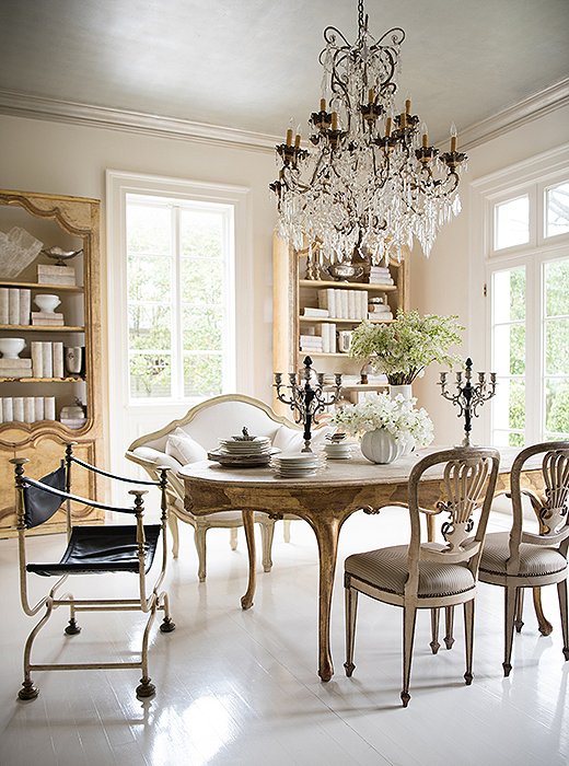
In another take on the multichair mix, three very different types are combined to stunning effect. While pieces this diverse—and this striking—might seem to compete for attention, this carefully calibrated grouping instead feels utterly chic.
To pull of such a mix, try to pick pieces that speak the same visual language, such as the refined Continental designs here. Then make sure the chairs have equal visual weight. In this case, the Italian metal campaign chair has a more open silhouette than the other styles, but the black leather seat gives it heft. The graceful settee is soft and pale, but its upholstered frame feels substantial. And while the wooden accent chairs are the most delicate, they’re doubled for added presence.
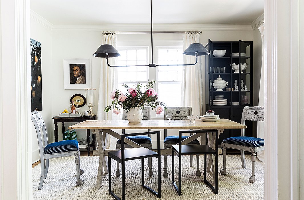
Offbeat Elegance
This chic twist places the contrasting chairs on just one side of the table, rather than at each end. What’s more, the styles here are wildly divergent—antique Empire-style chairs versus an ultramodern metal design.
The key here is in the rectangular shapes and graphic lines. The metal chair is essentially a super-streamlined rendition of the antique style, with square corners, straight legs, and a rectangular open back. And updated with striped indigo upholstery, the Empire chairs have a graphic punch that ties back to the modern style.
Join the Discussion