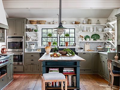
Stylist and content strategist Erin Hiemstra launched her widely read blog Apartment 34 to chronicle the renovation of her Seattle condo. Now, nearly 10 years (and one 20-month-old) later, she’s wrapping up an even bigger renovation project: the restoration of a 19th-century Victorian home in San Francisco.
To help her cross the finish line, Erin called upon the team from One Kings Lane Interior Design. “Even though the house could have gone really formal, I want it to feel like a family home—beautiful while still being livable and not overly precious,” Erin says. And while she had a definite vision for the decor, after two years of renovations done only with the help of an architect (“I don’t know if I would do that again!”), Erin was ready to hand over some of the heavy lifting. “I knew I had a vibe that I was trying to accomplish, but actually getting down to the nitty-gritty of sourcing pieces can be a mind-numbing experience—especially as I’m working on an entire house.”
For One Kings Lane designer Chelsea Conrad, it was important to give Erin a functional, welcoming space that would suit her young family—all while maintaining the clean, serene look that Erin loves. “The main thing we learned was that less is more,” Chelsea says. “In the dining room, it’s really about the people in the space.”
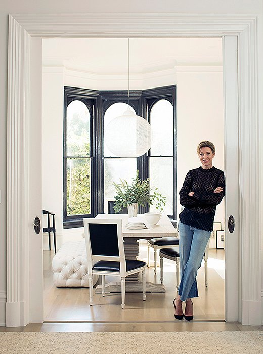
After an extensive renovation of her 19th-century home (listed on the city’s historic register), Erin welcomed a bit of help with the final touches. “I’m not a professional interior designer, so working with someone steeped in the design world was so helpful—from a time perspective and just knowing that she understood my vision.”

Even though the house could have gone really formal, I want it to feel like a family home—beautiful while still being livable and not overly precious.
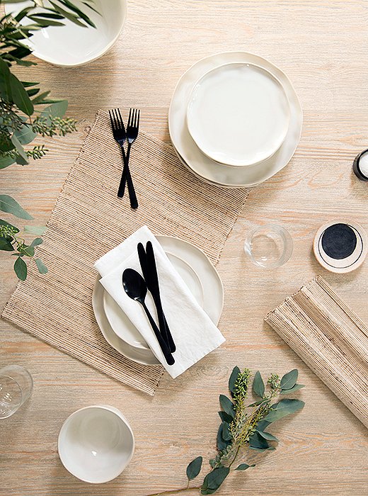
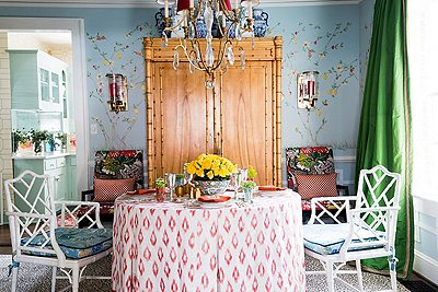
Modern flatware contrasts with earthy ceramics on the table. “I love that juxtaposition of really stark and modern and something with more of an organic edge,” Erin says.
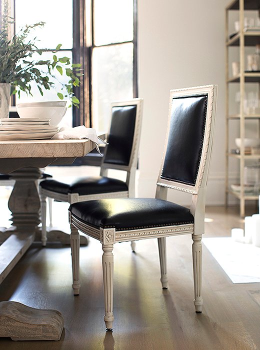
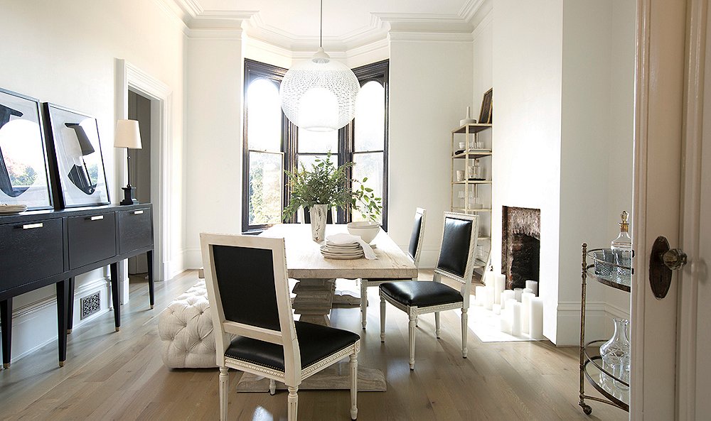
Black leather gives traditional Louis XVI-style chairs a glamorous update, while a weathered wood table brings the formality down a notch.
Bringing Paris to San Francisco
Like so many of us, Erin turned to Pinterest to refine her inspirations, and soon a common theme emerged: images of grand Parisian apartments, all with an effortlessly elegant mix of styles. “I really wanted it to have that tension of the historic and the modern,” Erin says.
She laid the foundation for this aesthetic with a bold paint choice: clean white on the walls and rich black on the window trim, a look she spotted in a magazine years ago and couldn’t forget. “My husband was so against it,” Erin laughs. “I just kept insisting, ‘You’ve got to trust me on this.’ Finally I think I wore him down enough that he said okay.”
The paint provided the perfect canvas for the dining room’s modern-meets-classic decor, in which unexpected materials and sleek shapes help traditional pieces feel of-the-moment. Case in point: the Louis XVI-style dining chairs, Chelsea’s favorite element of the space. “They kind of encapsulate the design process,” she says; in high-contrast black and white, the time-honored style feels unexpectedly fresh.
I really wanted it to have that tension of the historic and the modern.
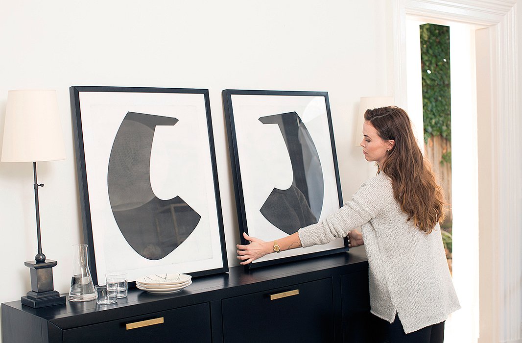
Erin loves the look of leaning art, so Chelsea placed a pair of large prints atop the sideboard. “It feels a little undone but kind of cool and intentional,” says Erin. It’s also a practical choice. Putting a nail in delicate plaster walls can be a risky feat—and once done, there’s no changing your mind.
Getting Scale in Balance
One of the project’s biggest challenges was proportion. The room is relatively narrow, with 12-foot ceilings, so “pieces get dwarfed really quickly,” Erin says. Finding furnishings with just the right scale became key. “That’s one of the biggest pieces where you need design expertise,” Erin says. “A lot of people can pull together color palettes, pick fabrics—but if your dining table and your chairs don’t work together, the whole thing is thrown off.” To help draw the eye up, Chelsea chose a sideboard with tall, narrow legs and a surface that sits higher than the dining table. An étagère likewise adds lift to an empty corner.
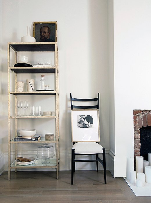
Chelsea kept accessories minimal to maintain an airy look. Displayed amid Erin’s styling props and serving pieces are a vintage Parisian portrait and a black-and-white photo of her husband and their newborn son.
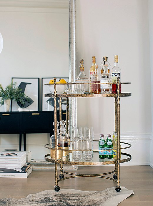
Leaned against the wall, an oversize silver mirror helps make the narrow room feel expansive—and plays off the metallic finish of the petite bar cart.
Going All-In on Neutrals
Although the room is largely black and white, it feels anything but stark. “We created depth by layering neutral textures,” says Chelsea. Furnishings in linen and weathered wood add softness and warmth, while the brick fireplace (revealed during renovations) lends a rustic touch. Touches of black—including those dramatic window frames—punctuate the space with a subtle graphic effect. “I wanted to keep the tones in the room monochromatic, very muted, understated,” Erin says. “I think it’s kind of my reaction to having a young child and having so much of his stuff everywhere. If I can keep the rest of my decor chill then I feel like it’s still my house.”
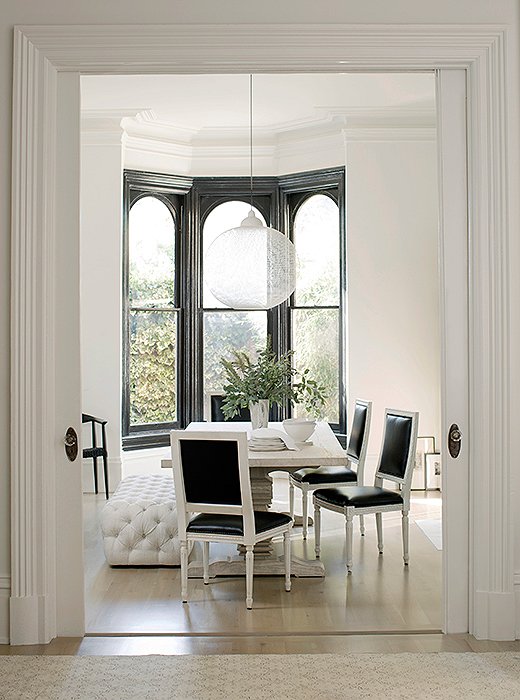
Black and white paint gives the home’s traditional architecture a modern edge. Walls (flat) and trim (high gloss) in Benjamin Moore’s White Wisp. Window frames in Benjamin Moore’s Black, high gloss.
More Than a Dining Room
After years of apartment-dwelling, having a dedicated dining space feels like a true luxury. “My husband and I joke, ‘Oh, now we feel grown-up!’” Erin has been relishing the opportunity to entertain, inviting friends for impromptu wine-and-cheese nights—and recently, hosting her first official family holiday.
Even when it’s not being used for entertaining, the dining room has become a key part of the family’s day-to-day. “Whether I post up at the table with my laptop or my husband’s there doing work in the evening while I’m making dinner, it’s just a really pleasant space to be in,” Erin says. “It really has become the center of where we gather right now.”
Chelsea’s Top Tips to Get the Look
1. Layer textures to create depth. “Matching tones in different finishes and pairing them with the contrast of white and black is clean, simple, and always chic,” Chelsea says.
2. Less is more. In Erin’s space, “it ended up being more about what we didn’t add than what we did,” Chelsea says.
3. Add color with greenery. It’ll instantly add life to any space, Chelsea notes, without distracting from a design scheme of subtle neutrals.

Join the Discussion