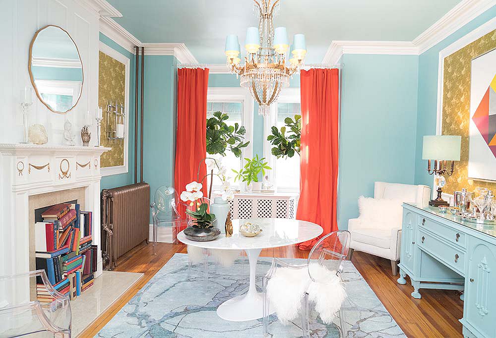
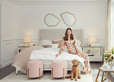
The duo famous for bettering the wardrobes and homes of stylistically challenged men on the original Queer Eye have teamed up for yet another TV smash. Fashion guru Carson Kressley stars alongside interior designer Thom Filicia in Bravo’s Get a Room, and it’s as chock-full of dazzling before-and-afters as you’d expect from the talented pair. (An after, above.) Each episode, Thom and Carson tackle decorating conundrums with their signature wit and charm, bringing to life the spaces their clients had dreamed of but lacked the wherewithal to bring about.
As the show nears its finale on December 21, we chatted with Thom and Carson about everything from decorating budgets (affectionately referred to as boujets) to the difference between style and taste to their favorite movie design moments.
One Kings Lane: Why does interior design matter?
Carson Kressley: Because it makes our lives better! Some people think interior design is just about making a space pretty, but something that I learned from Thom, and from doing Get a Room, is that form follows function, and great interior design not only makes your life better because it makes your place more beautiful, but [because it makes your space] more functional and livable as well.
What would you tell someone who wants to take on a design project but has no idea where to start when it comes to budget?
Thom Filicia: In terms of coming up with your own budget—or boujet, as we like to call it on the show—ask yourself, What are you comfortable with in terms of the investment? I would recommend that you spend as much as you’re able to, especially on anchor pieces. If you own your space, start with the bones and make changes that will add value to your property. If you don’t own your place, then start with the decor and invest in things that you can easily take with you when you move.
What’s the most common interior design challenge you’ve come across so far?
CK: The biggest obstacle for many people is just getting started. Interior design can be scary because you don’t want to make an expensive mistake, but it’s so important to take that first step. And that first step can be something as easy as choosing a paint color or freshening up your accessories, but little things like this are what instills the confidence to keep going and finish whatever else you have on your plan.
What’s the difference between style and taste?
CK: Style is about personality and flair and putting your stamp on things. Like with fashion, you can have great taste and kind of just look like the mannequin from your favorite store, or you can have great style and look exactly like you. Style is something Thom and I try to channel for our clients on the show so that we’re creating spaces that are really, really personal, really fun, and that tell a story about the people who live in them. A room should never look anonymous—it should look exactly like you!
TF: Taste is a learned idea. Generally, people who have good taste understand the social nuances of the world. They have good taste in fashion. They have good taste in home decor. They have taste in the way they communicate information. They have taste in the way they internalize and externalize ideas. Taste is something that you can read about, learn about, be exposed to, and understand. Style, on the other hand, is something that is innate to a person. People with style have a sensibility that feels unique and authentic. And sometimes people with great style aren’t even interested in taste because they find it limiting or even a bit boring.
Fashion analogies are often used on the show to help people better understand their own personal style. How would you compare the idea of trends in fashion to those in interior design?
CK: I feel the same way about interior design trends as I do fashion trends. Whether it’s a wardrobe or your home, you want to invest in great basics and then employ trends as the salt and pepper to the meat and potatoes of your design. With dressing I say have fun with inexpensive accessories like scarves and costume jewelry and fun bags, and then invest in the basics like a little black dress or a great pair of shoes. Same thing for your home. Invest in a great quality sofa, but maybe change up the throw pillows seasonally. Have fun with house plants and greenery. Have fun with changing out your artwork. These are all easy ways to keep your home feeling fresh and “on trend” without looking “trendy.”
TF: I think there’s a permanence when it comes to interiors. They’re a backdrop for your life as opposed to an outfit for the day. When people are investing thousands and thousands of dollars on home decor, they don’t want it to feel so trendy that they have to redo it once it’s finished. I like to ground my interiors, whether they’re modern or traditional, with substance and things that feel like they’re going to stand the test of time. The things that bring in the trends, like colors or patterns, can be brought in with smaller pops. If “global influences” is a big trend that’s happening, then bring it in with prints and texture using pillows or a throw—even interesting books about it. These are the kinds of things that you can fade in or fade out without changing the actual core of the design.
Are there any design trends from the past that you’d like to see make a comeback?
CK: My thing is, like, if your house looks like a little old lady from Palm Beach lived there in 1972, bring it on. I love watercolor floral prints and chintz and lots of color and chandeliers made out of metal daisies. I’m feeling all of that.
TF: Not really. I like when interiors are an authentic extension of the people who live in them—who they are, where they live, what makes them tick. The styles I love to see the most are ones reflective of people’s genuine points of view. I’m always intrigued by going into somebody’s home and being able to see where a person’s at in life. Twenty-five is different than 55; having children is a lot different than not having children. I think that all of those things play a role in how you create a space that tells your story without being literal and clichéd, but authentic and cool.
In terms of set design, what do you think is the most stylish movie moment of all time and why?
CK: “Think Pink!” [a scene from the 1957 film Funny Face] with Kay Thompson. The sets are incredible. They’re all very optimistic and chic and just have that Cecil Beaton/Dorothy Draper kind of vibe that I think is so great on film.
TK: One of my favorites is The Shining. The bathrooms, the bars, it’s pretty cool high style. I love it. And it was all built on the set. That was all made for that movie, which makes it that much more interesting. I also love Wes Anderson. I love everything about the way he approaches things. It’s humble and it’s cool and it’s interesting, and it’s artful yet it’s timeless and classic, but it feels very of the moment, and it’s a little quirky and odd.
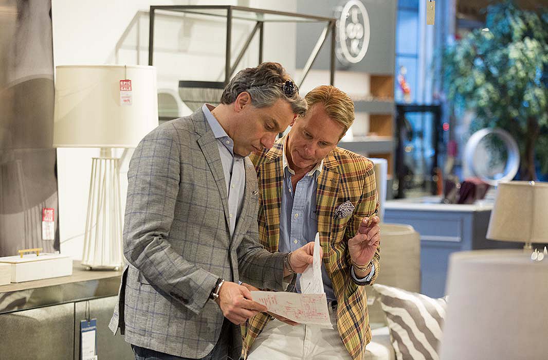
Thom Filicia and Carson Kressley. Above: A room designed by Thom and Carson features a round dining table, cleverly placed books, and artwork from Lillian August.

Join the Discussion