When I think of kitchens, I think of my parents’ 1990s kitchen decked out in the soft yet punchy colors of the Schumacher fabrics that adorned the windows. Soft yellow complemented gingham and fruit motifs, and oil paintings of bucolic scenes dotted the walls. My mother prided herself on having a beautiful home, using designer fabrics and hiring only the best interior designers to oversee things while she worked long days at her law firm. Her whimsical approach to design in the kitchen means that I shy away from the minimalist kitchens covered in brass finishes and subway tiles that dominate Instagram and Pinterest.
Apparently Plain English Cupboardmakers does too. Based in the English countryside (though with a showroom in Manhattan), the company excels in creating colorful kitchens in a distinctly British way. In fact, it just released 12 new colors in collaboration with London-based interior designer Rita Konig.
Colorful Restraint
“I love color and adore using it,” says Rita. “It was one of the things that first attracted me to Plain English. They use color in a very bold way and I admire that.”
Plain English may be bold in its approach to color, but it is classic in its approach to design. The kitchens they build are rooted in an appreciation for the neoclassical architecture of Georgian style. This buttoned-up look allows its designers to play a bit more loosely with color.
Working with Plain English color consultant Kate Shaw, Rita found inspiration in the quiet moments of country life. “Kate and I met, each bringing bits and pieces of things that we felt had resonance to British daily life—the proper colors of things: a scrap of cloth, a bit of paper, a dab of this or that.”
The names of her 12 color introductions are quintessentially English: Bib and Braces is the British term for overalls; Flummery is named after a pudding that appeared in a guide for English housewives in 1623; Moygashel is the name of a village in Northern Ireland that has been weaving linen since the 1790s.
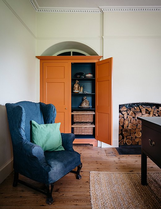
This vignette features three of Plain English’s new colors: the cupboard is painted in Moygashel, the wall in Cotton Pinny, and the chair in Mouldy Plum.
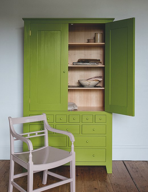
Candied Peel and Bib and Braces are wonderful foils for each other in this colorful cupboard.
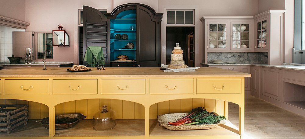
The colors are meant to work together in groups and not live in silos. “You need three or four colors in a kitchen,” Rita says. She suggests a different color for each of the main cabinet areas: the island, the upper cabinets, and the lower cabinets. “During the creative process we were always looking in threes and how various shades work together,” she says. “Combinations were always on our minds.”
Nicotine’s sunny hue is subdued by the taupe-peach of Silver Polish. Candied Peel, inspired by a photograph and what Rita thinks is a particularly good foil color, is made moodier by the intense draw of Bib and Braces. Moygashel, “which goes with anything,” Rita swears, is too yellow to be mossy but is still rooted in nature. Rita would pair it with Burnt Toast or Nicotine.
The list of potential colorful combinations goes on. But how do you choose them in a way that makes sense? We asked Plain English design director Merlin Wright for his advice.
Careful Planning
Merlin’s favorite color combination is Medlar Jelly with Nicotine against a slightly off-white wall. But he knows that the idea of colorful cabinetry might be scary to the uninformed consumer. “If people like the idea of color but are unsure about it, I encourage them to be bold but to plan their scheme carefully to avoid disasters,” he says.
Color elicits a visceral response from every person who interacts with it. It’s why you have favorite colors and why you hate the way certain colors look on you. Also, it’s why interior designers talk about color in a room as they would on a dress or a purse. When you pick a color for your home, it should reflect and flatter you.
That said, “we should bear in mind that a jolly jumper [sweater] is worn for a day, whereas we have to spend a lot of time in a kitchen,” Merlin cautions. “Its colors should be conducive to calm and focus.”
Careful planning and gathering inspiration can help you avoid color disasters. “A good approach is to study successful schemes in magazines,” says Merlin (and you can scroll through the Plain English Instagram account too).
Rita’s careful planning starts with the cupboards. “For a room, I don’t really start with the color of a wall,” says Rita. “But in the kitchen, you always start with a cabinet color. It’s all about the paint in the kitchen.”
Once you’ve chosen your combination of colors, it’s time to figure out where they go best. “A basic principle is to use a stronger color, such as Burnt Toast, for the floor cupboards,” says Merlin. “Then use a paler color like Cotton Pinny for the walls and then a blue or red highlight color for some chairs or the inside of a glazed cupboard.” These are merely his suggestions. There are no real rules to follow when it comes to a colorful kitchen. As when picking any paint color for your home, the best advice Merlin has to give is to just try it.
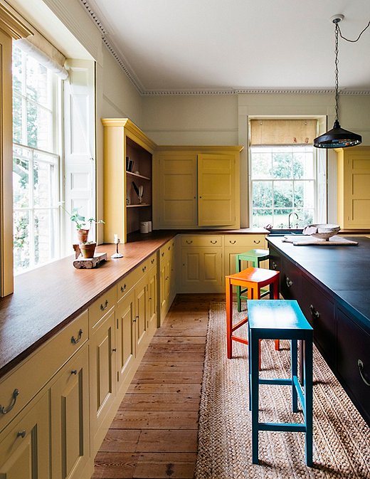
This kitchen takes a next-level approach to color by painting the cabinets in Nicotine and dotting stools painted in Tea Caddy, Medlar Jelly, and Moygashel throughout the room.

The colors are meant to work together seamlessly and these brushes display only a few color combinations.
Plain English and One Kings Lane
Because the kitchen is the heart of the home, we partnered with Plain English to create the kitchens of all One Kings Lane shops. Each store’s kitchen offers a wealth of inspiration and allows you to experience Plain English’s craftsmanship for yourself. If you’d like to discuss a project or book an appointment, contact the Plain English U.S. team via our website. Mention One Kings Lane during your appointment and receive 10% off.


Join the Discussion