Tour a gorgeous Santa Barbara home decorated by designer Megan Rice Yager, and steal her genius design takeaways.
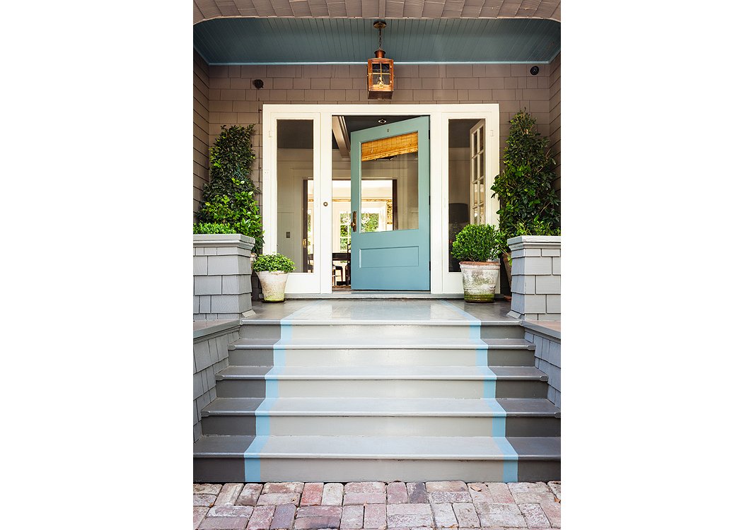
The door color, Benjamin Moore’s Stratton Blue, is continued into the foyer. A light from Bevolo casts a warm glow on the porch when night falls.
Tip No. 1
What’s on the Outside Counts
“The exterior of your home is where first impressions are made. It can make guests excited to see what’s inside! I painted a runner up the stairs to draw you into that gorgeous front door.”
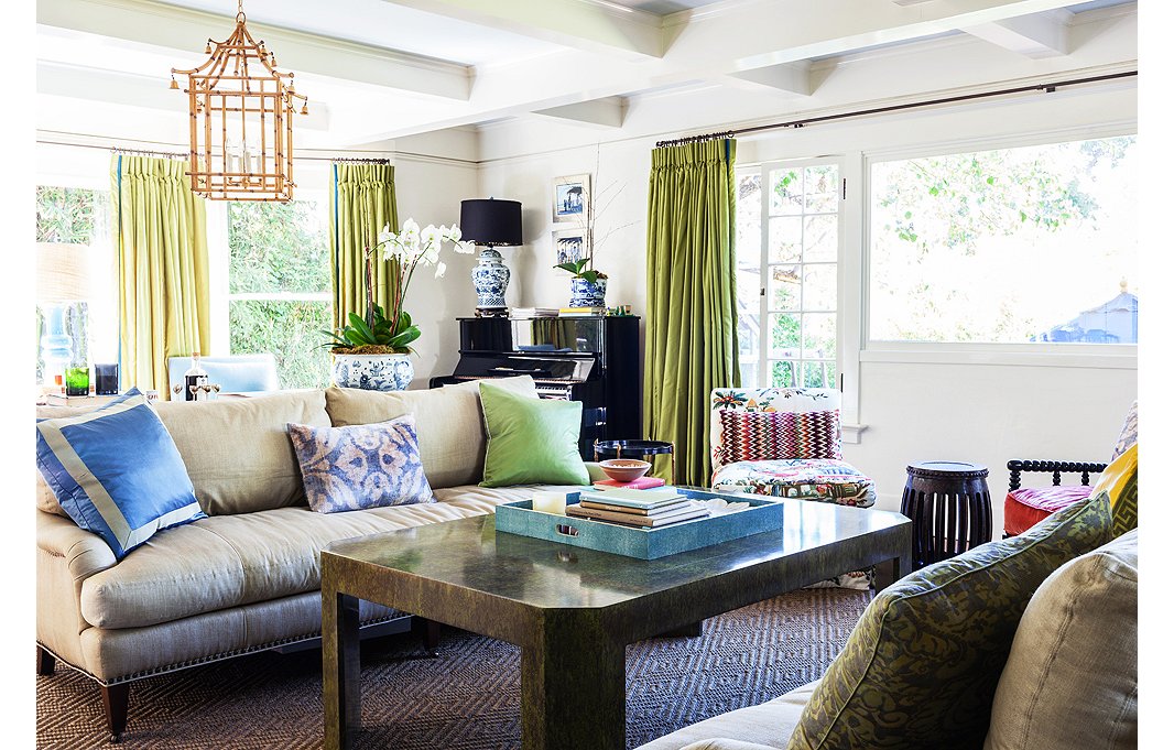
In the living room, Yager opted for a “chinoiserie overload”—bamboo lanterns by John Rosselli and plenty of blue-and-white ceramics—letting the Asian influence complement the home’s Craftsman bones.
Tip No. 2
Rely on Symmetry—to a Degree
“You’ll never see me setting things at a jaunty angle in a room—it gives me the willies when I see a rug placed on the diagonal. I love symmetry, but I am also conscious not to overdo it. For instance, I’ll use chairs that are like fraternal twins—not perfectly matchy-matchy.”
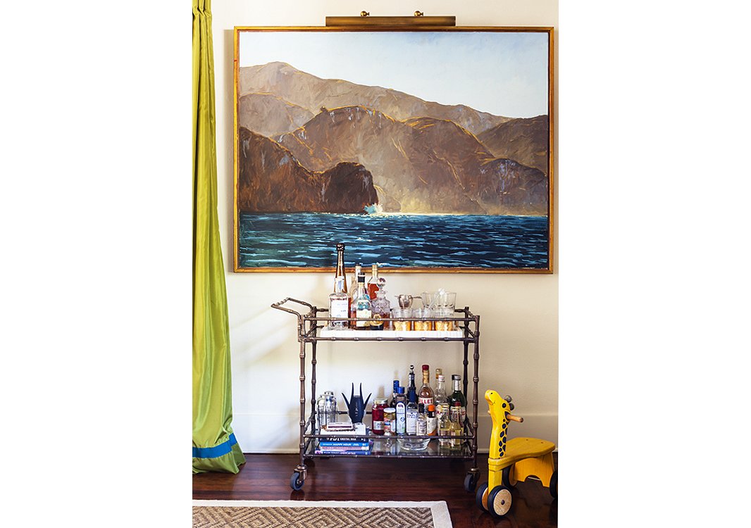
A fully stocked bar cart (who doesn’t love a portable party?) and a painting by Garrett Speirs create a moment on an otherwise empty wall.
Tip No. 3
Go Big When It Comes to Art
“I love playing with scale in a space, and I’m a major fan of large-scale art. It feels more modern.”
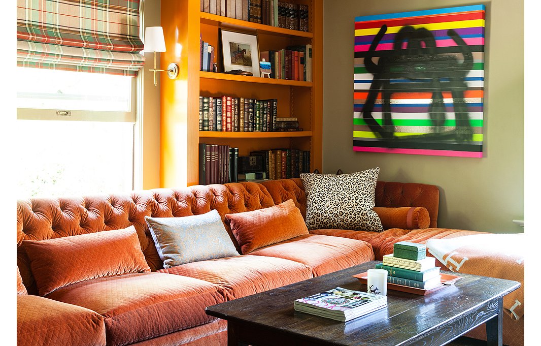
Yager transformed this spare room, an “empty box,” into a comfy den with built-in bookcases and a custom sectional upholstered in Schumacher’s Paley Quilted Velvet.
Tip No. 4
Don’t Shy Away from Major Color
“I love when clients are open to bold color. It can have such impact in a room—really it’s the oldest trick in the book. I just always like to continue at least a bit of the same color from room to room to maintain a visual continuity.”
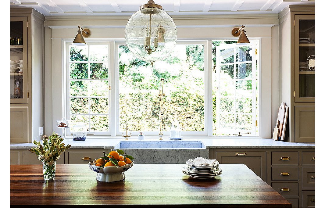
Though the kitchen is new, Megan referenced the original woodwork on the ceilings and brought in traditional touches, from the old-fashioned cabinetry to the island built to look like a French chopping block, complete with brass corner straps.
Tip No. 5
Let Your Lights Hang Low
“I generally don’t hang fixtures higher than 30 inches above a table surface. Light fixtures hung too high are like high-water pants—and not the cool Thom Browne kind.”
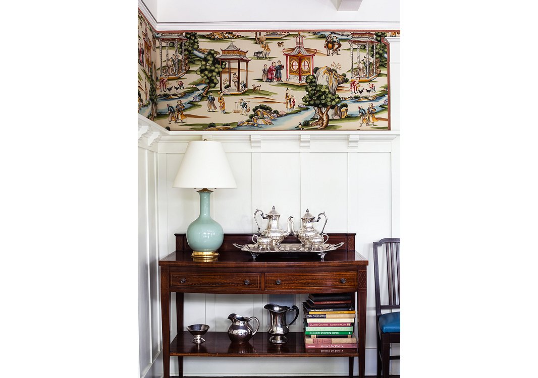
Megan upholstered these panels in Scalamandré’s Shanghai. Hits of pale blue in the fabric are set off by a lamp from Christopher Spitzmiller.
Tip No. 6
Rethink Wallpaper
“Not only is upholstering a wall very durable, but it’s fantastic for acoustics when used in a TV room or bedroom.”
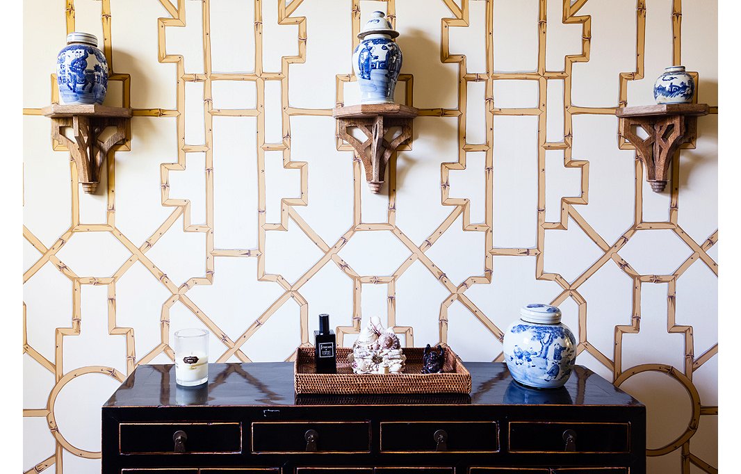
Baldwin Bamboo wallpaper from Scalamandré creates a graphic backdrop to ginger jars resting on brackets.
Tip No. 7
Curate a Collection
“I love collections—they make a house feel so personal, and they can be really affordable. A great container filled with matchbooks from your travels looks cool and costs nothing. I personally never met a foo dog I didn’t want to adopt, and they can be found in every shop in Chinatown for very little.”
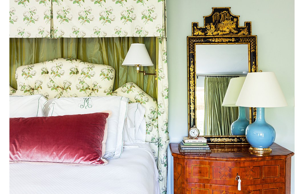
Megan designed the lovely pelmet treatment in bed drapery and headboard in Bowood by Colefax and Fowler. Another Christopher Spitzmiller lamp rests atop a vintage chinoiserie chest.
Tip No. 8
Make Your Bedroom Your Sanctuary
“I would live in my own bed if I could! (Robert Louis Stevenson’s “The Land of Counterpane” was my favorite poem as a child.) I really like to create ultracozy beds for clients with beautiful linens, a perfect mix of soft and firm down pillows, and good lighting for reading.”
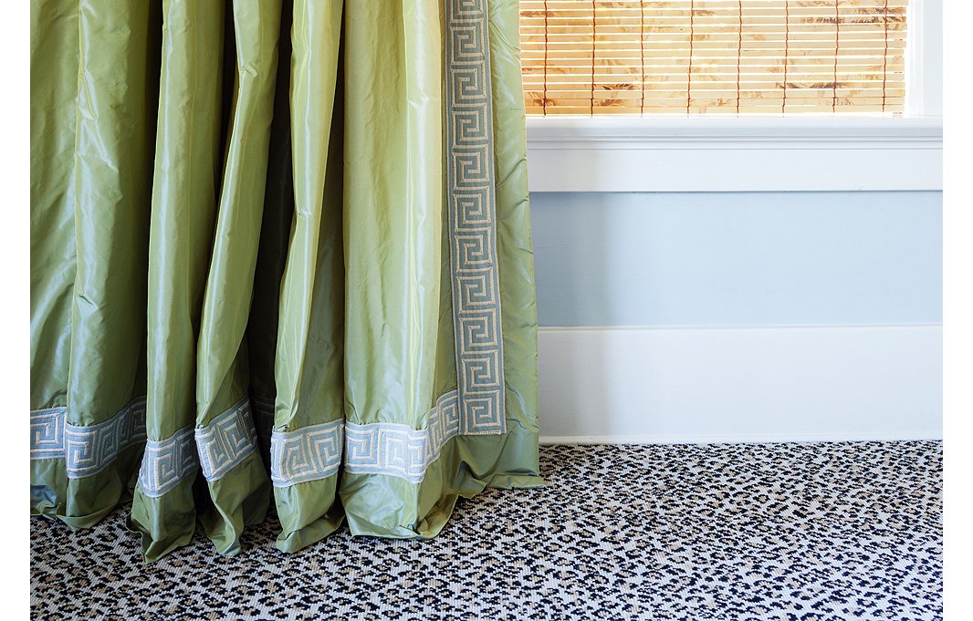
The green taffeta curtains with Greek key trim display the one-inch break that Megan swears by. Their juxtaposition against the leopard carpet is one of her favorite moments in the house.
Tip No. 9
Go for Twists on the Traditional
“When it comes to mixing prints and patterns, I don’t really believe there are any hard-and-fast design rules that must be adhered to. But my designs generally reference tradition, which then lets me feel free to experiment within that classic framework.”
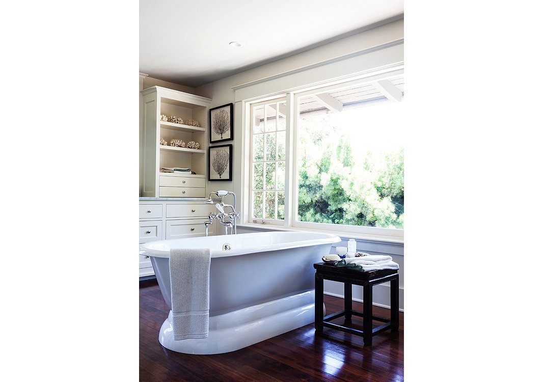
The clients’ own seashore-inspired accents add a serene touch to the bathroom.
Tip No. 10
Know When Less Is More
“As much as I love mixing things up in the rest of the house, I really like for bathrooms and kitchens to appear fairly utilitarian and classically simple—not too ‘decorated.’”
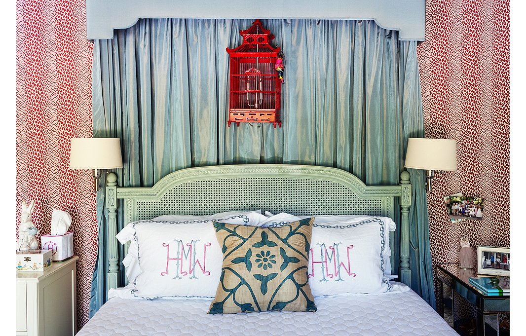
Rose Cummings wallpaper sets off the taffeta bed draperies. Wall lamps (these are by Visual Comfort) free up space on the nightstand.
Tip No. 11
Give Kids Rooms They Can Grow Into
“Ideally, bedrooms should be able to easily transition with kids as they enter their teen years. In this room for the client’s daughter nothing is too little-girly.”
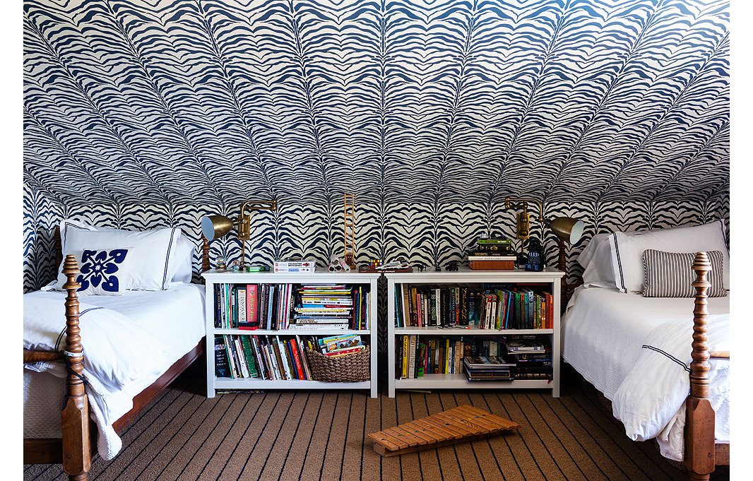
Zebrine wallpaper by Rose Cummings plays the star in this tots’ room, while the dark but neutral carpet takes more of a supporting role.
Tip No. 12
Balance Is Key
“Some things in a room need to exist as the chorus—not everything can be a star. It can feel too busy when every last thing is embellished.”
Any idea of the name of the painting by Garret Speirs? I haven’t been able to pin it down on any of his websites.
@chriscammarata:disqus garret Spiers paintings are sold exclusively at http://www.roomsandgardens.com in santa barbara.
These are some really good design choices. I like your tip about making sure you use some symmetry. I think that is a really important to use with blinds. It would be nice to also use motorized blinds in a room that has a lot of windows. It seems that would be a really easy to have some symmetry in a room. http://www.allcurtaintracksolutions.com.au/services
Is that a Donald Robertson painting in No. 4?
Yuck!
I really love the tip about knowing when less is more. A lot of the time designs can get really cluttered really fast. If can’t realize that things are getting cluttered in time then when the job is done it isn’t going to look as nice. It seems like you might want to get some help with decorating your home. http://www.blacksilver.com.au
I love the drapes in some of these pictures. I feel like they can really accent a room. My wife and I are trying to decorate our home. Maybe we should take a look at some drapes pretty soon. http://www.yourshadylady.com/Interior_Design_Framingham_MA.html
I absolutely love those green curtains that you posted. And like said, it is important to put a twist on the traditional look. I definitely feel like these green drapes do just that. Thank you for posting them! I’ll definitely keep these tips in mind just in case I ever do a home remodel. http://www.brandtsinteriors.com/
This looks like an overdone, 1960’s nursing home. Way too much chinoiserie. It seems if you can remember it the first time, you do not appreciate it the next go round. I just don’t like Hollywood Regency, it needs to go away.
Point me in the direction of that nursing home..please! 🙂
Tip # 1 is brilliant and very cost effective. Adding trim to plain fabric drapes is also a money saving idea. Have done it in the past. Never too much Chinoiserie, lol.
We are now moving to a new house in Lexington VA, which will need to decorate and come up with a new style. Very good visual tips. I agree that the balance in the design very clearly must be observed, especially relating to the mixture of styles tratsionnyh
What an innovative way to change the look of any door by adding color! This reinforces my plan to paint our new pool bath door Sherwin Williams, “Calypso” blue, for a pop of color on our lanai.
Anchor Real Estate
Marco Island, FL
So every bedroom has a different and wild carpet? These people are going to have a hard time selling, or are going to have to pay to replace each bedroom’s carpet when they go to sell.
These are amazing designs! Balance is key, from price to color, fabrics and texture. Also, be true to your personality, you want to space to reflect who you are and work for you needs.
Really?! No. 2…a fully stocked bar cart next to a toddlers ride on toy??!
On a scale of 1-10, she gets a 4!
Absolutely exquisite design with one exception- I am not sure that I could do the Zebrine wallpaper by Rose Cummings…
It’s too busy for a ceiling, especially one that’s so low and angled close to your head. Not restful.
As an interior decorator, I’m sorry you get the wilies from angled rugs. I think it’s interesting. My rule is at least one item angled in a room. The angled rug can welcome a person into the room.
Fresh, pleasing, airy, innovative without being too quirky. I wouldn’t copy everything but it gives me ideas.