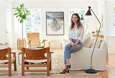
Erin Fetherston’s life—her fashion line, loft apartment, and downtown scene—was running full tilt in New York City. But when she learned she was expecting a baby, Erin began craving the West Coast. She’d grown up in San Francisco’s East Bay and says the prospect of a new baby made her suddenly want “the house, the yard, the drive to the grocery store.”
In short order, Erin and her husband, musician Gabe Saporta, set up what she calls a “bicoastal abode.” Like Erin’s ethereal style, from the whimsical prints and designs she creates for her eponymous line to her own luminescent skin and white-blond hair, their new home has a fairy-tale quality. The grand 1923 house is surrounded by gardens and a long pool, all hidden behind a wall. Located in the tree-lined neighborhood-within-a-neighborhood of Sunset Park, in West Hollywood, it’s a storybook take on life in LA.
They found the house in October and were sleeping there by January, with nary a stitch of furniture. So as her due date loomed, Erin tapped One Kings Lane Interior Design to focus on outfitting the main living space. The design needed to be in sync with the couple’s entertaining style, the needs of a growing child, the local environment, and of course, Erin’s own cool aesthetic. Mission accomplished—and here’s how we did it.
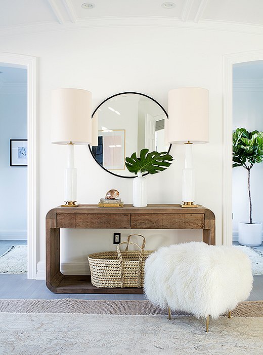
A few notes of family-friendly design: rounded edges on the console, a Moses basket (perfect for a sleeping baby or a pile of blankets), and a Tibetan fleece stool that takes soft to a new level.
Starting with a Clean Slate
Before moving to New York, Erin had lived in Paris and, while there, amassed a collection of antiques. She brought those to New York—at great expense and with lots of logistical headaches—and the beautiful result reflected her life at that moment. But, she says, “when friends would bring kids over, I could feel that they were nervous, watching their kids around fragile 17th-century antiques. And then my husband moved in and inherited this French aesthetic—he often called the apartment ‘the princess palace.’”
For this new era, Erin made a conscious choice not to drag any of her or her husband’s belongings across the country. With a clean slate, she and One Kings Lane designer Alex Reid landed on a fresh design with a California farmhouse feel—with lots of organic textures—and a grown-up sense of sexiness and character. “I wanted every purchase to feel fresh, from the plates to the sofa to the glasses,” Erin says. “I really asked, Does this fit into the home? Does it have that neutral, subtle, earthy California elegance? Is it easy and family-friendly? Will I worry about it?”
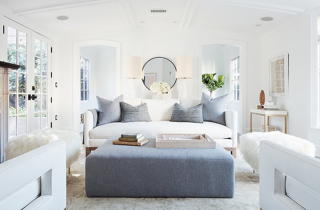
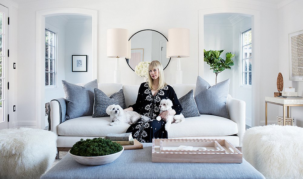
“I wanted every wall to make sense, to have its own vignette,” says Alex. It’s also a flexible design scheme—the ottoman adds extra seating and can be “scooched up for cozier conversations during parties.”
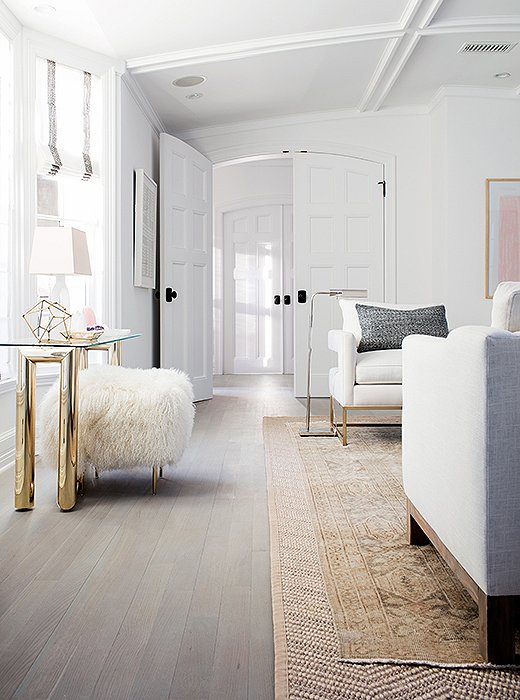
Erin loved the effect of the patterned sisal rug layered under an antique Oushak: “The rugs did a great job of grabbing the cool and the warm tones in the room, the gray highlights and the oatmeal lowlights. It creates this perfect base for everything.”
Opening Up the Palette
Initially Erin wanted an ultracool palette, limited to tones from bright white to gray. That seemed like a serene answer to her visually packed days of looking at textiles, colors, prints, and patterns. She refinished the floors in a driftwood gray, obsessing over the exact tonality that hit the soothing California farmhouse vibe she was after.
But Alex felt the room needed some warm-tone furnishings to balance all that coolness. At first Erin was unsure, but she eventually embraced the idea. “I was setting up too rigid a palette and worried warmth would fight with the gray floors,” she says. “In fact, the cool and warm make it very balanced.” Still, there are no outrageous colors—some subtle hits of pale pink are the most pronounced hues in sight; the team instead added richness with texture. “Rather than pops of bold color, we added pops of bold texture, like the Tibetan fleece stools,” Alex explains.

I wanted every purchase to feel fresh, from the plates to the sofa to the glasses. I really asked, Does this fit into the home? Does it have that neutral, subtle, earthy California elegance?
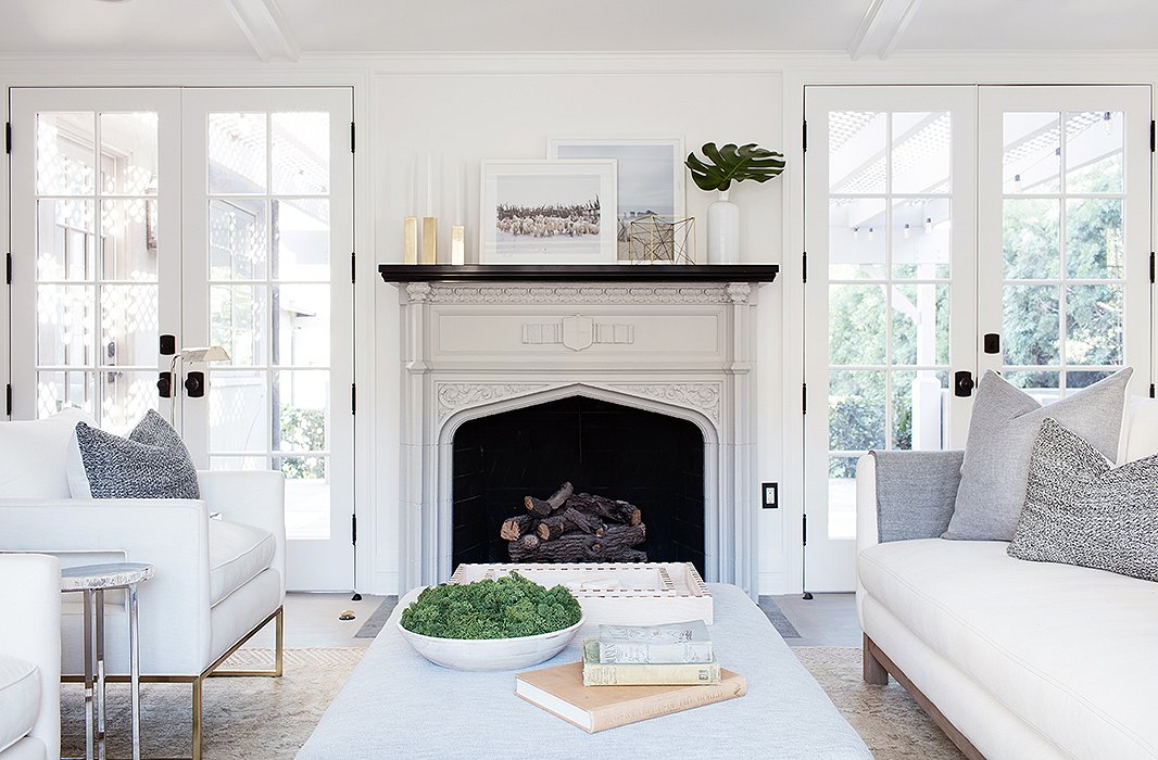
“Between my husband and myself, we have an interesting mix of people coming to our home,” Erin says. “We wanted to create a place that would work for the whole range, from the band to the children.”
Establishing the Room’s Flow
If there’s a defining character of California living, it’s an indoor/outdoor lifestyle. This house has that in spades. “The light is coming in through different windows at different moments, we’re going in and out of the French doors, and we’re basically using the veranda as our dining room,” Erin says. She loves being within the walls of the property—a part of her maternity-leave fantasy centered around “being outside without having to venture into the world,” she says.
To support a harmonious flow, Alex suggested a sofa turned perpendicular to one set of French doors so that there’s no visual block to the view beyond. Then, instead of a second sofa, he chose a pair of club chairs, also oriented to maintain an open flow to and from the other set of French doors. This setup makes a cozy seating circle anchored around the fireplace between the doors.
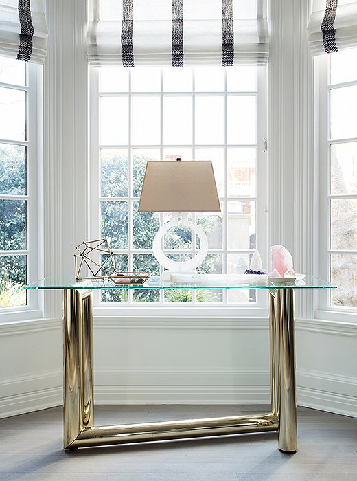
Alex suggested grouping the crystals together: “If you collect something, display it in a specific area so you get the point across and it’s tailored, not cluttered.”
Embracing the Decorative Object
Erin imbues objects with a lot of power. She’ll often choose an organic, decorative object over traditional art, and she has quite a collection of crystals. “I know people who will charge their crystals in a saltwater bath under the moonlight to bring about their energetic properties,” she says. “I don’t do that, but I do think they bring really good vibes.”
These objects offer a chance to ground the space in her own style, with the room’s display surfaces as the perfect foundation. Alex had a vision for the bay window that included the crystals and a 1970s Karl Springer console table. Erin was skeptical at first, but once she saw the luminous zone it created—the light from the window bouncing off the crystals and setting an alabaster lamp aglow—she was sold. Now, she says, “anyone who comes in gravitates toward that table.”
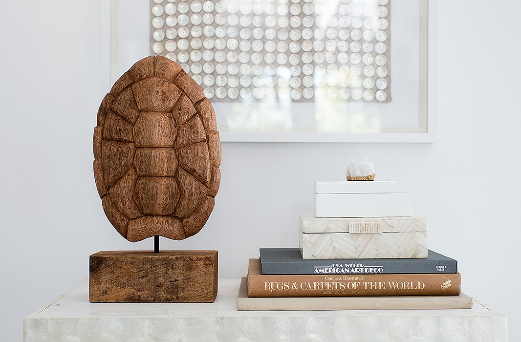
A piece of dried barn wood, carved to resemble a tortoiseshell, creates the right exclamation point on a bar cart.
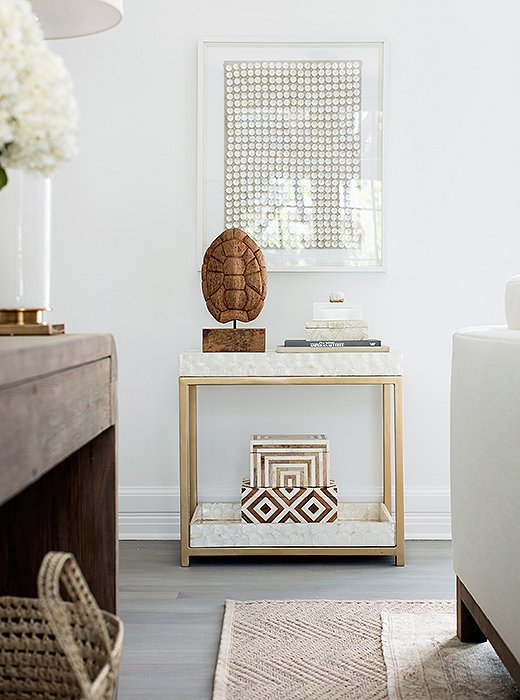
The bar cart is covered in capiz—part of the mission to add rich texture everywhere. “There’s no real color here,” Alex says, “but the capiz makes the whole spot dynamic.” And by tucking the shell and books below, Erin and Gabe can easily turn the spot into a setup for drinks when they entertain.
Creating a Unique Style
L.A. is rich with gorgeous midcentury homes and furnishings, and that can tempt locals to go midcentury all the way. Erin was wary of that. “In my New York apartment, I was trying to do something derivative of a specific era—the French ’40s and the 18th century,” she notes. “Here, since the design is balanced with all the fresh and organic textures, nothing feels overtly midcentury or overtly retro.” The ’70s moments, like the Karl Springer table, are balanced with contemporary photography from the American West.
Erin is also ensuring that she doesn’t get too precious about the pale furnishings, even with a new baby: “I’m taking a low-maintenance attitude about the white.” Blankets are always in arm’s reach and can be thrown down as a cover in a pinch.
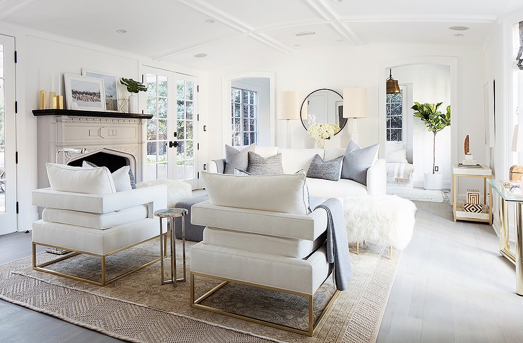
The club chairs, Alex says, “have a great architectural line and a sexy cut from the back,” making them ideal for a central seating arrangement.
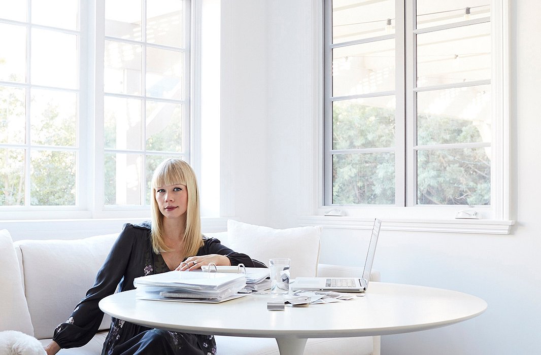
Erin, radiant in the final stretch of pregnancy, in the kitchen nook.
Edit, Edit, Edit
Erin admits it wasn’t always easy to create something at such a collaborative level—between partnering with Alex and integrating her husband’s aesthetic and comfort at every step, this was a new type of design process for her. “I bring a clear point of view to everything I do, and my own brand gets to be a constant unadulterated expression of my vision,” she says. “For this, it was good for me to instead do something on a truly collaborative level.”
The end result hits the exact tenor that she and Gabe want for their new family of three: a beautiful environment that will “live well, entertain well, and be the focal point of the home,” Erin says. “I think something about the pregnancy or the nesting made me want to purge. I wanted us to move into a more minimal and considered way of living in the home. To not have more than we needed, or less.” Alex agrees: “You can have lots of ideas, but a composed room needs editing, editing, editing.”
I LOVE the ottoman! Where is it from?
I love the Capiz table! Can you tell me where you found it?
Thank you!
Does anyone know where this ottoman is from? I’m dying to find it!