This Texas home is a symphony of influences, one that designer Marie Flanigan has conducted to perfection like the maestro she is. The design is rooted in French sensibilities, yet the house has a distinctly Southern feel to it. It’s contemporary, but traditional elements pull you in and invite you to sit awhile. Turn a corner, and you’re in a space imbued with modern lines. Walk up the stairs to the bedroom and sink back into a dreamy Southern oasis with rich textures and deep colors.
“It’s really about finding a common thread,” Marie says. “You don’t want to copy the same thing in every space but find a thread that makes you feel like this is the same home, the same voice being spoken and then expressed in different ways.”
Keeping a thread together through an 8,000-square-foot, two-story home is no easy feat. “I try hard to define the vision for the family about how they’re going to use the space and then design around that,” Marie says. For this project, she focused her vision on the color palette, which was inspired by nature with just a dash of subdued jewel tones. She changed the opacity and brilliance of the color in each room but kept the same colors in mind throughout.
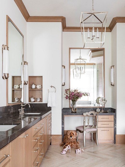
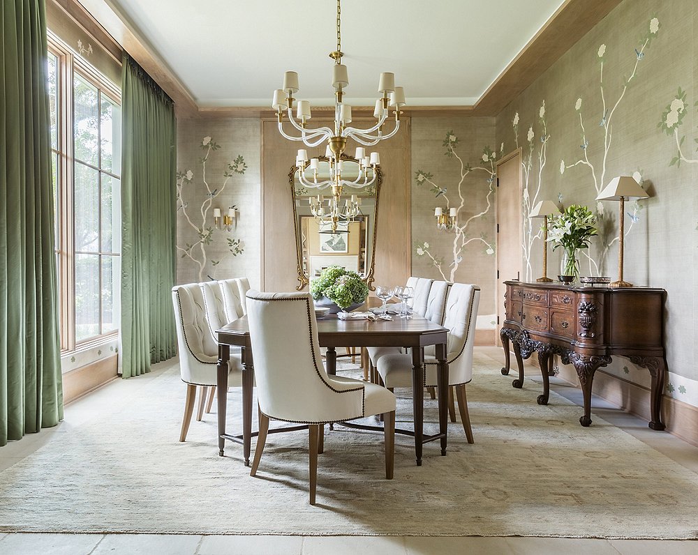
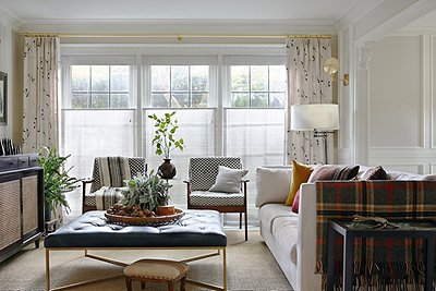
Marie pulled a soft green from a custom wallcovering by Gracie Studio to be the focal point for the front two rooms of the house. This color was the basis for drapery in the dining room and the upholstery on the sofa in the sitting room across the entryway. Sapphire velvets and artwork in tea-stained tones amp up the cozy factor in the master bedroom, while natural textures bring in a contemporary note. Her use of rift-cut oak keeps modern design in conversation with more-traditional elements.
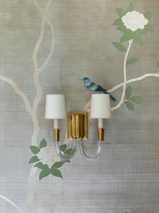
“We wanted to do a traditional chinoiserie wallcovering from Gracie Studio but in a fresh, impressionist way,” says Marie. The Gracie team brought her vision to life by minimizing the blooms and leaves on the tree. The effect was the dramatic and well-known look of Gracie designs in a more sculptural manner.
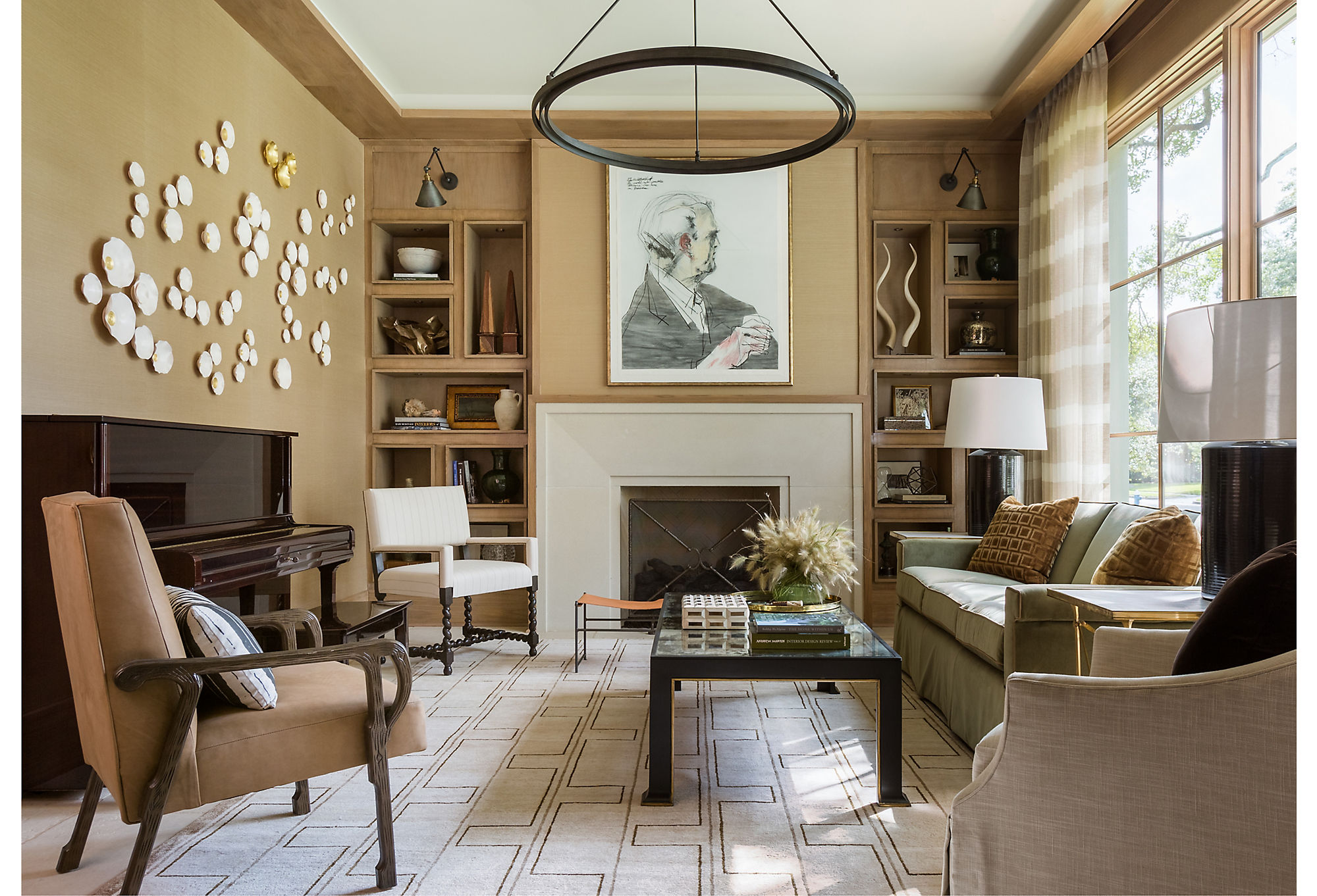
Rift-cut oak is a mainstay in the house. In the formal sitting area in the front of the house, Marie used it to case the ceilings and build out a unique bookcase. The palette in this room brings in a green hue from the dining room just across the entry.
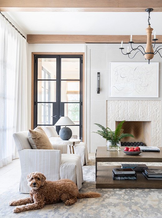
This light and airy living room isn’t as breezy as it first appears, thanks to the dynamic texture of the limestone fireplace. The oak beams on the ceiling play on the home’s rustic Southern sensibility.
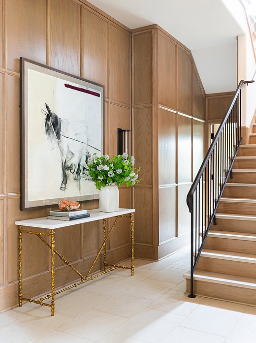
The panel-work in the staircase showcases the raw beauty of the rift-cut oak. The console table’s gilded legs introduce a graphic and geometric moment to the space.
“We really wanted to carry out the simplistic elegance throughout the home but still give it some Southern charm,” she says. In the kitchen, for instance, the crisp detailing and lustrous finish of the cabinetry provides the elegance, while the minimalist breakfast table of the informal eating area, flanked by steel-framed windows and doors, defines simplicity.
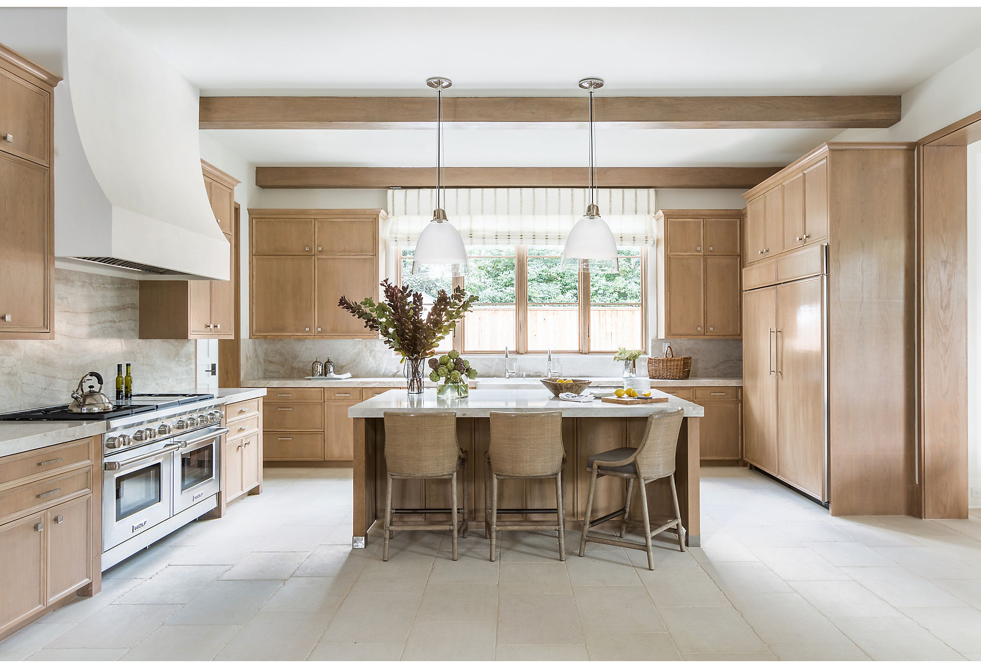
“They’re a family who uses their kitchen quite a lot,” says Marie. In keeping with the simplistic elegance throughout the home, Marie and her team went for a subdued palette. Subtle caramel tones and spots of brushed nickel make the heart of the home shine.
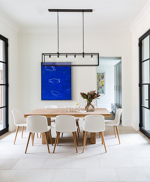
The dining area off the kitchen is simplicity at its best. The steel-framed windows and doors speak to a refined elegance of clean lines and subtle power.

It’s really about finding a common thread. You don’t want to copy the same thing in every space, but finding a thread makes you feel like this is the same home, the same voice.
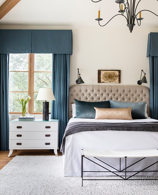
Moodier tones abound in the master bedroom. Sapphire hews to Marie’s plan for jewel tones but does so with restraint.
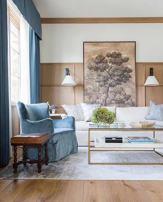
“This is one of my favorite room ever photographed,” Marie says of the quiet sitting area adjacent to the master suite. “I love the richness of the blue and the comfort of the room.” Marie enlisted the help of Gracie Studio’s artisans to create the one-of-a-kind art behind the sofa. “I asked if they could customize this piece I had envisioned in my head. I wanted to do it in a huge scale that drops down behind the sofa and anchors the space. It becomes a focal point that adds textural beauty to a nature-inspired palette.”
Every one of the rooms is layered but not overly so. There is breathing room, but nothing looks empty. The walls are adorned but never crowded. Warmth and soft lines stand together with sleek finishes. “The key is knowing how to edit,” says Marie. “Pare down just enough to say what you’re trying to say without overdoing it.”
View more home tours here →
Join the Discussion