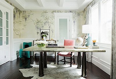
Cate La Farge Summers is a Nantucket native and Brooklyn-based writer and contributing editor for One Kings Lane. Get to know Cate in her monthly columns that run the gamut of decluttering her home Kondo style to learning how to make the perfect apple pie.
Raise your hand if you have art that you keep meaning to hang. I don’t know exactly what the stumbling block is—intimidation? procrastination?—but I’ve gone years without hanging certain pieces. Photographs pile up in the office without getting so much as a frame; paintings lean in the backs of closets, half-forgotten. And when I have managed to hang a piece of art, it’s rarely settled—I’m always swapping things around. It’s frustrating that the process stalls here.
Collecting art is a thrill—there’s a lovely sense of accomplishment in owning a work of art you adore. But in a sense, collecting only gets you halfway—you have to hang art up to really reap its rewards.
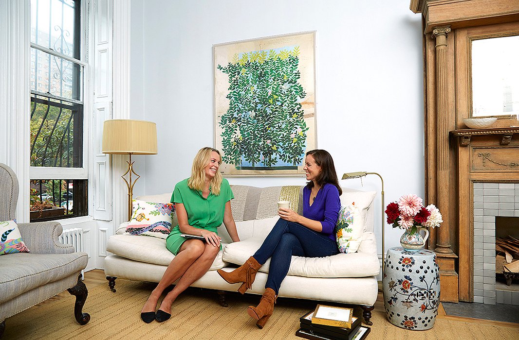
I recently found myself finally ready to tackle the task. And to kick it into gear, I called on interior designer Elizabeth Pyne, who spent a decade at Sotheby’s as a specialist in Old Master paintings before joining her mother, Anne Pyne, and her now-late grandmother, Betty Sherrill, at the legendary decorating firm McMillen Inc. Elizabeth takes art seriously and clearly knows her stuff, but—in equal measure—she enjoys it for what it can bring to a room. In her harmonious, energetic interiors, Elizabeth shows a well-honed approach to deploying an artwork’s colors and lines and how to place it in happy conversation with the surrounding furnishings.
It was exactly the kind of art therapy many of us need: someone to take art off its academic pedestal and make it something you can have a little fun with.
Before Elizabeth (at right) came over I took virtually every scrap of art out of closets and off the walls, except the leafy Paule Marrot reproduction shown here (I felt good about that one).
Getting Started: Assess All Your Art for Hanging
To dive in, Elizabeth came over and looked through all our art. “Every art collection is so private and personal,” says Elizabeth. When she’s creating any display of art, she strives to bring to light the common thread of the collection: “I always enjoy seeing collections that might mix centuries and different styles, but you can tell the same person put them all together.” Maybe there’s a note of green that appears in lots of the works, or maybe there’s a sense of geometric play throughout.
For my lot, we talked about making groupings to display throughout the apartment. And as we talked through each work, Elizabeth touched on scale and how framing or supplementing might help make each space pop. “Dimensions really matter,” she points out. “We always take both framed and unframed dimensions of a client’s art because something can always be reframed and take on a whole new life in a new space.”
Once we landed on a plan, Elizabeth brought in ILevel, top New York experts in art hanging and installation. Operating behind the scenes, they hang art in museums, in the living rooms of celebrities, and in the country homes of finicky architects. All the staff at ILevel are artists themselves, and they’re endlessly sensitive to the nuances of what they hang. David Kassel, ILevel’s founder, tallied they hung 56,000 artworks last year alone.
With this crackerjack team, four spaces in our apartment got a total art makeover. See how it all came together—and what I learned through it all.
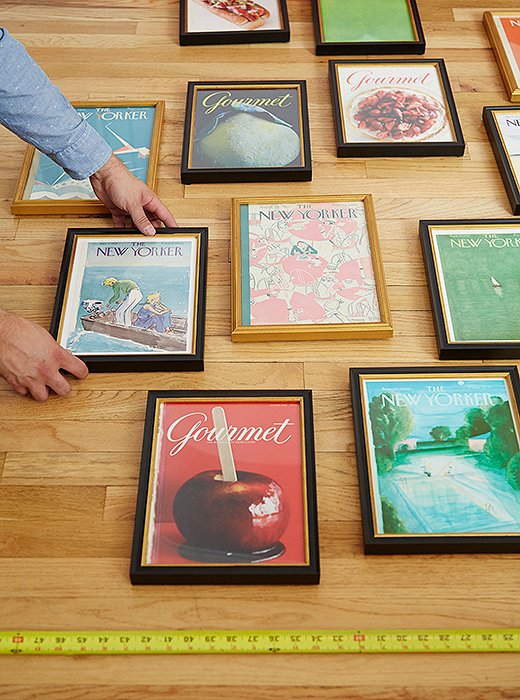
David Kassel and Chris Deo of ILevel got to work plotting out, on the floor, the rough distances between each piece. All works framed in black were done by Framebridge (what a brilliant framing solution that is).
Of framing these covers without matting, Elizabeth says, “Since these are magazine covers, they were never meant, as an image, to have a border. To keep the framing in that spirit, don’t use any matting.”
Dilemma 1:
How to Handle a Collection That’s Only Halfway There
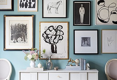
I showed Elizabeth three original New Yorkers from the magazine’s founding days in the 1920s—my mother’s grandfather had worked at the magazine then, and we’d discovered a ream of issues in a box. I adore the Art Deco pizzazz and grace of the designs.
Elizabeth’s advice: Round out the group to create one larger hanging that will have serious pizzazz. From Condé Nast’s archive I chose five more New Yorker covers (all reproductions) spanning the 1930s to the 1980s. Each hit a note that I adored—a couple boating, laundry drying in the wind. We supplemented these with a few Gourmet covers piled up in my office. All the cover designs were full-bleed images, without text other than the magazine title and date.
Elizabeth said they’d be most striking framed without matting, in black frames tinged with gold to give depth against the light walls. She pointed out that—unlike prints, which are often meant to be seen surrounded by blank white space—magazine covers are designed to be seen just as they are.
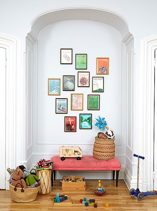
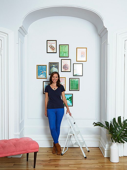
This whole arch area went from a blank space to a color-filled play corner.
ILevel’s hanging tips: There are slight differences in the pieces’ dimensions, which ruled out neat rows and columns. Instead, ILevel laid out the covers in an asymmetrical, sweeping shape on the floor, then hung it underneath an arch.
Here, ILevel shared its “failproof” method to keep the overall shape cohesive but not boring: Each piece is a neat two inches from one other piece, but if you look closely, you’ll see that while a piece is two inches from one neighboring piece, it might be farther away from another neighbor. The fun is in the irregularity, not in perfect measurements.
Shop the Look
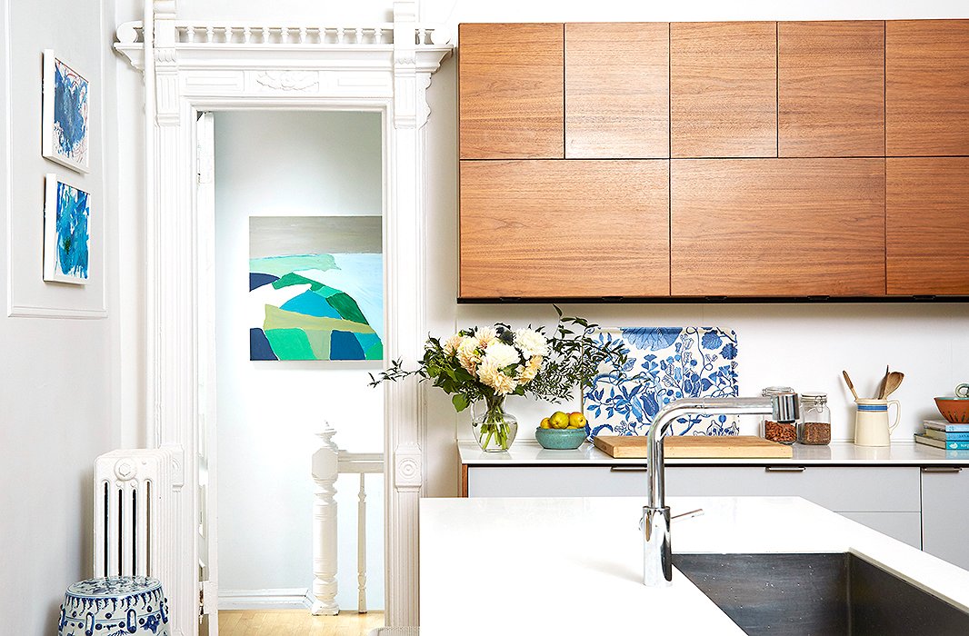
A painting I made as a direct copy of a real work of art now sits through a doorway at the end of the kitchen. I love that you see it from a distance—and am thankful that no one gets close enough to examine it.
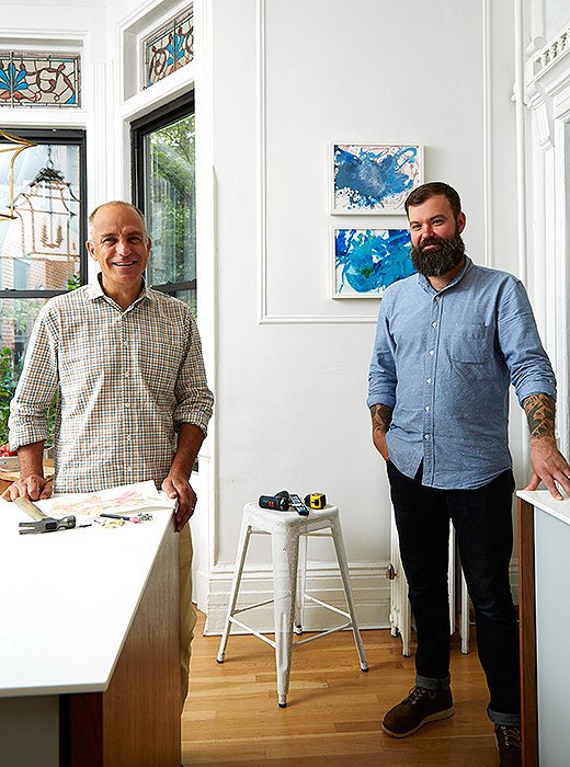
The art-installing maestros: David Kassel and Chris Deo of ILevel. This wall became a point of pride for my son, who adores seeing his glittery paintings on the wall and takes care to point out that he made them “at the Children’s Museum of the Arts,” perhaps his favorite destination in New York. The Float frames are by Framebridge.
Dilemma 2:
How to Show Off More-Casual Art
We have an ever-growing collection of our son Henry’s paintings along with several works painted on stretched canvas—a fruit still life by a friend, a 1970s painting of a Carmel, CA, beach that I found on One Kings Lane. There’s also a large painting I’d made during a painting party with friends, where I tried to copy a 1954 Nicolas de Staël work from Bunny Mellon’s collection. I was crazy about his layered landscape set in northern France with a faint-blue glimpse of the North Sea. I don’t pretend that mine has a scrap of the original painting’s magic—it’s a very amateur forgery painted while chatting with friends and listening to Adele—but the Mellon painting sold at Sotheby’s for $1.3 million; mine cost me about $50 in materials. These weren’t terribly serious paintings, but the colors—plus a bit of sentimentality—made me adore them all.
Elizabeth’s advice: Given the strong saturated colors (and unserious, mostly homegrown fun nature) of these paintings, Elizabeth suggested they go in the kitchen. The top floor of our apartment is open; it flows from the living space to the TV zone to the dining room and then to the kitchen sits at the end. This allows them to be seen across the apartment. What’s more, the greens and turquoises could now pick up colors from the new magazine wall; it’s one of the joys of open-plan living spaces, which let you play one artwork against another even from a distance.
ILevel’s hanging tips: With cabinets and windows, there wasn’t a ton of open wall space in the kitchen. ILevel suggested placing this grouping of casual pieces in sight lines, so that you could see them clear through the apartment. A pair of Henry’s paintings went together—they rest lightly above a molding, and I love glancing at them from the kitchen. My forgery went in the back pantry so that its color almost fills the width of the doorway. I feel these colors now at a gut level. The hangings brought new dimensionality to our kitchen—and a horizon-line of color in any direction you look.
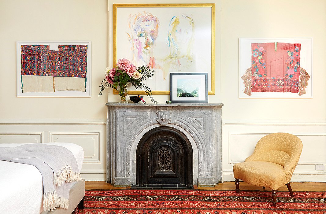
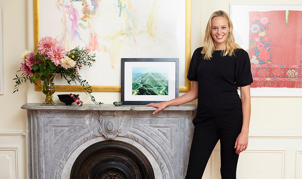
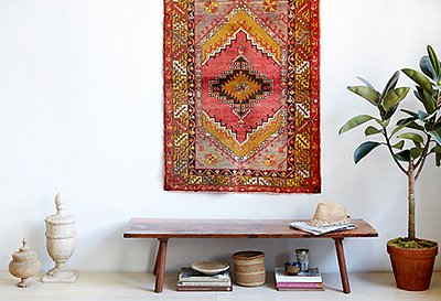
Carefully floating in Framebridge frames, two Mexican textiles became elegant wall hangings to complement a watercolor portrait. A photograph of a Haitian mountain leans against the mantel.
Dilemma 3:
How to Round Out One Very Large and Unexpected Piece
Just before we got married, my husband and I went to Prudence Whittlesey’s studio and sat for a portrait together. She gave the watercolor to us as a wedding present. Its loose, airy brushwork captures a dead-on take of the two of us. I adore it and love the moment it brings me back to—chatting with Prudence while she worked in her sprawling loft studio. We’d hung it in our bedroom as it had seemed a touch narcissistic to hang it in a public spot like the living room. It felt perfect above the mantelpiece in our bedroom but had remained the sole painting in the bedroom; all other walls were blank.
Elizabeth’s advice: When I showed Elizabeth all our art, I’d included a gathering of antique Mexican textiles inherited from a very dear cousin who had often traveled through Mexico. These included traditional needlepointe blouses, one of which I’d always passed by on the way into my cousin’s kitchen. Elizabeth suggested framing a pair of these blouses and using them to flank the watercolor in our bedroom. This way, she said, “the textiles will make this a mixed-media wall, so it will have a whole new texture. They won’t compete with the painting, but their colors will highlight its softer colors.”
Textiles, Elizabeth emphasizes, are wonderful to put on the wall—“quilts, tapestries, Native American fabrics, Hermès scarves. Once a textile is framed, you focus on the textile as a piece of art.” In a strange way, the orderliness of the frame helps you see the beauty of the handmade imperfections in the textile.
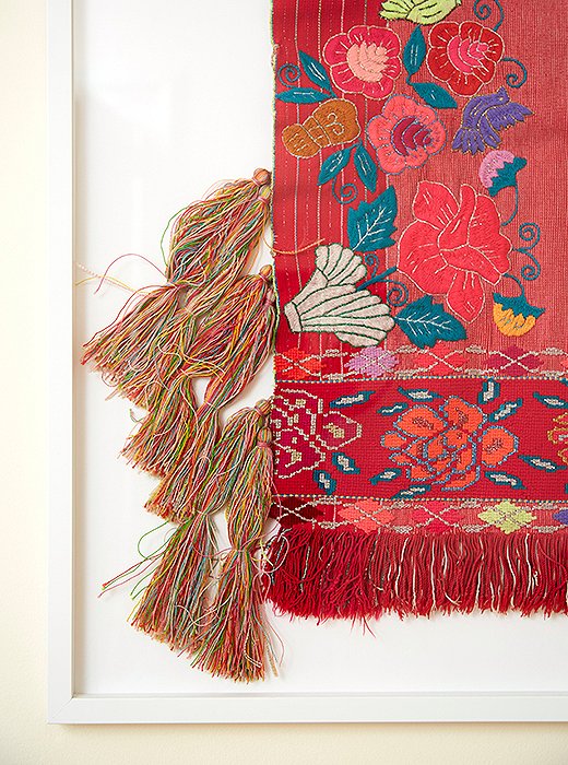
This needlepoint work sits on the opposite end of the spectrum from most needlepoint pillows: It has a vibrancy accentuated by almost neon bits of color threaded into the geometric design.
ILevel’s hanging tips: Another ILevel golden tip: Rather than line up the bottom of a frame with the architecture in a room—or with another painting—try to avoid perfect alignment. Here, with three relatively large works plus a mantel, there were lots of horizontal lines. ILevel took care to give each piece its own line.
It’s wonderful to see these textiles in such a relaxed place; they’ve quickly become a touchpoint of my mornings and evenings. And the whole effect finally gets the bedroom vibe I’d chased: a bit bohemian, with some rich pinks and cranberry tones and lots of comforting layers. All it took was one strong, filled-out wall.
Shop the Look
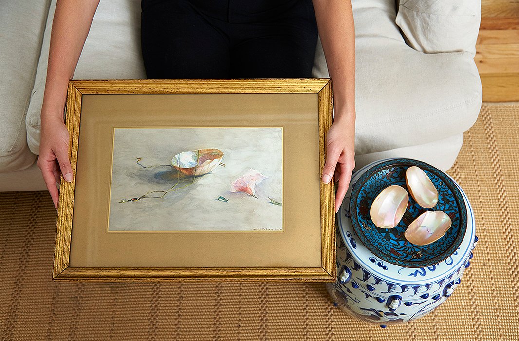
A 1905 watercolor by my great-grandmother, Mabel Hooper La Farge, painted in Paris. The Venetian shells on the garden stool include the very same one she featured in the still life (the necklace is long since lost).
Dilemma 4:
Where to Put Cherished, Light-Sensitive Art
Perhaps my most precious pieces are watercolors by my great-grandmother along with one by her son, my great-uncle. We’d hung them upstairs above the dining table, but Elizabeth broke the news that they had no business being anywhere close to natural light, even indirect light. “All watercolors and textiles should be framed with UV-protective glass, because even occasional light or artificial light can take a toll,” she says. At first, this was heartbreaking, since I wanted these pieces to be front and center in our apartment. But she struck the right fear in me: I definitely didn’t want to slowly wash out their rich jewel tones with daylight. And once I considered it, they’d always looked a little lost floating above the dining table.
Elizabeth’s advice: The first piece was really that you must protect anything sensitive; otherwise you’ll lose it over time. More happily, she pointed out that you can actually see the paintings you most love if they’re displayed along a staircase or down a hallway. You get closer to the art in these spaces; as she puts it, “People are much more likely to look at something up close on the staircase than they are in the living or dining room, where you’re focused on entertaining and the conversation.” Luckily in this case, our stairway gets zero natural light.
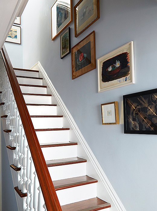
Inherited watercolors stay safe, secure, and better displayed along the staircase. The cloudlike form is rounded out by a celestial black-and-white work by my friend Field Kallop.
ILevel’s hanging tips: David and Chris agreed with Elizabeth and pointed out that intimate, small-scale pieces always look better hung lower so that you’re looking down on them a bit.
Beginning at the midpoint of our staircase and working out, ILevel created a cloudlike form, moving the works so that you have a new experience every couple of steps and never hit a spot of negative space (in this case, plain white wall).
I worried about contact, since the stairs are heavily used, but David explained that the D-rings on the back of each painting make them incredibly stable (they’d swapped out the old hanging wires for D-rings). Since then, I have brushed past one too aggressively and it didn’t even jiggle.

People are much more likely to look at something up close on the staircase than they are in the living or dining room, where you’re focused on entertaining and the conversation.
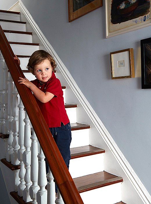
Henry already knows to stay on the banister side of the stairs. Phew.
Landing a Look That’s Never Monotonous
It’s hard to overstate how transformative getting all our art on the walls has been. Elizabeth and ILevel didn’t tackle every single space in our apartment, but now I feel ready—liberated, even—to try my own displays. “Lots of times, people don’t trust themselves to just look at a piece of art and know if it looks good, so they try to find something to link to, like architecture or door lines,” Chris says. “But actually, if it’s not aligned, you create a cool undulation, a flow of lines, and the space will never feel monotonous.” David adds, “It’s important to keep some blank walls too.”
Spreading out our art has made me love it even more for what it gives our home—new sight lines, new depth and dynamism, and of course, outrageously satisfying colors. I think the displays draw out the stories behind each one. We had a party a few days after the art went up, and so many friends commented on the feeling of life and color in the apartment—they might not have attributed it to the art on the walls, but I know that’s where the feeling came from.
Spreading out our art has made me love it even more for what it gives our home—new sight lines, new depth and dynamism, and of course, outrageously satisfying colors.
Join the Discussion