Too often, art hangs around the house instead of up on our walls. For starters, framing art often seems pricey and overloaded with options—a blue mat with a white wood frame or a blue frame with a white mat? Maybe no mat at all? And then putting a nail into the wall seems like a serious enough act to merit some special thought. Before we know it, a dozen Sunday afternoons have rolled by and our walls are still blank.
To come up with a no-fail, fun guide for finally getting everything framed and hung, we tapped two of the leading companies in these specific arenas. We spoke with Tessa Wolf, creative director of Framebridge, an online-only company that takes lots of the pain out of framing, to get help on how to frame a diversity of pieces, from children’s art to a large-format photograph. And then we got the ultimate art-installation demo from ILevel, a New York company that has, over three decades, honed the art of the hang. David Kassel, ILevel’s founder, counted that its small team hung 56,000 artworks in 2015 alone, everywhere from museums to celebrities’ living rooms to the apartments of busy families.
Here, a simple approach to framing and hanging, along with a few expert words of wisdom to make a display you’ll adore.
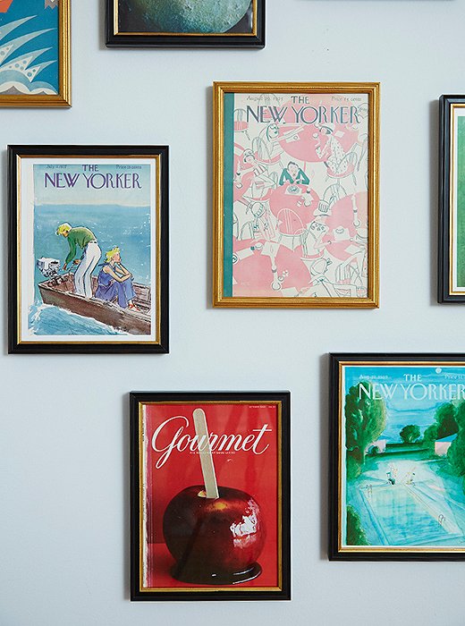
These Gourmet and New Yorker covers get new depth in Framebridge’s Providence frame, with its black molding subtly lined in gold. Framebridge uses only acid-free materials for matting, and its acrylic is UV-protected to guard against sun damage.
Good-to-Know Basics
For total clarity, we are speaking here about artwork other than wildly expensive masterpieces or precious heirlooms—for those sorts of exceptions, have a good chat with a well-regarded framer to make sure you accommodate all special considerations.
1. Your home doesn’t have to be a museum.
The majority of us collect wonderful artwork outside of the above categories: sentimental pieces we’ve inherited, flea market and online scores, a photograph bought on a honeymoon, a few choice children’s paintings, vintage posters, a beautiful quilt too fragile for use but that could be dreamy on a wall. These are the pieces you want to frame well, without spending a fortune or feeling intimidated by the process.
2. Frame for the long haul.
To preserve a piece over time, matting materials should be acid-free, and there should be a dust cover on its back. Traditionally there’s a glass layer over the front, but some companies offer acrylic instead. Acrylic has the advantage of being shatterproof and lightweight; on the other hand it can get scratched much more easily than glass. Whatever the material, the key is that it’s been treated to protect from UV rays.
3. Treat canvas works differently from others.
Oil paint on canvas is generally hardier and more stable in the face of the elements—hanging them in indirect sunlight is fine without any UV protection, and you can lightly dust them without worrying about doing damage. In fact, you want to see the textured sweeps and buildups of the paint. While you’d skip the glass and the mat for these, you might still want to surround the work with molding (aka the frame itself).
4. Hang in the sun or in the shade?
For sensitive mediums like watercolors or textiles, UV protection on the glass won’t be enough; these pieces should pretty much stay permanently in a well-shaded spot. Hang watercolors in a dim hallway or a dark bedroom so that their brilliant colors won’t get washed out by sunlight.
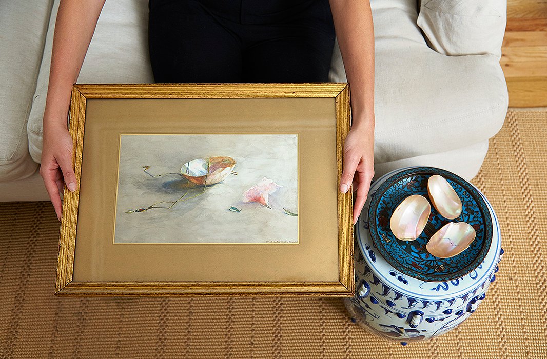
An inspiring idea: a watercolor from the turn-of-the-20th-century in a gold frame with gold matting (a gold mat and then a lighter gold-tan accent mat). Some might see it as gilding the lily; others might like the way the gold creates a jewel-box effect around the still life.
The Essential Matters of Matting
Frame shops will always ask you whether you’d like something matted. A mat (which the English call a mount) is a thin piece of paperlike material on which your art sits. It’s mostly decorative, a backdrop to give the artwork its moment in the sun. With a regular mat, the framer will cut a beveled hole in the middle of the decorative mat, then place the artwork on top of a foam mat, which sits behind the decorative one.
1. To mat or not to mat?
If you have any work on paper—a drawing, a print, a watercolor—it’s likely to look even lovelier with a mat. “Most pieces look better with a mat, with a couple of exceptions,” says Tessa Wolf of Framebridge. “Large-format photography looks incredible unmatted—the image has a greater impact without anything qualifying what you’re seeing. For multiple pieces—like diptychs and triptychs—that are meant to be read as one piece, it will be a tighter, more cohesive story without a mat.”
2. What about the mat color?
The whole idea of matting is to place even more focus on the art itself, so when it comes to choosing color, exercise restraint. An understated white or off-white will look splendid with most anything. If you want some drama or the piece is almost uniformly white, consider a gray or black mat to set it off.
If you’d like, you can add an accent mat—a second mat that sits inside the primary mat and creates a thin outline around the artwork. This accent mat isn’t necessary; it can be gilding the lily. But if you go for it, think of choosing a color that’s found in the work itself—a bit of red you want to highlight, for example, or a gray undertone from the sky.
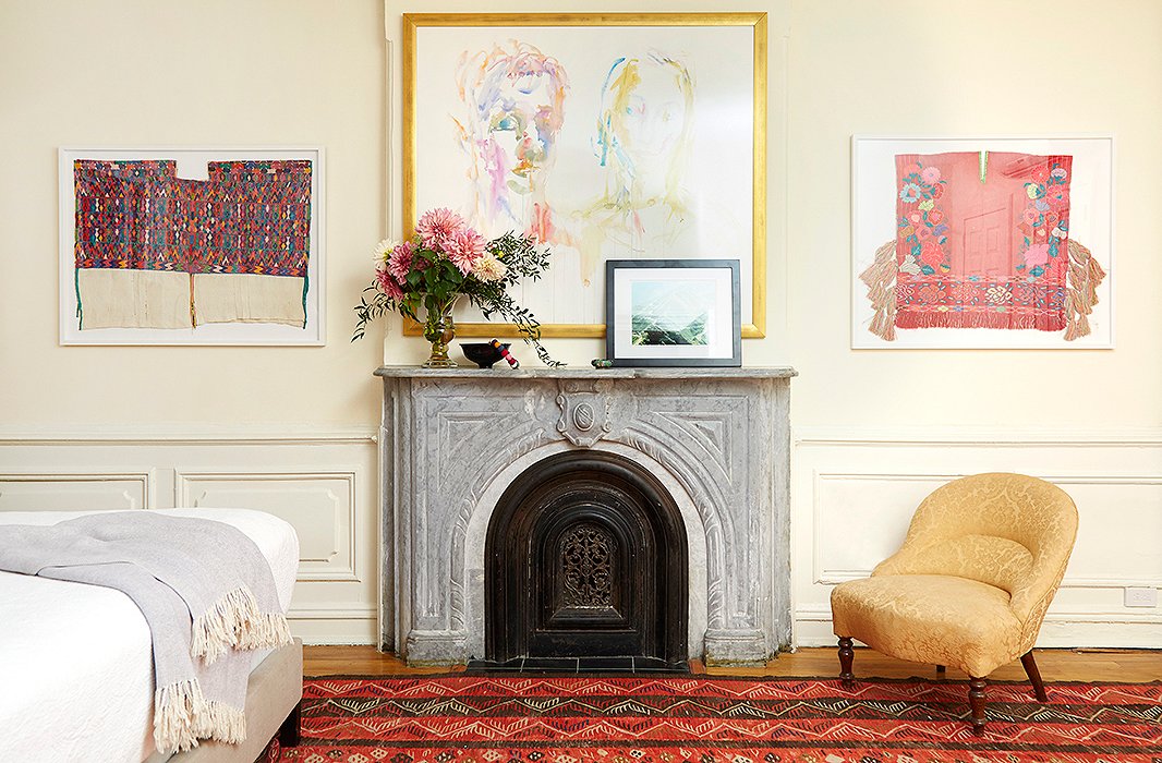
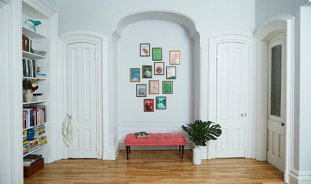
A variety of moldings (frames) gives a room texture.
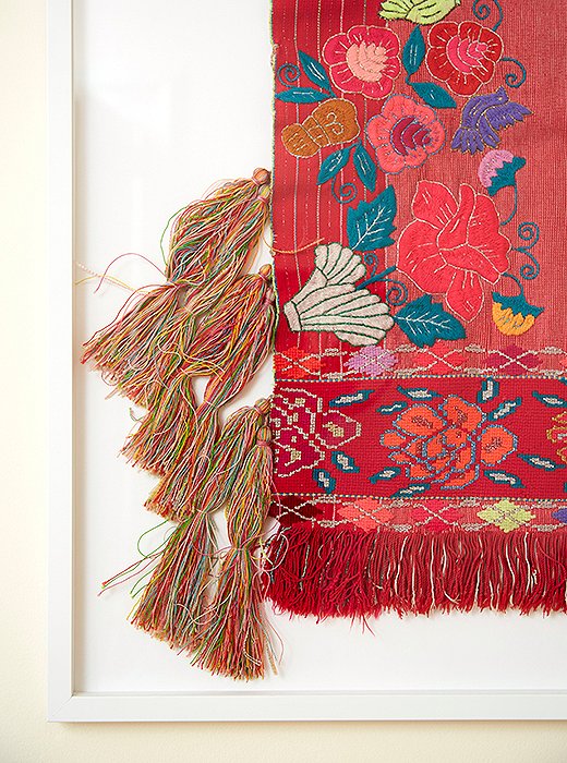
A Mexican textile floating (actually, sewn) on a mat to highlight its textured tassels and embroidery. Frame by Framebridge.
3. Make your molding a match.
The molding is the frame itself; when you walk into a frame shop, you’re often confronted with hundreds of options. Again, exercise restraint: “Really anything will look beautiful in a clean white gallery frame—it’s foolproof,” Tessa says. That said, “whatever you choose, you always let the art lead.” Paintings that are primarily green often look especially glowing in a gold frame, a historic favorite of framers. If you go wilder, make sure it complements your piece—a red-lacquer frame might work with something in a Pop Art flavor, while a gold bamboo frame can look just right with photography from the 1960s and ’70s, such as a Slim Aarons work.
4. When to float ’em.
For certain works, a float matting technique can vault the work into seriously special territory. Rather than placing the artwork behind the mat, this technique makes the artwork seem to float slightly above the mat. The mat is placed on the bottom, then a smaller piece of foam mat is mounted to the mat, and then the artwork sits on top of the foam mat, maybe 3/16 of an inch above the decorative mat. With float matting, hidden spacers are placed underneath the lip of the molding, separating the acrylic from the mat “to give more of an impression of drama and space,” Tessa says.
Cost note: Float matting usually costs extra. It’s worth considering for original artwork—among other things, you’ll be able to see the artist’s signature well this way. It’s also perfect for a piece that has a cool edge or texture to it or a piece “whose age you want to celebrate,” notes Tessa—antique paper can be a beauty to behold in itself.

David Kassel and Chris Deo of ILevel, fresh off hanging the pair of toddler paintings behind them.
Hanging 101: The Key Principles
ILevel’s David Kassel and Chris Deo are often called into a home only once the paint has dried on the walls, the furnishings are set, and the rugs have been laid down. Yet many times, the addition of art turns out to be the most transformative step of all. Their displays let the art lead while staying in touch with the rest of the room and the surrounding architecture. Here, their best advice on how to make the most of each display—and how to hang art like a pro.
1. Plot out your display.
Before picking up a hammer, plot out what’s going to go where (and for further inspiration on decorating with art, see how to create perfect art displays).
2. Trust your instincts.
“I’d say 90% of the time, we just go by what looks good,” David says. This is especially true when hanging art in any space affected by furnishings and architectural elements such as mantels or archways. For these, have someone hold the piece while you look at it from seated and standing positions. It’s common to hang art too high, which makes a piece look as if it’s floating around on its lonesome. When it doubt, hang low, so that the artwork relates more closely to the furniture or the architecture.
3. Use a measuring tape.
This is essential, especially when hanging in what David calls “gallerylike spaces”—hallways, stairways, alcoves, or anywhere else not dominated by furniture or strong architectural elements. For these areas, hang pieces so that the bottom is 58″–60″ from the floor. If you’re hanging one artwork on top of the other in such a space, make 58″–60” the midpoint between the two; then give two inches of separation between the edges of the frames.
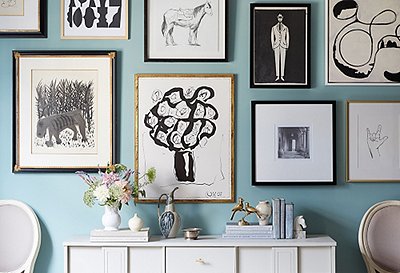
4. Embrace irregularity.
David and Chris don’t talk much about gallery-wall-style hangings; instead, an art grouping might flow like a cloud or loosely from a top-heavy triangle, or it might fall into a gridlike pattern. Lay out your art on the floor beneath the wall first and play around. To translate the pieces to the wall, measure the full height and width of each, and then mark off those outermost points on the wall using painter’s tape. From there, start hanging. Remember, imperfection is more than okay; even if the golden number for spacing between works is two inches, there’s no need to be too rigid.
5. Don’t line everything up.
“Often people are tempted to line a piece up with the middle of a molding or the height of a nearby mantel or sofa,” David says. This ends up feeling monotonous—instead, they take pains to give each artwork its own horizon line, keeping the entire room dynamic.
6. Use the images to create focus.
Some images have an ability to direct attention, even create a mood. For example, if you’re hanging a group of works that includes a side-facing portrait, position the portrait so that it’s looking into the group, rather than away from it. Or if the same portrait is near a window, position it to the side of the window where it will be facing into the room, not gazing out the window. Similarly, darker pieces carry more visual weight, so ILevel positions them higher in a group so that all the focus doesn’t clump at the bottom.
7. Leave some blank walls.
“This will happen by default,” David says—once you’ve hung your favorite pieces in the places that make the most sense, you’ll be left with some blank walls. Let them be. The effect of the art that’s there will be even more potent and lovely with some negative space.
8. If you make a mistake, don’t panic.
“Any holes in the wall from a picture hook are purely cosmetic,” David says. You’ll likely cover them up once you hang the art properly; if not, “use some Spackle and the original paint if you have it. Or even bit of toothpaste.”
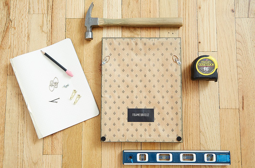
The necessary tools, according to ILevel, clockwise starting at the top: a hammer, a measuring tape, a level (David recommends getting one that’s at least 24″ for accuracy), gold picture hooks with their longer nails, D-rings with their short pinhead screws. And of course a pad to sketch out any designs or measurements.
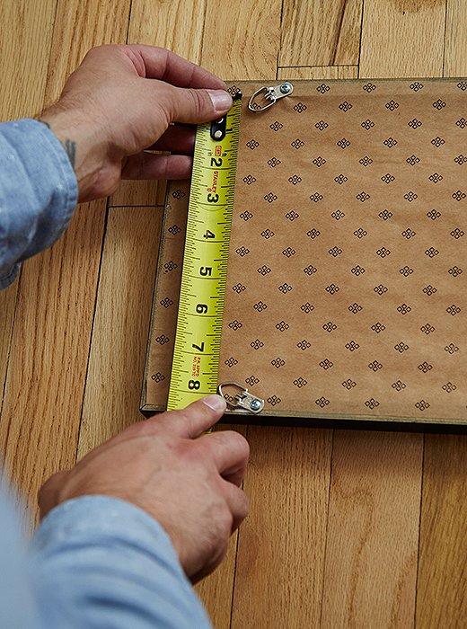
Measuring the distance between D-rings, in order to find the right distance to place the picture hooks on the wall.
The Right Tools: Put a D-Ring on It
For hanging hardware, David can’t recommend D-rings enough. Rather than placing a hanging wire onto a picture hook in the wall, IFrame hangs D-rings directly onto picture hooks. They are so rock-solid stable that you won’t need to keep pushing the picture back into a straight line. And even if you brush past the art too aggressively, it barely moves. D-rings work for almost anything, from small light pieces to very heavy works. Request that the framer put D-rings on your art if possible.
If a piece comes outfitted with different hanging hardware—a sawtooth hanger or a hanging wire—ILevel will replace it and quickly screw in some D-rings instead.
1. Get the right supplies.
At a hardware store, you’ll likely find OOK D-rings. Buy picture hooks and D-rings in equal numbers—two of each for each work. If you already have D-rings on there, just buy a picture hooks for every D-ring. Pay attention to the weight limit on all this hardware—Chris advises erring on the conservative side with the weight limits given for hardware: “If it says it holds 30 pounds, assume half that.”
2. Do D-rings right.
Along the back of the frame, measure down two to three inches from the top of the frame. Mark both sides—the important thing is that both are the exact same distance from the top. Then screw the rings in, and angle them to face inward slightly—this obscures the hardware and gives the picture even more stability.
3. Add hooks to wires.
If you end up keeping a hanging wire on a painting, perhaps because it’s an antique and the wire is still strong, hang it with two picture hooks instead of one central one. (“If you only hang on one hook, the piece will swing like its on a pendulum,” David says.) Space them out to two-thirds of the width of the frame.
4. Get hanging.
Once you’ve decided the best spot for your artwork, hold it in place and make a tiny pencil dot at the center of the frame’s top. Put the art aside for a moment and measure down from that dot however far the D-rings are from the top of the frame. To find where the two picture hooks will go (one for each D-ring), measure the total width between the D-rings and split that number—then mark off that distance to the left and right of the center. Nail the picture hooks into the spots, and hook on your D-rings. Voilà!
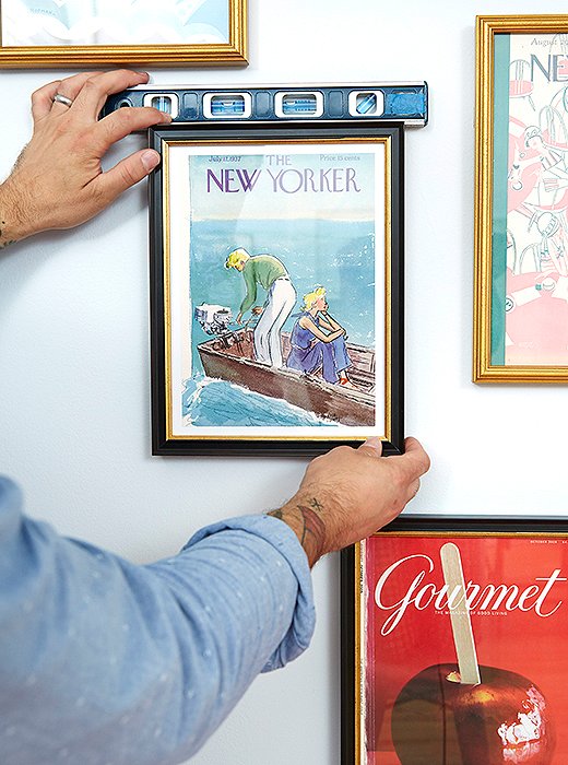
Using a level to check the straightness of a frame. Notice how some of these pieces are spaced two inches apart, while others have more space between them–charming irregularity at work.
Always Even Out
Once a picture is hung, always center a level on its top to see if it’s straight. But, David cautions, this is another area where eye-balling it might be the most important part.
1. Let your eye guide you.
“In New York, so many of the floors and walls are crooked. Often if something were hung perfectly level, it would look crooked.” So they make adjustments—tiny tilts once something is hung—to get it right. If one end of the piece is more than 1/4″ too high, David suggests moving the location of the D-ring rather than the location of the picture hook. It might seem counterintuitive, he says, but “if you want to lower one side, you raise that side’s D-ring.”
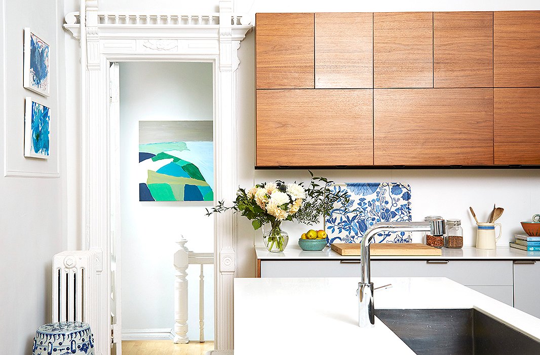
ILevel hung a large oil-on-canvas so that it almost fills the width of the doorway and commands attention from a distance. A child’s paintings hang in the kitchen, just above the wall molding—in this case, the molding became the architectural point of reference.


Join the Discussion