Jen Atkin and Mike Rosenthal have established themselves as a Los Angeles power couple, and now they have the house to match. Jen is the celebrity hairstylist known for getting the locks of Jessica Alba, Chrissy Teigen, and Gigi Hadid just so, and Mike is a photographer with more covers to his name than some of us have Instagram posts. They’ve worked hard to get where they are—late nights, constant travel, rarely saying no to the next job—and, as of last year, found themselves ready to embark on their first home renovation.
The house, seen here, has come a long way. The couple chose the home for its central location and intriguing history (built in the 1920s in a Spanish style, the house was given a makeover by legendary designer Tony Duquette in the ’60s), and they knew they wanted to live out their fantasy of a nearly all-white “Jetsons style” home before having kids. And though Duquette may have provided the contemporary bones for that vision, there was still much work to be done to bring the idea to fruition.”We knew that there was the potential for a beautiful, airy, magical space, but we would need to strip things down and unify the whole house,” Mike says.
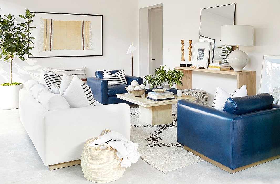
A tuxedo sofa and a pair of leather club chairs maintain visual consistency through shape and variety through mix of materials. The vintage Beni Ourain rug has a graphic weight on par with that of the striped pillows on both the sofa and the chairs.
Working with architect Peter Audelo, Jen and Mike gradually renovated the entire home to their liking. But after a year, one space was still undone: the glass-walled living room that leads out to the pool. And with their careers still as busy as ever, the two had trouble finding the time or headspace to tackle the project themselves. They called on One Kings Lane Interior Design for a little assistance, and this, says Mike, is what allowed them to create a room they couldn’t have come up with themselves. “[Our designer] pushed us out of our comfort zones,” he says, “and we love it.”

We knew that there was the potential for a beautiful, airy, magical space, but we would need to strip things down and unify the whole house.
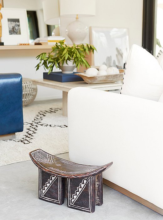
Accents such as a vintage African stool add warmth to the room’s cement floors.
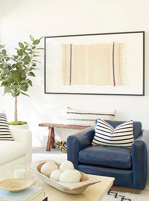
A striped Berber throw was framed as art and centered above an antique Shandong bench.
“We share a love of warm minimalism,” says Mike of the couple’s style. “Clean, light, architectural spaces that aren’t too cold or sterile.” To pull off this look, the Interior Design team left the walls white, layering on artwork in neutral tones and topping the cool cement floor with a plush Moroccan rug. Furniture in varying tones and textures delivers warmth and comfort perfect for a weekend of lounging. Before, “the space was a mishmash of conflicting styles and designs, due to multiple renovations by multiple past owners,” Mike says. “It was almost a Lego project—things were just stuck on and expanded with no consideration for cohesion.” Now the couple has a relaxation-ready room with its own distinct vibe, but one that flows perfectly with the rest of their home.
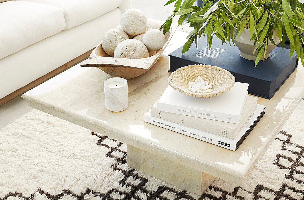
An Italian travertine coffee table from the 1970s brings a sense of polish to the laid-back space. On top, a French dough bowl was filled with a set of spheres selected to match the tone of the table’s stone.

We share a love of warm minimalism. Clean, light, architectural spaces that aren’t too cold or sterile.
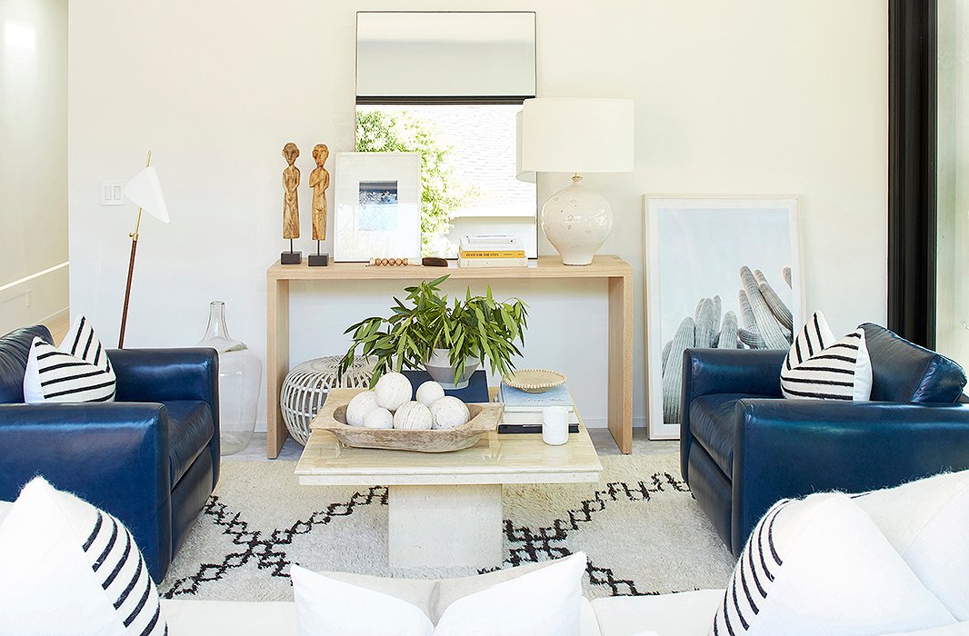
Between a midcentury-style floor lamp by AERIN and a cacti print casually leaned against the wall sits a console arranged with a ceramic lamp, an oversize mirror, and a white rattan Albini ottoman.

Join the Discussion