Interior designer Jenn Feldman doesn’t play it safe. But her bold choices are less casual rule-breaking than a reflection of her thoughtful, client-centric approach. “I come at things very emotionally: How do you want to feel? How do you want to live? How do you want to see your family?” Not your typical design-speak, but very appropriate from a one-time psych-art major and former PR maven who had her decorating jones validated when Nate Berkus turned up at her door to tell her she’d won Oprah’s first design contest. Eight years later, she heads her own design shop and partners with kindred-spirit clients such as Melissa Levin, co-founder and co-creative director of children’s clothing line Spritely Kids.
Melissa put her family’s three-bedroom Hancock Park, Los Angeles, cottage and guesthouse in Jenn’s maverick hands. “The only must was that our home represent our family and how we live,” says Melissa, who started Spritely Kids when she couldn’t find fashionable, functional outfits for daughter Hadley. “Our life is full of fun, laughter, sticky hands, dirty paws, and love! We don’t take ourselves too seriously, so our home needs to be consistent with that.”
“We met and it was an instant connection,” Jenn says. “We just kind of spoke the same language.” The two free spirits joined forces to turn Melissa’s home into a cheeky, sophisticated, family-friendly space.
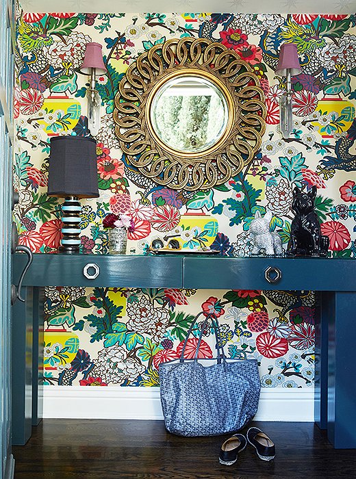
When it comes to embracing color, Jenn goes all-in. To balance such an extravagant print, she chose a deep-teal entry table and a gold mirror.
Wild for Wallpaper
The strong statements begin straightaway in the entry hall. Jenn is a big believer in working with what you’ve got, so rather than trying to disguise the small space (“I think we had two inches of clearance between the door swing and the console table!”), she put a big, splashy Schumacher paper on the walls (Chiang Mai, which she’d been saving for a “really special” client).
Jenn invoked one of her mantras, “Everything matters,” and used the paper to set the tone for the rest of the house. Right away it introduces you to the Levins’ sense of style and fun, preparing guests for the vibrant palette in the rooms that follow. “When you’re walking into a home, not only should it make you happy,” Jenn says, “it should make a statement.”

When you’re walking into a home, not only should it make you happy, it should make a statement.
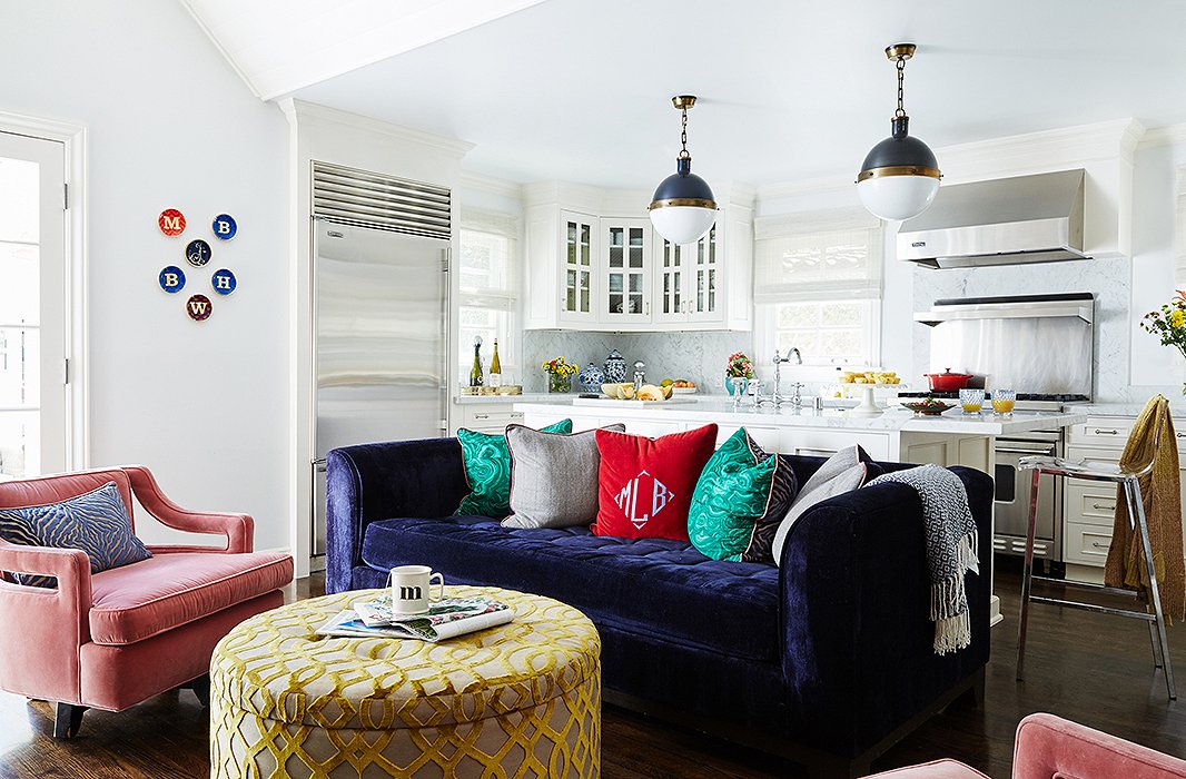
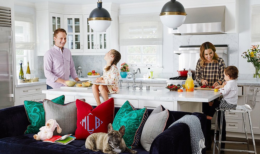
Jenn kept the macro palette white and the window treatments neutral, but her sense of playfulness is evident in the mix of pillows and personal family touches (note the monogrammed throw pillow and the initialed plates on the wall). The pendants over the kitchen counter are by Thomas O’Brien for Visual Comfort.
The Heart of the Home
For all her stylistic adventures, Jenn knows that function and form need to be in lockstep. “My wheelhouse is working for families with young children and dogs. I’m always asking myself, ‘Is this going to work for them?’” Luckily, Melissa and her family (husband Brian, son Briggs, daughter Hadley, and French bulldogs Waffles and Jelly Bean) have more than enough room to hang out, eat, cuddle, and nap in the open kitchen-cum-family room. “We love hosting everything from informal play dates to fun holiday parties to more-formal events,” says Melissa. “The layout lends itself to the welcoming, inviting feeling we wanted. Nothing is too formal or contrived; it’s just a comfortable, functional, and beautiful space for everyone—dogs included.”
To make her palette pop here, Jenn kept the space light and bright. Where kitchens are concerned, “I just crave the simplicity of white,” she says. She added energy with a sapphire sofa dressed with mismatched throw pillows and a pair of vintage armchairs she had covered in pink velvet.
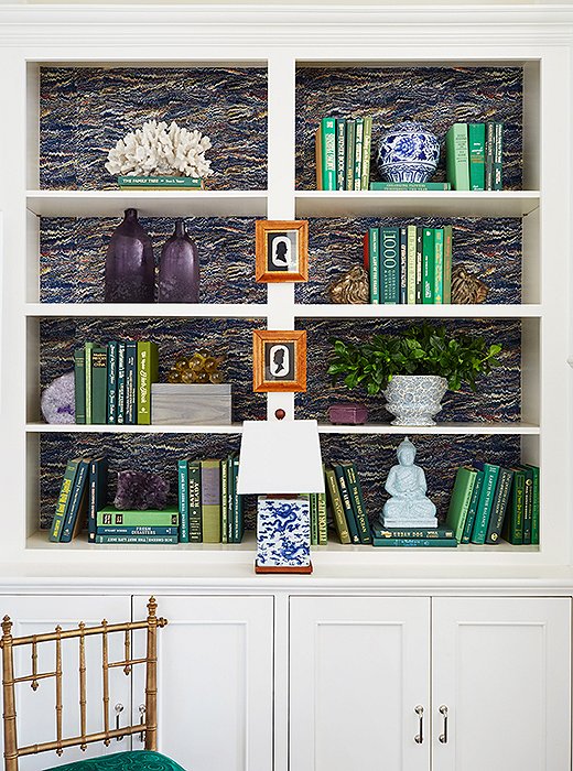
For a fun twist, try hanging framed artwork on the exterior of a bookshelf, as Jenn does here with these silhouette cameos.
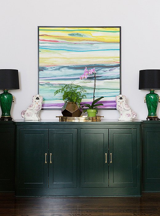
Black shades never fail to chic things up, and traditional touches like these lamps and Staffordshire dog figures balance out the modern painting hung above.
Big Style in Small Places
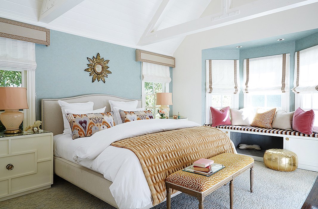
Touches of gold and leopard add a dash of glamour to the serene space, and tailored window treatments pull it all together.
Blissed-Out Bedroom
In the bedroom, Jenn took a more restrained approach, relying on a softer palette and luxurious finishes. “Jenn took me to her favorite places to dig for special fabrics, which really helped make the process a more intimate and personal experience,” Melissa says. No-fuss white bedding is layered with pattern and subtle gilt touches. The effect is mature, serene, and eye-catching. Function was also never far from Jenn’s mind. “They’re a dog-loving family, and in their bedroom, they really wanted Waffles to have a bed.” Hence the custom window seat, complete with dog bed.
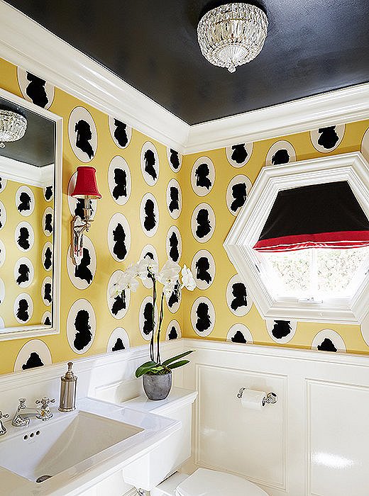
The yellow, black, and red palette and traditional fixtures give the playful silhouettes of the wallpaper a more refined edge.
The Poshest Powder Room
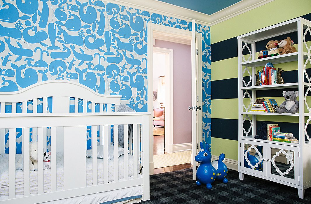
Three prints coexist here without being overwhelming. The trick is their boldness and proportion—none of them rely on intricate details that might be distracting.
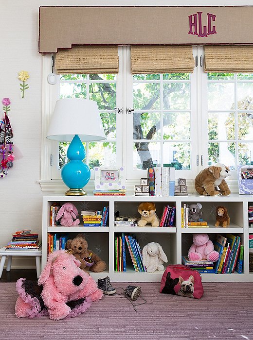
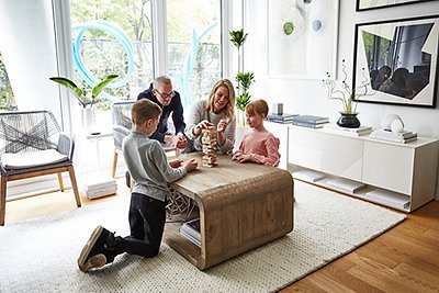
Kids’ toys automatically inject a room with color, so even if you choose relatively sedate carpeting and furniture, you’ll never lack for pop.
Now Entering: Kid Zone

I’m totally confident with making choices that might seem risky as long as they feel right to me.
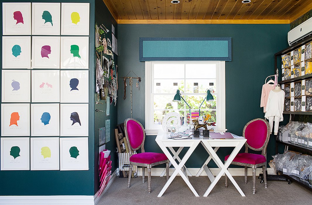
Work Hard, Play Hard!
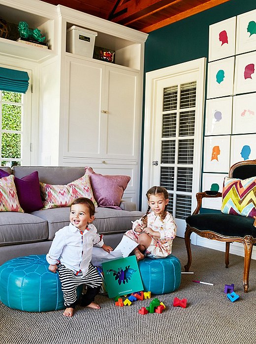
The multiuse space is sophisticated yet child-friendly. It cleverly mixes and matches Middle Eastern touches—the poufs and ikat pillows—with classical European elegance, such as this Louis XV-style chair.

The details make it just perfect, allowing me to feel inspired just by sitting at my desk.
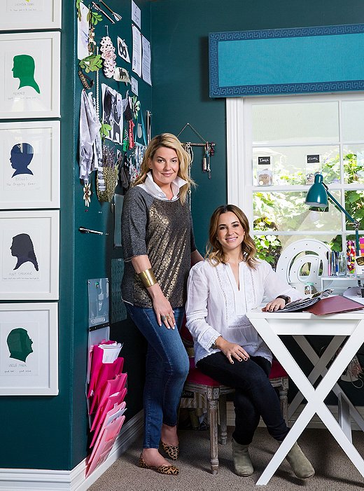
The Dream Team
The cohesion of the home’s interiors speaks for itself, and that’s a tribute not only to Jenn’s talent and vision but also to her having had the perfect partner in Melissa. “From the beginning of this process, Jenn understood exactly what I was looking for and my distinct and definitive taste and style,” says Melissa. “The entire project was very organic, and every detail from fabric to furniture fell into place as it was meant to be.”
Jenn, great to see you on OKL! Love this house and you look great 🙂
Thanks for sharing. Where did you get the profiles of the family in multiple colors?