Effortless. Elegant. Modern. These words describe the clothing that fills fashion stylist Jessica de Ruiter’s closet as well as the Silver Lake home it sits in. A former fashion editor at Vogue and W now a stylist for Drew Barrymore, Charlotte Gainsbourg, and Jennifer Lawrence, to name a few, Jessica shares the home with husband Jed Lind, an artist-designer at Commune, and their five-year-old daughter, James. Jessica and Jed melded their classic sensibilities (both hail from the East Coast) with the “quintessential California midcentury” vibe for a space that is as livable as it is lovely.
L.A. architect Gregory Ain designed the three-level home, filled with open rooms and vast windows, in 1953. The abode had only one previous tenant after the original owner, a painter. During the two-year renovation, it was clear that most things would stay, like the clever series of built-ins. The couple restored the original Douglas fir wood that now casts a warm golden glow. “Jed was specific about that,” says Jessica. “We wanted to maintain the integrity of the house while updating it for a modern, young family.”
The natural materials continue throughout the home with Carrara marble, travertine stone, and Belgian linen, accented with unlacquered brass. “We like things to patina over time,” says Jessica. “It’s simple and true… considered, cozy, clean.” Though nearly every square foot has been updated, the home retains a graceful, timeless vibe thanks to instinctual choices and astute editing. Come take a closer look at this chic, relaxed oasis.
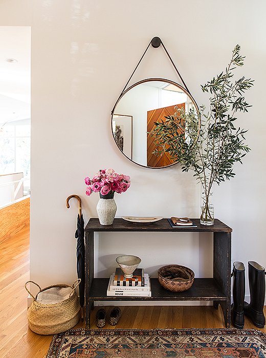
The entry illustrates the couple’s ethos of “less is more.” A console from Galerie Half holds pottery from Californian and Japanese ceramists. (David Korty and Akio Nukaga are favorites.) The front door, designed by Jed, is seen in the BDDW mirror’s reflection.
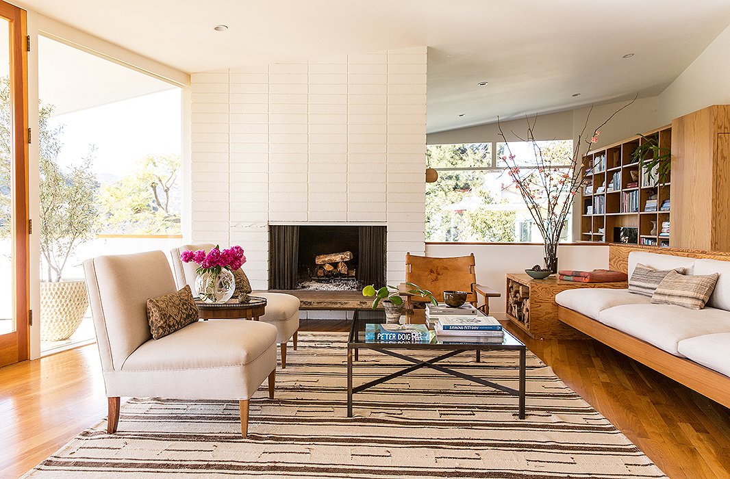
“We adore and collect vintage rugs,” says Jessica. The added textural elements (leather, linen, glass, wood) happened by chance. “It’s always stronger to mix materials and metals. However, our furnishings evolved organically.”
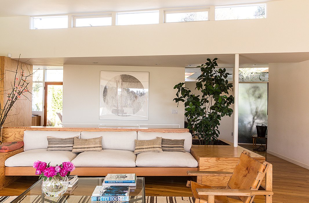
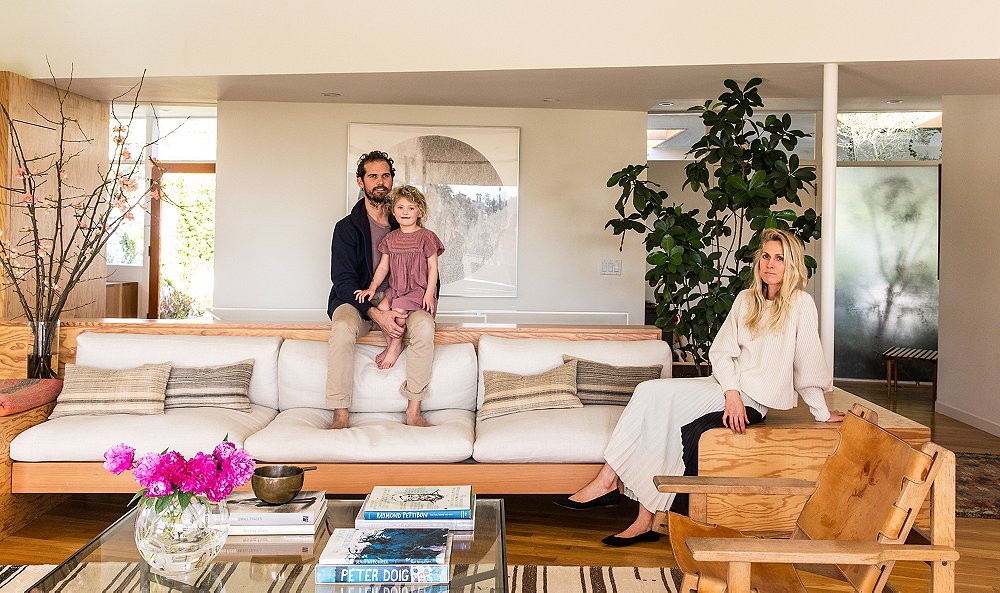
The built-in sofa is the focus of the living room, accented with vintage-linen custom-made pillows. “We like a mix of solids and patterns,” says Jessica. “And we’re really drawn to washed linens and ethnic prints.” The large circular artwork is by Russell Crotty, a California artist and friend.

The house was so specific, it was really about working with what was already there in the best possible way.
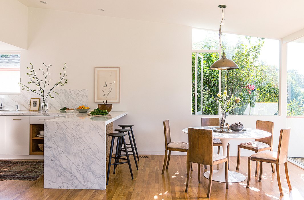
The open dining area suits the couple’s entertaining style. “We like to serve family style so that people can make themselves at home,” says Jessica. Stools from Sawkill Co. under a Carrara marble bar and a Michael Snow print make for a nice breakfast spot.
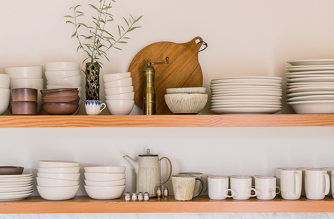
An admitted ceramics-lover, Jessica uses the kitchen’s open shelving to display an alluring array. “Most are from Heath and Akio, but it’s good to mix up tones and textures,” she says. “There’s some vintage there too.” Her other kitchen essentials? “A Vitamix, a cast-iron pot, and Moon Juice overnight oats.”

We are inspired by California and Scandinavian design and strive for something that feels eclectic, edited, and timeless.
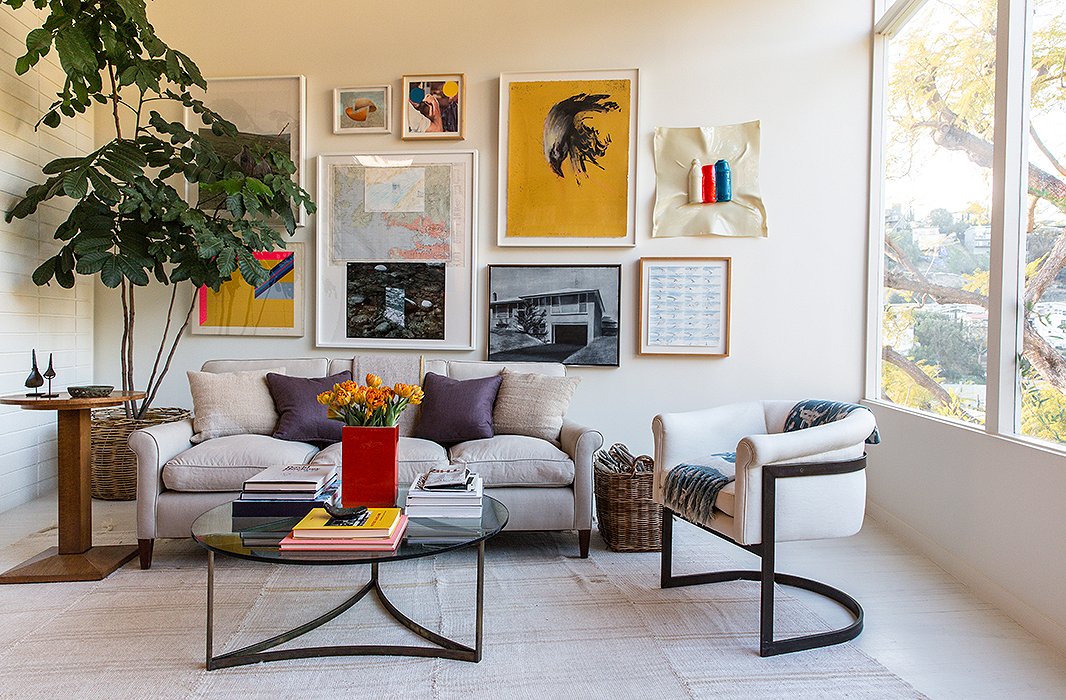
Jed’s parents and the couple are passionate art collectors, resulting in a bold gallery wall. The piece “hiding behind the tree is one of Jed’s,” says Jessica. The furniture is a mix of “custom, vintage, flea market, and inherited pieces, like a Milo Baughman chair.”
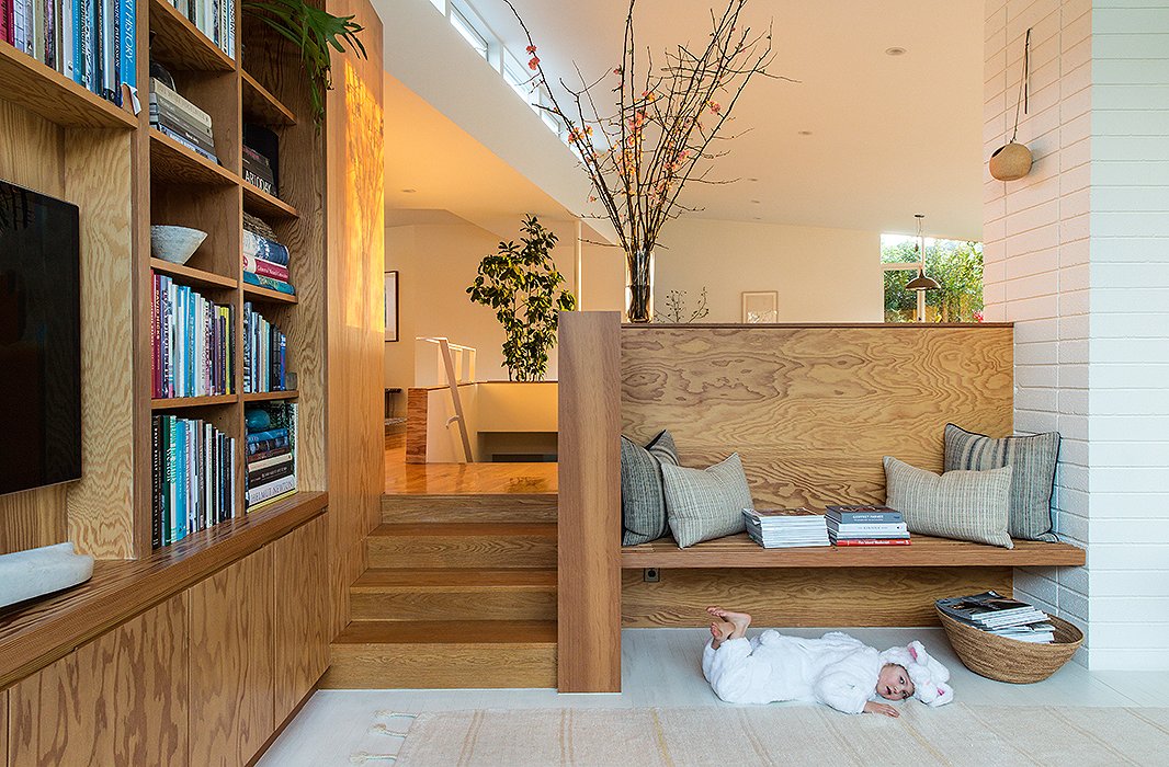
James (in bunny disguise) lounges beneath one of the home’s many built-ins. Baskets in all shapes and sizes are another common sight. “Can’t resist a good basket,” laughs Jessica. “The bigger floor baskets with magazines are from Dream Collective in Silver Lake and Hollace Cluny in Toronto.”
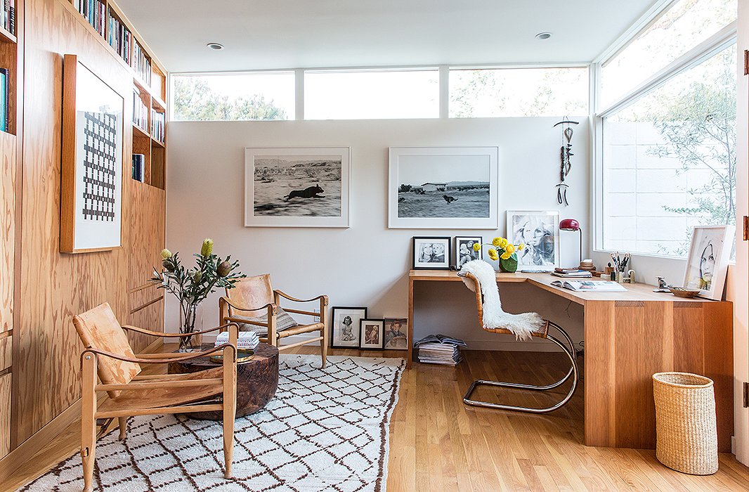
The office doubles as a guest room courtesy of a Murphy bed and side tables hidden in the built-in bookshelves. Jed crafted the L-shape Douglas fir desk. Two Kaare Klint Danish safari chairs flank an Alma Allen table. The photographs are by John Divola.

The home is a nice combination of midcentury but also cozy and accessible because honestly, midcentury isn’t always cozy and comfortable.
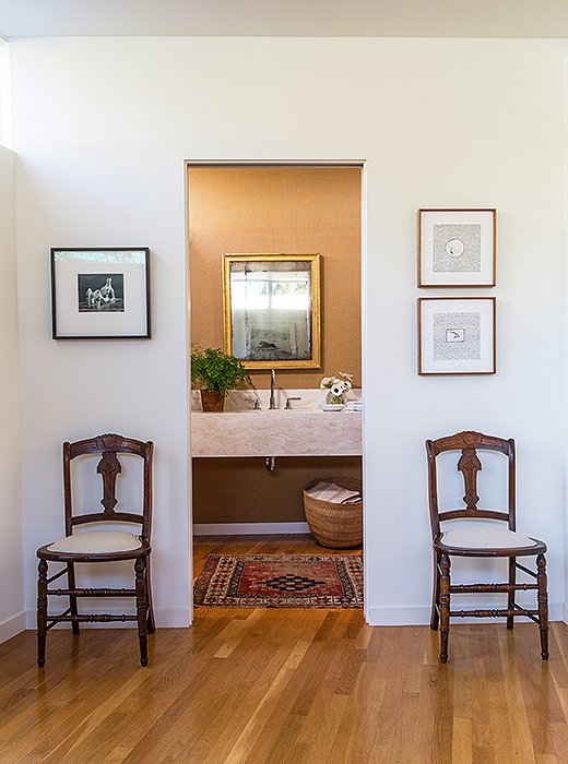
The powder room pairs “traditional with modern pieces”—a mix the couple enjoys. “It makes it cozier and more comfortable,” says Jessica. Jed’s mother gifted the chairs (upholstered in Libeco linen).
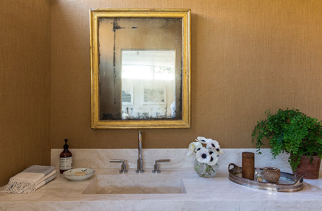
A cool travertine vanity is a perfect foil to the 19th-century mirror. The color throughout the home is Benjamin Moore’s White Dove, but for this space, Jessica chose burlap wallpaper. Anemones and maidenhair ferns are two of the couple’s favorite plants.
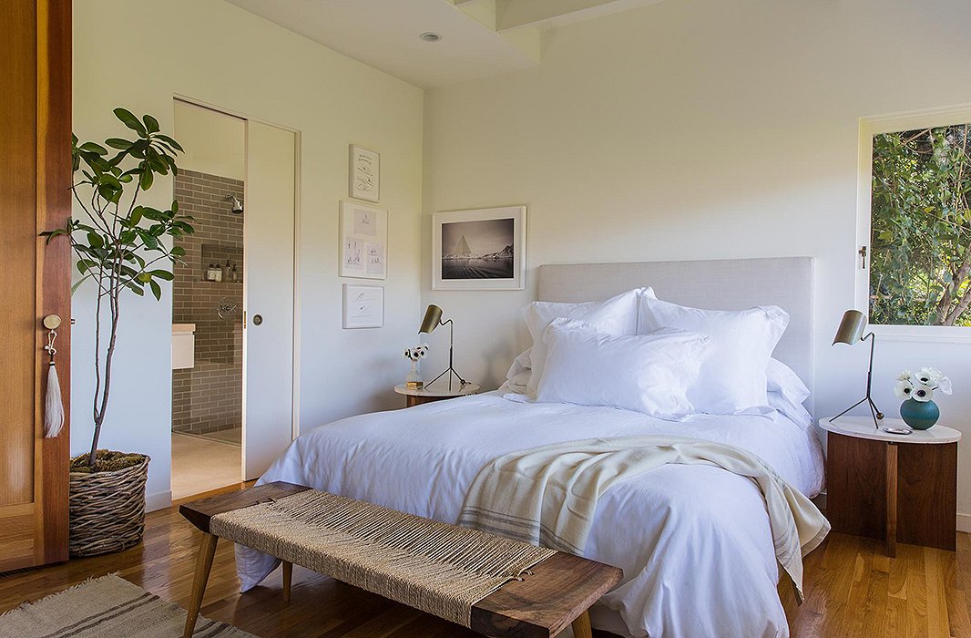
Jessica wanted “a little more ceiling height and lots of natural light” for the master bedroom, making it “a refuge to relax in.” A linen-covered headboard and white bedding keep it airy. A custom bench by Mark Coppos and artwork by Russell Crotty and Sarah Anne Johnson add delicate pattern and texture.
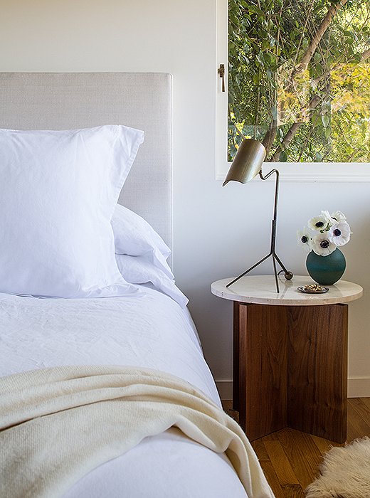
Atop the nightstands, designed and built by Jed, are fountainhead desk lamps from Doug Newton for Nightwood. A surprise pop of color comes courtesy of a vase by a friend, ceramicist Victoria Morris.

I’d rather buy pieces that are timeless and that I’ll keep forever than disposable things.
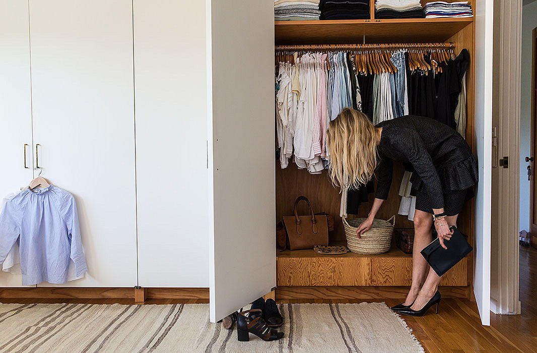
Jessica pulls items from her enviable closet, which includes favorite designers such as The Row, Celine, Isabel Marant, and Lanvin. The fashion stylist uses straw and metal baskets to corral belts, sunglasses, and accessories. Hermès ashtrays are catchalls for jewelry. “I am constantly editing everything,” she says.

Style is so innate and more than just surface choices… how you prepare and present food, the way you treat others, the choices you make.
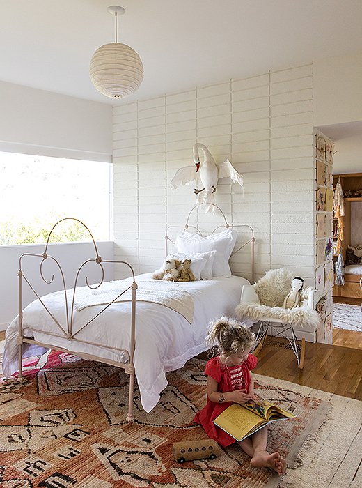
Art appreciation starts early with a wall-mounted swan. “It’s by Tamar Mogendorff,” says Jessica. “I adore her pieces and would love to collect more.” James chose the light pink Farrow & Ball paint for her vintage bed. Layered vintage rugs make for comfy seating. They call the Noguchi pendant “the moon.”
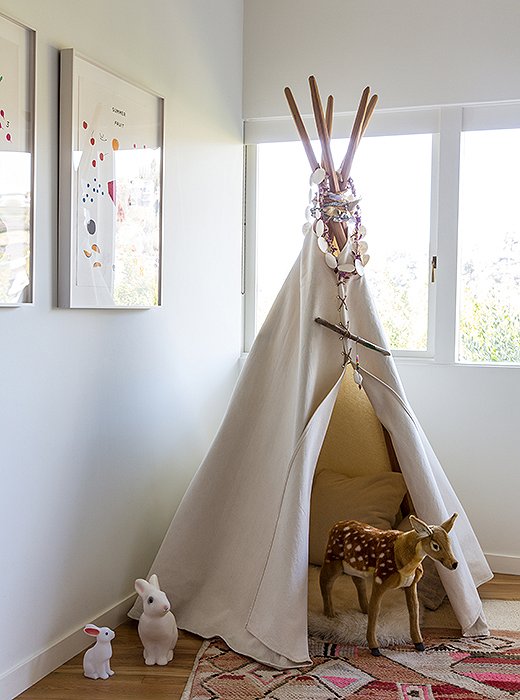
A tepee from House Inhabit commands one corner of James’s room, filled with “a collection of pillows, a sheepskin, and a revolving door of animals, dolls, and often our dog, Blue,” Jessica says.
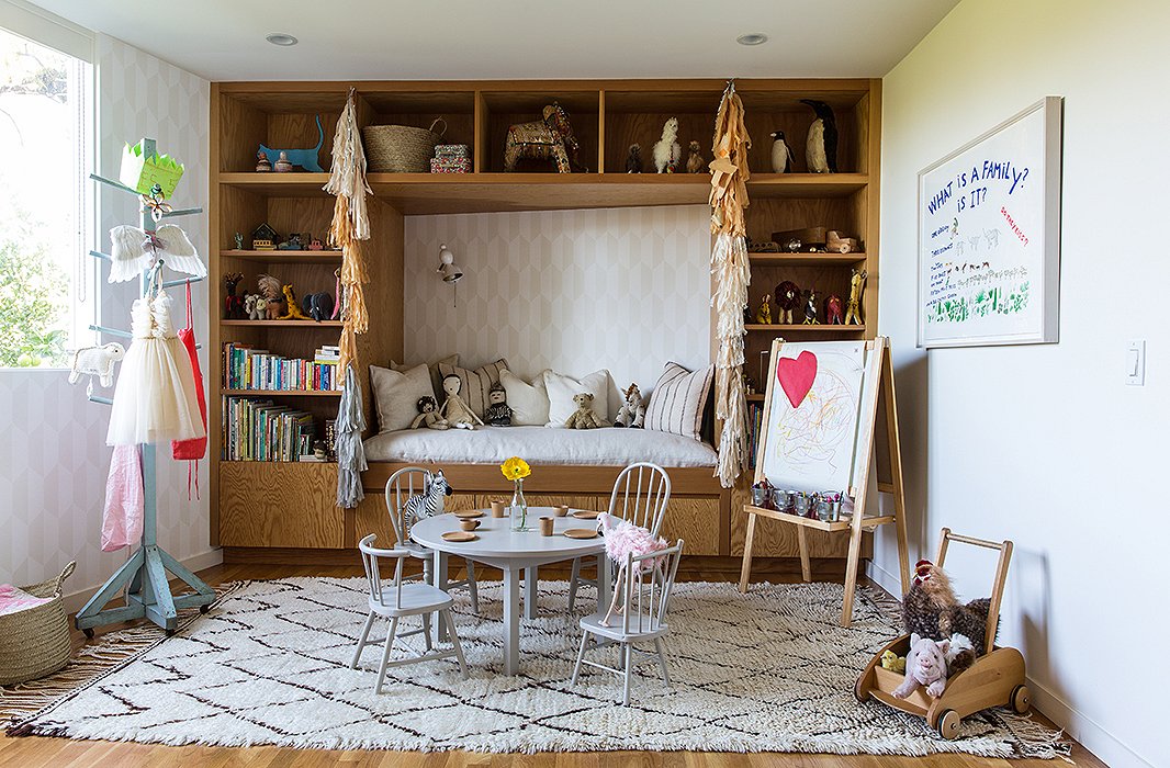
The couple designed James’s room with distinct “components.” In addition to a sleeping area, they wanted a space for “playing, reading, and being cozy,” says Jessica. Jed built the table, which is encircled by mismatched chairs scored at flea markets. The “set” is unified with a light gray Farrow & Ball paint.

Ultimately we want a home that works well for our family and feels authentic and comfortable.
Join the Discussion