Martyn Lawrence Bullard is known for high-impact spaces with a glamorous twist. A fixture of publications including Architectural Digest, Elle Decor, and House Beautiful, the designer has a signature style that’s eclectic, global, and chock-full of midcentury swing. It’s fitting, then, that the Sands Hotel & Spa tapped Martyn for its new property in Indian Wells, CA. Pink walls, Moroccan flair, photographs of leisurely desert days gone by—these are just a few of the elements Martyn incorporated throughout the property, most notably in its on-site restaurant, the Pink Cabana. We chatted with the designer about his vision for the space, the allure of California living, and the power of a great print.
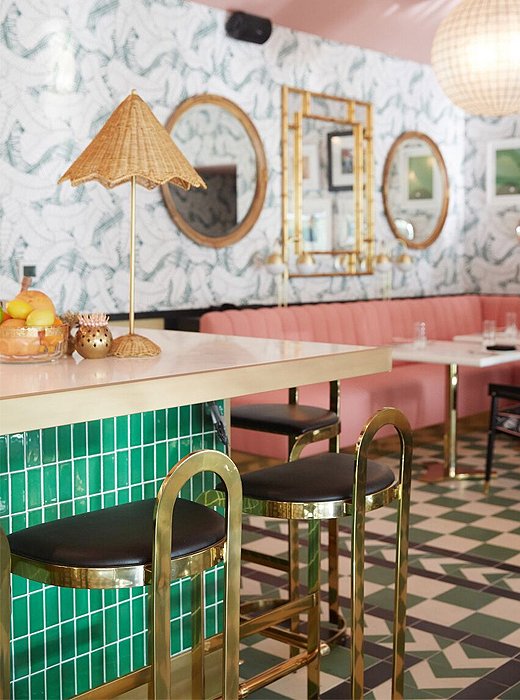
Midcentury swing: a wicker shade and brass barstools.
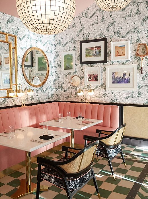
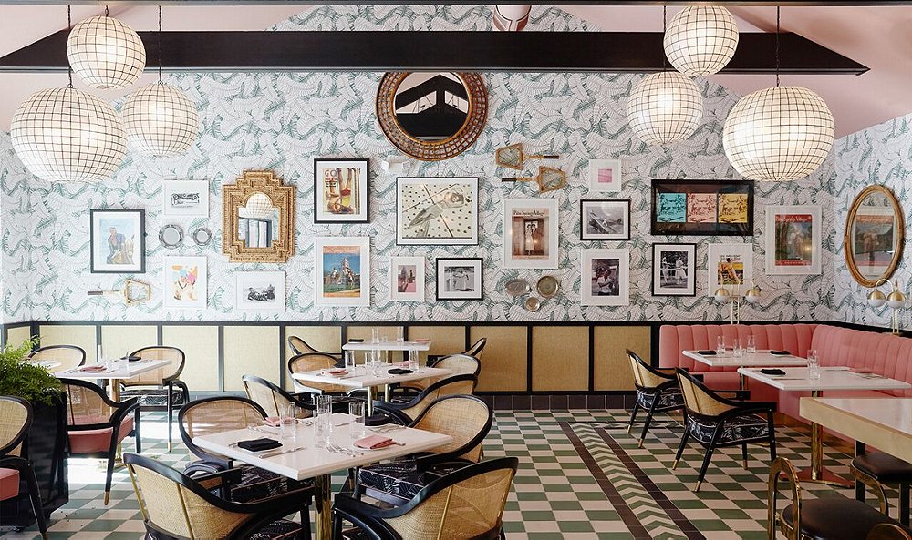
Pink velvet banquettes sit against Martyn’s banana-leaf wallpaper.
One Kings Lane: How do you think your individual style as a designer comes across in this project?
Martyn Lawrence Bullard: My design taste is influenced across the board by the places I’ve visited across the world. But I’m finding that there’s always a bit of a California flair to it now, having lived here for over 20 years. I think that kind of ease of life—the indoor-outdoor experience—has really colored all of my work. And certainly for the Sands, that idea of a real indoor-outdoor vacation, a mix of a little old-school country club with a little Palm Springs midcentury, was really the ultimate recipe for the project.
Was there a particular point of inspiration for the Pink Cabana’s scheme?
We started with the wallpaper, which I designed. It was taken from an old 1950s palm print that we sort of reinvented, rescaled, revived—more of a modern-day version of the iconic Paul Williams Beverly Hills Hotel wallpaper. I wanted something that felt exotic but still a little modern so we could make a real statement on the walls but not overpower the space. So that came first, and then I designed the rest of the room around that. I really wanted it to feel kind of like an old Palm Springs country club but with a little bit of the Moroccan exotic flavor that the rest of the hotel exudes.
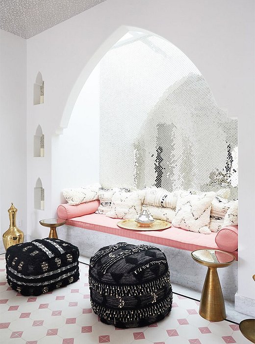
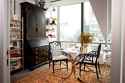
A glamorous Moroccan-inspired niche elsewhere on the property.
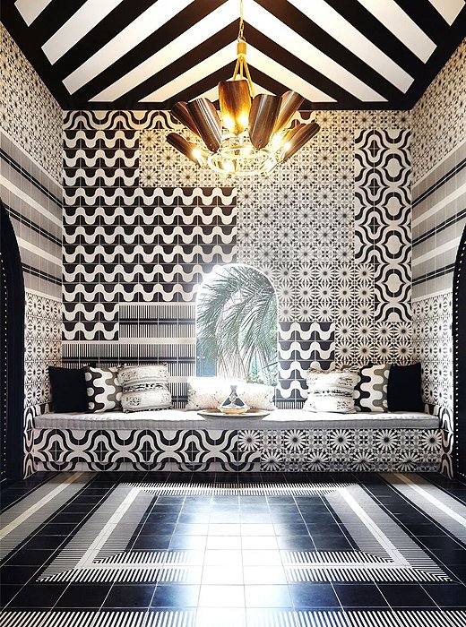
Black, white, and bold all over.
Why do you think midcentury design continues to endure?
Midcentury is such a broad term, because we’re really looking at things from the ’40s to the ’80s that we’re grouping into this idea of “mid-century.” But it’s more of a look of a period when things have been simplified but still made to feel luxurious. The twists and turns of the Edwardian era and the streamlined lines of Art Deco were all softened up and made much more fluid. And there became much more of a focus on the materials and how they were employed: caning, leather, etc. Even today it’s a very easy look to mix in or to create a vibe and then mix around it.
Could you tell me more about the gallery wall in the restaurant?
The point is to reclaim the history of that era, which is why we have all of those great tennis and golfing photographs that speak to Indian Wells as well as the surrounding clubs. So I picked those sports as the two major flavors of the artwork and then around that added some fun vintage fashion images. And also a bunch of old Palm Springs Life magazine covers that felt correct for the experience of the hotel. It’s a layered look that feels inherited by the space.

Join the Discussion