“If it was up to me, every inch of this place would be covered with some kind of tchotchke,” says Mindy Kaling, looking around her freshly decorated apartment in New York’s Nolita neighborhood. And though that may have been the case had she been left to her own devices, deep down she knew that’s not what she actually wanted. She knew her penchant for “more is more” would not have worked in the glass-encased small space. The energy, excitement, and visual noise happening on the streets below provide more than enough stimulation for her creative mind; a layered and loud decor would have pushed “more is more” to “over-the-top” all too quickly.
So Mindy called up One Kings Lane Interior Design for a bit of guidance. She met with designer Sally Gotfredson, who worked with her over several months to create an edited mix of midcentury anchors, nubby textiles, and graphic art. And though their initial meeting took place IRL, a project in Los Angeles rendered Mindy out of New York for the remainder of the process. Product pitches, spatial visualization, and several iterations of a design plan were all sent via email and discussed by way of a reply note or a phone call. The bicoastal challenge turned out to be a benefit in Mindy’s eyes. “I got to be surprised, like in a reality television show,” she says. “It was also great because I couldn’t micromanage, which would have driven everyone crazy.” Neither was it a problem for Sally, who managed the entire process three time zones ahead. “I would work on her design, send it through, and then we’d arrange a time to dissect it,” she explains. “She wanted each piece to be meaningful. It was a collaborative process, and it forced me to put myself in her shoes to deliver a design that reflected who she is and how she lives.”
As for the big reveal, “the first time I walked into the space after One Kings Lane designed it, I thought, Who is this chic person who lives here?” Mindy recalls. “I couldn’t believe it, and I desperately didn’t want to mess it up because it’s just so chic and clean.” This disbelief mingled with relief, because Mindy has no time for decorating mistakes. Her schedule is too packed and too varied to deal with a sofa that doesn’t fit or the wrong shade of white. There are days when she’s commanding a crew of 175 for a TV show, then there are full days of press, then there are evening events, and then there’s writing. Writing. It’s what she’ll be doing most in this apartment, perhaps with some wine and almost certainly with chili, she’ll retreat here to create the scenes she’s known and admired for. To date she’s written close to 50 TV episodes in her L.A. home, and she plans to write another 50 right here.
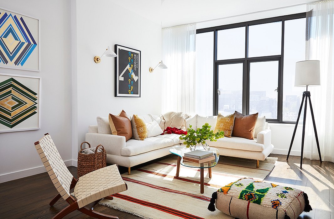
The vibe? “Moroccan midcentury,” says Sally. “Mindy wanted it to feel different than any of the other spaces she’s lived in before. She’s always gone for tons of color with layers of pattern, and this time she really wanted to push herself out of that comfort zone.” In the living room that vision materialized with a sectional by Kim Salmela (upholstered in stain-resistant Crypton) balanced by a patterned pouf from Habibi Imports. A vintage kilim anchors the space, pulling in the tones of mud-cloth throw pillows backed in leather from Mike Seratt.
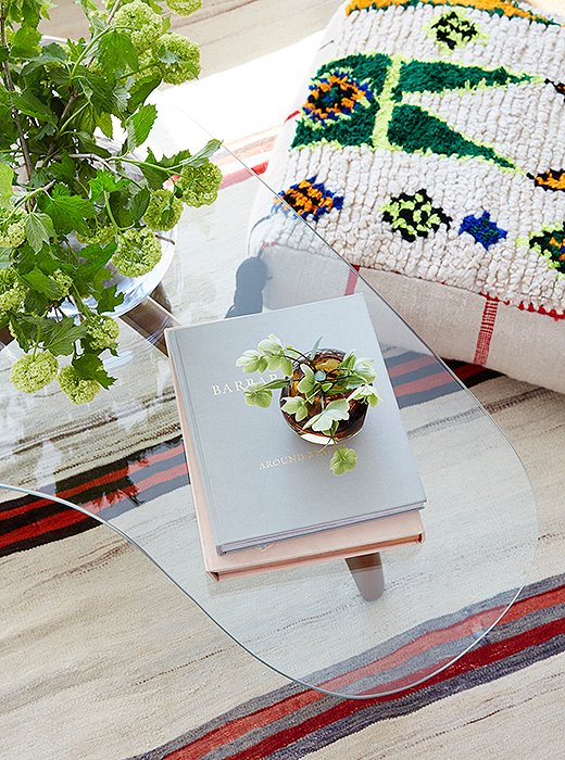
A Noguchi-style coffee table breaks up the otherwise angular space and carries the weight of tired feet.
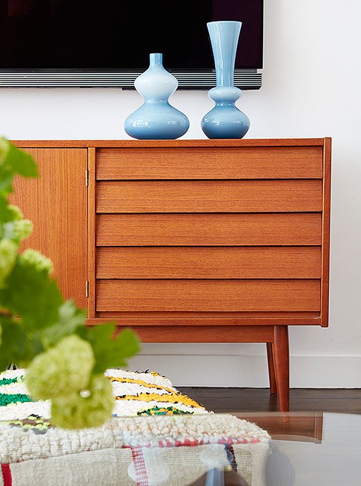
“All of the inspiration photos she sent me had super warm palettes—yellows, pinks, reds,” Sally says, “and I think those tones informed the style of the entire space.” Here, a midcentury console keeps pace with the room’s warmer accents and hides the less glamorous components of Mindy’s guilty pleasure—television.
More on Mindy’s Style Evolution
Mindy’s father, Avu, is an architect who held a certain amount of sway in her style evolution. “My dad loves Mid-Century Modern, and the house that we grew up in was furnished with a lot of pieces in the Danish midcentury style,” she says. “As I grew older I reacted to that. Whereas at one point in my life I loved wallpaper and gilded things, now, as a 37-year-old, I’m gravitating more toward my dad’s style, and I think Sally really captured that in the vintage pieces she found.” Time plays its part. For Mindy, each year of hard work yields incremental success, resulting in “more money and less time.” It’s not that she views this as a burden; quite the contrary, she embraces it. “I like outsourcing projects like these to people like Sally. She has a great eye, and it was so fun to be surprised by the final result… to see how she executed my style and vision. And she did so perfectly.”
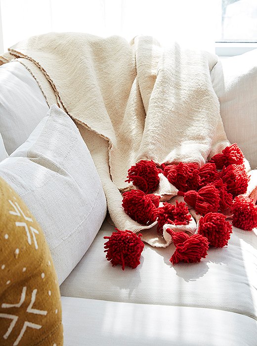
A tasseled throw adds texture and vibrancy to a neutral base.
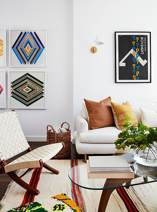
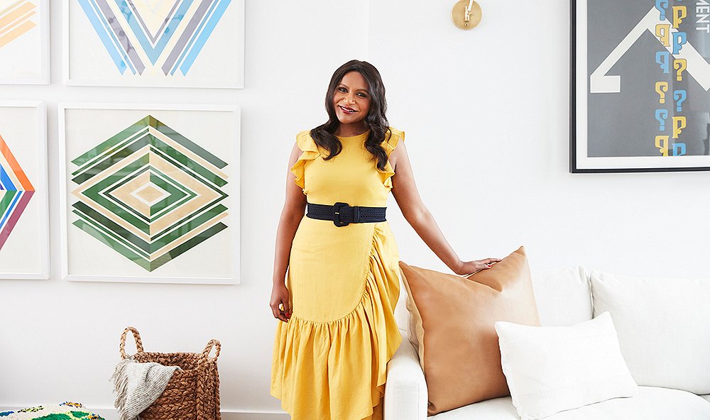
It’s on the left side of this wall where we discover Mindy’s penchant for bling. Custom graphic prints by Wonderwall feature the space’s token touches of blue and green, atop which layers of gold leaf shine. Above the sofa, sconces by AERIN flank another punchy piece.

The apartment is a reflection of my street style—great accents on top of a neutral palette.
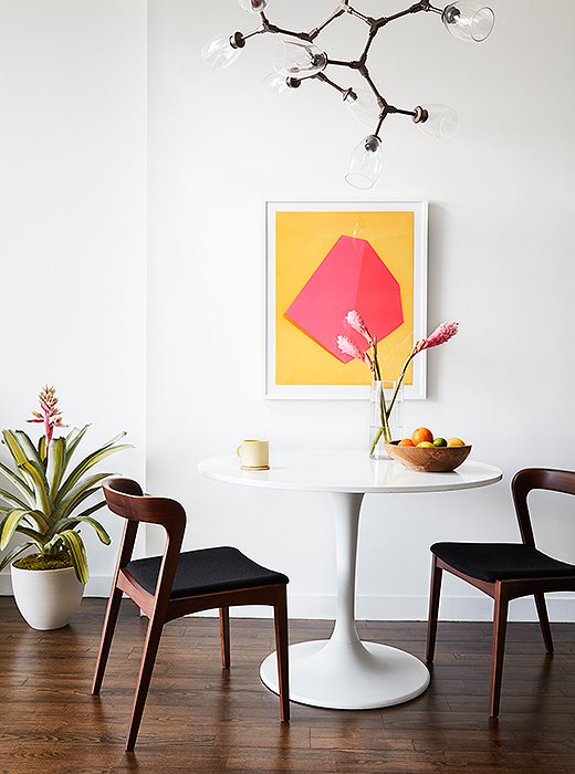
More midcentury in the kitchen. A white Tulip table and two Scandinavian-style chairs float beneath a chandelier of bronze and wineglass-cupped bulbs. The art? “Yellow and pink are colors Mindy really wanted to use,” says Sally, “but we couldn’t really find the right moment for it. So during the 11th hour, we found this piece and installed it without ever showing it to her.” Needless to say, she was pleased.
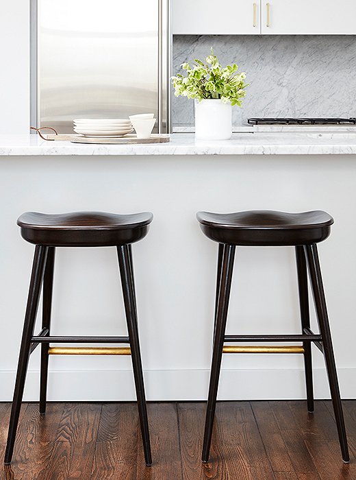
Brass details on two barstools by Brownstone provide a pleasant contrast to the kitchen’s stainless-steel finishes. “Even without a back, they’re probably the most comfortable I’ve ever sat in,” Sally says.
Mindy’s Three Favorite Things
- The Moroccan floor pillow: “It looks like it’s for the chicest, most elegant dog ever. Of course, I’d never actually let a dog sit on it.”
- The media console: “Because I watch so much TV, my eye falls to it all the time, and it’s just the most beautiful color. I think it’s an antique? Anyway, it’s amazing.”
- The coffee table: “It’s a beautiful shape, but also it can withstand the weight of my feet.”
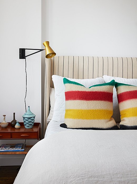
A guest-room bed serves as an experiment in scale. The bold primary stripes of the pillows work with the headboard’s fine lines to create maximum visual interest. “It’s a poppy room,” notes Sally, “and I think it represents the side of her that’s more laid-back. Everything here was about comfort, color, and texture.”
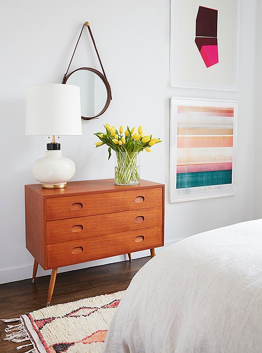
For Mindy, the biggest design surprise in the guest room had to do with two pieces by David Grey. “When Sally told me she wanted to put two big prints in here, I thought, okay, that’s going to really overwhelm the room. But they actually made it feel bigger. It’s so weird to me, but somehow it works.” Above a vintage dresser (from Uptown Found), a round mirror suspended by a leather strap delivers both function and form.
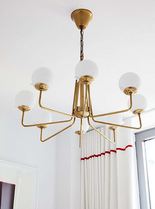
No room is too small for a statement fixture. “It creates height,” says Sally. “There was very little you could do in here other than floor-length window treatments and a chandelier to create a sense of grandeur.”

The first time I walked into the space after One Kings Lane designed it, I thought, Who is this chic person that lives here?
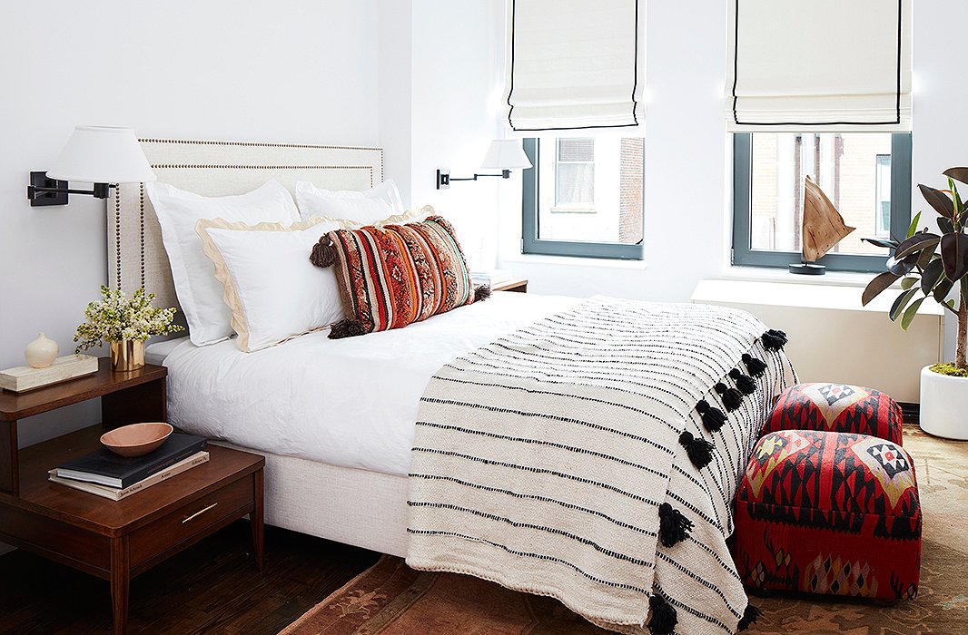
Textiles carry the eye in the white-walled master bedroom. “I really learned from my past decorating mistakes,” says Mindy. “I would fall in love with a really bright specific color, end up painting the whole room that color, and get really sick of it.” Catastrophe, avoided. On the windows, Roman shades from The Shade Store continue a theme of black details with stitched borders, tying into the tasseled quilt and bronze accents.
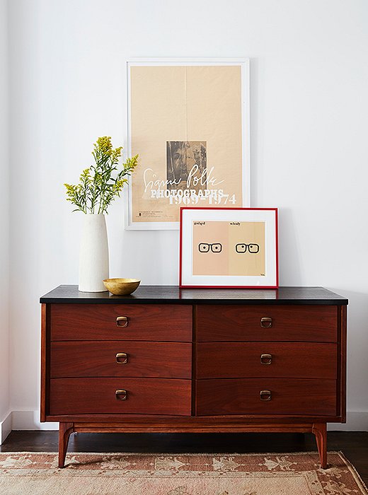
Yesteryear’s nightstands meet their match with a black-top dresser. The Godard | Woody Allen print was Mindy’s own. Note the red frame, which was chosen to contrast with the room’s peachier hues, as seen in the print itself and the Oushak rug below.
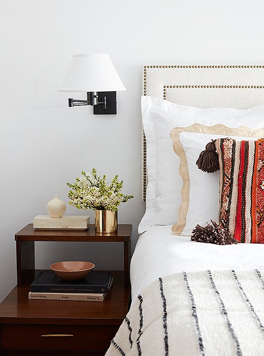
A headboard accented with brass nail heads is a polite nod to tradition—and proof that beige can be beautiful, especially when it’s loved and layered.
Join the Discussion