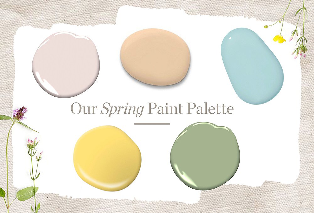
Springtime brings with it the promise of new beginnings and fresh starts. What better place to get those fresh starts than in your home? We chatted with our art directors to gather five of their favorite paint colors, all pulled from our spring trend report. From soft blues to cheery yellows, these are just the colors you need to give your home that fresh spring feeling. “Our nature-inspired spring palette is the perfect mix of classic and modern,” says senior art director Anthony Santelli. “It’s a great way to bring color into your space, especially if you’re hesitant about incorporating color.”
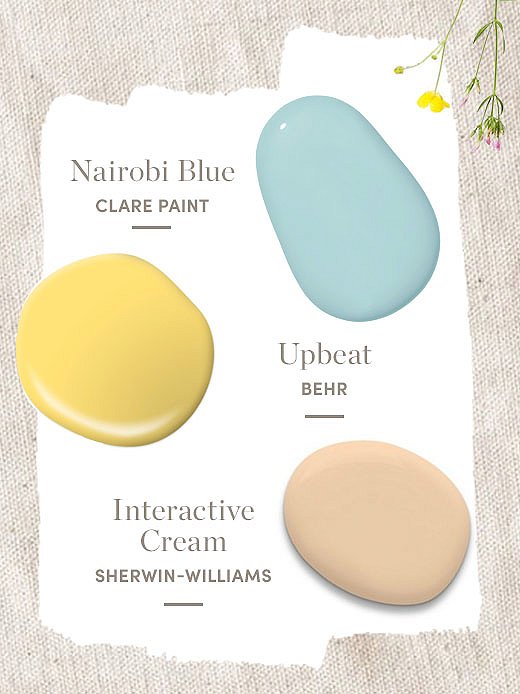
Nairobi Blue from Clare Paint
“It’s a classic light blue, like living in a Tiffany & Co. box,” says photo art director Eileen Behnke. Soft blues have always been our favorite way to incorporate a bit of color, but this spring we’re pushing the boundaries and adding it in some unexpected places. Putting it on the ceiling not only brings a bit of fun, but it can also make the space feel bigger.
Upbeat by Behr
If you think yellow is too bright for an everyday room, it’s time to think again. “Yellow is such an underrated color,” says Eileen. While we admit that getting the right shade is tricky, it can bring the ideal dash of cheer to your space. “If you don’t want to paint a whole room, you can use it to enliven some decor. I recently painted some old wooden candlesticks this color, and it gave them a whole new life.”
Interactive Cream from Sherwin-Williams
Cream is the perfect starter color for those who shy away from even pale blues and yellows. “This is just a really elegant neutral that can complement so many other color palettes,” says Eileen. She’s right. Interactive Cream is one of our favorites because you can layer on top of it, but it can also hold its own in a room of other neutrals.
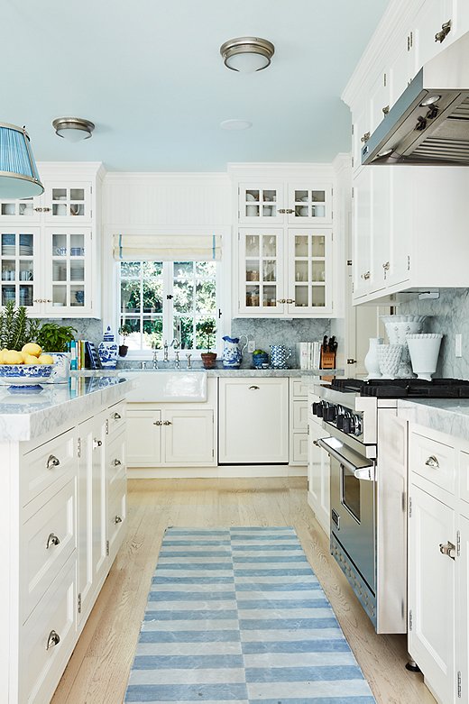
Mark Sikes chose to paint the ceiling of this kitchen a light blue. He carried the color throughout the space with ginger jars, a blue shade on the pendant light, and a blue runner.
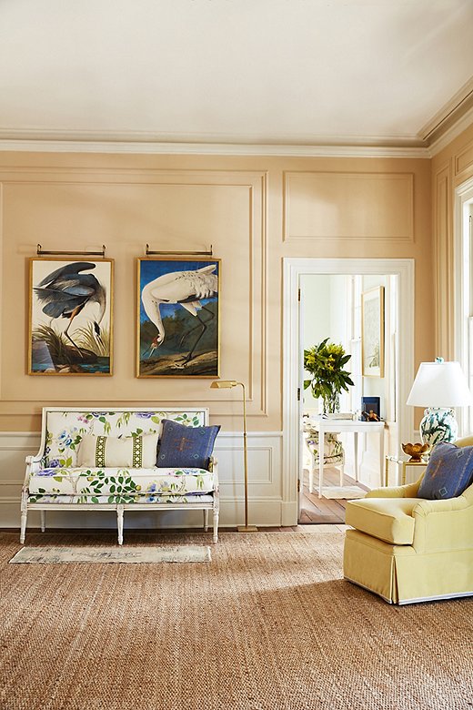
Our team decided to paint this lovely sitting room Interactive Cream to add some depth but allow the patterned settee to take center stage.
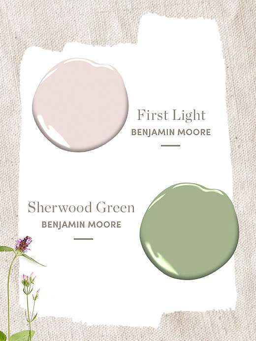
First Light by Benjamin Moore
Benjamin Moore named First Light its 2020 Color of the Year because pink has a staying power that just won’t quit. “Somehow pink has become the new neutral, and I love that,” says Eileen. From rose gold to millennial pink, numerous rosy hues have made their way into the mainstream during the past seven years. First Light is the perfect mix of baby pink and creams.
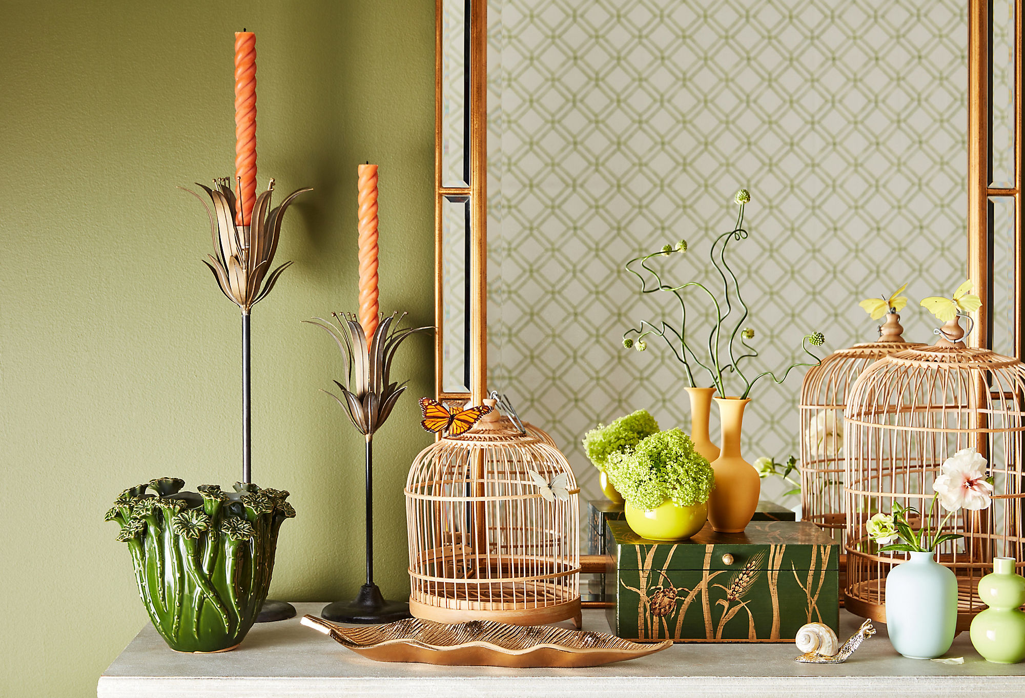
Sherwood Green from Benjamin Moore
We predict that green will be the next big color trend because people are hungry for elements of nature in their homes. “I love this color,” says Eileen. “It reminds me of a beautiful English country house on a lazy Sunday morning.”
“This pastel color palette, once regarded as too saccharine, has taken on a whole new life,” says Eileen. “I think it’s refreshing, but also makes us feel cozy and secure.”
“Whether it’s painting an entire room or giving a vintage piece some new life, paint can help you make big changes from a design perspective and breathe new life into your home,” says Eileen. If you’ve gotten inspired and are ready to change up the paint in your home, you can reach out to One Kings Lane Interior Design; they’ll help you with their new paint color consultation service.
Join the Discussion