Anyone who’s braved the NYC real-estate market has faced the tough choice after looking at a dizzying parade of apartments, “Do I want the street or the space?”
Content strategist Cole Wilson faced such a decision after relocating to New York from L.A. a few years ago. “It’s a second-floor walk-up studio in an old classic SoHo building,” Cole says. “I accepted the tiny, quirky space—sloping floors, kitchen in the living room—because it’s on one of the prettiest blocks, lined with trees, next to a small park, and steps from great bistros and shops.”
While she quickly embraced her new neighborhood, Cole had a harder time planting design roots. In her previous homes, her heirloom furniture and art pieces fit perfectly. In this 500-square-foot space, they took on a Miss Havisham vibe and prevented Cole from finishing the design. “I never even hung my art because I was paralyzed,” she says. And while she knew her style—“Classic but cool. Very downtown/uptown. Just the right mix of both”—she couldn’t bring it to life. “My fear of it not looking right stopped me,” says Cole. “I needed a translator.”
Enter One Kings Lane Interior Design. Designer Alex Reid met with Cole to assess the situation and create a pulled-together look with plenty of personality while maximizing the space. “I saw a lot of potential by redoing the floor plan and looking at the apartment with a new perspective,” says Alex. “There was space in both the living area and the bedroom, but it wasn’t being utilized. We needed to reconfigure the layout and edit, edit, edit.”
In addition to revising the floor plans of both the living room and the bedroom and opting for scaled-down furniture to better fit the space, other top priorities were to showcase a beloved art collection and design a lighting scheme that flatters as well as functions. “Cole had great pieces that needed a better stage to really shine,” says Alex. “With a fresh layout and small swaps, we achieved a layered, eclectic, cool space… just like Cole.”
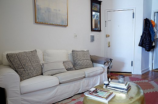
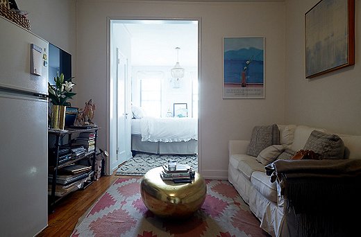
Living Area Before: Cramped and Colorless
“This living room was all about function and style,” says Alex. “I wanted to create a proper sitting area and disguise the television. The space was being consumed by a huge sofa and coffee table.” The goal was to create a hybrid space that could easily be used for both an intimate dinner party and a Netflix marathon. “I also wanted to give the key pieces of art some breathing room,” adds Alex. “A large gallery wall would be overpowering in the space, so I edited down the collection to display the real showstoppers.”

I really wanted a flow to the apartment because that one main room where I spent most of my time was dark and not as inviting as the bedroom. I also wanted it to feel like a grown-up home. I wanted everything to have its place.
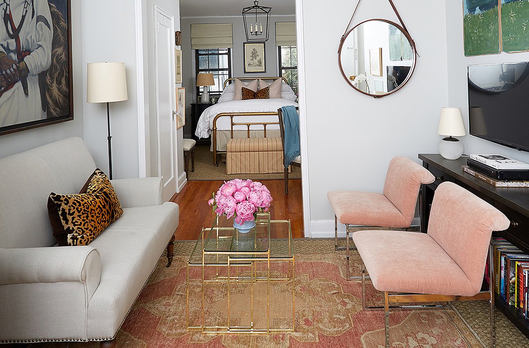
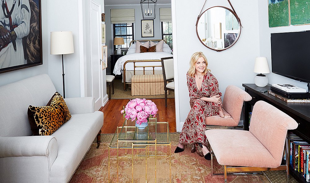
A slender settee is just the right size for the petite living room. A leather-trimmed hanging mirror adds a touch of refined texture and maximizes light.
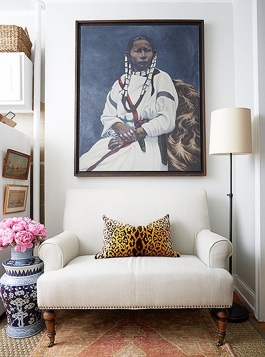
Cole spotted the striking painting at a flea market and texted Alex to see if it would work. “The image did not come through, but I told her to get it without seeing it,” says Alex. “I believe if you love a piece of art, buy it. It is personal and should make you happy.”
A Chic Salon
Alex swapped the sizable sofa for a settee and two slipper chairs in a delicate pink velvet. A dense coffee table was replaced with glass nesting tables. “Stacked together they take up no space,” says Alex. “And when Cole entertains, she can pull them out to serve drinks and snacks, even dinner.” The new arrangement gives guests a glimpse of seating and art, not a TV screen, when they enter. The living room was visually defined from the adjoining kitchen with a neutral, durable sisal rug. A smaller vintage rug layered on top adds subtle color and pattern.
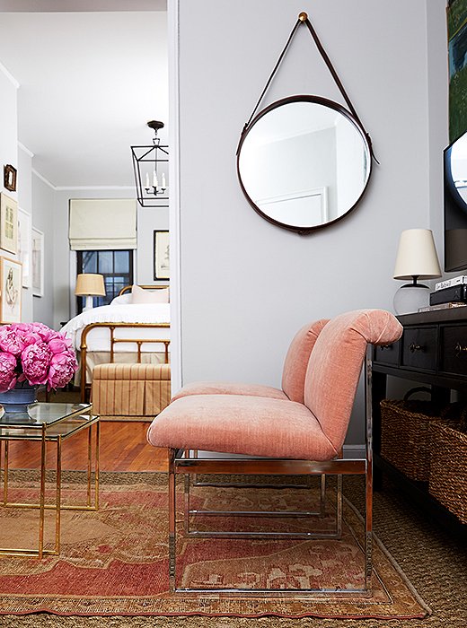
Cole originally wanted light pink walls. Fearing it might read nursery, Alex painted the room with Benjamin Moore Gray Owl and found a pair of Milo Baughman chairs in a blush hue that picks up on the pink tones in the rug.
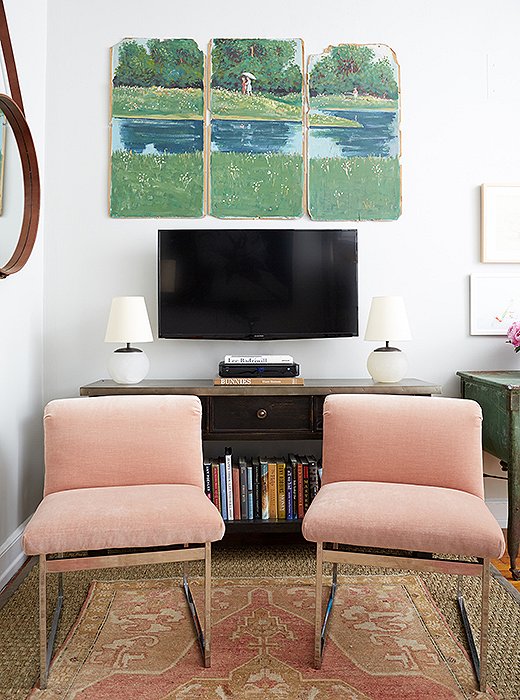
A slender console replaced a bulky armoire. “My biggest surprise was how removing the bigger storage pieces allowed for more targeted stowing and more living space,” says Cole. The triptych was found on a Boston side street.
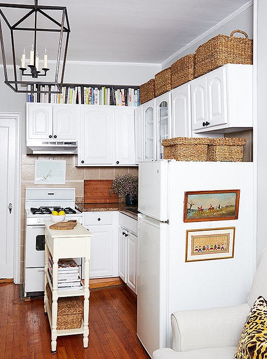
Alex found clever ways to display Cole’s growing art collection—including the side of the refrigerator. “It disguises the appliance that sits right next to the sofa,” says Alex. “Now it feels softer and more a part of the living arrangement.” He used adhesive hooks to hang the landscape prints.
Divide and Conquer
“I wanted the kitchen to feel as separate from the living room as possible,” says Alex. “Once the living room was scaled down and the rugs were placed, there was a clear delineation.” Being a rental, there were limitations to renovation work. So Alex focused on cleaning up the areas and updating the dated maple cabinetry with a fresh coat of white paint. New hardware gave the fronts a custom look for a fraction of the price.
To up the storage ante without adding furniture, Alex used deep woven baskets: “They’re great at hiding anything and make for a clean look on top of cabinets and the refrigerator.” A slim “island” was added to separate the front door from the kitchen. It also serves as a surface for prepping dinner or serving drinks when friends drop by. “The island is actually a small console table that had the right height of 36 inches,” says Alex.

I discovered that there was actually more room for my things by getting rid of the pieces I had bought just to put things in.
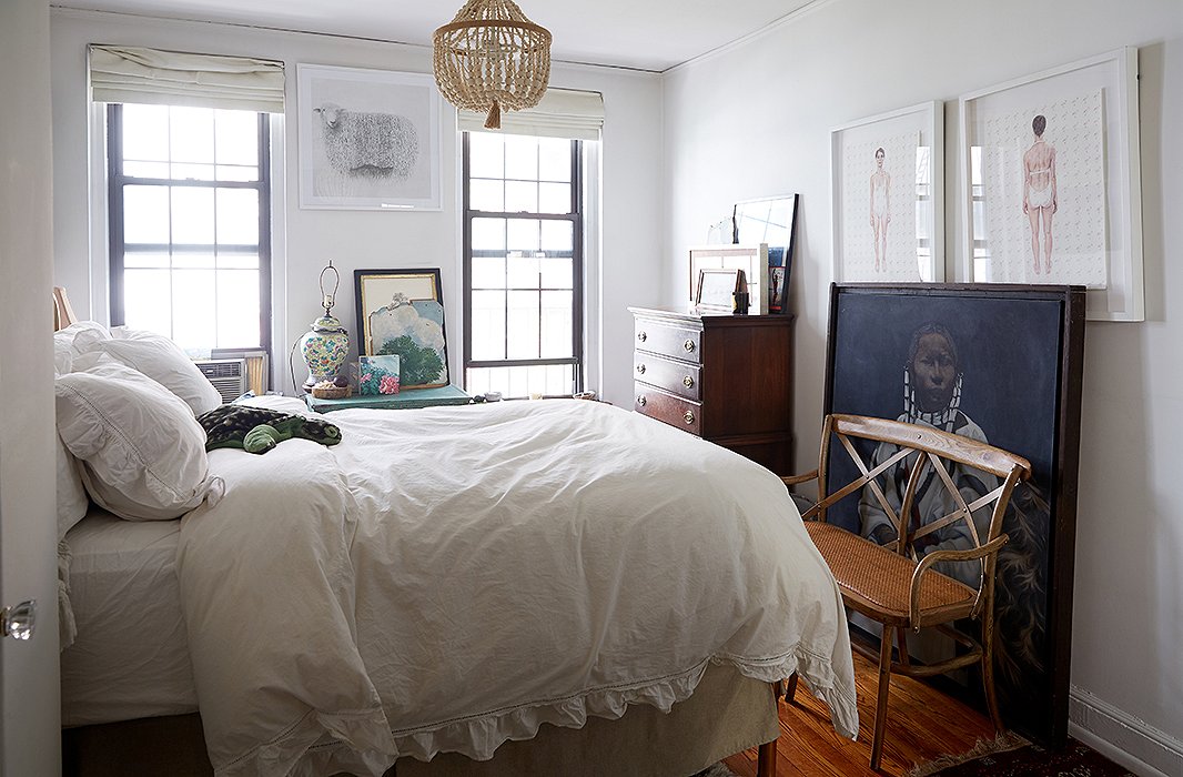
The Bedroom Before: Straight to Bed
The focal point of Cole’s bedroom (before and after) is her antique brass bed. “I know it’s a little big for a studio space,” she says, “but I just refused to give it up.” Alex did not put up a fight. “The bed was incorporated into the design because she loved it. She’s the one sleeping there, after all,” he says. They did agree to ditch an imposing wardrobe that took up a large corner.

This [bedroom] did not represent the person that I wanted to be and the life that I wanted to live.
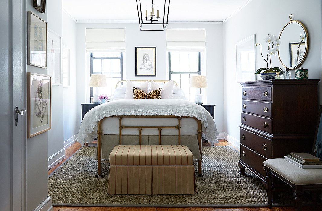
Reconfiguring the bedroom layout gave the space depth and a strong style statement. “Before, you couldn’t see the amazing bed through the clutter. I wanted to give Cole’s great pieces a stage to shine,” says Alex, who dressed the room in neutral shades: beige, white, and black.
Soothing with Symmetry
“Rearranging the room allowed us to make the bed the central focus,” says Alex. “Now it aligns well with the windows, and there’s room for two tall nightstands on either side.” Symmetry has a calming effect on any room, especially one you sleep in. With the large wardrobe gone, Cole and Alex edited down her clothing to fit inside her closet and in rolling baskets under the bed. The finished space reads clean, calm, and finished. “I even sleep better in the space,” says Cole.
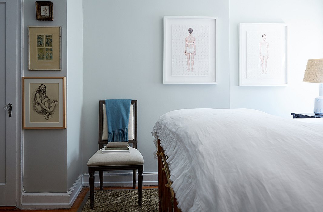
“I have a classic style, but it definitely has a little wink to it,” says Cole. “Some bright colors but all within the same family. Not too much pattern. I let the art speak. I like things to be soft and cozy but not too gender-specific.”
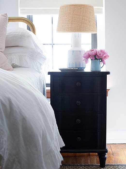
Cole loves the addition of the nightstands. “I call these my gift with purchase,” she says. “They’re tall and have three deep drawers. And with the lamps, they make such a pretty little vignette.” A shallow tray is the perfect perch for earrings or hand cream.
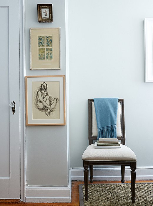
A sliver of wall becomes a pixie gallery. The charcoal drawing is by Virginia artist Lincoln Perry. The graceful Swedish-style chair plays three roles: office chair, guest seating, and solo reading spot.
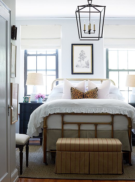
“I learned a lot about scale during the process,” says Cole. “The huge lanterns first seemed like too much. But they give such incredible light and are now my favorite design element.”
Letting There Be (More) Light
“If there was one true game changer, it was the lighting,” says Alex. “It was very dark, with only two windows at one end of the apartment.” In addition to accent lamps, Alex installed large matching pendants in each room. The black-iron fixtures cast an inviting glow and add a bit of drama without taking up floor space.
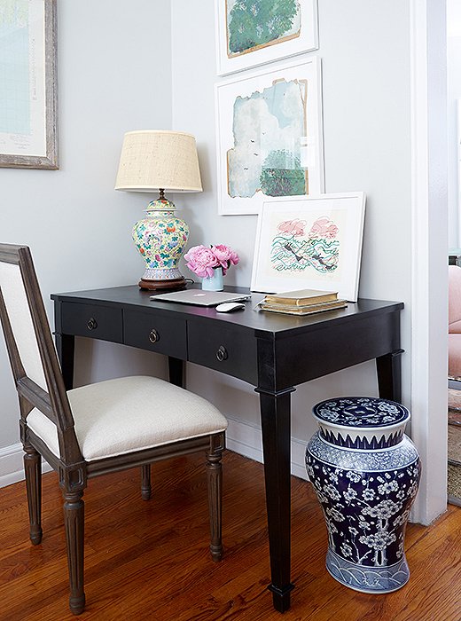
“I love working here. I originally was fighting to keep a filing cabinet underneath, but in the end, I didn’t need it,” says Cole. “I’m really pushing to keep things digital so that the space stays lovely.” The artwork is by Sun Valley, ID, artist Maggie Shafran.
Working a Desk Set
Not a square inch was wasted. That empty bedroom corner where the wardrobe used to live? Alex created a petite home office. “The key to living in a small space well is editing what you have to create opportunity,” he says. The classic desk is accented with a ginger jar lamp and more artwork.
Enlisting Helping Hands
Cole found a few invaluable resources that saved her time and stress as her studio was being turned upside down:
AptDeco is a service that picks up and then sells your unwanted decor on its online marketplace.
Paintzen is a website that provides access to professional paint services in your area. You type in the details of your job and wait for your quote. “They were awesome to work with. It’s great if you have a deadline to meet,” says Cole. “They came and painted the kitchen cabinets in an afternoon.”
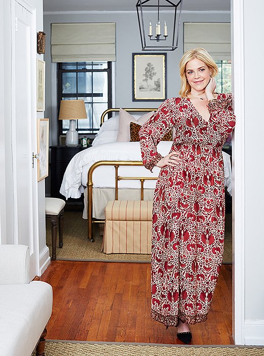

The experience has changed my behavior because I’m now living in my apartment. Before, it was just a lily pad where I would do a quick stopover. I’m so happy to come home. It’s truly my place in the world. Maybe I should say it’s been like a complete life makeover.

where did the nightstands come from?? LOVE
Can anyone tell me where the Glass Coffee table is from?
I’m wondering the same!
Are these size small or medium Darlana Lanterns…. they run rather large and I ordered 2 mediums, just curious what these are?