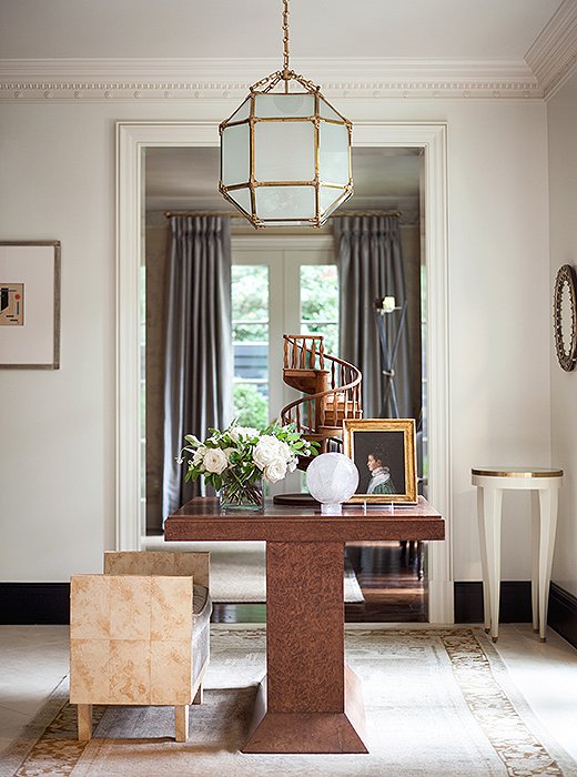
Below a 1940s French lantern, a burl-wood table anchors the light-filled entryway. Suzanne painted the baseboards a dark charcoal to define the architectural space.
Suzanne Kasler was happily settled in her home in Atlanta, where she had lived since moving with her husband and daughter from the Midwest in 1995. Until a few years ago, that is. That’s when the acclaimed interior designer—known for creating architecturally focused interiors with a strong European sensibility—found herself itching for a change. “I was restless,” Suzanne says. The decorating was done, meaning no more opportunities to experiment, to rearrange, to create. And so the search began for a new blank canvas.
After several years of house-hunting came up short, Suzanne took a second look at a 1930s Federal-style house she had initially dismissed. An unassuming red brick structure, the house had been stripped of much of its period character during a previous renovation. But the location—an older, tree-lined street in Atlanta’s Buckhead neighborhood—was exactly what Suzanne and her husband had been seeking. The couple took the leap, and with the help of architect William T. Baker, Suzanne set about transforming the lackluster house into a Regency-style gem. Refined yet utterly welcoming, the home is filled with pieces collected over years of travel and experience. “I love coming home every day,” Suzanne says. “This house really does reflect a lot about my family.”
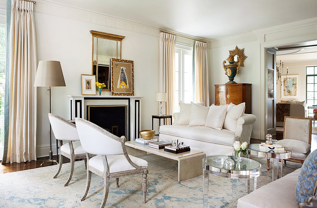
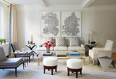
Throughout the home, a restrained palette unifies a mix of styles and eras. Lucite tables, antique Swedish chairs, and a French Moderne-style coffee table form an asymmetrical yet balanced arrangement in the living room.
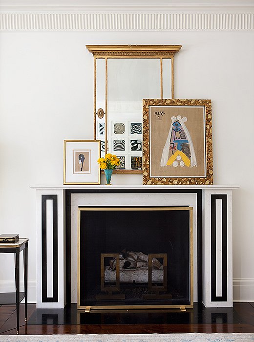
The living room mantel, one of three added to the house, was modeled on an 1824 drawing in the archives of Sir John Soane’s Museum. Paintings casually leaned on the mantel are easy to swap out when the mood strikes.
Getting the Fundamentals Right
Suzanne is known for placing emphasis on the architecture of a space, so naturally her first order of business was restoring the home’s classical character. She installed not one but three antique mantels, creating strong focal points in the living, dining, and family rooms. She also added elegant moldings and trims throughout the home, instantly elevating each space and establishing what Suzanne calls the “architectural envelope” of the home: “Once you get the architectural envelope right, then you can start adding the layers that make it more personal”—the paint colors, the rugs and window treatments, and last, the furniture and accents.
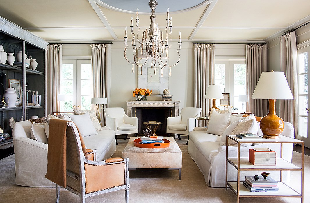
Suzanne added these geometric moldings to the family room ceiling, giving the space more of a presence. Painted ice blue, the center circle sets off the room’s orange accents.
Starting from Neutrals
Suzanne doesn’t hide her affinity for neutral hues. “White is a signature for me,” she says, and while some clients may prefer bold color on the walls, in her own space Suzanne was free to indulge her inclinations. With few exceptions, she swathed every room in tones of pure white or cream. All that white could lean stark, but paired with strategically chosen accent colors it instead feels utterly soft and enveloping.
“That’s how I love to use color,” Suzanne explains. “Lots of white on the architectural part of the house, and then hints of color in just components of it. It’s amazing how the color almost shows up stronger against the white.”
This neutral foundation formed the perfect canvas for Suzanne’s eclectic mix of furnishings and art, which spans Swedish Gustavian, Russian modern, 18th-century French, and everything in between. Suzanne doesn’t worry too much about period—in fact, for Suzanne this mash-up of styles and eras is what gives a home character. “I like houses to look collected, not decorated,” she says. “It’s being able to mix the things you find—that’s what creates style.”
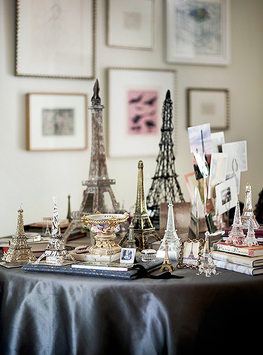
An avowed Francophile, Suzanne has amassed a collection of Eiffel Tower figurines over years of travel. Together they give pop and personality to the upstairs landing.
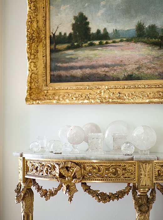
While most of her furniture leans more tailored, Suzanne mixed in a few ornate elements for contrast. Case in point: this gilded console, which houses her collection of rock-crystal spheres.
Living with What You Love
Suzanne travels often and is an avid collector. She also casts her eye widely: A beautifully designed invitation, a drawing found at the flea market, even a kitschy figurine picked up at the airport—anything can be collection-worthy if it speaks to her sensibilities. “I like having that ability to mix high and low,” she says. “I always say if you see something you love, just buy it because you’ll find a place for it.” Once home, she puts these collected mementos on display, where they serve as daily reminders of treasured experiences.
Meshing Suzanne’s love of collected objets with her home’s more minimalist, clean approach took some thoughtful arranging. “If you put the pieces around the whole house,” she says, “it would be too much stuff.” Instead she places like objects together, which both magnifies their visual impact and keeps the house from feeling too busy. “If you put a collection together it takes on a specialness and looks more sophisticated.”
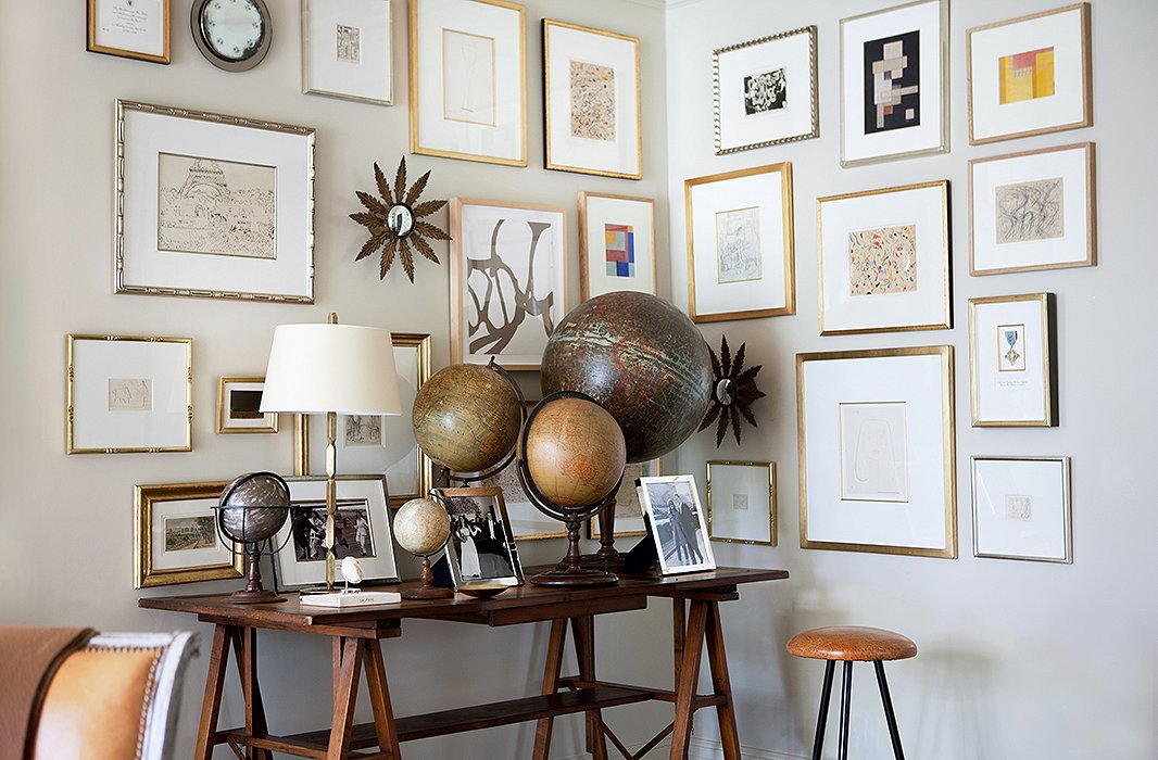
An ever-expanding gallery wall fills a corner above Suzanne’s collection of vintage globes. “I hang the frames in a random pattern because I’m always adding to it! A constant theme has been collecting art and then finding enough walls to hang it on.”
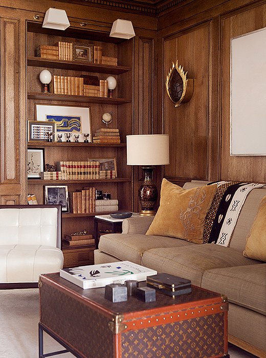
A vintage Louis Vuitton trunk-turned-coffee table nods to Suzanne’s love of fashion, while its rich hues add to the library’s cozy feel.
Dialing Up the Comfort
Suzanne’s designs are often called “pretty,” and it’s an adjective she doesn’t shy away from. That said, she gives as much weight to the comfort factor of a space—how her clients will actually live in the finished rooms—as she does to beautiful antiques and pleasingly arranged vignettes. “That’s my biggest thing about houses,” she says. “I love things to be really comfortable—and they can still be beautiful.” In her own home, comfort meant incorporating plenty of plush seating (including her own upholstery designs for Hickory Chair) in every room, and orienting furniture around relaxation and conversation.
It also meant including at least one ultracozy room. Paneled in quarter-sawn oak, Suzanne’s library is a departure from her home’s white-on-white scheme. It’s also the perfect spot to curl up with a book or catch up on TV shows. Even here, however, Suzanne brought in her signature hue: White leather slipper chairs and a minimalist painting pop against the rich wood, a “classic color tone that’s very timeless.”
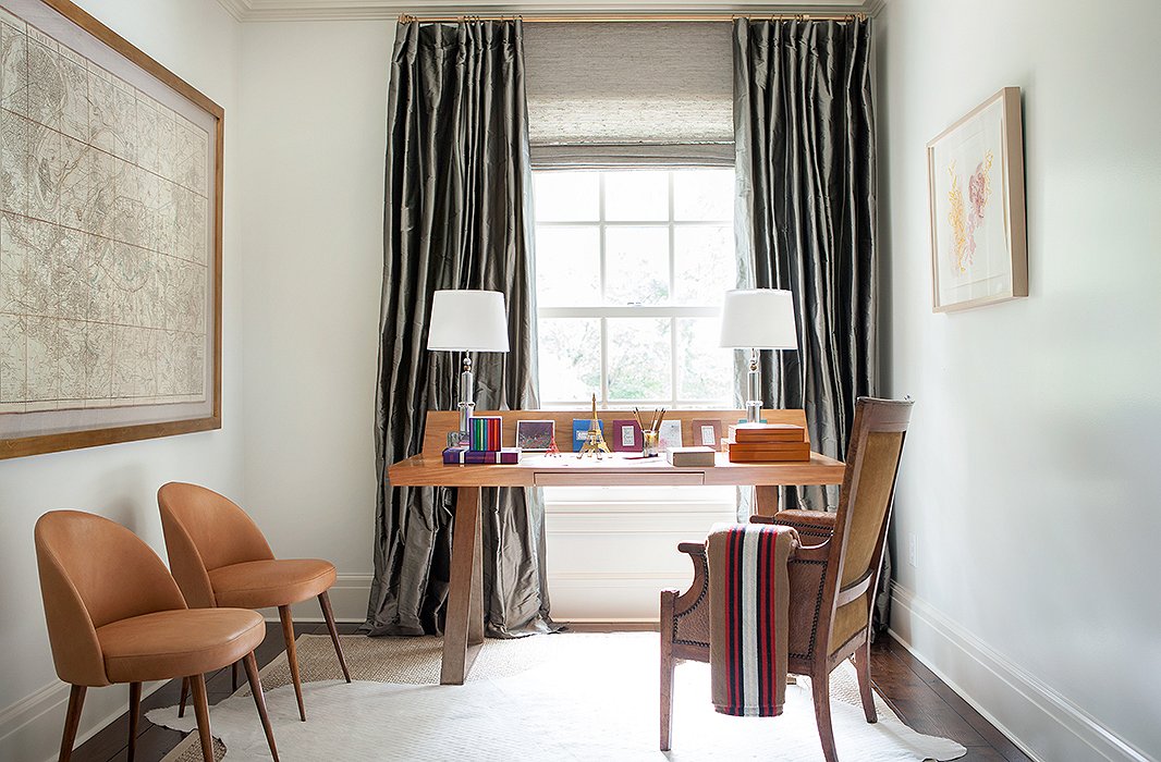
Illustrating her flair for mixing styles, Suzanne combined a sleek, modern desk, a French-style armchair, and a hide rug in a quiet upstairs nook.

That’s my biggest thing about houses. I love things to be really comfortable—and they can still be beautiful.
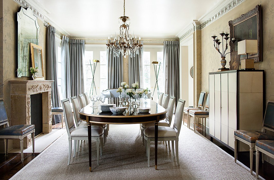
The dining room sparkles, thanks in part to mirrored molding that runs around the cornice line. Suzanne used a metallic paint on the ceiling to capture even more light.
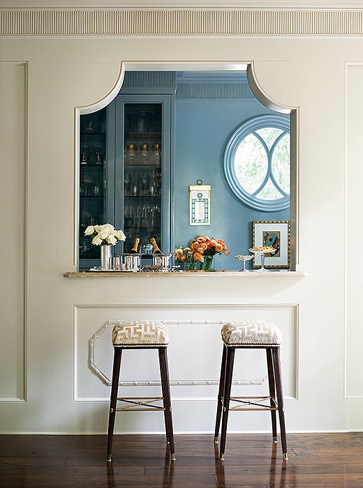
Guests gravitate to the butler’s pantry and bar, which has a jewellike appearance when glimpsed from the dining room.
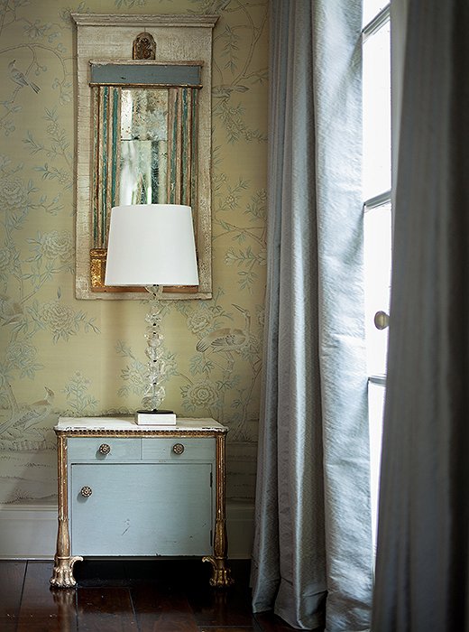
Suzanne chose this custom-colored de Gournay wallpaper for its soft sisal hue—”almost a no-color,” she says. Silk curtains in platinum blue tie in visually to the butler’s pantry.
A House for Hosting
The home is equally geared for entertaining and for downtime. The foyer opens directly onto the dining room, and guests are naturally drawn into the light-filled space—until they catch sight of the bar and the butler’s pantry, lacquered in a lush platinum blue. Entertaining here, Suzanne says, “has been better than I imagined because of the way the house flows.” When she and her husband throw parties, hors d’oeuvres are stationed on the dining room table, and everyone congregates around the bar area.
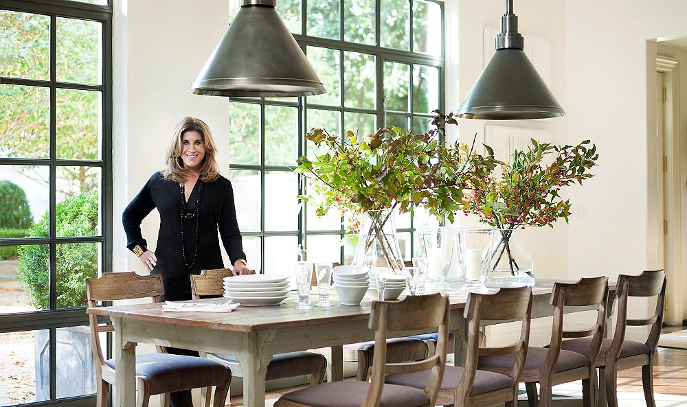
But if there’s one thing Suzanne has learned from years of hosting, it’s that everyone inevitably ends up in the kitchen—“even if you think you don’t want them to!” For that reason, she always recommends tying the design of a kitchen in with the rest of a home’s decor. So it’s no surprise that white features prominently in her own kitchen, where an expansive marble-top island provides a spot for guests to gather. Opposite the island, an antique Swedish table seats a crowd. “It’s a great hangout place,” Suzanne says, especially with the iron windows open to the backyard beyond. “You really feel so connected to the outside—like the outdoor space is a kind of room.”
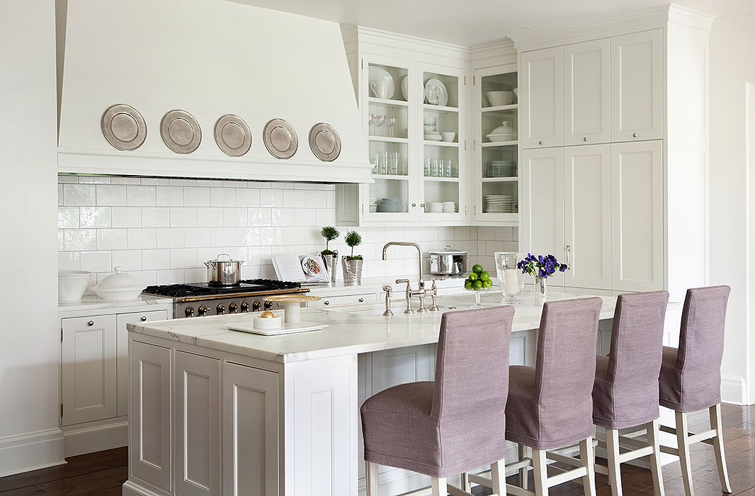
Crisp and clean in bright white, the kitchen is the hub of the home. Slipcovered barstools designed by Suzanne add softness to the marble-top island.

Everyone will hang out in your kitchen, even if you think you don’t want them to!
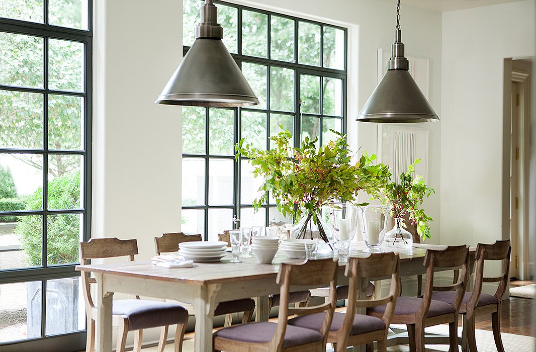
Sunlight pours into the breakfast area through steel casement windows; their industrial feel is carried through to the pewter pendant lights.
Taking an Easygoing Approach
If the thought of entertaining amid all that white makes you nervous, you’re not alone. Often when her clients first move into their new spaces, “they are kind of paranoid about that!” Suzanne says. The key is changing your perspective: Spills mean character, not ruin. “Things will get worn or stained, but it really ends up being the best thing. Houses just feel much better as they get lived in. That’s really what we all want—for people to live in all the rooms of a home.”
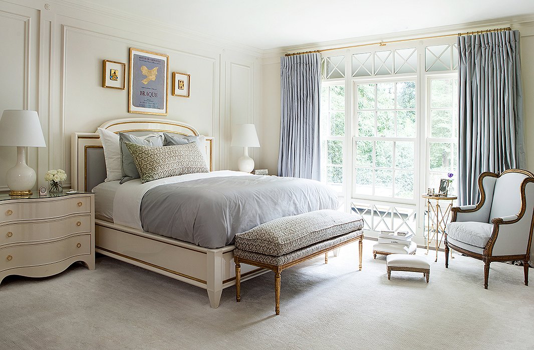
Touches of gold are woven throughout Suzanne’s bedroom, from the detail on the bed to the base of the table lamp to the ornate frame of the upholstered bench.
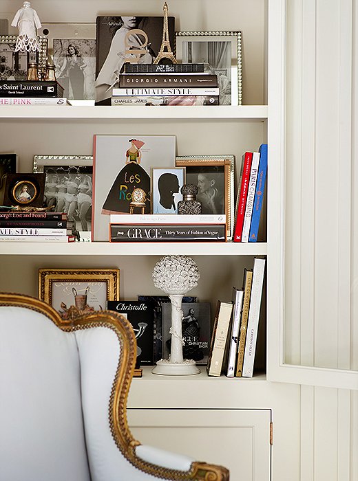
Behind glass cabinet doors live some of Suzanne’s favorite things, unified by a glamorous palette of black, white, and gold.
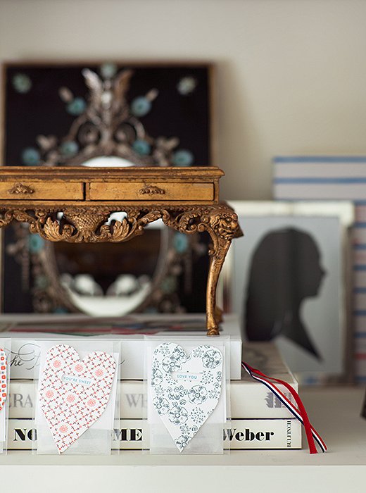
A miniature gilded desk, part of a larger collection of model furnishings, sits atop a stack of books in the bedroom. The silhouette was made in Paris and depicts Suzanne’s daughter, who gave her the two heart-shape cards.
Keeping Calm
Among a wealth of restful rooms, Suzanne’s bedroom is perhaps the most serene of all. The blue accent color initially stemmed from the print above the bed, a Braque poster unearthed in an antiques shop in France. Carried through to the silk curtains, the bed linens, and the upholstered armchair, the hue casts a cool yet comforting air.
Facing the bed, a wall of glass-fronted bookshelves houses some of Suzanne’s favorite finds: books on art and fashion, framed photographs and mementos, small-scale objets. The glass doors are a savvy design element; while they keep the contents on display, they create an overall look that’s polished, not cluttered. “I love having these little pieces, but I found that by putting them behind glass cabinet doors they look more tailored—a little bit crisper and not so decorative.”
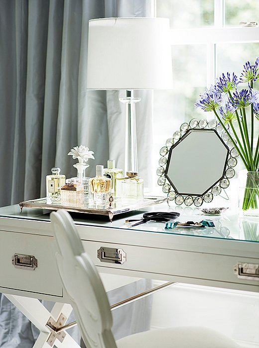
A desk designed by Suzanne for Hickory Chair stands in as a dressing table in the master bath.
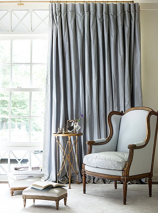
Silk curtains and an upholstered bergère create a restful corner in shades of pale blue.
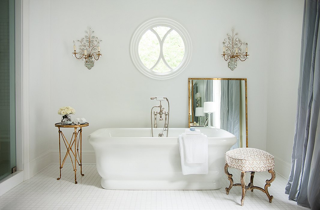
In the master bath, an antique Russian bench and a bronze-doré table add patina to the clean white surroundings.
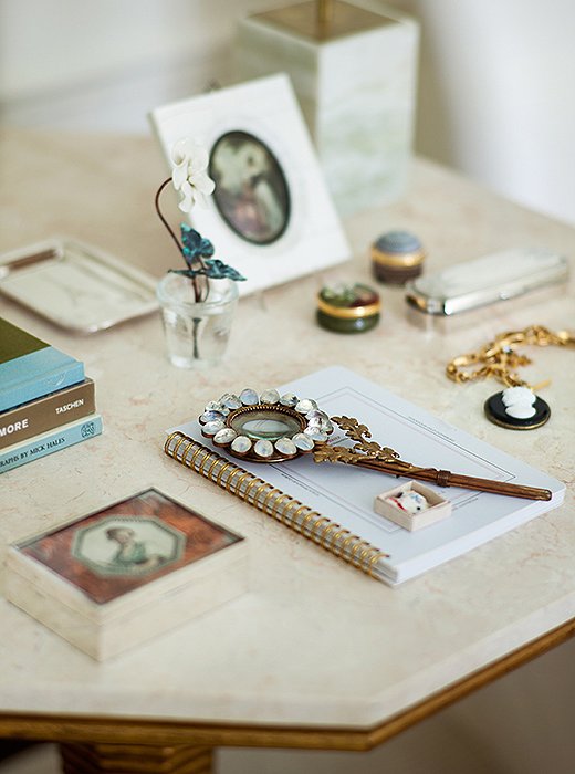
Suzanne’s eye for composing vignettes comes through at every turn, including this delicately arranged side table.
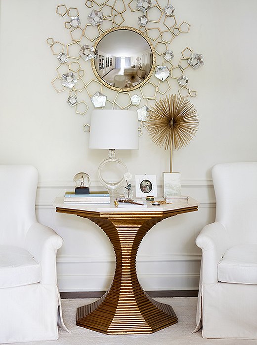
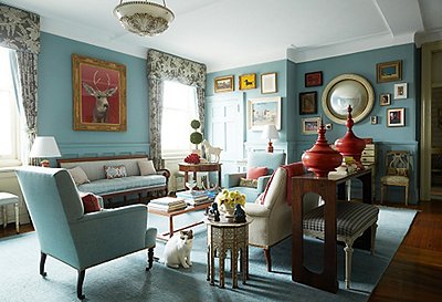
Repeated curves—in the round mirror, the pedestal table, the sputnik sculpture, and the lamp—give this bedroom seating area an interesting visual rhythm.

Houses just feel much better as they get lived in. That’s really what we all want—for people to live in all the rooms of a home.
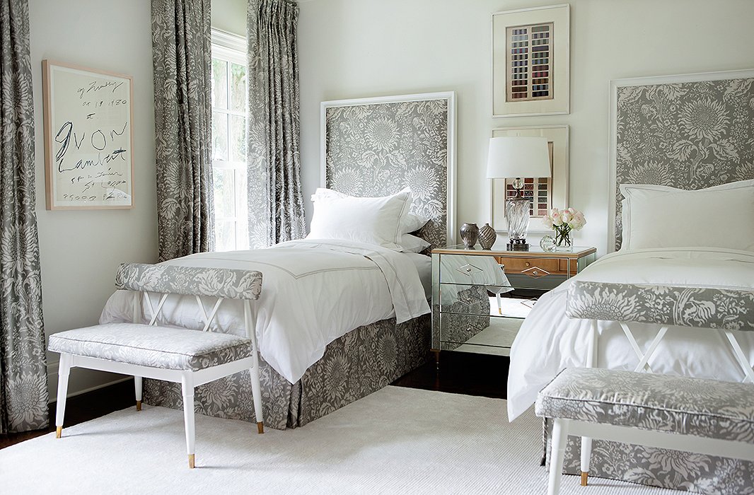
Taking cues from French design, Suzanne repeated a patterned fabric (by Brunschwig & Fils) throughout this guest room. The ribbon artwork above the nightstand comes from Suzanne’s own collection for Soicher Marin.
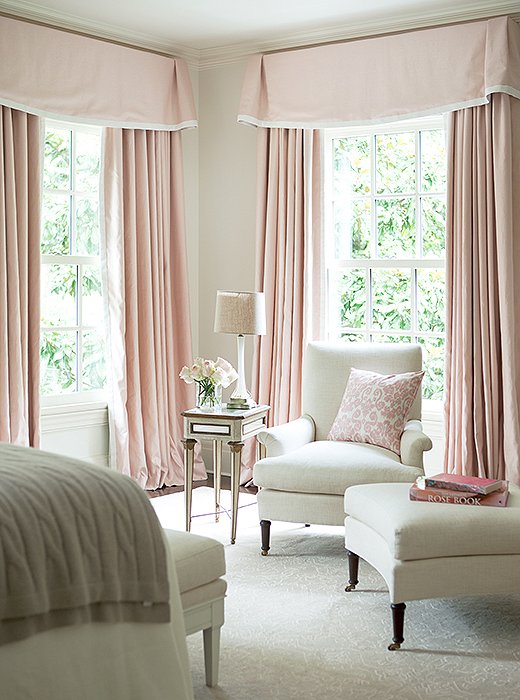
What guest wouldn’t want to curl up in this sunny corner? Swathed in white and shell pink, the room is a dreamy confection.
Making Room for Guests
Southern hospitality rings true for Suzanne, who relishes the ability to host overnight guests. “It gives a home more personality,” she says. While grounded in white, each guest room has a distinctive accent color: the palest pink in one, a silvery gray in the other. In both spaces, she’s turned up the comfort factor with plush upholstered seating and soft area rugs.
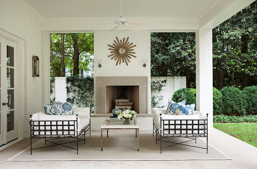
“I love having a house that interacts with the outdoors,” Suzanne says. On the terrace, the furniture’s strong lines play nicely off the sunburst mirror and round boxwood hedges.

You really feel so connected to the outside—like the outdoor space is a kind of room.
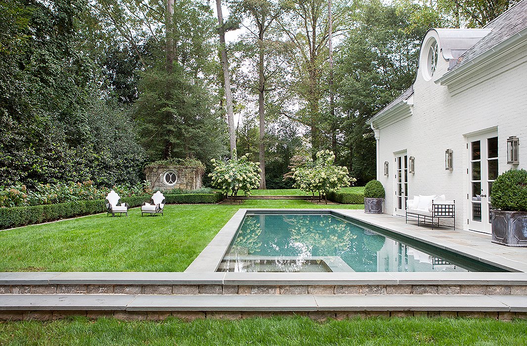
In the backyard, boxwoods in clean, classic shapes complement the home’s Regency-style exterior. Suzanne found the vintage wrought-iron armchairs at a flea market in Avignon, France.
She’s kidding herself when she says her house doesn’t look “decorated”. It most definitely does! And to my eye, not particularly comfortable. I wonder which room she really DOES live in.
only in my dreams or are they your dreams