When Will Taylor and husband Toby Taylor-Willis purchased their first home in the sleepy Long Island town of Bellport, they knew they had (almost) exactly what they wanted: a two-bedroom gable-front house surrounded by plenty of grass, and situated just under two hours from New York City, where the couple rent an apartment and run the lifestyle blog Bright.Bazaar. For some time they’d been looking for a weekend escape that could accommodate friends and family. Move-in ready, but not to their taste, they commanded a six-month renovation that culminated in a new kitchen, floors, and fewer walls. With all the necessary structural changes in place, they turned to One Kings Lane Interior Design to help them decorate every inch to match their dream vision.
Finding the idea of furnishing an entire house somewhat daunting, Will and Toby were glad to have One Kings Lane designer Sally Gotfredson on board to guide them through the process. “We were keen to create a space that would feel like a tonic from the fast pace of city life,” says Will. Downstairs, that translated into a classic palette of blue and white with nautical twists like a rope-wrapped chandelier, a sailing print, and pendants with a porthole-like effect. Upstairs, a neutral scheme was accented with green and embellished with luxe touches, including tufted velvet and brushed brass. Both Toby and Will were adamant about having the feeling of a beach house—Bellport is located by a bay that buffers it from the Atlantic—but one that made sense year-round. “It’s really nice to finally put down roots in a place that feels like home,” says Will of the finished project. And you can see it in full, with a few stylish takeaways anyone can put into practice, below.
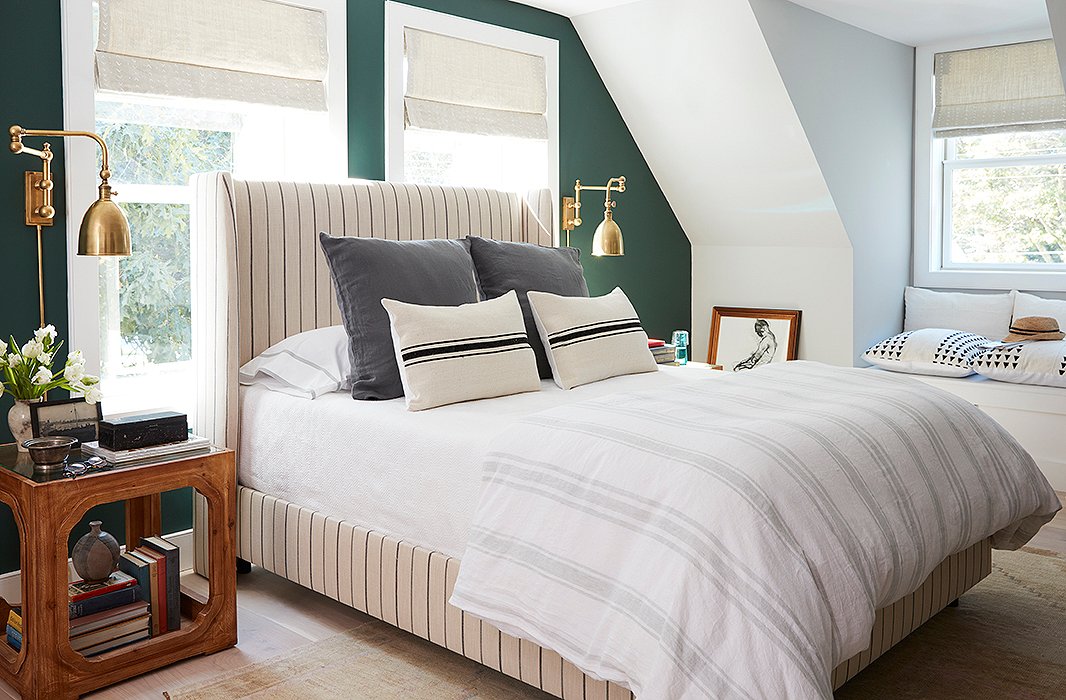
In the master, an upholstered bed was placed in front of double-hung windows to maximize the room’s layout. Brass swing-arm sconces lend the arrangement a sense of place and cast an unobtrusive downward glow when on.
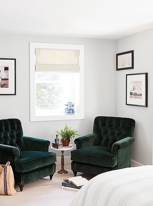
A soothing spot in the bedroom’s niche. Black-and-white prints of tennis players hang behind a duo of velvet green armchairs by Miles Talbott. Between them sits a brass side table with a marble top just big enough to hold two cups of coffee.
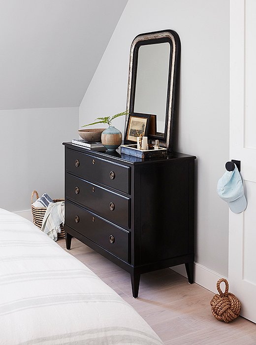
An antique mirror adds weight and character to a dresser designed by One Kings Lane.

This is a place we want to come to and escape our lives in the city.
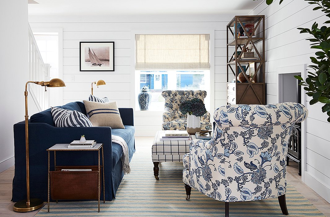
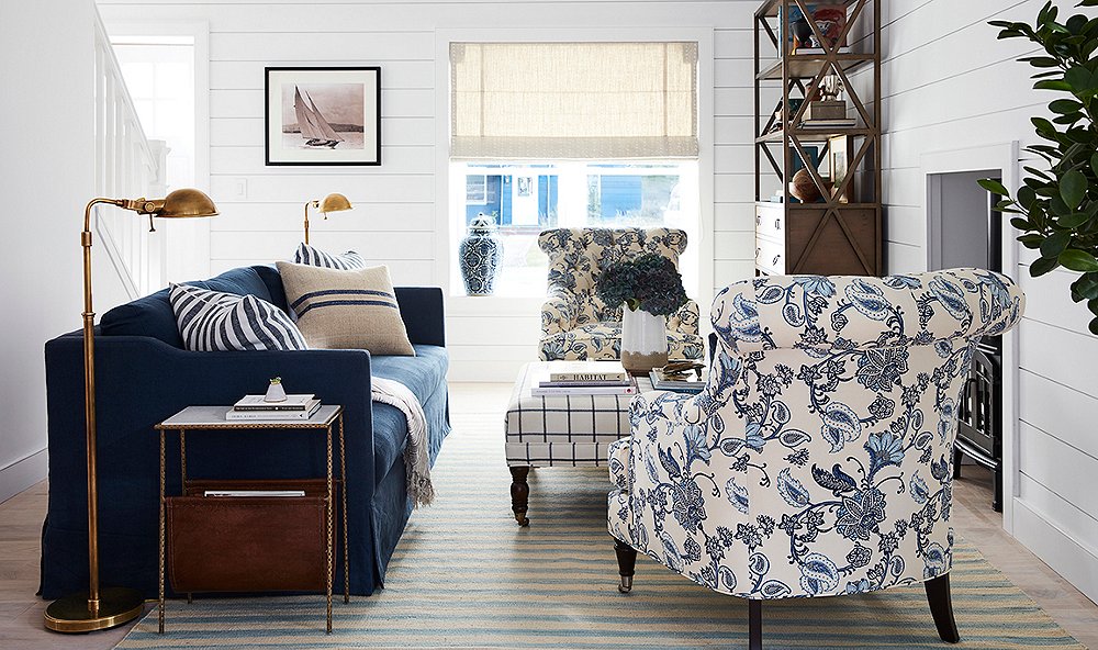
Brass pharmacy lamps by Ralph Lauren Home flank a Brownstone sofa in indigo linen. “Will was drawn to very classic yet masculine pieces,” says Sally. Patterned chairs by Barclay Butera soften the look, and an ottoman by Miles Talbott serves as extra seating when neighbors pop by.
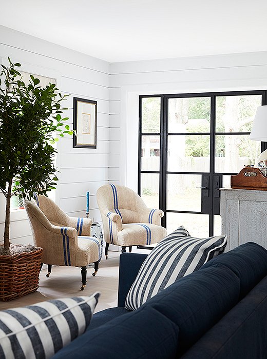
Vintage armchairs with a French ticking stripe can be rolled elsewhere if needed.
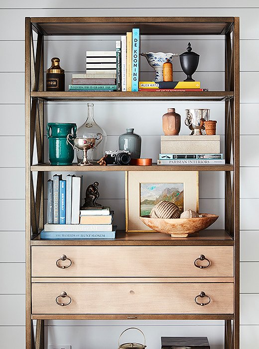
Perfectly imperfect: The living room’s étagère houses a collection of things new and old.
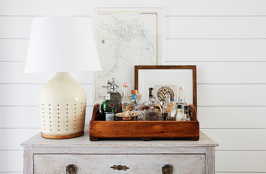
A Ralph Lauren Home lamp sits atop a vintage chest with an oversize tray transformed into a bar. “It’s a move that allows you to take the party wherever it needs to be,” Sally says, and encourages guests to help themselves while you’re busy hosting. A map, picked up by Will on his travels, hangs on the wall behind.
Designer Tips for a Similar Look
Float your layout. A key component of Will and Toby’s living room look (and functionality) was keeping furniture away from walls. The couple worked with an architect to reconfigure the room to suit a wood-burning stove, which Sally used as a focal point. “Keeping the seating centered around the stove allowed for spatial flow and prevented things from feeling crammed,” she notes. Sally was careful to keep the scale and proportion of all the pieces in mind, noting that “if the sofa had been an inch or two deeper, the balance would have been totally off.”
Go round. In the kitchen, a round dining table was the only way to go. “They make for forgiving seating charts, great conversation, and an easy way to share ice cream after a meal,” says Sally. If the style shown here doesn’t strike your fancy, rest assured the right one is out there for the taking. From something midcentury with chic skinny legs to Gustavian drop-leaf beauties, the round table knows no end.
Think nautical-ish. Boats are great, but you don’t want it to appear as though you’re actually living on one. Have your blue-and-white stripes and brass anchor, but temper such strong nods to life by the sea. Tufted chairs with botanic prints, vintage silver, a large ginger jar—these are the details that keep away the kitsch.
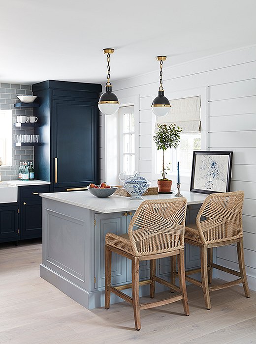
Kitchen stools offer a mod touch with a nautical twist, pairing perfectly with the clean look of the kitchen, which was designed by Will.
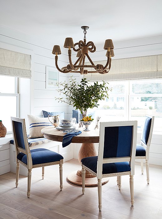
Toby and Will had a banquette installed during the renovation, a decision they feel “encourages guests to linger.” Beneath a rope-wrapped chandelier by Jamie Young, a round pedestal table and color-blocked velvet chairs provide just the right amount of comfort and formality.
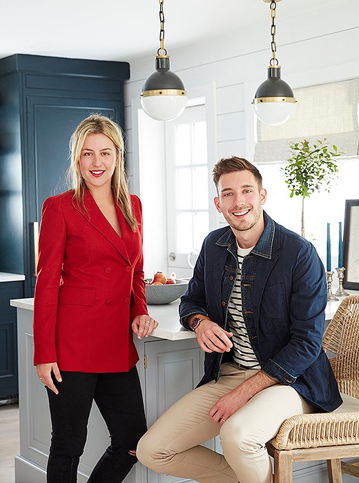
The dream team: One Kings Lane designer Sally Gotfredson and lifestyle expert Will Taylor.

My home is an expression of my personal style because it has an upbeat and playful energy about it: lots of pattern on pattern, and of course color plays a strong part.


Join the Discussion