Every home has one of what Zanna Roberts Rassi calls a “slashie”: a space that’s a little bit of everything but nothing in particular. For Zanna, senior fashion editor for Marie Claire and co-founder of Milk Makeup, it’s her apartment’s “bedroom-slash-playroom-slash-sitting room-slash-I don’t know!” After living in their Manhattan loft for two years, Zanna and husband Mazdack (known to friends simply as Rassi) were stumped by this multipurpose space, used by their twin daughters as a playroom and also as a default guest bedroom.
“It was one of those rooms we couldn’t really figure out,” Zanna says. “It was just a hodgepodge.” It was also a catchall space for pieces that didn’t fit elsewhere in the couple’s home, including Moroccan rugs and pillows picked up on travels, the girls’ artwork haphazardly stuck on the walls, and “baskets and baskets filled with toys,” Zanna says. “And as we all know, kids’ toys aren’t the most attractive things sometimes. It was like an explosion of Disney in there!”
To help transform this problematic space into a functional, beautiful retreat, Zanna and Rassi called on One Kings Lane Interior Design. The new design needed to suit Zanna’s NYC-by-way-of-England style, the couple’s two-and-a-half-year-old twins, Rumi and Juno, and the girls’ doting grandparents, who visit often. Mission impossible? Not quite—read on to see how we pulled it off.
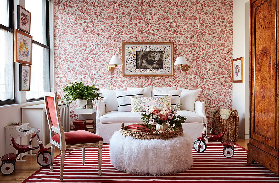
“It’s a color pop that I was not expecting,” Zanna says of the room’s new red-and-white palette. “I would never have gone for it, honestly, but it works so well.”
Nailing the Two-in-One
To achieve the dual function of guest room and playroom—in an apartment-size setting, no less—One Kings Lane designer Sally Gotfredson knew that each furniture piece had to work extra hard. “You can’t fit much in there, so I wanted the two pieces that were really the stars of the show to be superfunctional,” Sally says of the room’s anchors, a chic white sofa bed and a vintage armoire. As for the look of the space, Zanna’s one request was color. “It was fun and bright, and that’s one of the things I wanted to keep,” she says. “I wanted to make it more curated color as opposed to this color explosion.”
Guidelines in hand, Sally sought out inspiration in the existing space itself: namely, a pair of red tricycles and a wildlife-theme work of art by Peter Beard, a gift to the couple that Rumi and Juno adored. “They look at it and pick out the animals, and they love the lion—it’s got a name,” Zanna says. To bring the whole scheme together, Sally picked a playful wallpaper. Filled with birds, flowers, and butterflies, it takes the strong red hue to a light and airy place. “It’s almost like a neutral,” Zanna says. “It doesn’t jump out at you—it’s really restful on the eyes in a way. And there’s nothing like a wallpaper to elevate a room.” A red-and-white palette filled with whimsical, fauna-focused motifs: It’s an unexpected approach for sure, but one that checks every box for the Rassi family.
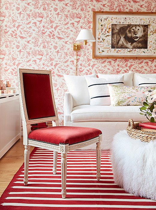
This red-and-white cotton dhurrie “ties the whole room together,” Zanna says. “And it’s one of those fabrications that’s going to be easy to wash as well, which if you’ve got two toddlers you’ve got to think about.”
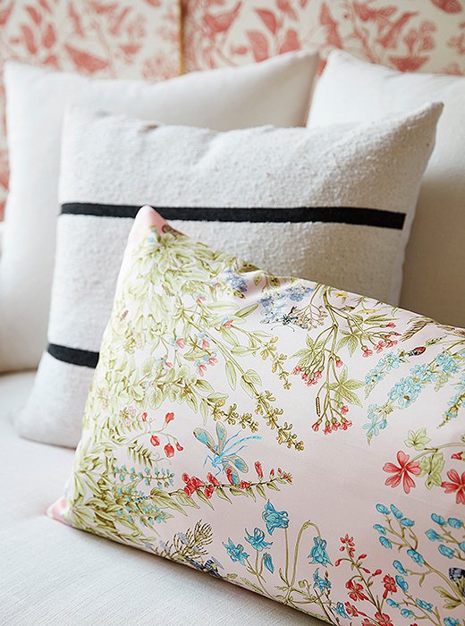
A mix of graphic stripe and floral-print pillows breaks up the room’s red-on-red color scheme—and makes the skirted sofa even cushier.
Keeping It Polished
Because this room is adjacent to the apartment’s main living space, separated only by a sliding door that mostly stays open, it had to feel like a fully integrated part of the home. To ground the space in grown-up style, Sally brought in luxe touches that still manage to feel kid-friendly. The Louis XVI-style chair is sumptuous, yet its velvet upholstery is surprisingly easy to clean. Brass sconces add a formal note while freeing up surface space. A pretty floral pillow makes the sofa even more inviting. And a vintage dhurrie rug (unexpectedly chic in red and white) brings everything together. “It’s playful but superluxe at the same time,” Zanna says—just right for the fashion-forward young family.

The wallpaper is almost like a neutral. It doesn’t jump out at you—it’s really restful on the eyes in a way. And there’s nothing like a wallpaper to elevate a room.
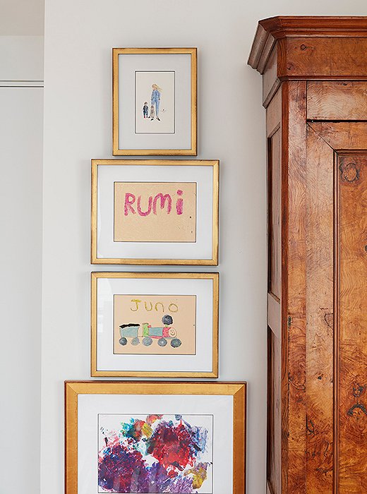
A column of gold frames in varying widths serves as a rotating mini gallery beside the armoire.
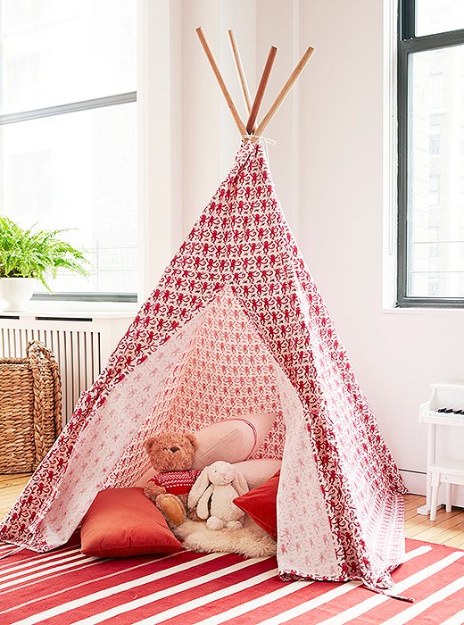
Inside the tepee, a small sheepskin rug and a pile of red-and-white pillows create an extra-soft landing spot.
A Place for Play
Sally made sure that playtime was still a priority—albeit in a decidedly chicer way this time around. No more kids’ drawings stuck haphazardly on the walls: Simple gold frames elevate Rumi’s and Juno’s artwork to gallery level—and the drawings can easily be swapped out as new masterpieces are created. A cloth tepee is a kids’ blanket fort gone glam, and in a playful monkey print, this one feels right at home amidst the room’s wildlife motifs.
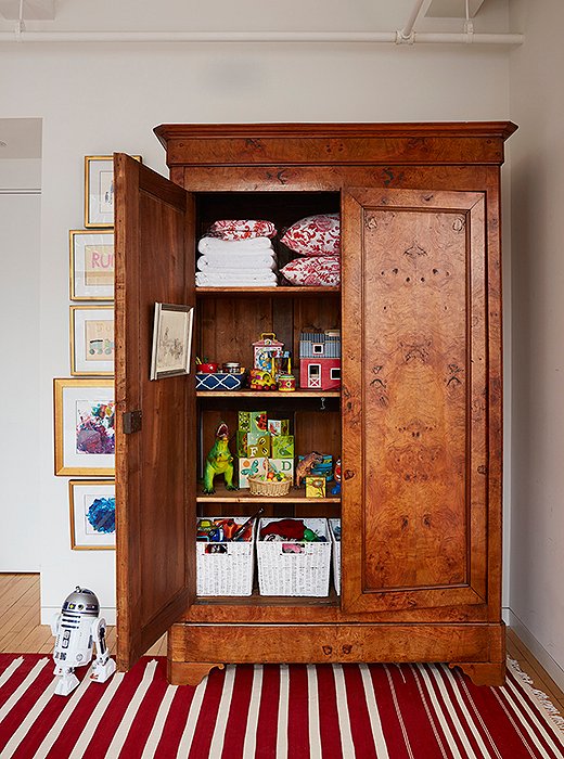
The antique armoire is “larger than life,” Zanna says. “It’s something out of The Lion, the Witch, and the Wardrobe.” If nothing else, its storage superpowers are certainly magical.
Storage, Streamlined
To solve the family’s clutter woes, Sally skipped the open-shelving trend. “It’s just too much work to have open storage. Everything you own has to be good-looking, and that’s just not a reality for anyone—especially when you have two little kids,” she says. “I am all about as much concealed storage as possible. It’ll make your apartment feel so much cleaner.” She opted for an antique armoire, where linens and toys can be neatly stashed behind closed doors.
Zanna’s verdict? “It’s magical. It’s probably the prized piece in our apartment at this point!” Besides its clutter-corralling prowess, it’s also gotten the girls into tidying—perhaps the most magical feat of all. “Maybe it’s because it’s more organized and they like the action of putting things in baskets,” Zanna says. “It has organized everyone in a way, magical armoire that it is!”
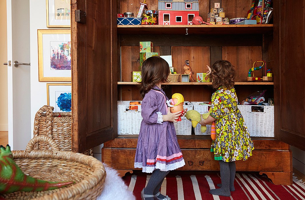
A row of baskets on the bottom shelf keeps favorite toys at toddler height. And the armoire has been fun for the grown-ups too: “Rassi and I are both organizing freaks, so it’s really nice,” Zanna says. “The label-maker came out.”
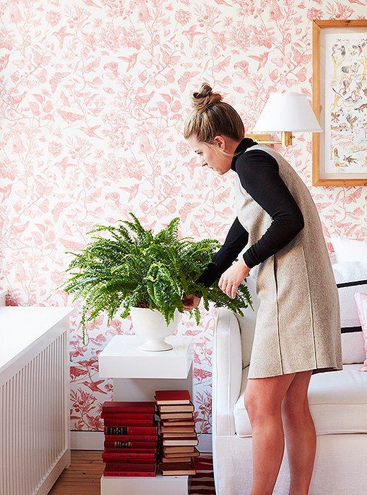
To save space, Sally placed a pair of swing-arm sconces above the sofa. “Other than the radiator, there’s basically no other surface,” she notes. “And we wanted to create a space that felt nice without having to turn on all of the overhead lights.”

I am all about as much concealed storage as possible. It’ll make your apartment feel so much cleaner.
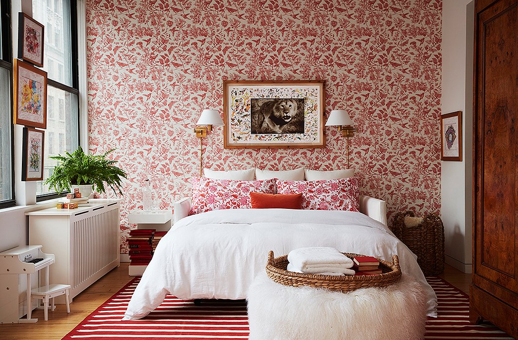
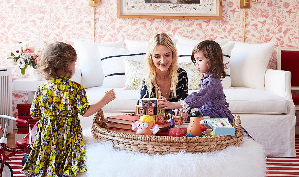
“It’s practical yet it’s fun,” says Zanna of the fuzzy lambswool ottoman. “The girls love it to bounce on and launch themselves off of, but we can also pop a tray on it and play games or build puzzles.”
Day to Night
With the trundle-style sofa bed extended, the space becomes the true guest room that Zanna and Rassi dreamed of creating. “We want our guests to feel at home and like we have a space for them, as opposed to that they’re just kind of crashing the girls’ playroom,” Zanna says. “The fact that we’ve got this ‘slashie’ room that looks like neither a playroom or a bedroom but like a chic living space is genius.”
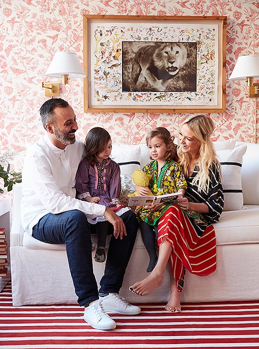
“It is a space that a 2-year-old or a 78-year-old can feel at home in,” Zanna says. “It’s fantastic.”
Heart of the Home
With the sliding doors shut, the room can be closed off from the loft’s main living space. “But honestly, now we never want to shut it!” Zanna says. “We actually use that more than even our sitting room now. Because it’s cozy, it’s elegant, it’s fun… No one would know that that is actually a playroom or a bedroom.” It’s also become the home’s prime mother-daughters hangout space. “We’ll all jump on the trundle bed and curl up and read our favorite book before we go to bed. It’s become almost a routine. And with the sconces as well—we turn those on, dim all the rest of the lights, and it’s a very calming space before bedtime.”
If there’s any lesson to be learned from the process, it’s that even the trickiest decor puzzle often just needs a fresh set of eyes. “That was what was wrong with the space—we were just at the point of, Ugh, I can’t even look at it!” Zanna says. “Sometimes it takes a professional eye to come in and give their opinion. It totally is something I never would have done. We were taken completely out of our comfort zone, and we’ve ended up with the best room in the house.”
For more, check out Zanna’s tour of the space below!

Join the Discussion