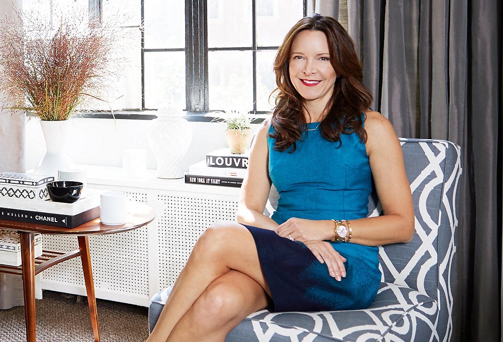
Stacy Twilley, the L.A.-based fashion designer and creative director of Twilley Atelier, uses her Manhattan studio apartment as a crash pad when she’s in town and as a casual place to show her collection to buyers. Stacy filled her home away from home with a modern mix of vintage and new pieces (most scored on One Kings Lane!) for the perfect polished, feminine look. We stopped by to pick up a few small-space decorating secrets for packing tons of style into just a few square feet.
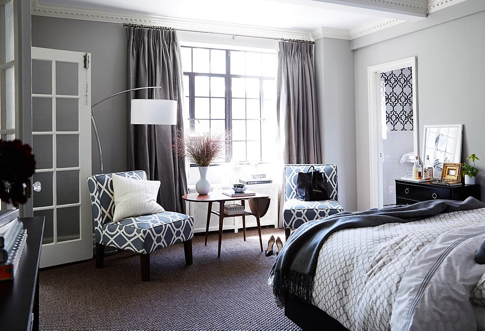
Tip No. 1: Choose a Restrained Palette
The apartment’s gray walls and white trim have a cool, city-chic look. “I love gray tones and find them very soothing and elegant,” Stacy says. “I actually used four different shades on various walls of the apartment, depending on the natural light in each room. I think gray walls with sharp white moldings and doors look very fresh.”
Despite the monochromatic palette of Stacy’s space, it looks layered and interesting thanks to a few boldly patterned pieces, kept in the same cool color family as the rest of the space. Her slipper chairs, for instance, attract the eye without overwhelming the scene. Considering experimenting with pattern? Steal a page from Stacy’s decor playbook and soften the impact by choosing colors that blend with the rest of the room.
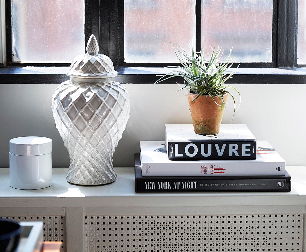
Tip No. 2: Pick Double-Duty Accents
On her windowsill, Stacy creates a chic vignette starting with a few simple accents: a lidded white box and a ginger jar, which also serve as all-important catchalls for odds and ends. Faced with a shortage of shelf space,Stacy stacked a few of her favorite tomes, largest to smallest, adding a bit of height to the composition and some clean lines to balance out the shapely accessories.
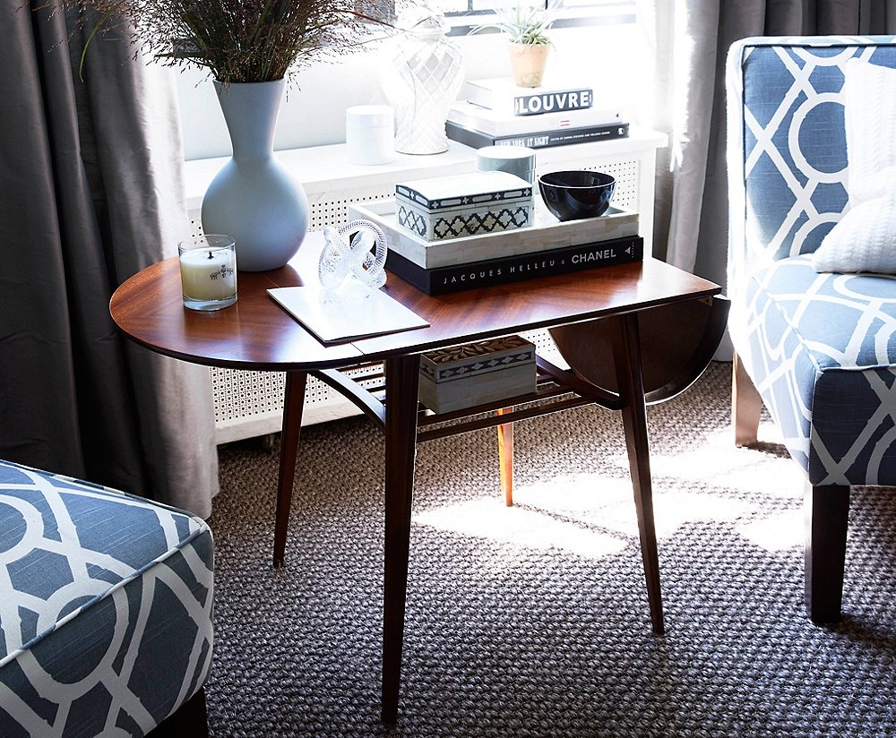
Tip No. 3: Make Spaces Multitask
The studio is just a short walk from NYC’s fashion district, so it’s perfect for Stacy’s growing business. When she shows her collection to buyers, the sitting area doubles as the perfect petite showroom. “Buyers love to come here to see the collection in such an intimate, casual, and fun setting.”
At other times that same area serves as a quiet reading nook, conversation area, or cocktail-hour spot. The drop-leaf table is a vintage find that works perfectly as the apartment’s entertaining hub. It expands when needed and stays compact the rest of the time.

If a room is decorated with all vintage or precious, pedigreed items, it feels a bit stuffy and old-fashioned, regardless of how great the pieces are. By the same token, if a room is decorated with all new pieces, it lacks soul. So I try to find a balance.
Tip No. 4: Put Surfaces to Work
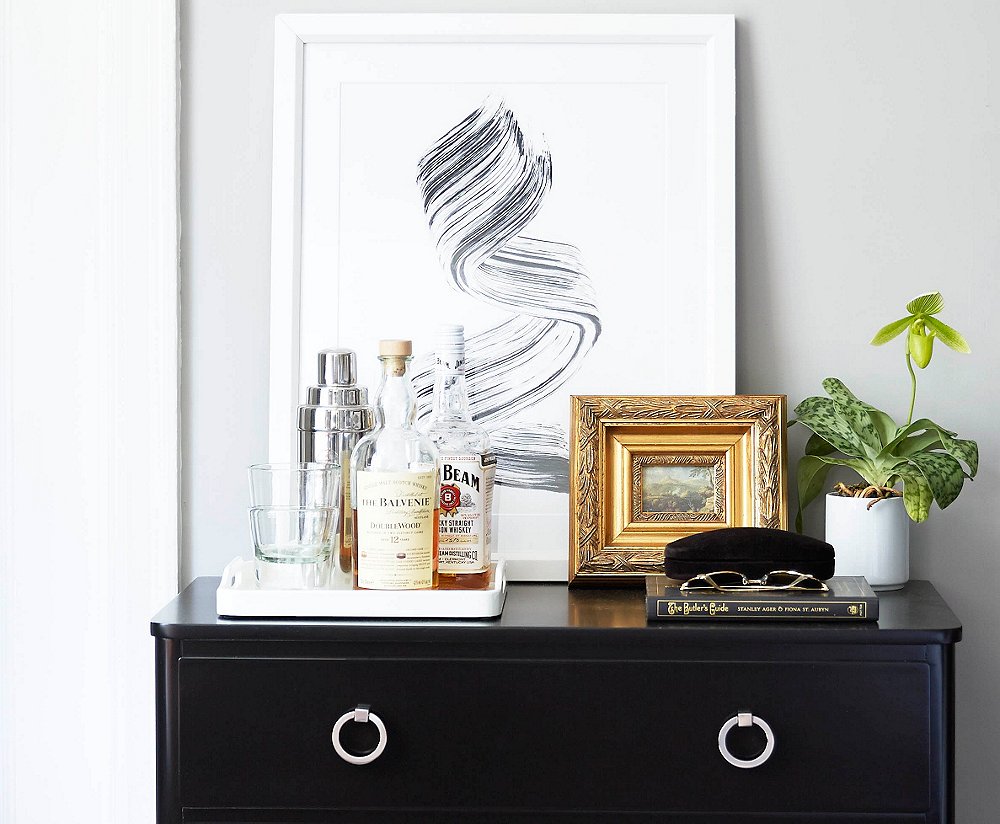
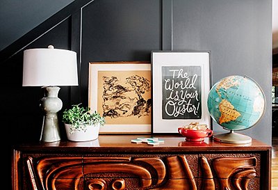
By topping her dresser with a bit of barware and framed artwork, Stacy transforms the surface into both bar and gallery. Situated next to the seating area, the dresser was a logical spot to stash imbibing essentials. Interested in adding a bar to one of your surfaces? Be sure to place supplies on a tray to make the display look intentional and cohesive, rather than out of place, and to protect the surface from spills.
Tip No. 5: Play Up the Bed
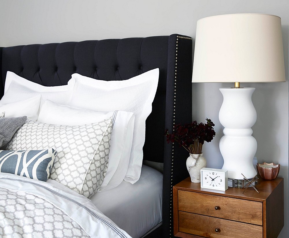
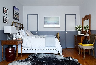
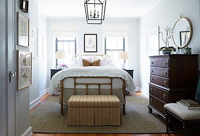
This one goes against the studio-apartment decorating bible. Instead of trying to hide the bed, Stacy makes it a focal point with a chic upholstered headboard, dove-gray trellis-print pillows, and crisp white sheeting. The result is a bed that’s always ready and inviting. About the apartment, Stacy says, “I wanted it to look finished, have everything in its place, and feel like home away from home immediately.”
The richly layered sleep zone is in line with both her decorating and her clothing design philosophies. “I like monochromatic interiors with lots of different textures and shades. Same with my clothing,” Stacy explains.
Tip No. 6: Go Bold
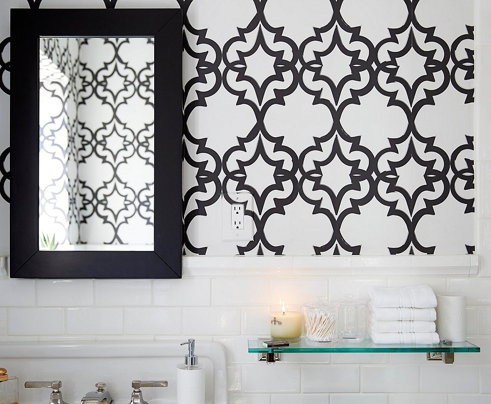
“If I like a pattern, it has to be bold. I don’t like little sweet patterns,” Stacy says. She proves it in her bathroom, where handmade wallpaper from L.A.’s Walnut Wallpaper adds major graphic impact. Stacy notes that the made-to-order wallpaper was a splurge but worth it for the texture and depth it lends the room.

The smaller the space, the bigger the pattern. It’s counterintuitive, but I think it has a more modern impact that way.
Tip No. 7: Make Use of Vertical Space
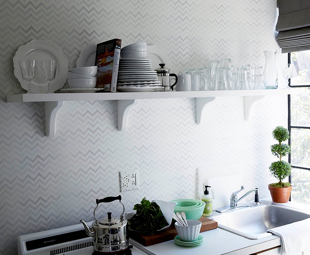
The simple white shelf in Stacy’s kitchen provides both storage and display space. Stacy loves to buy sets of dishes when she travels (she considers them jewelry for the home), so the open shelving is the perfect opportunity for her to showcase her favorite finds while lending some personality to the space. The room’s light gray chevron wallpaper—a subtle nod to the graphic patterns on display in the rest of the studio—infuse the space with enough pizzazz that you might just forget you’re in a tiny NYC kitchen.
Join the Discussion