Pantone is feeling blue. The color specialist announced that its Color of the Year for 2020 is Classic Blue. “Instilling calm, confidence, and connection, this enduring blue hue highlights our desire for a dependable and stable foundation on which to build as we cross the threshold into a new era,” the company declares on its website. As far as we’re concerned, this color transcends years, trends, and fads. It’s named “classic” for good reason.
White is an ideal complement to blue, seen here on our Kos Raffia Console. Photo by Manuel Rodriguez; styled by Ben Reynaert.
A bit brighter than navy, Classic Blue is almost certain to lift your spirits, evoking as it does cloudless evening skies just before the first stars peek through and lakes sparkling in the sun. Clearly the expression ”a case of the blues” has nothing to do with this shade.
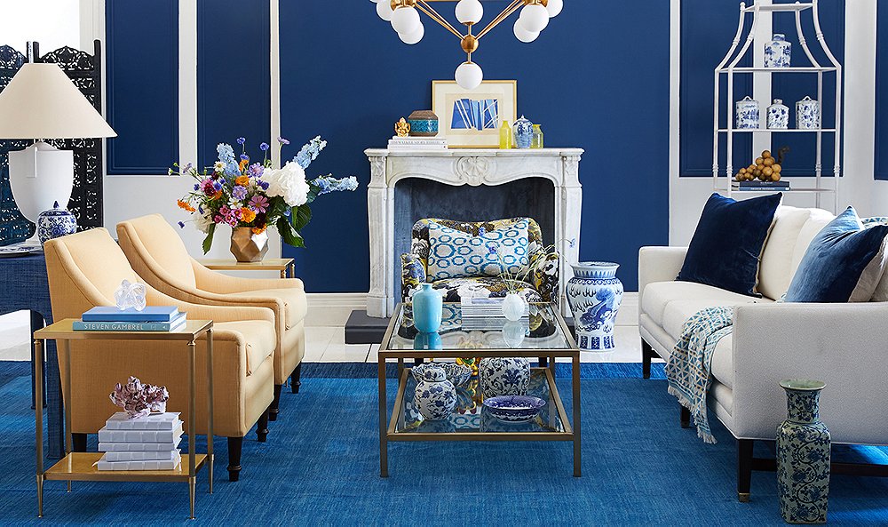
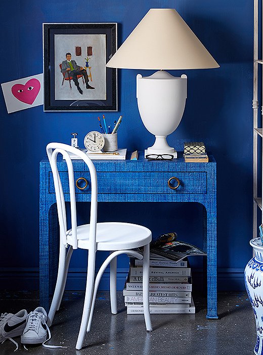
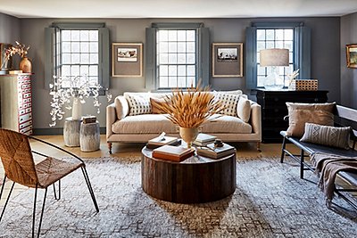
Also in its favor: It works well with just about every other color imaginable. Pairing it with white is, of course, a no-brainer. Not only is that color combo the basis of coastal cool and nautical chic, but Classic Blue is the shade commonly seen on chinoiserie urns, ginger jars, and other pottery. For a less stark contrast, team it with cream, pale yellow, the subtlest of pinks, or a soft green.
Conversely, if you favor juxtapositions of bold color (think Piet Mondrian and Roy Lichtenstein rather than the seascapes of Winslow Homer and Katsushika Hokusai), introduce some vivid yellow, red, or orange alongside your Classic Blue—though you might want to nix this high-energy combo in your bedroom or any other space dedicated to relaxation. And speaking of rooms where you might want to proceed with caution, blue in general is considered an appetite suppressant. Then again, if you’re trying to eat less, blue plates might be just the thing.
Shop our favorite blues >
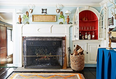
Classic Blue is the shade most often used in chinoiserie (it really is a classic!). Photo by Jason Hamilton; styled by Anthony Santelli.
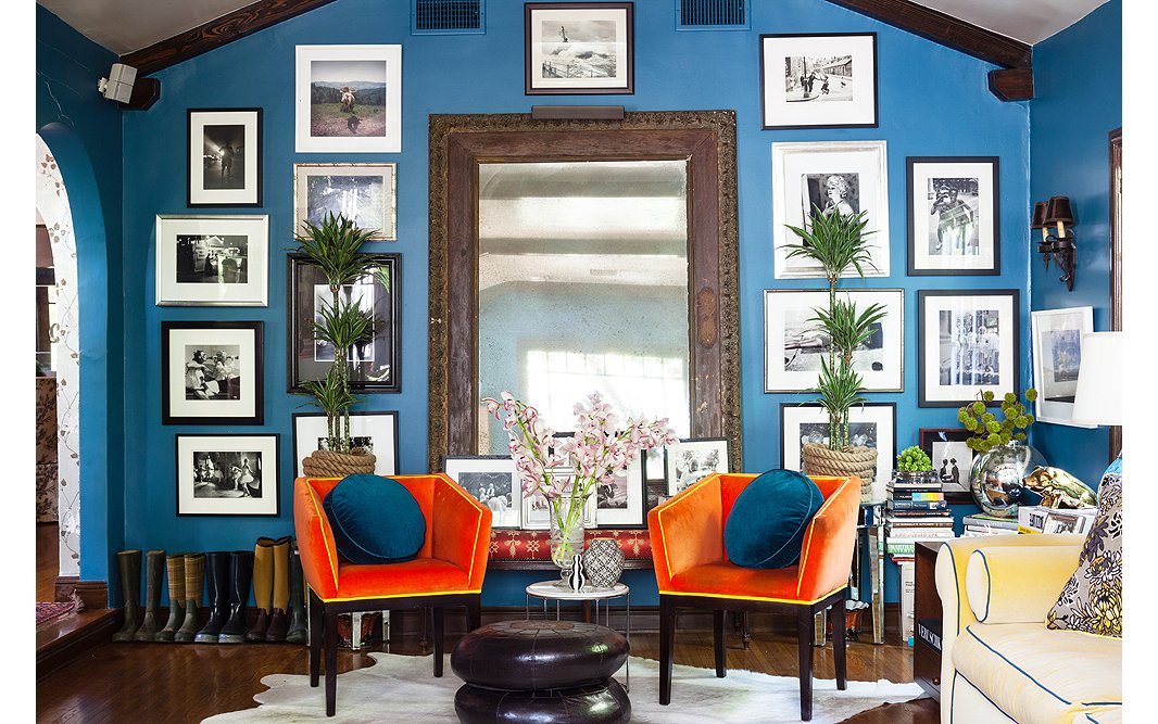
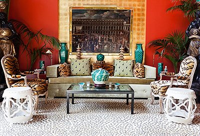
Opposites attract: Because orange and blue are on opposite sides of the color wheel, when used together they create an energetic vibe. Photo by Nicole LaMotte.
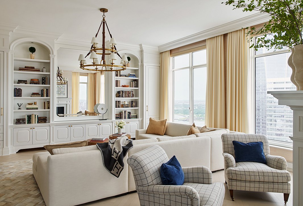
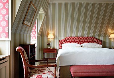
Even a few dashes of this blue—here, on the pillows—perks up a space. Photo by Seth Caplan; room designed by Ariel Okin.
Join the Discussion