Ask Darryl Carter the greatest lesson he’s learned as a decorator, and he’ll tell you, without skipping a beat, “Knowing when to stop.” It’s not surprising, for the preeminent designer has espoused a pared-down approach that results in serene, sophisticated, and perfectly imperfect interiors, many of which are gorgeously captured in his inspiring tomes, The New Traditional and The Collected Home.
He’s brought the same balance of polish and patina to his widely beloved Washington D.C. boutique in the once forlorn Shaw neighborhood. It was by chance that Darryl stumbled upon the pre-Civil War building nearly a decade ago. “I was utterly charmed by the adjunct carriage house in the rear of the building that you egress from an interior courtyard,” he tells us. “Carriage houses are rare in this city, and I have always found them to be very intriguing, and this one especially so from its place on historic Naylor Court.” Following its full restoration and with an ever-changing selection of antiques, travel finds, and artisanal wares handpicked by Darryl, the boutique now sees a stream of local visitors and travelers from far afield.
We recently stopped in on Darryl at his stunning boutique to take in his latest finds from around the world. Tour the space and reap Darryl’s advice for striking that perfectly imperfect balance at home.
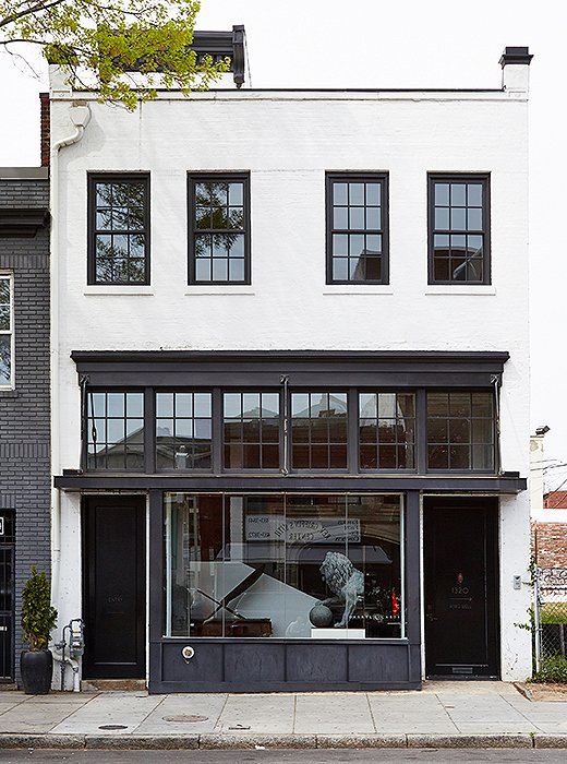
Located in Washington DC’s Shaw neighborhood, Darryl’s boutique captures “a rare example of pre-Civil War architecture.”
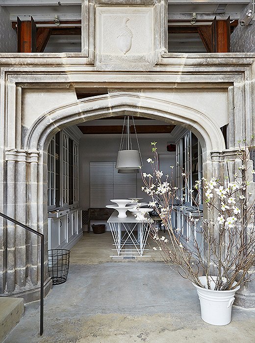
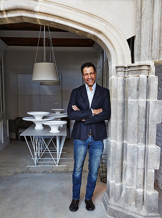
In the shop’s entry, poured concrete floors pave the way to a grand greeting: a limestone arch salvaged from a manor house on the Potomac River.
Lesson No. 1
Look to a Building’s Bones
It’s not apparent now, but the building that houses Darryl’s boutique was once a dilapidated pre-Civil War structure. “The top floor has what I understand to be one of the first skylights of its kind on a structure of this sort. So of course it was the antiquity of the building in its ruin that appealed most to me. My mission, of course, was to preserve it,” Darryl says. “I did want to respect the history of the building.” He restored the building and played up its architectural bones but also infused it with his signature aesthetic and a few grand gestures. “All additional embellishments, both found and antique, were executed in a modern vernacular,” he notes. The pièce de résistance? A limestone arch salvaged from a Virginia manor house. “I really didn’t even know until we were well under construction if it would actually fit.”
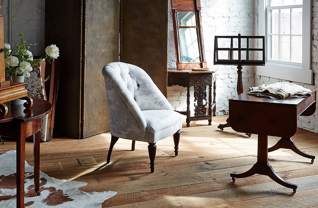
“Simply put, I am prone to white space, not as a default but as a canvas that creates a backdrop for beautiful objects,” Darryl says.
Lesson No. 2
Let Furniture and Antiques Lead
“A piece is timeless when it has appropriate scale and clean lines,” says Darryl. “I gravitate toward the piece itself, not how I imagined it in a space. It’s why I am so prone to spare environments. I would far rather see a room with a few great things that are highly meaningful than a gratuitously populated space with every wall covered in decorative objects.” What’s more, using furnishings in new ways can transform the feeling in a room. “I often use [fabrics with] graphic pattern on the reverse because it suggests a watercolor and is less graphic—subtle patterns that demur rather than overwhelm a room. Similarly I often use antique rugs on the reverse because it suggests they have been walked upon.”
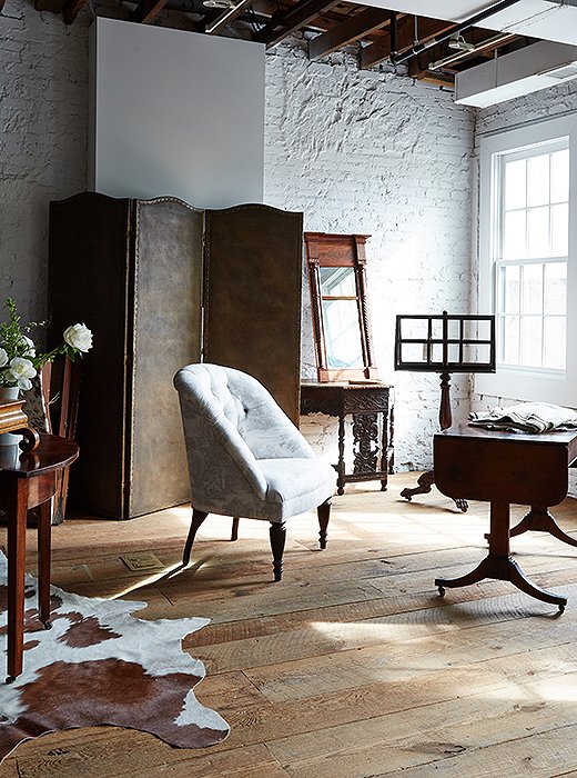
Old and new live in seamless harmony on the boutique’s second floor, where a four-panel embossed-leather folding screen and a 19th-century drop-leaf table join a chair designed by Darryl and upholstered in a reversed toile.
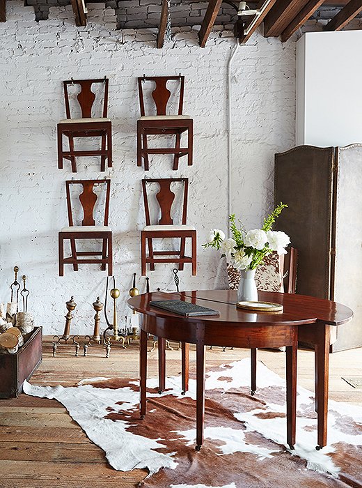
Darryl has a keen eye for clean lines, even in antiques. Case in point: this pair of circa-1810 Hepplewhite demilunes from England and the set of late 19th-century dark-cherry dining chairs discovered in Philadelphia.
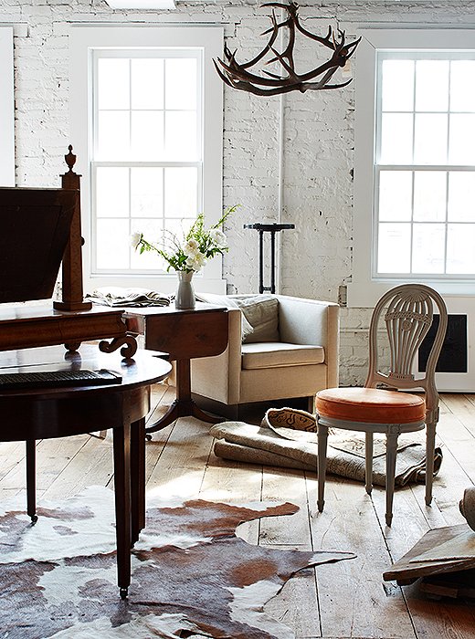
Timeless designs, including American antiques (“A piece is timeless when it has appropriate scale and clean lines—American antiques are very clean-lined”) and upholstered pieces by Darryl, are mixed in with antique rugs, hides, and an antler chandelier.
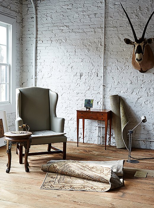
A table made of marble and carved wood pairs with a 19th-century wing chair reupholstered in leather and shirred velvet. Against the wall, the late 19th-century fruitwood sewing table is by French furniture maker Envio de E Kahn & Cie.
Lesson No. 3
Embrace Spare Spaces
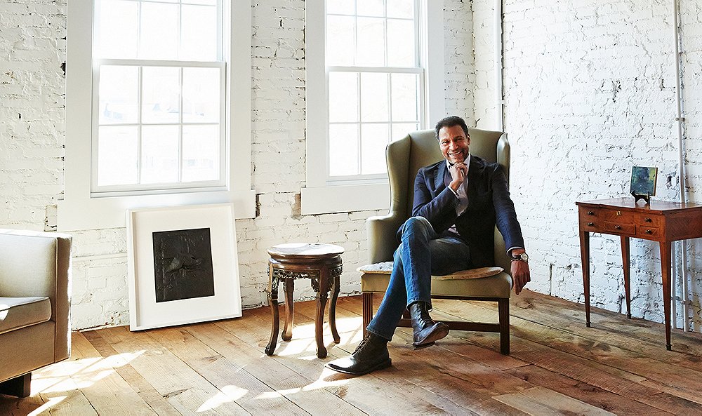
“Some may think of it as a default, but it’s far more complicated to work in a room with less going on, because it’s unforgiving,” Darryl points out. “The beauty of that is that each thing speaks for itself. It’s more of a backdrop for the objects and the people living in it.” This philosophy extends throughout the boutique, where stripped-back white brick walls have become a clean-slate canvas for dark wood antiques as well as his own tailored upholstery, giving each piece presence. “I feel like I see a lot of overdesign, and I think there is a tendency that if there is a blank space, seal it,” he says. “Don’t feel compelled to cover every wall with art.”

I gravitate toward the piece itself, not how I imagined it in a space... I would far rather see a room with a few great things that are highly meaningful than a gratuitously populated space with every wall covered in decorative objects.
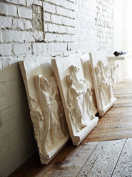
Darryl worked with Giannetti’s Studio, a local plasterer, on this set of cast friezes inspired by the painting Entry of Alexander into Babylon.
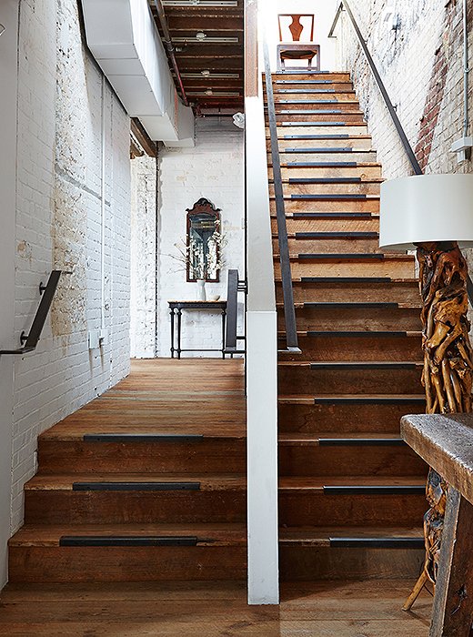
On the first level, the floors, ceiling trusses, and main staircase are made from wood salvaged from a former South African embassy built around the same pre-Civil War period as the building that houses Darryl’s boutique.
Lesson No. 4
Reimagine the Past in a New Light
Darryl is a master at reinventing what’s old in fresh ways. It’s this juxtaposition that defines his spaces, including his boutique. “I find myself more daring with and prone to polarity—placing something high modern, clean and pure, opposite an antiquity veneered with elaborate marquetry.” For example, the salvaged floorboards on the ground level of his boutique are placed diagonally to draw the eye to the reclaimed material in a new way, and the new walls of the shop have been treated as old, pargeted to appear like plaster. “I am drawn to the tension between the modern and the antique and the balancing of these vocabularies,” he adds. “It’s mixing up the materials and the periods together so that they can revive together but as something altogether new in vocabulary.”
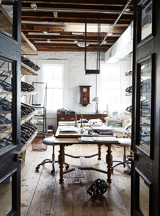
Reclaimed wood doors open to the shop’s fabric library on the first floor. Swatches are arrayed throughout and fill metal bins originally used to sort military mail during World War II. “The bins sat in storage for years before we found the perfect use for them,” says Darryl, who discovered them at an L.A. salvage yard.
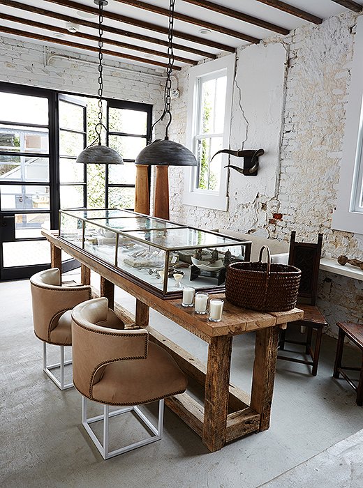
For the first-floor “kitchen” in the boutique, Darryl topped an old farm table with an antique apothecary case for his unique objets. The Shaw pendants (“named for the neighborhood in which we sit”) are by Darryl for Urban Electric Co., and he refurbished the midcentury office chairs with metal bases and kidskin leather.

I wanted [the boutique] to feel like a home. I didn’t want it to feel like a cardboard box, I didn’t want it to be experienced as a large barren room. So it meanders, purposefully.
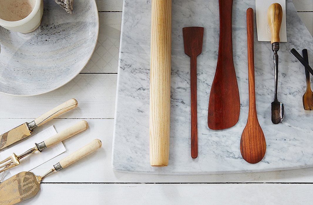
Handmade ceramics, a marble prep board, and new and vintage serving and cooking utensils are housed in an antique apothecary case.
Lesson No. 5
Edit Meaningfully
“I wish I could claim some formula, but really things have to speak to me,” Darryl says of his one guiding principle for selecting the treasures he brings into his boutique, whether they’re gems picked up during his travels or designs by local artisans. “I am very prone to history and the wonder of the former lives of antiques; I am equally prone to things precious and primitive.” Hence his selection of gleaming horn spoons, elk-antler flatware, horn serveware, stone dishes, and hand-molded clay salt cellars, all of which boast rich textures, timeworn appeal, and the often imperfect touch of the hand.
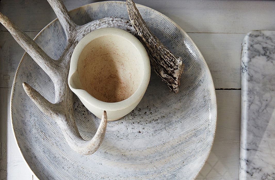
Darryl worked with local ceramicist Ani Kasten to design the white-glazed charger with a thumbprint motif. Atop are an elk antler and a vintage stone soap dish.
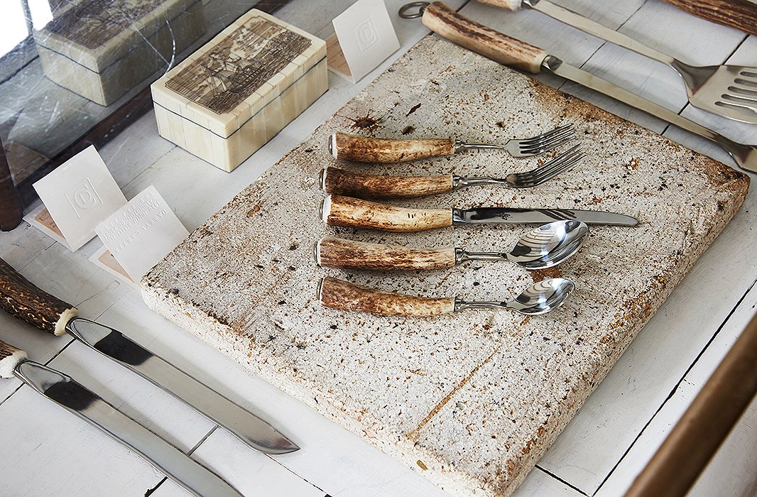
Flatware and serving pieces with naturally shed elk-antler handles reveal Darryl’s eye for details and materials.
![A delicate mother-of-pearl spoon is placed with one-of-a-kind salt cellars designed by one of Darryl’s friends, local artist Margaret Boozer. “Margaret works in all earthen materials, and this clay in particular was dug up from the ground around Washington D.C.,” Darryl explains. “No two [pieces] are the same.”](https://okl.scene7.com/is/image/OKL/042716_DARRYLCARTER_5?wid=1066&op_sharpen=1)
A delicate mother-of-pearl spoon is placed with one-of-a-kind salt cellars designed by one of Darryl’s friends, local artist Margaret Boozer. “Margaret works in all earthen materials, and this clay in particular was dug up from the ground around Washington D.C.,” Darryl explains. “No two [pieces] are the same.”

I wish I could claim some formula... but really, things have to speak to me. I am very prone to history and the wonder of the former lives of antiques. I am equally prone to things precious and primitive.
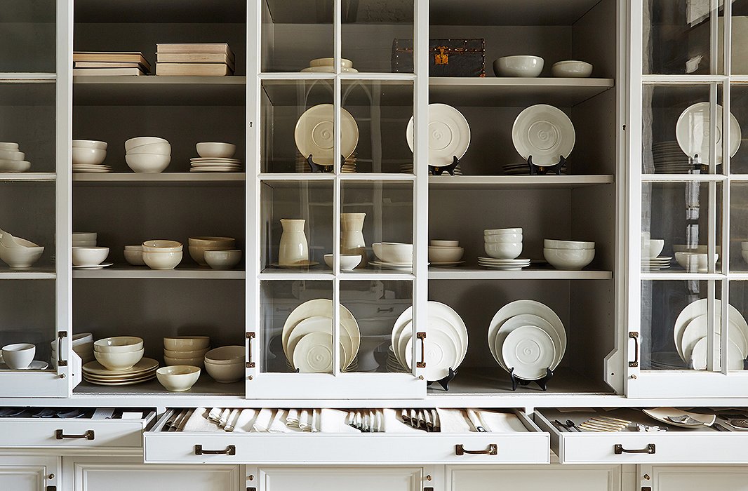
Primitive vessels, dishes, bowls, and tableware created by Darryl with ceramicist Ani Kasten fill the display case. Darryl designed the display around panel doors salvaged from the butler’s pantry of a historic Georgetown home.
Lesson No. 6
Set Your Sights on Simple Beauty
“There is not a lot of distance between something having interest and too many of the same things creating visual chaos,” says Darryl, reiterating his reigning sensibility for the simple and the sophisticated. “I am not a fan of clutter. I like objects that have a certain beauty or utility.” That mind-set trickles down to the littlest accents, including the smooth ceramics with delicate detailing, flow china with painterly flourishes, and unadorned linens on display. As he sums it up, “It’s curated and highly thoughtful but with the intention of approachability.”
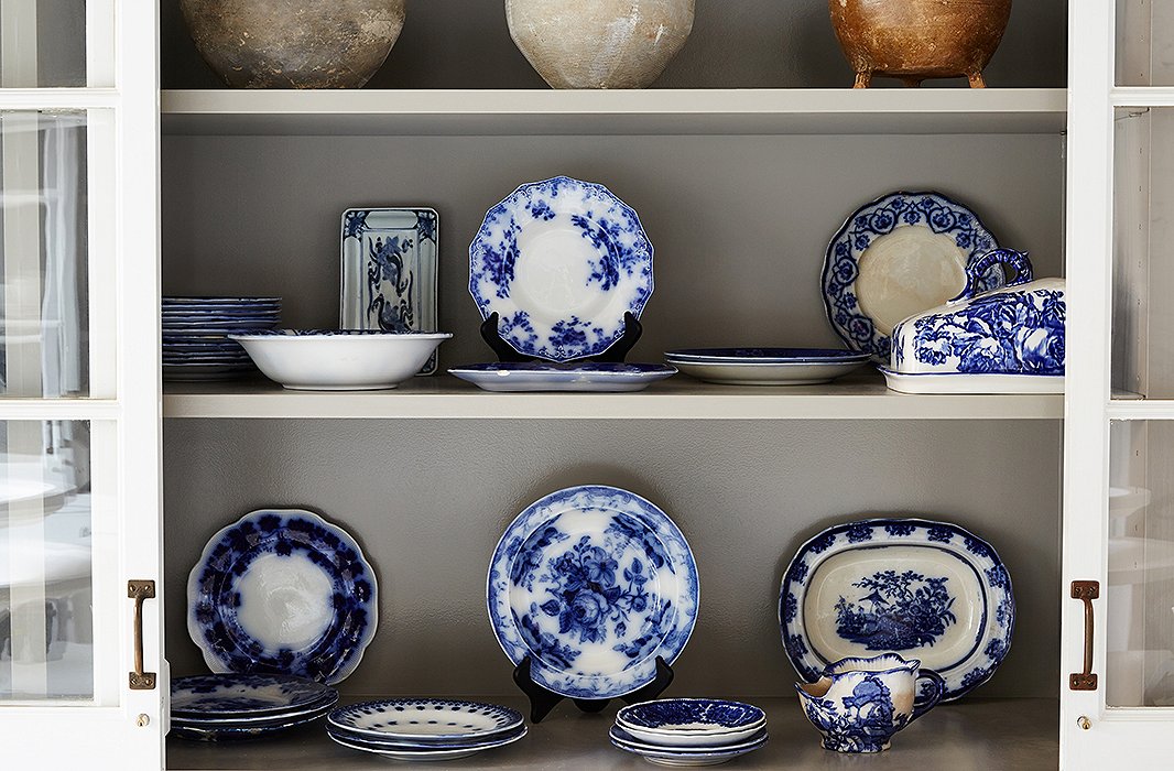
A display cabinet showcases flow blue china that Darryl has collected over the years. Most of the pieces are hundreds of years old and originated in England, Prussia, and China.

I truly do believe less is more... buy things that you love and that are meaningful to you. A space doesn’t have to come together all at once, and not everything has to have provenance.




Join the Discussion