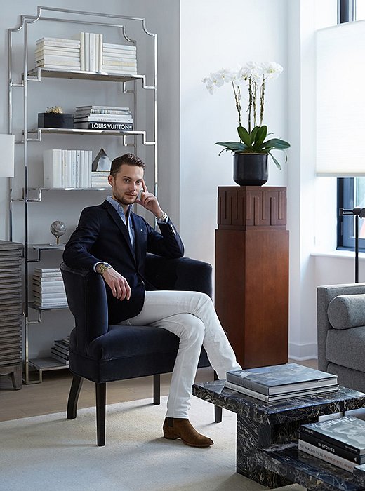
A brand-new, empty home is filled with endless possibilities, but also endless choices. That’s when it helps to have a professional eye to narrow down the options and make a blank canvas less daunting. That was precisely the case with interior designer David Bazner of One Kings Lane Interior Design, who recently stepped in to help transform a just-finished Brooklyn townhouse into a bold space befitting its hip location in 365 Bond, a new development building in the up-and-coming Gowanus neighborhood.
David took inspiration from Gowanus—a formerly industrial area that has seen an influx of artist studios, galleries, and music venues—in his design for the two-bedroom residence. “I think it needed to be contemporary, and it needed to feel luxurious,” he explains. “That was the vibe we were going for.”
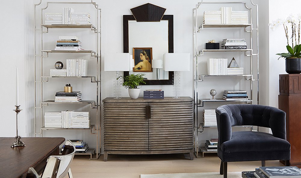
As with almost any other New York home, space was at a premium, so David worked to add flair with a minimal number of pieces. “I think that with homes of this size, vintage is a great resource,” he says. The townhouse’s living room was separated into living and dining areas, and David chose slightly smaller furnishings, such as the vintage French farm table, to make sure the space didn’t feel crowded. He centered the living area around a striking trio of marble tables and used a neutral rug to visually separate the seating.
The walls were kept white to maximize the brightness and make the space feel larger. “We layered in textures and different tones,” he explains. “I think that because the color is so sparse, what we do have speaks volumes.” Leopard stools add a graphic punch beneath a clear console, while velvet chairs keep the seating area feeling luxe. David also played off the white walls with gleaming chrome chairs and étagères, along with a few antique touches such as Victorian pewter candlesticks and a 19th-century portrait. “It was important that the space didn’t feel sterile, and that’s when these Old Worldly items come into play.” Read on to see how David warmed up the sleek, minimalist space.
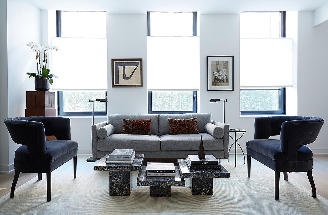
Two barrel chairs flank the sofa and help define the seating area. “I think that the important thing was to visually define the space without obstructing the eye, and we achieved that with this layout,” David says.
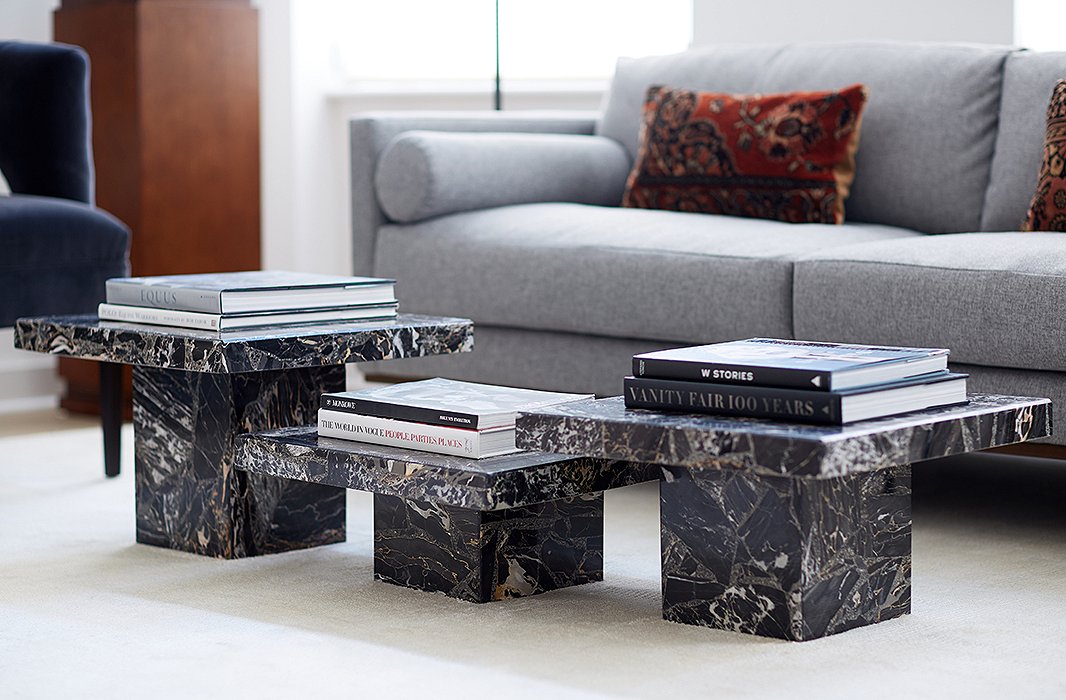
The coffee table is actually three side tables clustered together. “It anchors the room and provides a sculptural touch,” David explains. “I just wanted something really clean and simple. I think that those tables are almost like pedestals.”
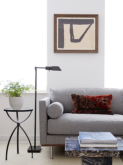
David created a light-filled living area using a muted palette of gray, cream, and blue. “Since we wanted to keep the space feeling as large as possible, we kept the walls white,” he says. Throw pillows on the sofa add a punch of color.
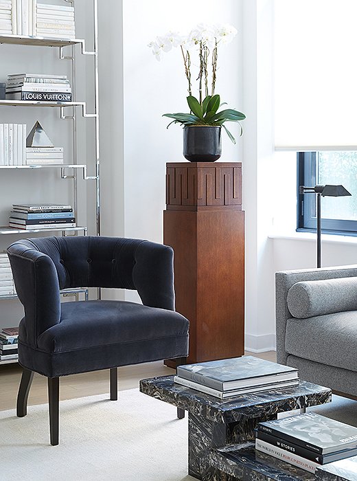
An orchid brings a bit of life to the corner of the living area. “I think that when you are dealing with clean-cut lines and geometric shapes, there always needs to be something hyperorganic in the space,” David explains. “The pedestal provides some height and lends a simple floral arrangement a sense of presence and grandeur.”
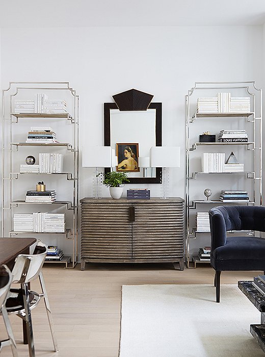
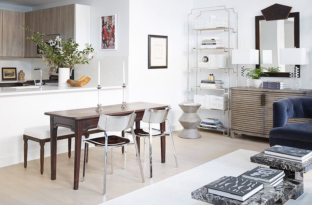
The townhouse has 11-foot ceilings, so David chose tall étagères to play up the soaring space: “I was looking for something more skeletal, so they didn’t detract from the clean lines of the space.” He placed them on either side of a chest and completed the vignette with an Art Deco–style mirror and crystal lamps.
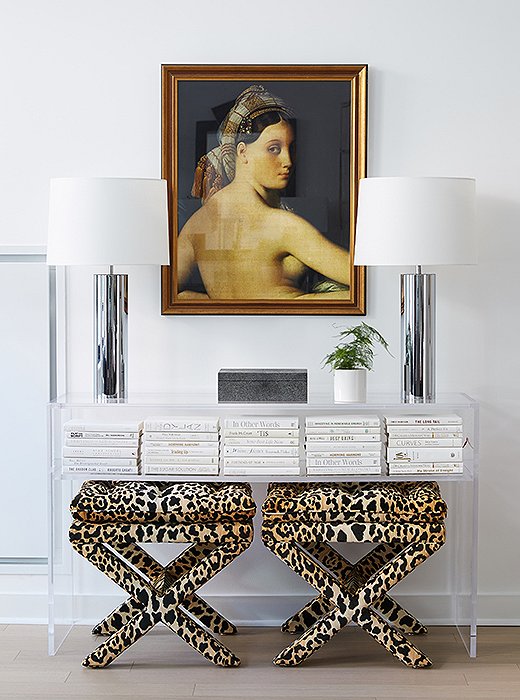
David tucked leopard-print stools beneath an acrylic console. “They bring in a sense of weight and texture and draw your eye to that vignette.” He added the vintage lamps to play off the chrome pieces in other parts of the room.
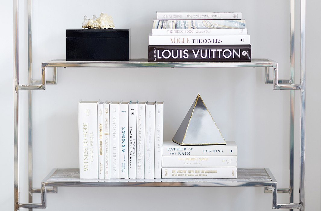
White books and a few geometric accents keep the étagères from feeling cluttered. “I think that there is an interesting tonal play between the books and the wall color,” David says. “Even though the books were published in the ’50s, ’60s, and ’70s, they feel more modern and up-to-date because they’re all color-blocked in one shade.”
The vintage French table was the perfect size for the dining area. “Because it’s so Old Worldly, we needed to counterbalance that with something really modern and sleek,” David says. He chose a pair of chrome chairs to give that contemporary contrast and placed a bench on the other side of the table to maintain the visual flow into the kitchen.
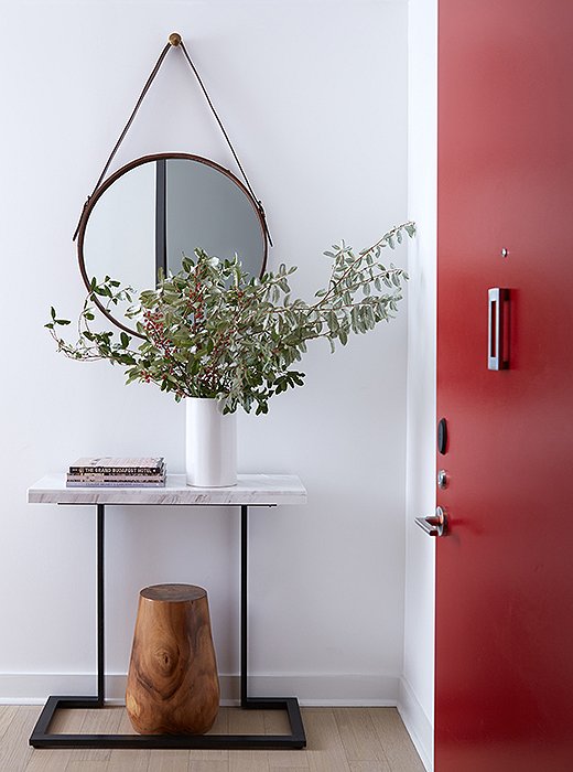
A console by the townhouse’s interior entrance provides a convenient spot to drop keys or mail. “That was all about the geometric play,” says David. “I softened the rectangular console table with the circular mirror and then added some weight to the table with the wooden stool underneath.”
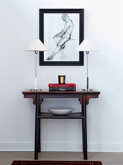
David focused on adding light in another entry vignette. “There’s a flush mount on the 11-foot ceilings, but that was really the only light source. We brought in the two lamps and put them on a vintage Chinese altar table.”
Join the Discussion