You might’ve heard that you shouldn’t use dark color in small spaces. You also might’ve heard that overpowering a space with too much color makes it look smaller and less put together. But neither is necessarily so. Check out some of our favorite ways to use color in petite spaces below.
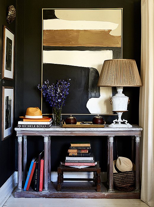
Photo by Frank Tribble
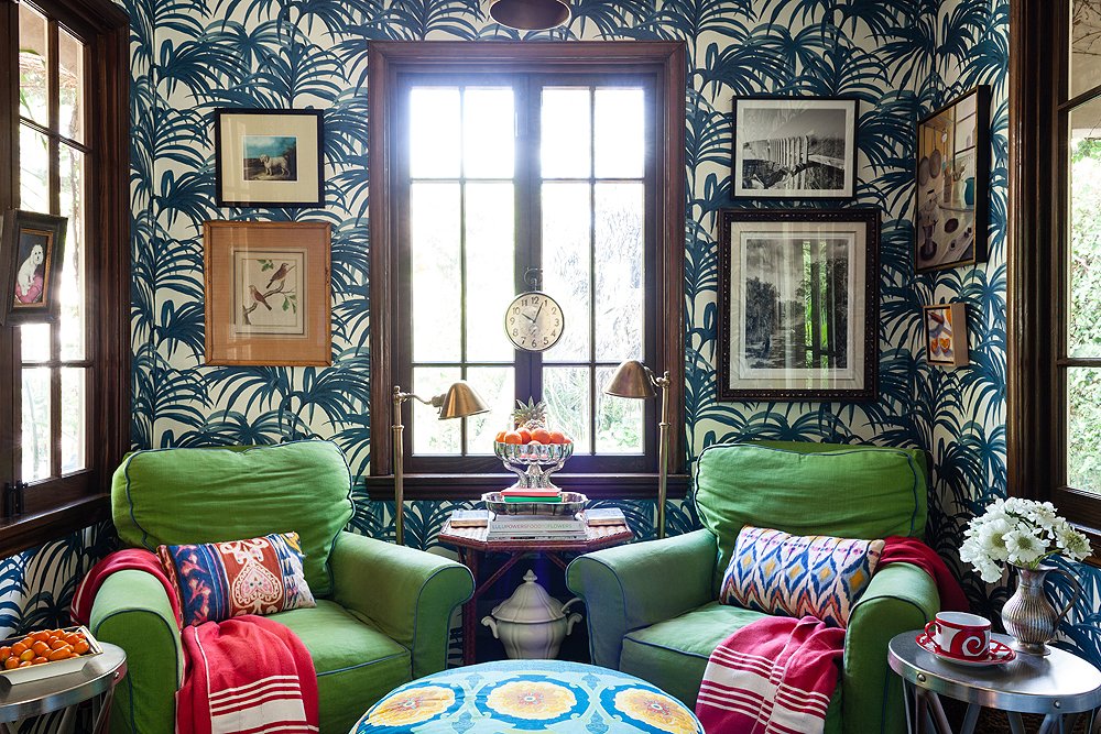
Go Dark
It might seem counterintuitive, but going dark in a small space can make a chic statement. Case in point: this nook in designer William McClure’s Birmingham, AL, bungalow.
Play with Pattern
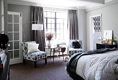
Pattern on pattern can make a space feel more cohesive, especially if you stick to a carefully edited color palette and vary the scale of the prints. For time-honored elegance, use the same pattern to cover the walls, the upholstery, and even the window treatments.

Photo by Jessica Sample
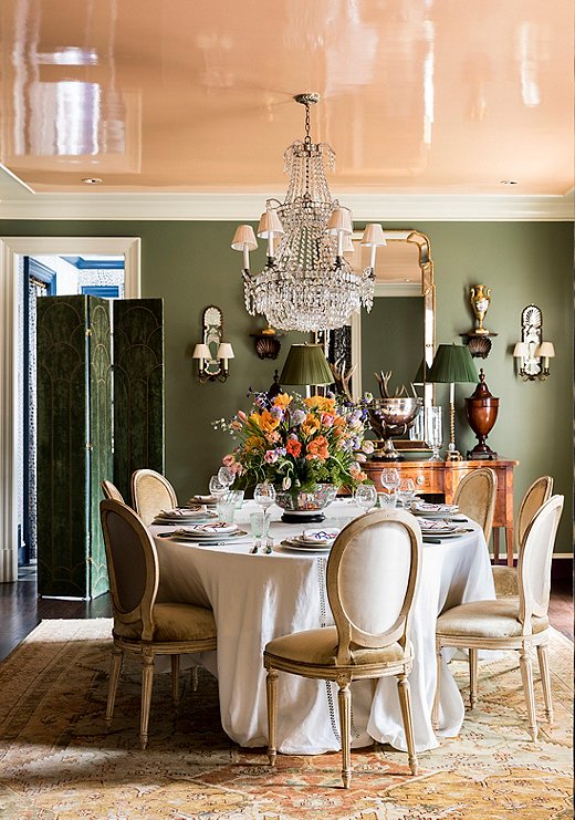
Photo by Lesley Unruh
Look Up
Most New Yorkers know this secret, but if you don’t live in a shoebox, it might be new to you. Never forget that the ceiling is the fifth wall. Painting it an interesting shade is a good way to get some extra color in your home. You’ll impress your friends with the wild surprise, too. Double points if the ceiling is lacquered, as it is here in Danielle Rollins’s Atlanta home.
A Touch of Shine
Ah, lacquer. When used correctly, it’s a beautiful design element. The shiny surface can add a fun dimension to smaller rooms, and its reflective nature can help a room feel more spacious. If you don’t want to use lacquer throughout your home, using it in the entryway is a great room-defining trick.
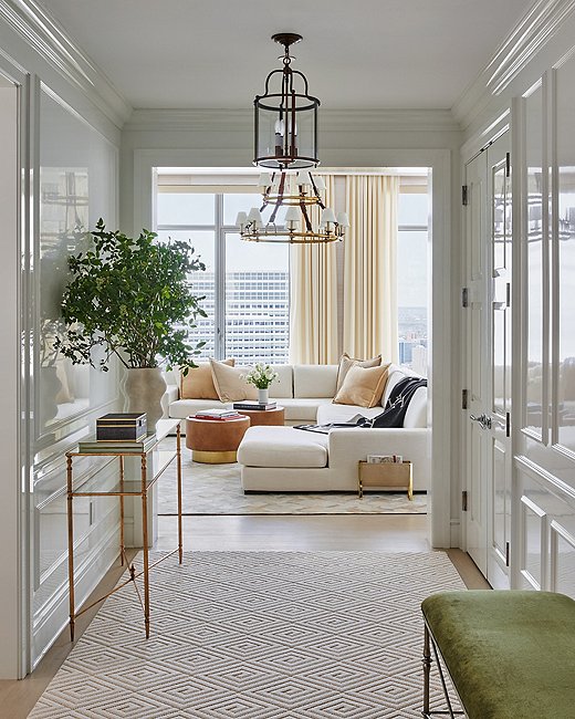
Photo by Seth Caplan
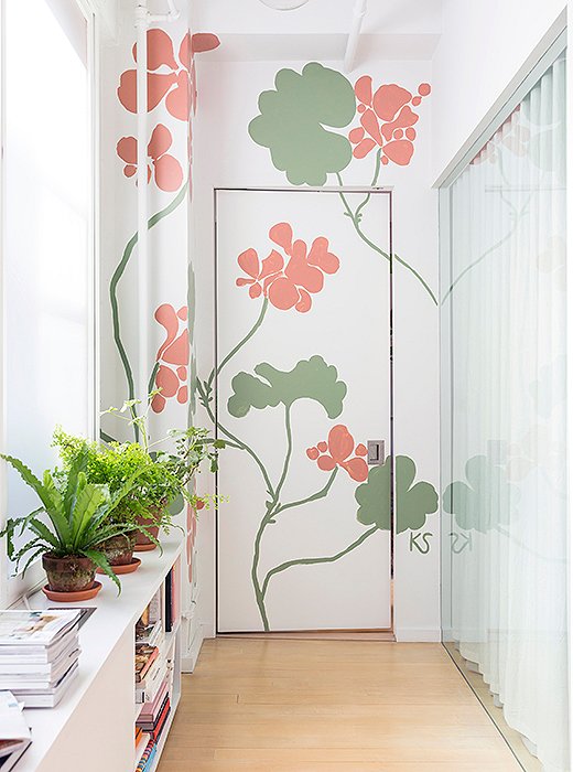
Photo by Lesley Unruh
Get Artsy
You might not have room for a triptych or a mural, but that doesn’t mean you can’t paint some art on your walls. New York-based artist Kate Schelter turned her entryway into a garden by adding some flowers to the wall. The large scale elongates the room, and the design brings a dash of color to the otherwise white space.
It’s All in the Details
When you don’t have a lot of space, every surface provides an opportunity for drama. Painting wainscotting or trim makes a room feel finished, and in the renter’s world, that’s key.
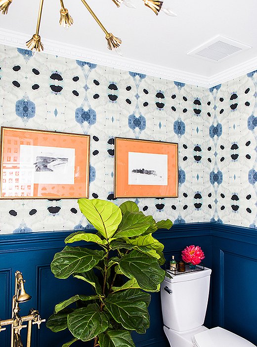
Photo by Tiffany Haynes
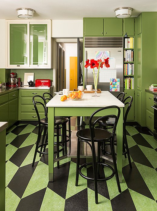
Photo by Lesley Unruh
Look Down
If your walls are covered with storage because space is at a premium, turn your eyes to the floor. An intriguing floor pattern brings dimension to a space that lacks it.
If you lack the wall space for artworks, try turning your door into one. Read a full tutorial on how to do that here.
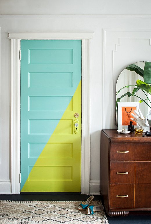
Photo by Lesley Unruh
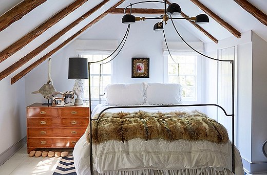
Photo by Tony Vu
White-Out
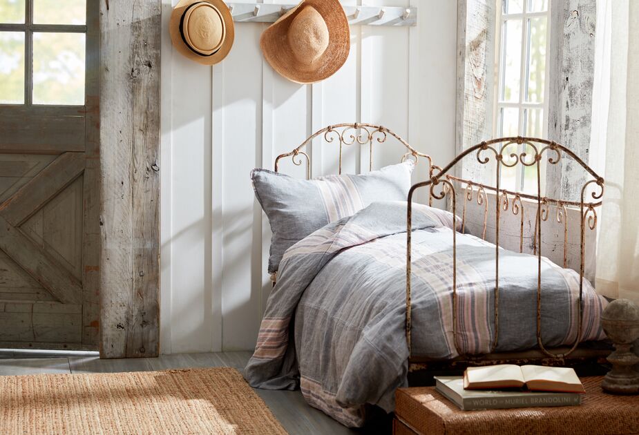
Of course, the opposite of all the above is a total white-out. Open up even the smallest of spaces with white to create an airy vibe.

Join the Discussion