When you walk into the apartment of designer Alex Papachristidis, it’s easy to forget that you’re in New York City—and that’s just the idea, Alex says. The space, located in a Manhattan high-rise, wasn’t in great shape when he first saw it; the previous tenant had left it largely untouched since it was built in the 1970s. But the location (close to family) and spectacular views won out, so Alex and partner Scott Nelson took the leap.
Fourteen months of renovations later, the space was transformed into an oasis in the city. “When people come over, they say, ‘I feel as if I could be anywhere in the world.’” We stopped by for a tour and were completely swept up in the fantasy, not to mention Alex’s gracious entertaining style and thoughtful attention to every last detail.
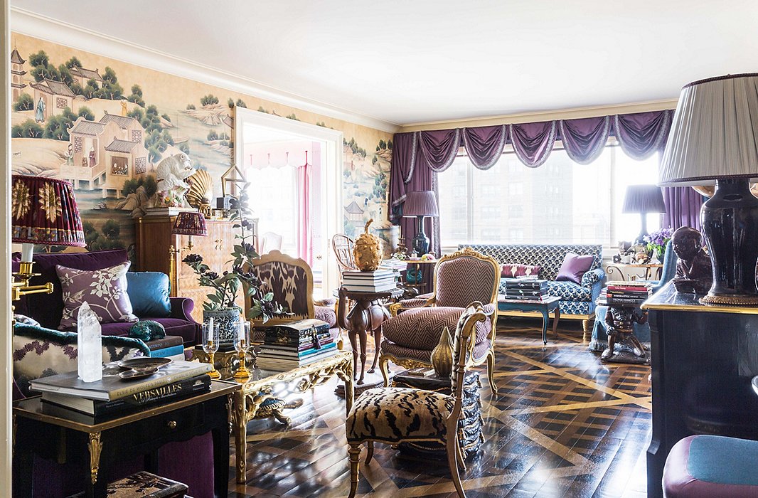
Sumptuous seating abounds in the apartment’s layered living room.
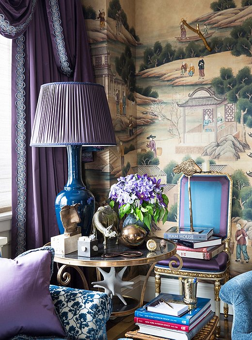
A gilded table that belonged to the designer’s mother houses a collection of treasured objets. The inky-blue glazed lamp was created by Alex for Christopher Spitzmiller.
Restoring Proportion
A classicist at heart, Alex craved the traditional character of a prewar apartment. “The goal [of the renovations] was to refine the proportions of the space and give it an open feeling,” one that would be inviting and warm for the pair and their frequent guests. “It was really about creating classic spaces that worked for us and how we would use them.”
Achieving that lofty goal took some imagination—and the removal of a few walls. In collaboration with an architect, Alex opened up one of the three original bedrooms to transform it into a library. It now unfolds into the living room and dining room in a classical enfilade, a layout that maximizes light and sets off the spectacular views of Central Park. “I think that a view is much more special if it’s framed, whether by doorways or curtains. It makes the view focused.”
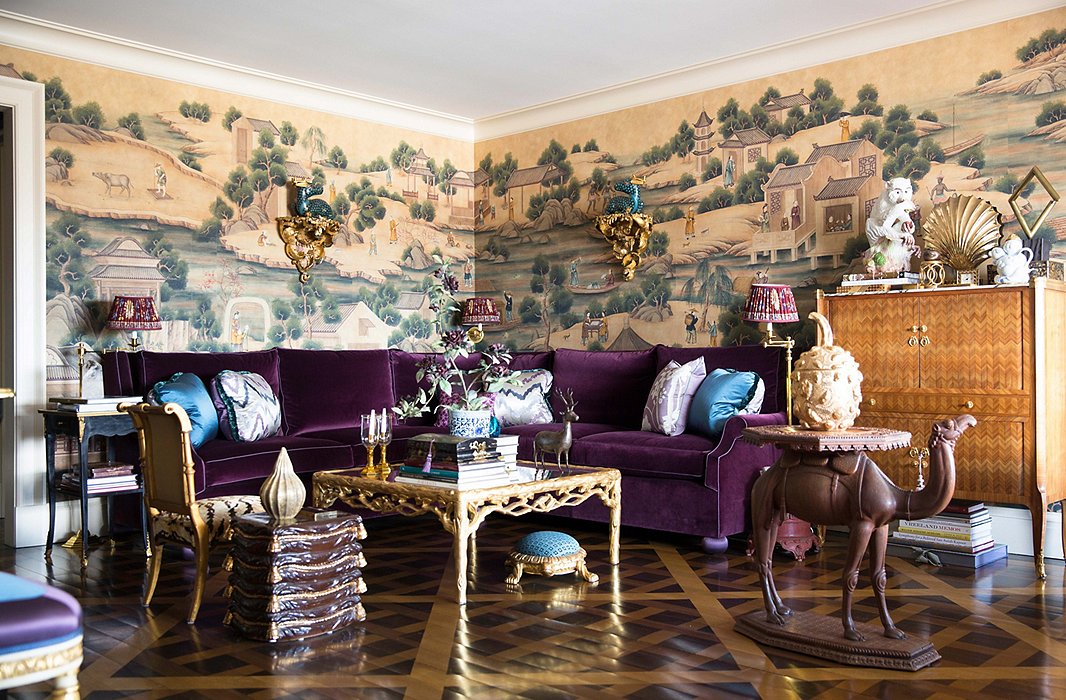
Alex freely mixes pieces of diverse origins, from Indian textiles to chinoiserie sculptures: “It creates this grand bohemian atmosphere that I like so much.” The ceramic wall brackets were commissioned from artist Eve Kaplan.
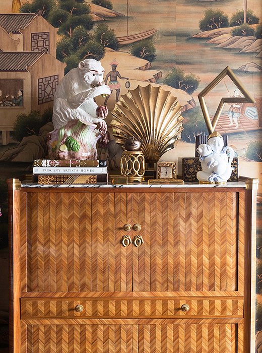
An inlaid-wood secretary, found in a New Orleans auction, shows off a curated vignette in radiant, golden hues. The hand-painted wallpaper is a custom creation by Gracie.
Mastering the Mix
“It’s about a variety of textures,” Alex says of the fabulous array of finishes that fill the rooms of his home. The floor of each room gets special treatment: Limestone tile in classical patterns covers the kitchen and the bathroom, while Alex’s own colorful carpet designs warm up the library and the bedrooms. The living room features a parquet de Versailles, a historical pattern that dates to the 17th century. The twist? It’s trompe l’oeil, created with a stencil. “I love the idea of taking beautiful classical elements and using them in a modern way.”
Aside from the trim, the floors are just about the only painted surfaces you’ll find here. Every wall is either mirrored, papered, or upholstered, a commitment that might scare off some. But Alex says it’s well worth it: “There’s nothing like fabric and wallpaper on the walls—I love that coziness.”
The living room walls are a world unto themselves, covered in a murallike wallpaper based on an 18th-century design. After spotting the original chinoiserie image in a book, Alex had a custom version made to encompass all four walls.
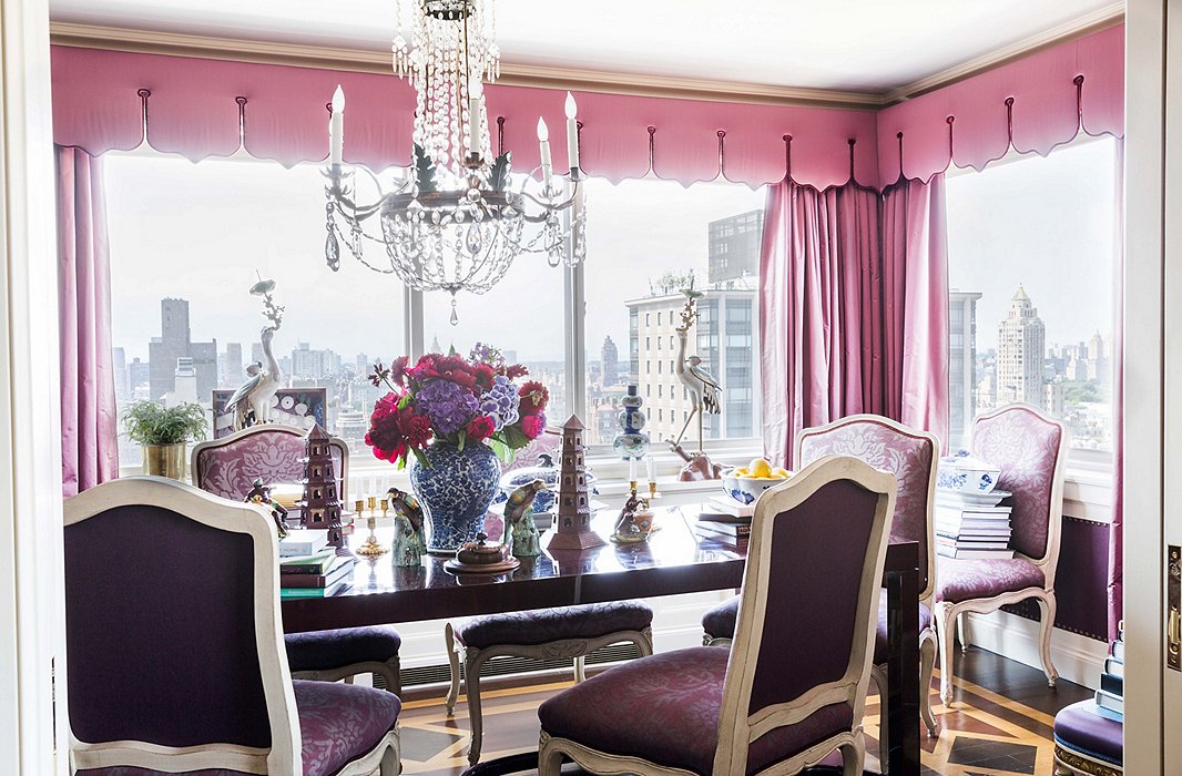
An array of purple hues turns the dining room into a jewel box. The living and dining room floors feature complementary parquet patterning, each created with a stencil. Shop an array of crystal chandeliers here.
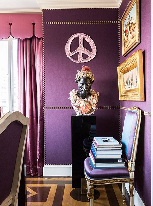
Nail-head trim imitates paneling on the dining room walls. Alex had the shell-covered bust created after an antique spotted in Paris, and the glass peace sign is by favorite artist Rob Wynne.
Making Entertaining Easy
While Alex hosts dinner parties when at his family’s home in the Hamptons, he finds city living lends itself to more-informal affairs. For larger cocktail parties, Alex turns the dining table into a buffet, and friends spill over into the library and even the dressing room—“We bring chairs in there and pop up some TV tables!”
And the couple doesn’t shy away from impromptu get-togethers. Should someone drop by for a drink, the napkins (custom by Leontine Linens) will be pressed and ready, hors d’oeuvres will be stocked, and a bottle of champagne will be chilling in the fridge. “Our apartment’s always entertain-ready,” Alex says. “I think that’s the way you have to live. You have to be spontaneous once in a while, so it’s important to always be prepared!”
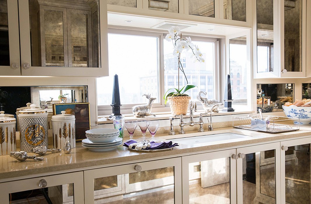
Panels of antique mirror make the kitchen sparkle. “I wanted my kitchen to feel like a big bar,” Alex says.

Our apartment’s always entertain-ready. You have to be spontaneous once in a while, so it’s important to always be prepared!
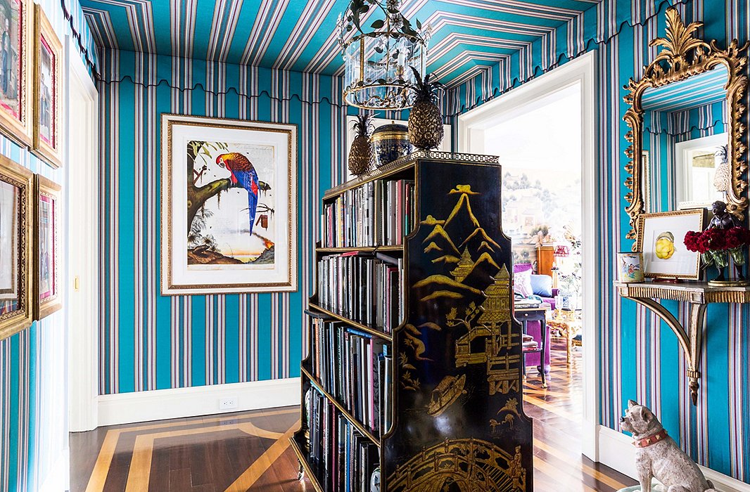
“I thought that the colors were so wonderful and whimsical,” Alex says of the striped Lee Jofa fabric in the entryway. He found the double-sided bookcase while antiquing in Hudson, NY. “There’s nothing I like more than books.”
Creating a Sense of Drama
While the apartment now boasts traditional bones, the decor is anything but staid. In fact, the drama begins the moment you step in the entry, where a tented ceiling evokes a French Empire fantasy. “It feels very Parisian,” says Alex, who mitered the corners of the fabric rather than running stripes straight across to create a more classical shape. “It’s one thing to use a stripe,” he notes. “It’s important to know how to use it successfully.”
In another daring move, he placed an antique chinoiserie bookcase smack in the center of the room. “Why not?” he says. “As a decorator, it’s good to have a combination of being fearless and being able to create something that’s reflective of the people who live there. Our home is very reflective of us.” Crowned with a fanciful tole lantern, it creates a sense of grandeur as well as playful ease.
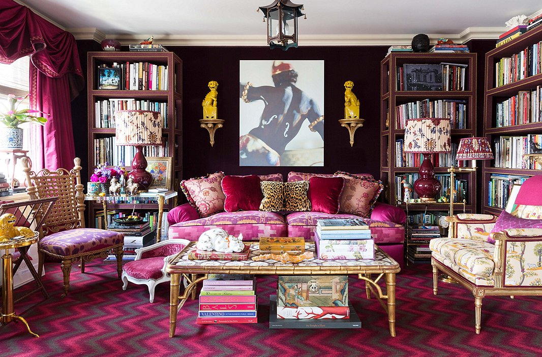
Rich textiles create a cocoonlike feel in the library. Deep purple velvet lines the walls, and the étagères feature a fabric overlay. The chevron carpet is one of Alex’s own designs for Langhorne.
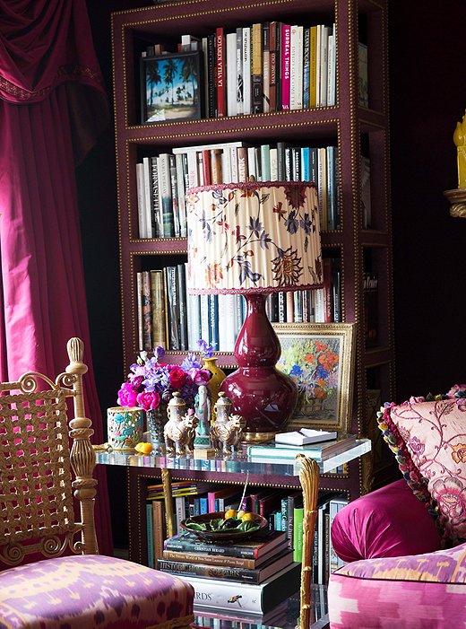
The library bookshelves are packed from floor to ceiling with volumes on art, fashion, and interiors.
The Comforts of Home
Alex’s schedule takes him all around the world, so his home is a true retreat—and the library in particular is a favorite hangout spot. A pair of Christopher Spitzmiller lamps offer plenty of light for curling up with a book, and Alex says the plush couch is ideal for Sunday afternoon movies. With the pocket doors closed, the space becomes the ultimate cozy screening room.
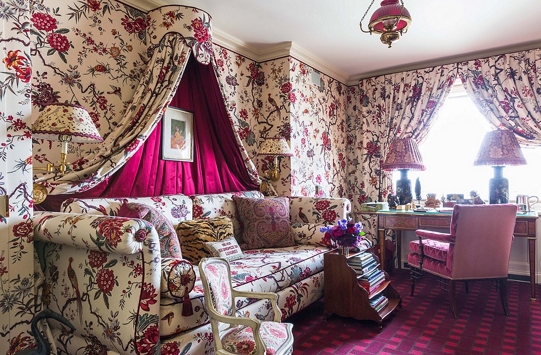
Once a petite bedroom, this space now serves as a dressing room and office for Alex’s partner, Scott. The basket-weave carpet, designed by Alex, adds geometric contrast to the Manuel Canovas floral.
Piling on the Print
In Scott’s dressing room, a lively floral toile takes center stage. While it might seem counterintuitive to do a small room in an allover print, Alex says, “Pattern on a cream background actually creates depth, so it opens up a room and gives it dimension.” Plus, the upholstered walls “add a kind of romance and richness that just nothing else does.”
The pattern carries onto the grand canopied daybed, with chairs and lampshades in complementary prints. The antique child-size chair is one of many throughout the home, placed near sofas and beds for the benefit of Teddy, the couple’s beloved Yorkshire terrier (“He just hops up and down and comes and goes when he wants!”). Alex loves that the chairs reference historical forms, and his young nieces love to play on them when they visit.

I love the idea of taking beautiful classical elements and using them in a modern way.
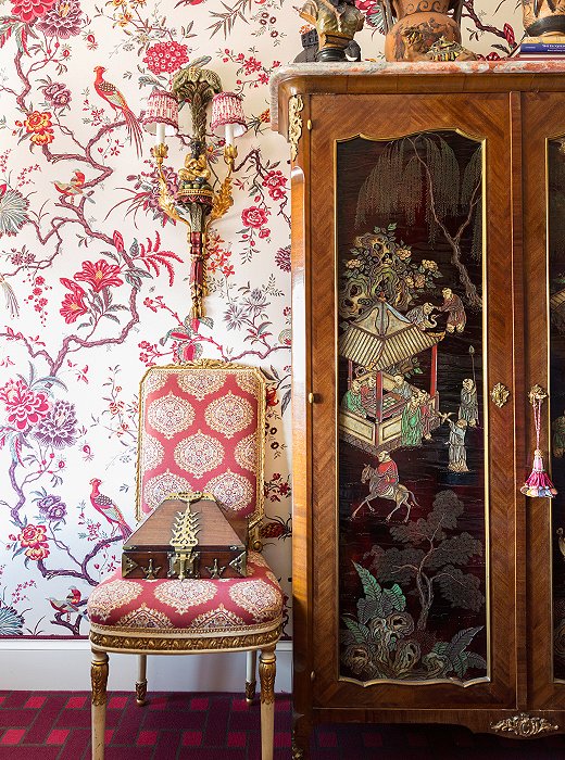
The Chinese armoire, found in London, features lacquered panels that add rich contrast to the upholstered walls.
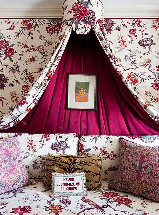
Alex lined the daybed canopy with red satin to create a break from the pattern. “There’s an important balance between decorating and overdecorating,” he says.
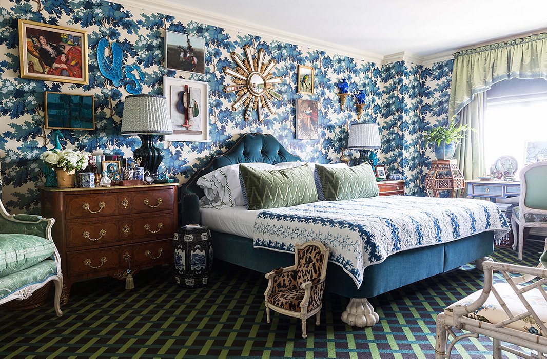
An upholstered bed with sculptural feet forms a grand focal point. “A bedroom can be beautifully decorated,” Alex says, “but if the bed isn’t paid attention to, the whole room falls flat.”
Going Full Spectrum
When it comes to color, more is certainly more for Alex. “I like to add things and not have to worry if it’s going to match.” In the bedroom, it seems that every hue of blue and green is represented, but it all works—the peacock-blue bed; the apple-green curtains; the teal, green, and purple basket-weave carpet—precisely because of the mix. “Clashing colors can be beautiful when they’re used correctly. They highlight each other in an interesting way.” The result is a dreamy atmospheric effect, almost like waking up in a garden.
As for that wallpaper? Alex describes it as a stroke of subconscious inspiration. While rereading a book after finishing the room, he was struck by an image in it of aFrench château’s tapestry-covered hallway, done in the exact hues of his bedroom wallpaper. “I realized I must have seen that, fallen in love with it, and stored it in a little file in my head. And then when I saw that paper I was drawn to it—I didn’t even realize where that had come from!”
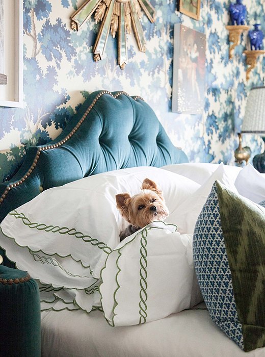
Teddy tests out the freshly pressed Leontine Linens sheets in the bedroom. “He’s an amazing traveler—he goes all over the world with us.”
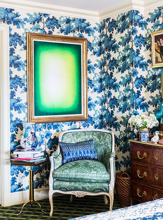
Green Shadow by Anish Kapoor hangs over a chair upholstered in Fortuny fabric, used on the reverse for a more antique look. The Swedish wallpaper from Old World Weavers was inspired by the Château de Groussay.
Adding Elements of Contrast
In a signature move, Alex juxtaposed a bold abstract print with a curvy bergère. The green hue (Scott’s favorite) has an almost electric tone that wakes up everything around it. “I love that modern splash of color on those historic-looking walls,” Alex says. “It creates an interesting dynamic, and it makes the paper feel rather modern and new, even though it’s very classic.”
This inspired mixing of materials and eras has become somewhat of a specialty. Even when a client asks for an all-white space, Alex creates atmosphere by varying the textures. “It’s all about the layering of textures and details that all come together. Nothing is the focus, but everything is an element.”
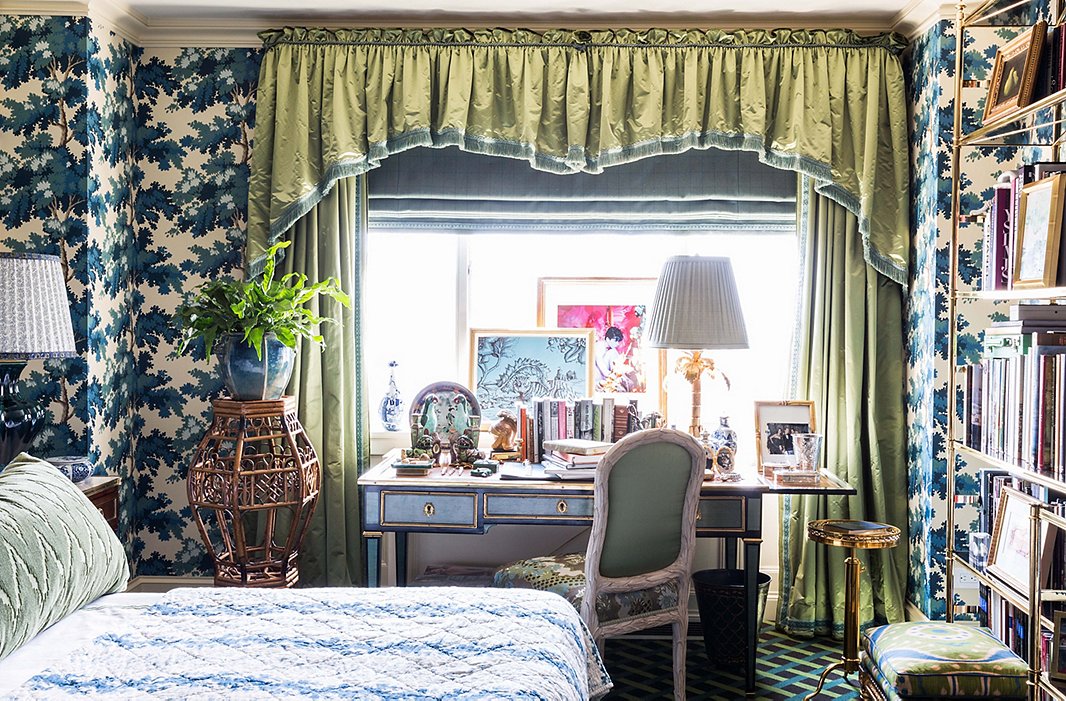
Alex values style in even the most utilitarian areas, such as a desk. “It’s all in the details,” he says. “You should live beautifully!”
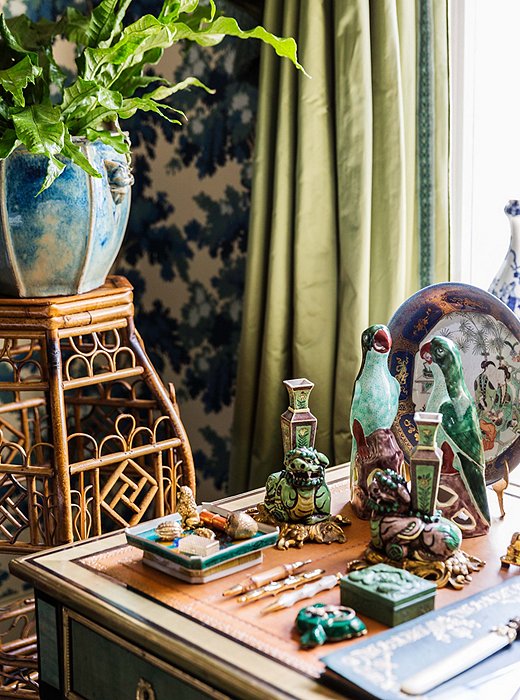
A vignette on Alex’s desk unites two of his collecting passions: animal motifs and chinoiserie. He’s also a big proponent of indoor plants. “It’s important to have living things in the house other than the people.”
Bringing the Outdoors In
A love for the natural world comes through in every corner of the home. Animal figurines top dressers and side tables, brightly feathered birds wink out from framed paintings, and floral vines climb onto walls, chairs, and drapery. It could be overwhelming, but the overall effect is magical.
Alex is quick to say that he’s no outdoorsman and jokingly describes the kind of nature he favors as “man-manipulated—I love planned flower beds, a beautiful greenhouse.” While he cultivates his own garden at his family’s Hamptons home, in the city he brings in natural notes through fabrics, objets, and artwork.

A bedroom can be beautifully decorated, but if the bed isn’t paid attention to, the whole room falls flat. It’s the biggest part of the room!
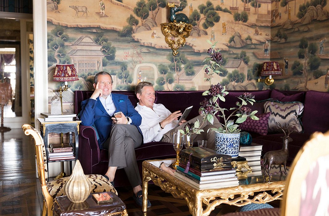
Alex and Scott kick back on the living room sectional, which seats a crowd during their frequent cocktail parties.
The Consummate Collector
Whether Alex is shopping a flea market in London or an antiques store in upstate New York, his well-honed eye can spot a piece with provenance right away. Scott now joins him on these shopping expeditions. “It’s fun. It becomes sort of a hobby and a sport.” What eventually makes the cut could be anything from a 19th-century French secretary to a bargain found at a sidewalk sale. These layers of objects, textiles, and artworks speak to a well-traveled life. “Everything in the house has a story and a memory of where it comes from.”
And if it looks like the collection has been assembled over decades, that’s because it has. “I have things that I’ve had since I started decorating,” Alex says. “Our home is very reflective of us. Unfortunately it has no more room in it, so we’re really finished. We’re going to have to find another house to start decorating!”
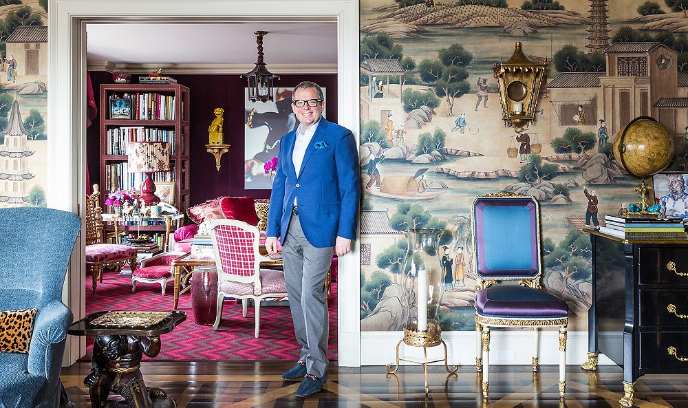
The BS items for sale in this segment don’t live up to the interior designs shown.
… so true, good point.
I agree but I dont think many could afford the textiles shown… they are not bad for the “knock off”
Definitely not minimalist.
Visual overload, too grandma for my taste.
The money spent on wallpaper alone in this house is probably more than my whole house is worth! Too crazy town for my taste…I couldn’t relax there.
STUNNING !!!!! Love the rich infusion and mix of vibrant colors. The decorative accesories all coordinate with all the rich colors and add more pop to each room. JUST OUTSTANDING !!!!!
Duggie – there is no coordination whatsoever!!
Goodness (that’s a nice word for what I really want to say), I’d need blinders to even visit this house much less live in it.
Well its a good thing this wasn’t built for YOU! Whether you could live there or not is irrelevant, and I don’t think you will need those blinders b/c you would never be invited. This is magnificent individual artistic expressionand this designer was kind enough to share it with others. Then you go and put it down, why to make you feel better about yourself? If you open your world to appreciate other’s creativity and stop putting it down, I assure you you will live a happier life.
As my father used to say when we bumped heads, “We can agree to disagree.”
You say two gay men live there? I’m shocked.
This is unkind. Sorry bud! And I do have a good sense of humour.
Over done ,out dated and way over the top.Less would have proven to be more! The eye gets dizzy in this room while traveling the space! There are several beautiful items,the sectional super fab, none of which are appreciated given the overwhelming clutter! “Asembled over decades”, can somtime be code for “hoarders live here.”
Hoarders on drugs.
Beautiful and skillfully done. But I was influenced early in my decorating life by Mario Buatta and Sister Parish. We must not mistake collections for accumulation, and layering for clutter. We are living in the one painting focal point, beige, grey and black era of decor. Popular television has wrongly pilloried collectors and those who love antiquity as hoarders stuck in the past. And the white dishes of the last three decades that have driven china production into bankruptcy… don’t get me started… has left us bored and boring. Will take this detailed look with rich narrative over the fake, staged, lifeless, ‘who the hell lives here’ look any day!! Added bonus for layered rooms is that they are more functional, i.e. newspapers, magazines, bills, mail on the coffee table of a minimalist house; place looks like a mess; in above spaces, no problem.
Not to forget Beige on Beige dashed with white or black….Blah,,,,,,,but it is a conformist color and historically as a retired designer that is what most people want.. conformity..Ask any real estate salesperson they all want to sell homes that are transitional and can be moved into immediately so no color walls and carpeting or plain hardwood floors or beige or tan tiles are the order of the day..Most people are afraid of color and now it has become even worse because you pick up any design magazine and you get these beige or white on white rooms Read the article and most designers will say “i like to use neutral colors and then accent with a “pop” of color..” ..It is refreshing to see color is coming back…Thankfully…
I love this apartment as 1) it seems to totally make the couple who
designed it and live there, very happy and content; and 2) because it’s
done so beautifully. Why so much negativity from commenters? No one is
asking you to live there, visit there, or likewise decorate your own
home that way. If anything, it seems it’s urging each of us, “Express
Your Self in ways that really resonate with You!”
and that is exactly what we’re doing.,,,
…if bashing and insulting others is what’s considered “self-expression,” that’s a very sad commentary, especially when there are so many ways of creating beauty for one’s self that don’t involve insulting others. Not liking a design scheme is one thing, but hurling personal insults is another.
Why are you so personally involved? I appreciate your reading my comments, really I do and I accept your response. Everyone has different tastes and different ways of expression. You don’t have to agree with mine.
I absolutely love the wall covering the rooms could have less and then the most beautiful things would shine. Love the way he covered small chair with border fabric to compliment the wall covering, it gets lost with all the stuff, I understand they are collectors and so am I, but i rotate and try to hold back. We have children in college, so it is easier for me to walk away from buying.
This house is brilliant. I read Delia’s negative comment, in her home, the television is the focal point of the room, and she is probably used as a footrest!
lol most likely delia can only afford Walmart. l believe its beautiful
Her house was decorated in ”EARLY ROLLBACK” The Zuber wallpaper and the entire house is a masterpiece. AN ABSOLUTE MASTERPIECE!
lol “Early Rollback”
Cute, Early roll back… I love it!
This ship has definitely sailed. Even Dorothy Draper showed more restraint. (btw, I LOVE her)
This man is on drugs …… Looks more like a second hand store and fine antiquities boutique …. I’m sure the stuff is worth millions but the eye can only focus on one thing at a time — this décor style only tells me the man is manic.
What has been captured here may not appeal to most. But then again, as the Greeks knew, “matters of taste are not disputable.” Gorgeous and mesmerizing, these rooms show a keen understanding of the depths of artistic expression, composition, and subtle editing that befits the grandeur of beautiful things. Someone of lesser abilities would not have been able to pull off the variety of textures presented here. The air is even…plush. Not for the masses for sure.
Exquisite. My mouth was drooling with the images of such a well-trained eye for color, a wonderful color palette over a whole apartment: turquoise, ruby, garnet, cream, and that diamond kitchen. All a jewel box escape up an elevator from the grey concrete of NY. What a treat to be invited up!
This look may not be something I would personally have in my own home, but since I don’t spend a lot of time on “social media”, I am shocked at how mean spirited and rude the general public has become. Why doesn’t “interesting to look at, but not a personal fan” suffice? Whatever happened to “class” in our country and “common good breeding” that kept us from ripping one another apart? Everyone has a different idea of interior design perfection. Personally, I like the variety designers bring to the table and enjoy perusing. No one is implying that I have to adopt every element I see before me.
… you peruse ripping as you rip ….
Please look up the formal definition of the word peruse and then keep it in context. “Peruse” and “Ripping” were used in two separate sentences and not directed towards a particular person. Perusing allows one to look at photographs and enjoy certain elements without feeling the need to put every item in one’s own home. However, since you feel the need to attack others personally, perhaps a spelling and grammar check in some of your postings might help you to better convey some of your thoughts – and that, “LazyFair” is a rip.
I couldn’t agree more, Suzanne. It was posted to appreciate an artist’s point of view and creativity. For all those who think it would be horrible to live in, well its wasn’t made for YOU! Actually you have nothing to do with it and whethter YOU like it or could live there is irrelevant. Open your world and enjoy individual expression and I assure you haters will have a much better life. Putting other’s down to make you feel better about yourself is a horrible quality in a person.
This rudeness is cyber behaviour. It is already being written about. And it is not pretty. One would never speak this way to the person in question. So why say it. If what you type is not something you would say to a room full of people, do not say it!!! Full stop.
Stunning!!!
Alex your home it’s a super hit, super cozy, and i just love your boy Teddy!!!
I think every room was fascinating to look at and just when you thought you had seen everything you realized that there was more. All the unusual pieces were a treat to my eyes.
Spectacular! Loved every inch. I am now an Alex Papachristidis fan and have been to his website to see all his posted projects. I am also an admirer of the work of the late Tony Duquette, and follow with great interest the magazine photos of Hutton Wilkinson’s home. I wish I could find the gorgeous porcelains, sculptures and wall brackets Papchristidis uses. My shopping trips to Miami and Palm Beach — though a distance from my island home near Key West — have yielded less than I hoped.Having commissioned a few coral and shell pieces, I can say that the dining room bust with the shells and coral is a commanding work of high art, and I would love to know the name of the artist. Well done!
That’s easy to find out. Just call Alex NYC office and ask. They will be more then happy to give you the name and location so you can contact them. Any major designer like Alex is wonderful and the staff are more then happy to oblige your inquiry.. that is only good business. But my bet with Alex is that he and his loving family are very proud of being Greeks. They are extremely hospitable, warm and caring to all..If you ever get to Greece you will understand what i am saying here..Give it a try i’ll bet his staff are as nice as he is….
Sipping coffee, waiting for babies to come down, reading and looking at these pics = pure entertainment. We’re privileged to have such easy access to these artists. Papachristidis is genius and this home is breathtaking and magical–I learned some fun things :). That last pic is pretty adorable!
Not my style, to be sure. But these boys made it a home. And as for the nasty comments here, you people should have more sex, drink more wine, look at the stars more….try to find some meaning in your lives. If you don’t like what you see, save the snarky snake biting. Go do something productive and leave people alone.
I personally loved the rich textures, fabrics, vignettes, colors and of course Teddy was a bonus!
Why should one have restraint when decorating ones own home? It’s the very place where one has complete artistic freedom. It should be filled with objects and colors that sing to the owner. It was nice to see creative people living in a vibrant space that they cherish! I certainly wouldn’t want some of these commenters visiting me.