Combining multiple spaces, whether it’s merging several rooms or two entire apartments, can be tricky—and sometimes result in some interesting layouts. That’s where symmetry plays a major role in helping to make the newly formed spaces feel—and look—perfectly proportioned.
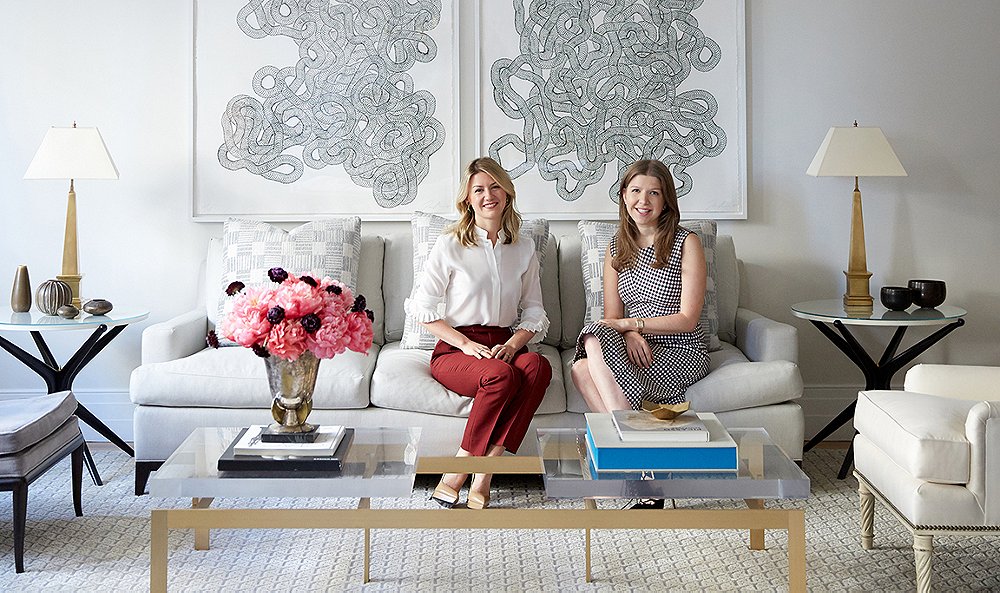
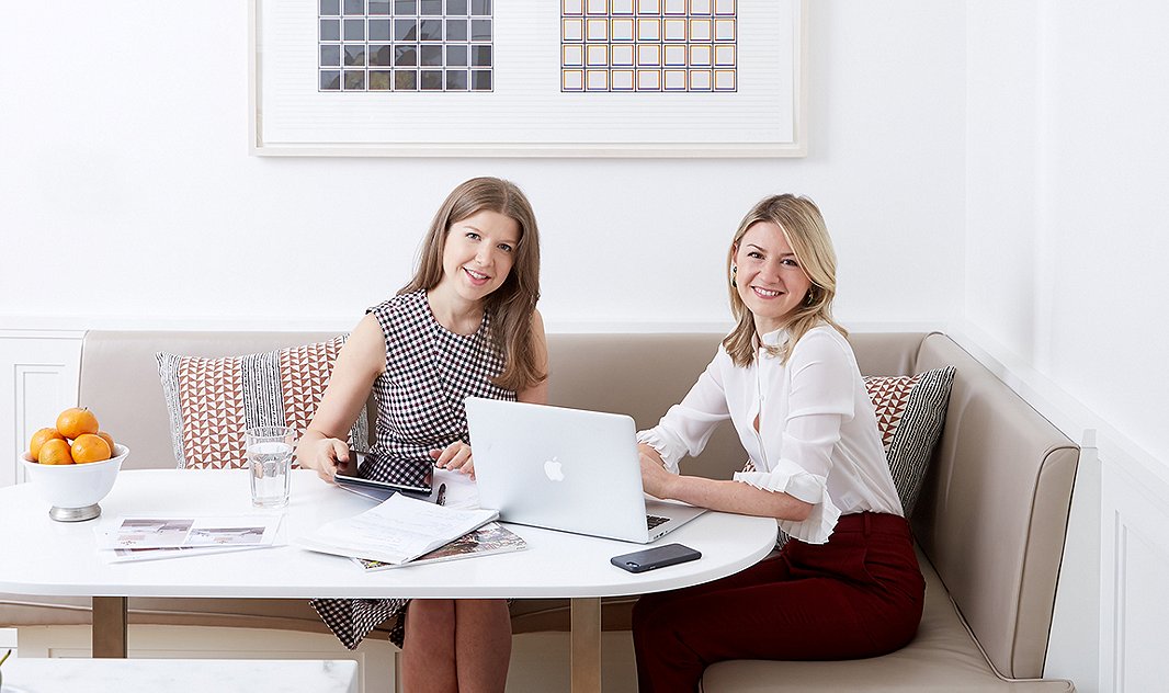
When we heard that two of our favorite rising design stars—Alyssa Kapito (above left) and Vivian Muller of the in-demand firm Kapito Muller—had recently combined two New York City apartments into one balanced and beautiful home, we knew we had to get their tricks. “Originally the combined apartment had no symmetry,” says Alyssa. “Creating a space that felt like it had symmetry—as opposed to a bunch of rooms weirdly put together—was something very much at the front of our minds.”
Here, Alyssa and Vivian take us through the design they created for a family of six and offer seven lessons on bringing symmetry into your own space. (And who better to speak to symmetry than a pair of designers!)
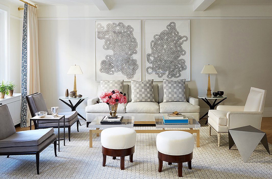
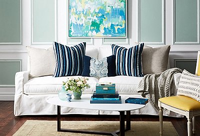
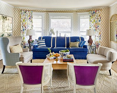
A pair of Tara Donovan prints set the symmetrical tone for the polished living room. The homeowners “have a passion for art and antiques, so we wanted to start a collection for them at the same time,” says Alyssa.
Lesson 1: There’s (Always) Power in Pairs
“Symmetry is very easy to achieve,” says Alyssa. “You just buy in pairs.” But a bit of contrast helps to draw attention to the elegance of symmetrical arrangements. The designers used multiples throughout the room to achieve a sense of balance in the open space; to keep things interesting, they varied the seating on one side of the room and added a mix of accents to catch the eye. “We like to throw the symmetry off a little bit,” Alyssa adds.

Graceful wallpaper makes an impact in the entry. “We wanted something that felt a little bit feminine but clean and simple at the same time,” says Vivian.
Lesson 2: Let Bold Elements Shine
Alyssa and Vivian wanted a “wow moment” in the entry, but the space still needed to be practical. They balance the eye-catching botanical wallpaper with a sleek console table, an organic mirror, and pairs of tailored benches and glam sconces. “We were able to create a vignette as you walked in,” says Vivian. “You have a place to sit or just put down things.” Plus, adds Alyssa, “it sets in the mood for the entire apartment.”

In the dining room, Alyssa and Vivian chose striking pieces, such as the convex mirror and the vintage table lamps, that could almost double as art. “We also have this beautiful glass chandelier to add warmth,” says Vivian.
Lesson 3: Make an Impact with Multiples
“The dining area was definitely important,” Vivian explains. “We wanted to create an area where you can have a lot of seating because she hosts a lot.” While a mix of seating might have overwhelmed the space, Vivian and Alyssa kept the chairs cohesive for a polished look. The color palette is in harmony with the nearby living area, adding to the sense of calm. “We kept the colors similar so the areas would feel uniform and create a big overall space,” Vivian says.
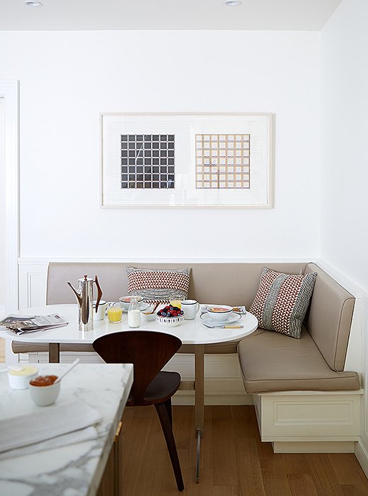
The family’s four boys love piling into the breakfast nook for meals and homework. Alyssa and Vivian paired a banquette upholstered in kidproof vinyl with a custom table.
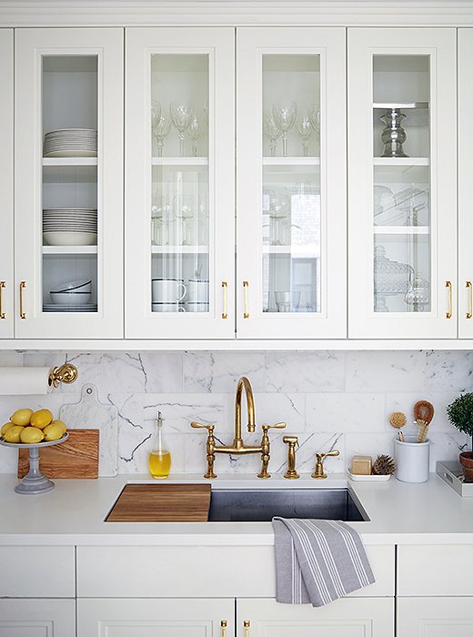
Rich materials including brass and marble accent the kitchen. “Brass is such a warm metal,” says Vivian “One of the ways we accomplished that warm feeling in the apartment was by using brass.”
Lesson 4: Choose Complementary Elements
Since the family has four young boys, Vivian and Alyssa picked accents that balance beauty and function—such as a durable Corian countertop with a gorgeous marble backsplash. Colorfully patterned decorative pillows keep the breakfast nook’s banquette comfy for homework time and work perfectly with a geometric print hanging above. “They play off each other in fun a way,” says Vivian.
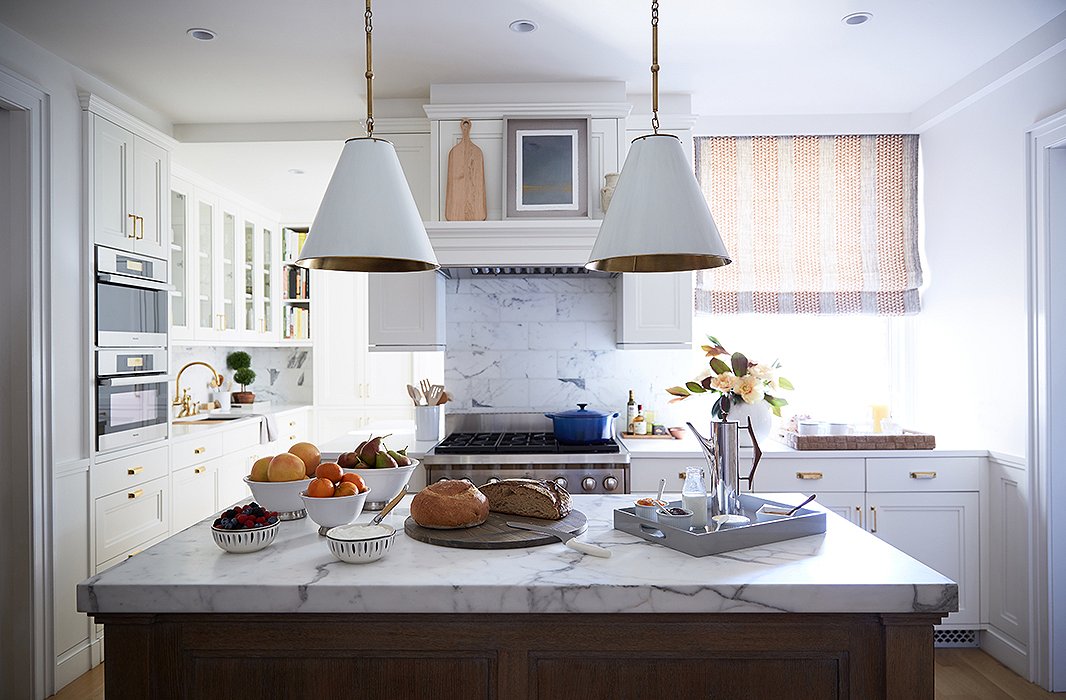
The kitchen island was a must-have for the wife, who once worked in one of New York’s best restaurants. “Maneuvering things in the kitchen to make sure she was able to get that was fun and interesting,” says Vivian.
Lesson 5: Create a Centerpiece
“The kitchen was an unusual shape to begin with,” says Vivian. “That was where the two apartments got really convoluted.” The designers centered the space around the large kitchen island, where the wife gives cooking classes. Even through the rest of the room has an unconventional layout, the marble-top surface and the pair of pendant lights give the room a focal point and a sense of symmetry.
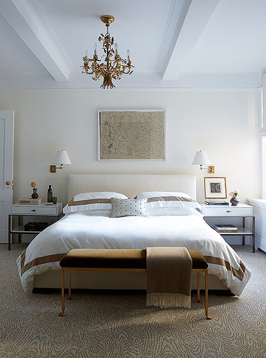
Gilded details and warm metals add a bit of restrained opulence to the master bedroom. “We didn’t want the apartment to fall flat because we weren’t using a lot of color,” explains Vivian. “The way we avoid that is in by playing with different textures. Metal is a great texture, although most people don’t think of it as a texture.”
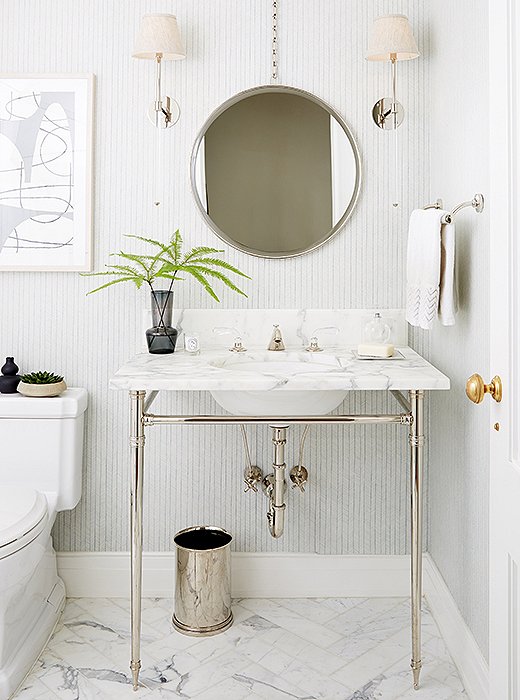
The subtle wallpaper was the starting point of the powder room. “We wanted something that was feminine but a bit masculine at the same time because it’s five boys to one woman,” says Vivian. “We also put marble on the floor and then carried that through with the vanity to keep a clean but warm feeling.”
Lesson 6: Symmetry Leads to Serenity
“The master bedroom is very calming,” says Alyssa. “That was a very big part of designing the apartment. She wanted a very calming space.” To create the soothing retreat, the designers relied on a pale palette of white and brown and a symmetrical layout. “I think symmetry is always calming,” Alyssa adds. To extend the serene effect, they repeated the clean-lined symmetry of the bedroom in the bath with a simple vanity topped with a round mirror and gleaming sconces. “We also put marble on the floor and then carried that through with the vanity to keep a clean but warm feeling.”
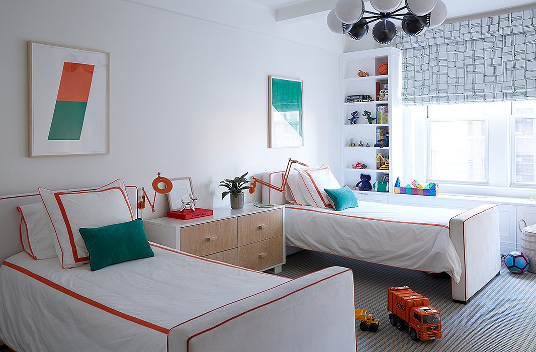
The palette of each of the kids’ rooms was chosen by the pint-size occupants. “They wanted something bright and colorful,” says Alyssa.
Lesson 7: Play with Color
The kids’ rooms gave Alyssa and Vivian a chance to get a little wild with pairs and bright colors. “That’s a place where we really had fun with symmetry,” says Alyssa. “Everything matched each other, except for the artwork, which I thought was a way to be playful.”

I think symmetry is always calming. One of the goals of the apartment was definitely to create a space that would be a break from the city crazy.

Join the Discussion