A handful of factors posed a challenge for One Kings Lane’s VP of marketing, Michael Krueger, and his family upon moving to New York City from California. He and his wife, Erin, had parted with most of their furniture—which had become worn from years of raising two children—so they were essentially starting from scratch. They were moving into a much smaller two-bedroom apartment, which meant less space and that their son and their daughter would share a room. The new-build layout of the home, while pristine, offered little in the way of architectural details and character. And then there was balancing Michael’s strong affinity toward modernist designs with something that felt practical and warm for a young family.
“We did what we could the first year,” says Michael of outfitting the new apartment. “It was fine, but we knew it could be more interesting and more pleasant to be in. But we were out of ideas.” So they called upon One Kings Lane Interior Design to reinvent the space and make it feel more like a home. “We wanted it to feel clean and serene, a refuge from the city,” he says. Read on to learn how it all came together.
Shop the look →
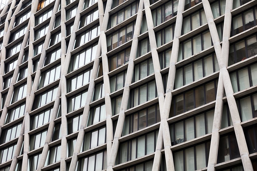
Michael and Erin’s apartment is housed in a building with a modernist exterior of criss-crossed concrete pillars.
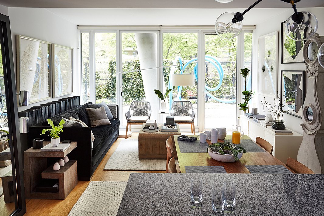
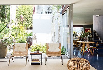
The woven chairs against the windows echo the modernist angled lines on the facade of the building, a concrete pillar of which can be seen in the background in the building’s private garden.
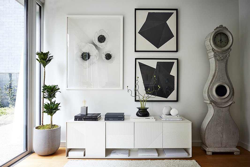
Oversize artwork from Dawn Wolfe and Lillian August makes a graphic statement on the main wall and provide a striking contrast to the vintage Swedish Mora grandfather clock.
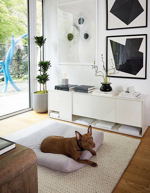
Rescue pup Clementine hangs out on a cozy bed by Sferra. “She’s a cuddler and will follow you all over the apartment,” Erin says.
“Less but Better”
The key to creating the finished, practical, and modern home Michael envisioned lay in famed German industrial designer Dieter Rams’s 10 principles of good design. Rams’s edict of “less but better,” perhaps the most famous phrase from his manifesto, served as a mantra as Michael put together the apartment with his designer.
This meant fewer pieces but bigger in scale and better in quality. Also important was a pared-down color palette, but with bold punches of graphic black and glimmering metallics. And with few closets in the apartment, the furniture has to work hard: The bunk beds in the kids’ room have storage underneath, and the large console in the living room holds a host of essentials.
Such a streamlined decor approach called for a similar clutter-free philosophy for personal effects. “We’ve purged a ton,” Michael says. “I own almost nothing besides clothes and the furnishings in the apartment. It all goes back to ‘Less but better.’ To me, it’s a whole organizing principle for life.”
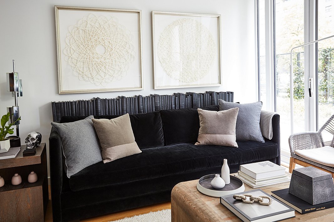
The silver chain objet from Ralph Lauren Home that sits on the coffee table and the nickel skull by Regina Andrew on the side table are always a hit when Nils, 9, and Elin, 7, have friends over.
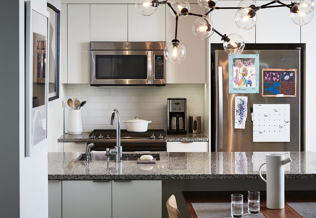
The kitchen required little in the way of dressing up. It is accented with a constellation-inspired chandelier and a few pieces of art. In lieu of barstools, they tucked the dining table under the counter to create enough space for four to sit, eat, or do homework.
The Art of “Accessorized Minimalism”
While minimalism is a guiding influence in the Krueger apartment, Michael and Erin wanted to ensure it felt livable and like home for their family. This required thoughtful curation and incorporating only pieces that have a purpose, meaning, or both. “I think of it as accessorized minimalism,” Michael says. “There are no architectural elements in the apartment, just white walls. If you went straight minimalism, it would be sad and boring. The accents seemed really important.”
He looked to modernist architectural masters such as Marcel Breuer and Richard Neutra for inspiration, as well as contemporary interior designers including Robert Stilin, Ryan Korban, and Alyssa Kapito, who are pros at “taking a blank New York apartment and making it look interesting,” Michael says.
The first step in adding warmth and cohesion to the space was replacing the two rugs in the living and dining areas with matching white designs. “We were definitely hesitant, having a white rug with two kids,” Michael says. “But it was totally worth it. It really transformed the room and made it feel complete, elevated, and calm.”
Art was another major player in accessorizing the apartment. His designer paired oversize monochromatic pieces with his existing collection, which includes sculptural works made of paper by Matthew Shlian and Gill Wilson, along with a street-art-inspired Kaws doll the kids love. “Being in the city, the kids have taken a strong interest in graffiti and street art. Anything in that genre excites them,” Michael says.
Linking their new home back to places in their past was also important. Michael and Erin are both from Minnesota, so they incorporated several designs from artists and craftspeople based there. Michael surprised Erin with the vintage Mora clock that sits in the living room, which was made in a town in Sweden near where her family originates.
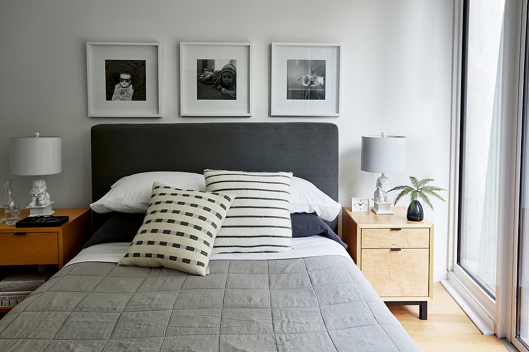
The master bedroom is all about soothing neutrals and a few personal touches. Above the bed hang three photos of the kids. “We have Nils hanging out, the two of them being goofy, and Elin doing what we call her ‘boss lady’ face. We wanted one together and then one of each that felt unique to their personality,” Michael says.
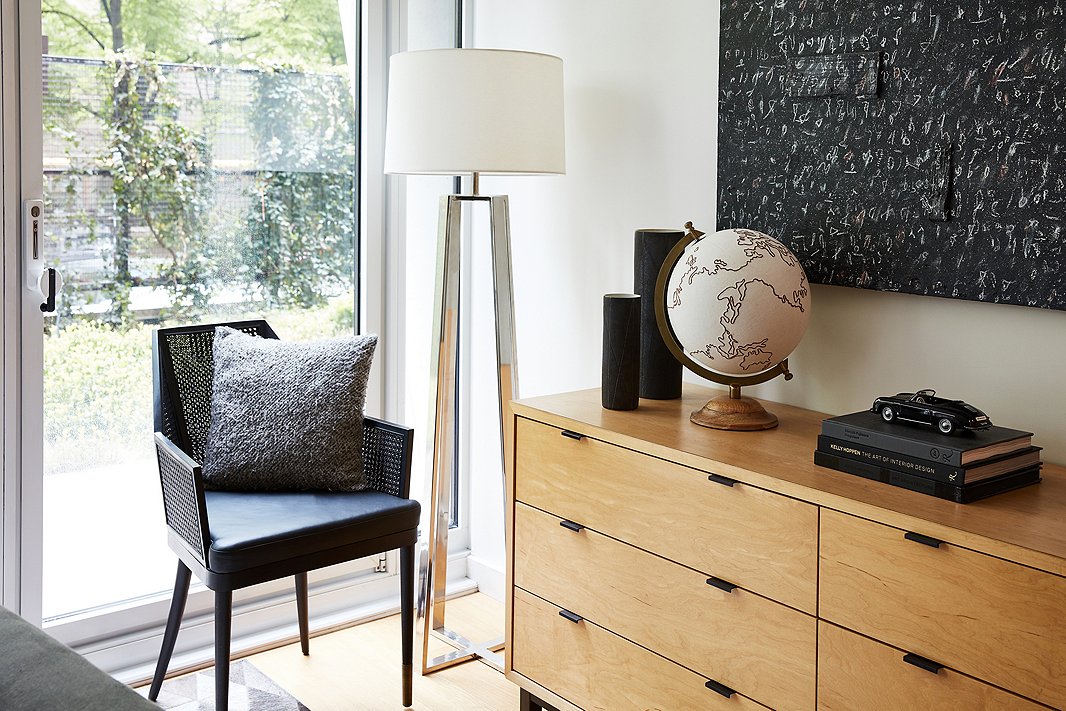
“Even though our bedroom isn’t very big, adding the small-stature chair has made a huge difference,” Michael says. “It’s made for a nice reading nook we use all the time.” A canvas globe by Jamie Young sits on the console among other decorative flourishes.
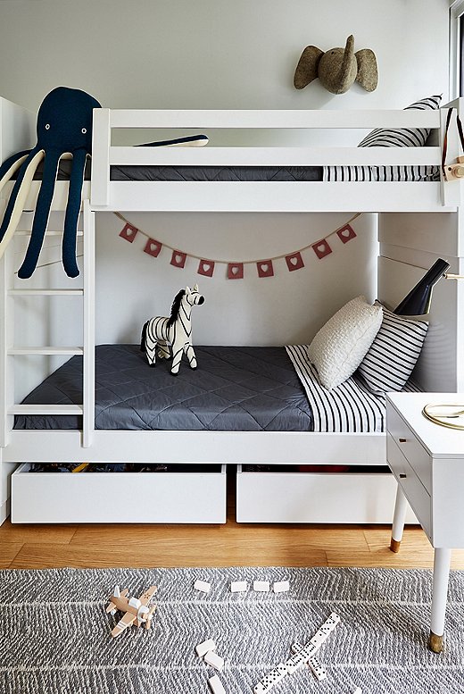
“The kids are obsessed with the elephant,” Michael says of the plush animal hanging above the bunk bed. “I was telling them Elsie is the name of the One Kings Lane elephant mascot, so they decided its name should be Elsie Junior.”
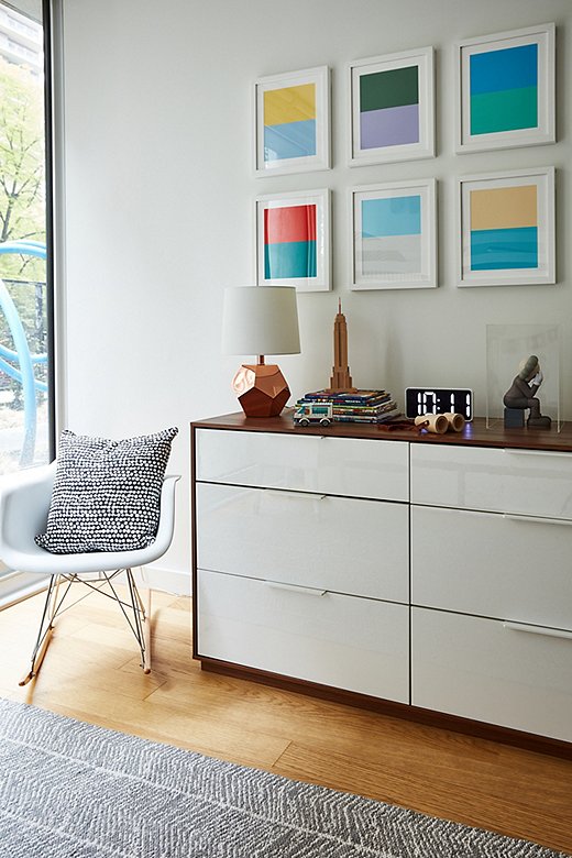
The Color Studies set by Pencil & Paper Co. adds a vibrant pop to the kids’ room—and is one of the few sources of color in the entire apartment. A Kaws doll—a favorite of the kids’—sits on the right side of the console.
Making Room for Fun
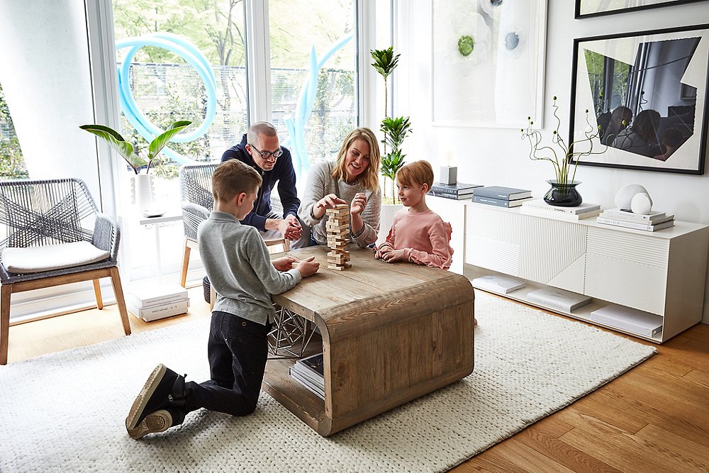
Moving into a smaller apartment has been an adjustment for the whole family—but one that has allowed them to spend more time together. Weekends at home mean hanging out in the living room playing games or reading. “Being in that small of a space, you end up doing everything together,” Michael says. “There is no sending the kids away to the basement to play.”
Of course, Nils and Elin can always retreat to their shared bedroom, which Michael admits was a challenge to put together. “How could we make it feel like their space? They were moving from 3,000 miles away,” Michael says. “We wanted them to both connect with the room and feel at home.” They stuck with a largely neutral color palette but added fun pops of color with art and mixed up the textures with textiles and a rug. The result? It’s working well so far. “Interesting things happen from being in a small space,” Michael says. “It’s fun to force them to be in their room together and see what games they invent. They’ve definitely gotten closer.”
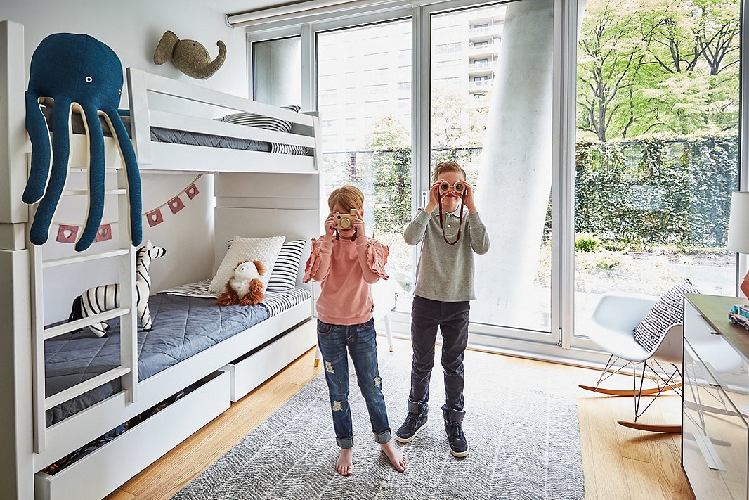
Elin and Nils hang out in their shared room, which looks out onto their building’s private garden.
Join the Discussion