Offices aren’t often celebrated for their warm, welcoming decor. There are certainly work spaces designed with a forward-thinking approach—kitted out with the latest technologies tailored to elevate productivity and creativity—but hominess and a true feeling of comfort are less common.
That was the major issue at the New York offices of Clique Media Group, the company behind popular fashion, beauty, and lifestyle websites Who What Wear, Byrdie, and MyDomaine. Being the interiors enthusiasts that they are, MyDomaine editors Sophie Miura and Gabrielle Savoie craved something a bit more stylish—so they called on One Kings Lane Interior Design to give their office a fresh look. Read on to tour the revamped space and see how it all came together.
![Gabby and Sophie were open to taking a few risks in the name of great design. Case in point: the streamlined channel chairs in the entry. “They bring so much personality,” Sophie says. “We weren’t sure what they would look like in the space, [but] everyone [thinks] they’re incredible.”](https://okl.scene7.com/is/image/OKL/BLOG9_MYDOMAINE_092717?wid=1066&op_sharpen=1)
Gabby and Sophie were open to taking a few risks in the name of great design. Case in point: the streamlined channel chairs in the entry. “They bring so much personality,” Sophie says. “We weren’t sure what they would look like in the space, [but] everyone [thinks] they’re incredible.”
Getting Started
“It was definitely lacking in personality,” Sophie says of the space—formerly occupied by a tech brand—to which Clique Media Group’s New York team recently relocated. This stood in stark contrast to the company’s lavishly decorated Los Angeles headquarters, a space with a cohesive black, white, and blush color scheme and filled with gorgeous furnishings and midcentury accents. “The goal was to elevate the New York space so it could be said in the same breath as their L.A. office,” says Sally Gotfredson, the One Kings Lane designer who partnered with MyDomaine on the project.
The open floor plan of desks and cubicles worked for the office’s collaborative environment. It was the reception area and a shared meeting spot that needed the most help—both in terms of aesthetics and in proper use of space. As is often the case with offices, the layout was tricky. “It was kind of like a game of Tetris, figuring out what we could fit,” Sally says. “We had to go back to the drawing board a few times.”
Gathering inspiration, on the other hand, was the easy part: To keep the new space in line with MyDomaine’s company identity, the brand’s West Coast office served as a polestar for the design. With this directive, Sally set out to create an elevated, chic, and comfortable space—one that would appeal to the many interiors-obsessed employees and guests who spend time there. The verdict? “We’ve definitely noticed morale in the office lift,” Sophie says. “It’s a place people enjoy coming to every day.”
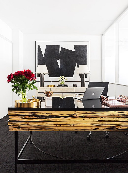
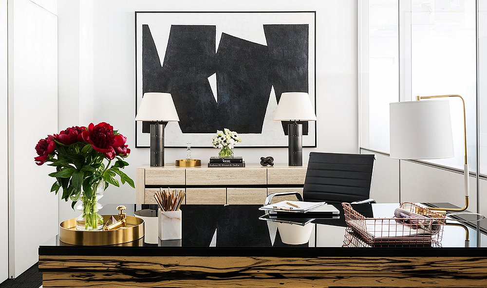
This desk is a particular favorite of Sally, Gabrielle, and Sophie. “It’s the first thing you see when you walk in. It really grounds the space and looks so chic,” Gabrielle says. “It’s totally unexpected for an office space,” Sally adds.
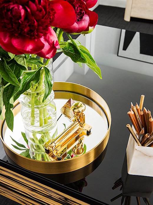
Everyday office supplies don’t have to be drab. A glimmering gold stapler and metallic pencils add a little glamour to the workday.
A Warmer Welcome
As the first spot visitors see, the reception area needed to make a strong first impression—and to feel as elevated as the interiors MyDomaine features online. The area had been largely underused, with too much empty space and a clunky (and unnecessary) built-in desk. Sally replaced it with an oversize style. With its dramatic proportions and unusual wood graining, it gives guests a seriously stylish welcome.
The other tricky feature was the existing gray carpet. Instead of covering it up, Sally decided to highlight it—choosing a console, artwork, and other pieces in a lighter palette that would really pop against the dark hue. Gilded accents, table lamps, and fresh flowers finish off the space.
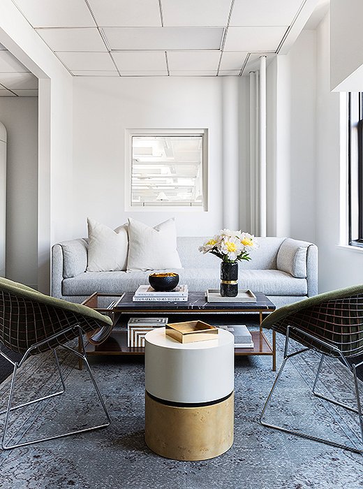
Plush furnishings, clean-lined accent tables, and a vintage rug give this mixed-use space a living-room-like feel.
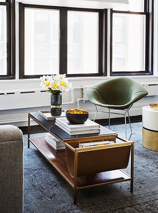
“The hero pieces in this space are the green-upholstered Bertoia chairs. They’re so special, and they look good from every angle,” Sally says.
A Place to Congregate
The office had a few closed-off meeting rooms, but what the staff really needed was an informal gathering space that could pull double duty as a stylish set for video shoots. “We wanted to create a space where they could go and relax but also have meetings,” Sally says. “We wanted it to feel almost like you’re sitting in someone’s living room.”
To make it happen, the team cleared out what was once a small photo studio. The airy multipurpose hangout is now furnished with pieces that would feel just as at home in, well, a home—a vintage rug, a sleek sofa, and a coffee table flanked by vintage Bertoia accent chairs—with plenty of extra floor space to accommodate large meetings.
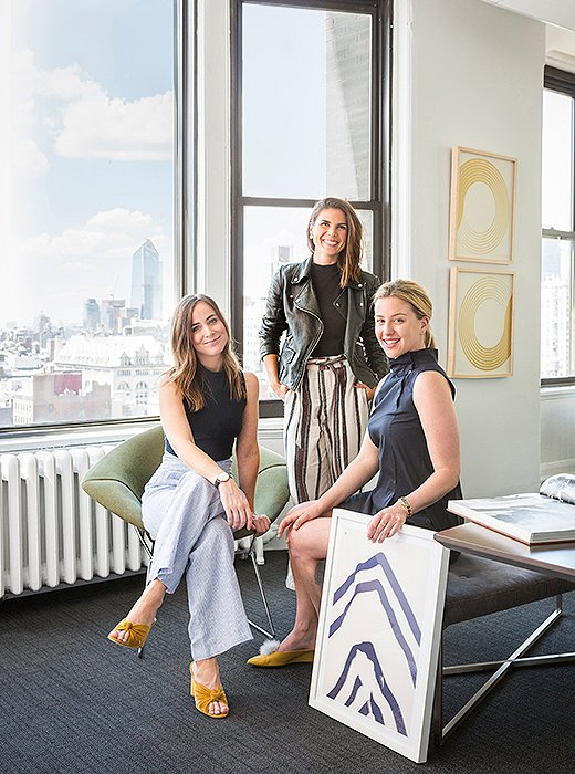
Sophie Miura, Gabrielle Savoie, and Sally Gotfredson in Clique Media Group’s Manhattan office.
How to Make Work Feel Like Home
Not everyone can work from home, but that doesn’t mean your office can’t feel more like a home. “It’s all about making the space feel more residential and using a lot of pieces that couldn’t be further from traditional office decor,” Sally says. Here are her top tips for bringing an inviting ambience to work.
Give wall-to-wall carpeting an upgrade. Standard office carpet is difficult (and often impractical) to replace. To dress it up, try a layered look—adding one oversize rug or overlapping several smaller pieces to give your office a boost in texture, comfort, and color. Sally suggests choosing a patterned, durable rug that will hide stains and stand up to heavy traffic.
Elevate the office staple. Do away with executive-style built-in desks! Channel the home office and opt for styles that combine utility with statement-making flair.
Bring in mood lighting. Sure, light from the overhead fluorescents may be perfectly adequate, but it’s rarely all that inviting (or flattering.) Supplement your space’s existing lighting with a few table lamps. “It’s a really residential touch, and a little bit of mood lighting—especially in the winter months when it gets dark sooner—is so nice to have,” says Sally.
Make it memorable—and take some risks. Drab offices tend to look alike, so be sure to incorporate details that feel fresh and memorable. Try a special vintage piece, an oversize artwork, or a pair of chairs that push the design envelope.
Join the Discussion