While hanging wallpaper or painting a room in an eye-catching shade may be your first impulse for an instant top-to-bottom refresh in a room, consider this alternative chic trick that designers swear by: painting your trims and moldings.
A beautifully painted trim can highlight the architecture of a space, accentuate your wall color, and make a gorgeous wallpaper shine. Think of it as the perfect frame for your walls—and your rooms.
Not sure what color to pick for your trim or molding? We asked some of our favorite interior designers to share the colors they love—from dreamy white to tantalizing teal—and how they’ve used them to create standout spaces in their own homes.
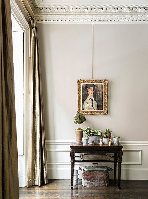
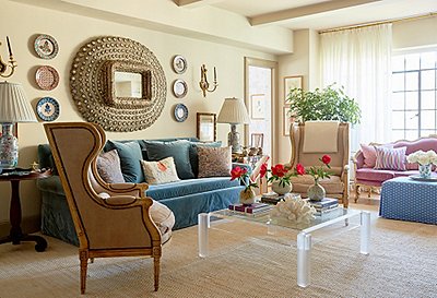
Photo by Lesley Unruh
Nina Farmer
The favorite: Simply White by Benjamin Moore

“I used it on all of the millwork, casing, and architectural details,” says the Boston-based decorator, who chose the shade for her own Beacon Hill brownstone. “Simply White can complete a wide range of wall colors. Here I used it with Revere Pewter, which is a warm gray,” she adds of the subtle, dreamy contrast the hues give her living room.
Why she loves it: “This is a great warm white,” she says, pointing out that the shade’s cream undertone pairs perfectly with neutrals, warm wood tones, and serene colors. “It was actually Benjamin Moore’s color of the year for 2016.”
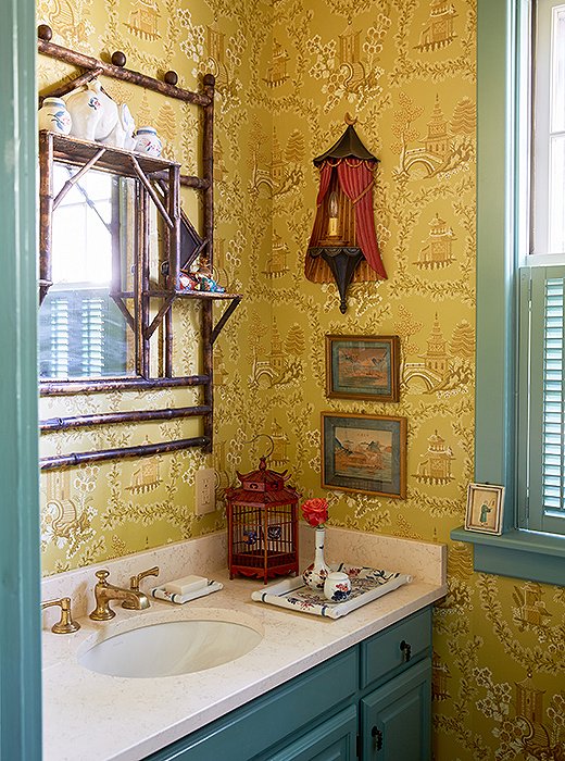
Photo by Tony Vu
Madcap Cottage
The favorite: Spotswood Teal by Benjamin Moore
Jason Oliver Nixon and John Loecke, the designers behind Madcap Cottage, used the shade to enliven a small powder room in their High Point, NC, home. “The color teal has stepped from the runway and into the home,” they explain. “It’s moody, gives a small space unexpected flair, and it’s a good balance to the golden hues of the vintage wallpaper.”
Why they love it: “Dark trim colors call out the architecture of a space and add a bold punctuation mark. Use a dark trim to make a small space feel that much larger. Moldings need not be white: Have some fun, and think big and bold. Life is short; details matter.”
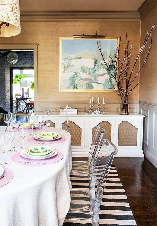
Photo by Aubrie Pick
Chloe Warner
The favorite: Oxford Stone by Farrow & Ball

San Francisco-based Chloe Warner selected the shade for her Oakland home’s dining room. “It’s the best gray-beige, neither too chilly or too brown,” she says.
Why she loves it: “I painted all the wainscoting and trim in this color,” she explains. “It works perfectly as a nonsnoozy neutral. And it picks up a silver gray from the grass cloth, which I love. It looks so nice with blues, makes black look sober and white look clean. It also works especially nicely with metallics.”
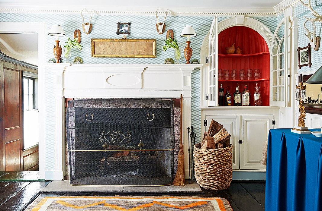
Photo by Tony Vu
Jeffrey Bilhuber
The favorite: White Dove by Benjamin Moore
“This reception hall is in our Colonial Revival house in Locust Valley that has impressive period architectural detailing and millwork,” says the New York–based designer. “White Dove helps us see and appreciate all the details by capturing light and enhancing shadow.”
Why he loves it: “For the past 10 years, White Dove has been our go-to color, as it provides a warm-based white that doesn’t yellow or offset the colors that surround it,” he says. “It complements everything I throw at it!”


Join the Discussion