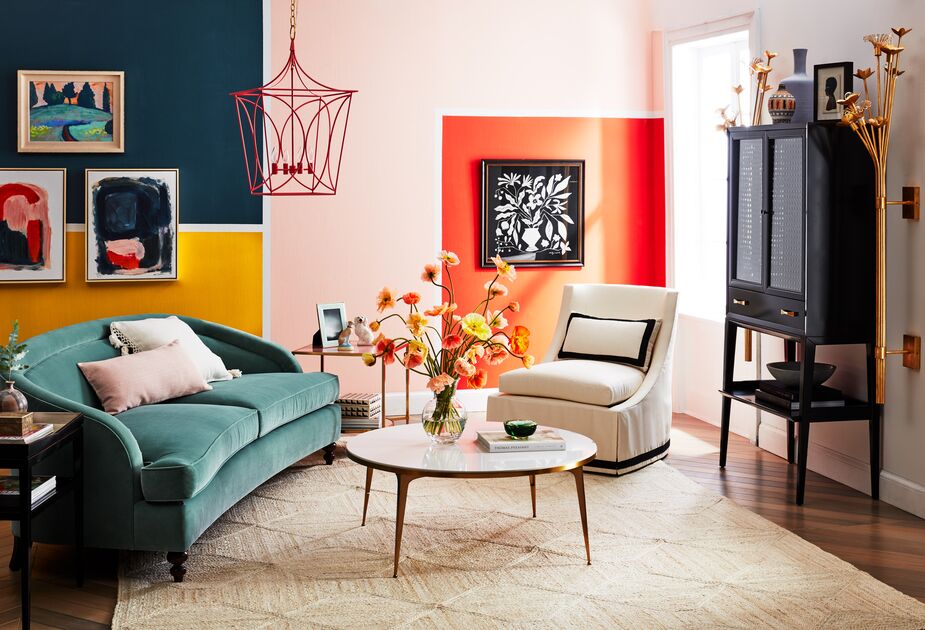
Seeing red. Feeling blue. Green with envy. Color has long been associated with moods, so it makes sense to give more than a passing thought to palettes when decorating a room. There is even a science dedicated to color, chromatology. Research into the psychological and physical effects of color on people is why some jail cells and drunk tanks are painted pink: That particular color is calming, even enervating.
Below, we take a look at which hues are soothing and which are energizing, which stimulate the appetite and which encourage concentration. Of course, these are all generalities. If when you were a child you were attacked by a swarm of bees while wearing pink overalls and eating pink cotton candy, that color could make you feel anything but serene. And if orange makes you happy, feel free to swathe your bedroom in it, never mind what conventional wisdom says.
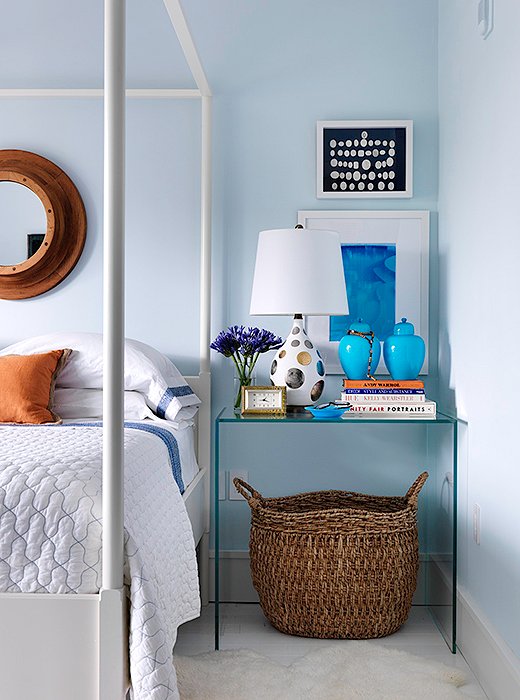
Pale blue offset with white calls to mind floating on clouds—wonderful imagery for a bedroom. Photo courtesy of Robert Passal.
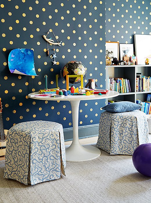
Layers of blue in a playroom will help little ones from getting overstimulated while still encouraging fun. Photo by Tony Vu.
Blue Heaven
Blue is the favorite color of more people around the world than any other color, and that’s regardless of culture and locale. Maybe it’s because of the hue’s association with clear skies and clean water. Maybe it’s because the color lowers blood pressure and boosts concentration in some people. Exposure to blue light has even been shown to minimize pain.
The color’s association with serenity makes it a lovely choice for a bedroom or a study. And because it is so popular and rarely stirs strong feelings of distaste, blue is a great option for a room where you entertain guests or work with clients.
One space you might not want to go heavy on blue: the dining room. The color has been shown to depress the appetite; some theorize that’s because there are hardly any blue foods found in nature. Then again, if you’re trying to cut calories, consider buying indigo plates or navy place mats.
Shop all things blue >
Green hues that skew more yellow than blue are considered the most cheerful and inviting. Photo courtesy of John Loecke and Jason Oliver Nixon; design by Madcap Cottage.
Get the Green Light
Like blue, green is associated with nature and considered a calming color. The reason for the latter may be due in part to green’s being the easiest color for humans (or to be precise, the cones of the human eye) to perceive, thanks to its position in the middle of the visible color spectrum. People can also perceive more variations of green than of any other color.
Because green creates feelings of serenity and security, it’s popular in hospitals and other medical facilities. That could be one reason it’s not as pervasive as blue in home decor (though green sofas have grown increasingly popular recently). Another might be that some shades of green can be unflattering to certain skin tones, and at least one study suggests that darker greens such as olive have negative connotations.
No matter which palette you settle on for a room, there’s a foolproof way to introduce a soothing dose of green—with plants, real or faux. The artful eye of Mother Nature ensures that they’ll complement every color scheme.
Shop all things green >
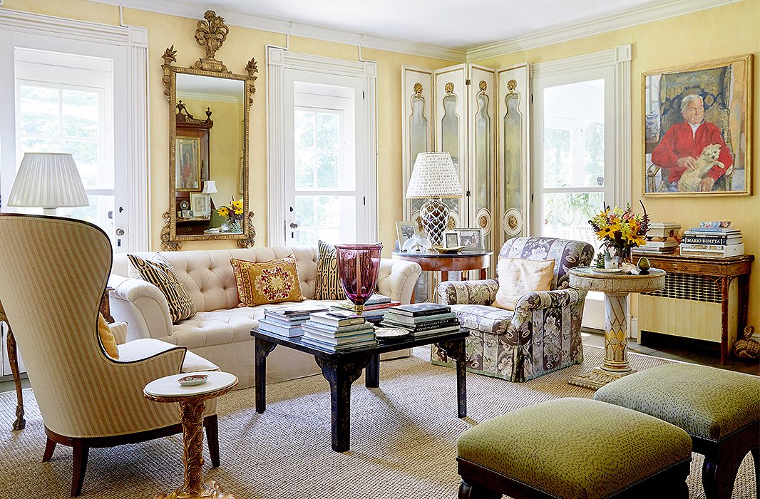
Soft, buttery yellows and regal glints of gold keep this room both sunny and serene. Photo by Tony Vu; design by Bunny Williams.
Mellow (and Not So Mellow) Yellow
Yellow is a color of contradictions. On the one hand, exposure to yellow has been shown to encourage the secretion of the neurotransmitter serotonin, and higher serotonin levels generally translate to a happier mood. It’s also believed to encourage creativity and communication—at least in small doses. Too much or too bright a yellow, however, can be too stimulating. Research suggests that people are more apt to lose their temper in a yellow room, and at least one study posited that street crime rose when cities switched to yellow streetlights.
That doesn’t mean your previously happy marriage will descend into endless arguments if you paint your walls yellow. But you might want to limit brilliant yellow to an accent color in your scheme, rather than make it the dominant hue. Or you can envelop a room in paler, softer shades of yellow.
If you nonetheless want to go both big and bold with yellow, start off in the kitchen. The color has been found to stimulate the appetite. It’s no accident that yellow is prominent in the branding of McDonald’s, Burger King, and Carl Jr.’s, to name just a few.
Shop all things yellow >
Limited to an accent color, bright yellow generates cheer rather than angst.
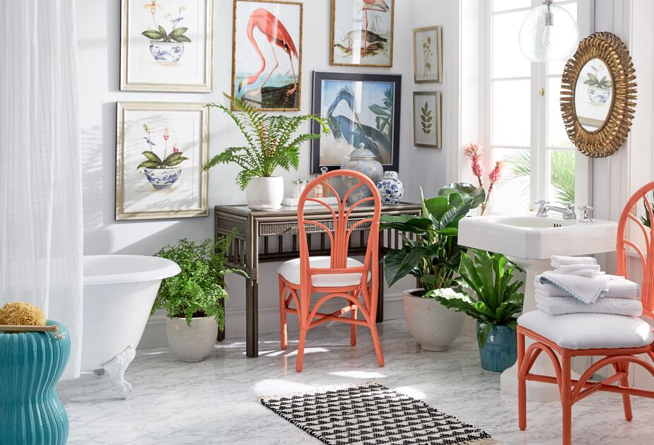
The orange chairs serve as palate cleaners in this biophilic bathroom.
Orange: Not the New Black
The longer the wavelength of a visible color (as opposed to infrared and ultraviolet colors, which are invisible to the naked human eye), the more stimulating that color is. Because orange is a combination of yellow and red, two warm colors with long wavelengths, it can make you feel energetic when you’re exposed to small doses. Too much pure orange, however, can increase your anxiety level and even your body temperature. If you live in, say, Texas or Arizona, you probably don’t want to paint your walls tangerine, but an orange sofa or artwork in an otherwise neutral or pastel space can be just the right burst of color. What’s more, muted or pale oranges such as terracotta and peach can lift the spirits. And because peach tones flatter a broad range of skin tones, they’re a worthy option for a powder room or even a dining room.
Shop all things orange >
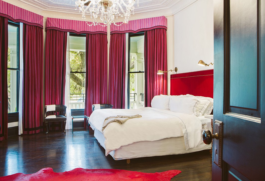
The bold red rug and headboard certainly spice up this bedroom, but the pink window treatments, cream walls, and white bedding keep the overall mood restful. Photo courtesy of Hotel Saint Cecilia.
Seeing Red
When you want to add drama to a room, red is the way to go. There are the cultural signifiers, of course: the red carpet, the red velvet curtains of theaters, red roses, ruby slippers. And there’s the physiological effects: Exposure to red can increase speed and strength in athletes. One study of four combat sports in the 2004 Summer Olympics even showed that, all else being equal, those wearing red won more frequently than those wearing blue. Like yellow, red stimulates the appetite (hence red tablecloths and napkins in many restaurants). On the downside, the color has been found to lower one’s pain tolerance.
As the visible color with the longest wavelength, red is highly stimulating, making it wonderful in a living room, a den, or a dining room. As with fellow warm colors yellow or orange, you can temper it by using only small hits of the most saturated tones or reserving muted or paler shades of red for larger areas. In fact, as mentioned earlier, pink—red mixed with a substantial amount of white—is one of the more pacifying colors around.
Shop all things red >
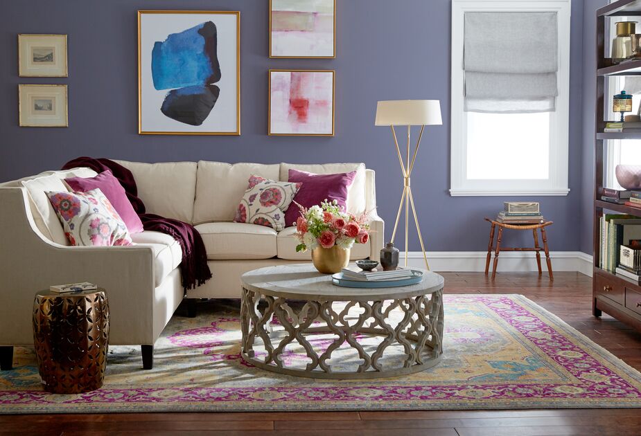
Deep purples can signify creativity and luxury, but they might be best used in small doses.
Purple Reign
Technically purple is different from violet. The former is the combination of blue and red, while the latter is a distinct color on the spectrum, one with the shortest wavelength of the visible hues. There doesn’t seem to be much difference in how the colors affect people, however. When mixed with white to create lavender, both violet and purple create a tranquil ambience, much as the fragrance of the lavender plant does, making it perfect for a bedroom.
Offering both the serenity of blue and the energy of red, purple would seem to be an ideal color to surround yourself with. And having been associated in the West with royalty and nobility for millennia, it suggests luxury to many. But while purple is thought to encourage creativity, some say it is best used in small doses, as it can induce or increase depression in some people—though another line of research suggests that it’s more a matter of people who are prone to depression and anxiety preferring purple.
All of which reinforces what we said in the beginning: Go with what you love. Chromatologists may be experts on color, but you’re the expert on you.
Join the Discussion