Instagram has inspired a lot of things, including at least one move. The power of the photo-sharing app was an eye-opener for Birmingham, AL-based designer William McLure, who was living in an apartment that lacked the good bones to truly showcase his aesthetic. “I realized that I needed to move into a space that’s amazing,” he says, “one where I could create these beautiful interiors and switch it up.”
He found a one-bedroom apartment in a 1920s house with plenty of potential. “I saw the bones and the details that a lot of landlords can’t see,” he says. “I knew instantly that all that was going to get ripped out. I didn’t tell them that because usually that’s a red flag for any landlord.” William ripped out the carpet (sneaking pieces out to the trash late at night) and painted the wood floors that had been beneath, as well as the kitchen’s linoleum. “I striped the living room and kitchen floors,” he says. “That’s an easy way to instantly jazz up your space.”
The living room was designed as a multipurpose space that could serve as a painting studio, a gallery for his artwork, and a spot for entertaining close friends. He used a neutral palette of brown, white, and cream to let the graphic artwork shine and accentuate the airy feel of the light-filled space. The complementary furnishings range from family heirlooms to thrift-shop finds that William refinished and updated.
Even the standard apartment features received a refresh: The bathroom sink was painted bright azure, as was a built-in cabinet in the hallway, and the bedroom radiator was transformed into a chic spot to display art. That attention to detail and the apartment’s approachable Southern style has made it something of an Instagram sensation and now serves as William’s design laboratory—which he frequently refreshes to the delight of his followers. And his landlord’s reaction? “He still hasn’t seen it.”
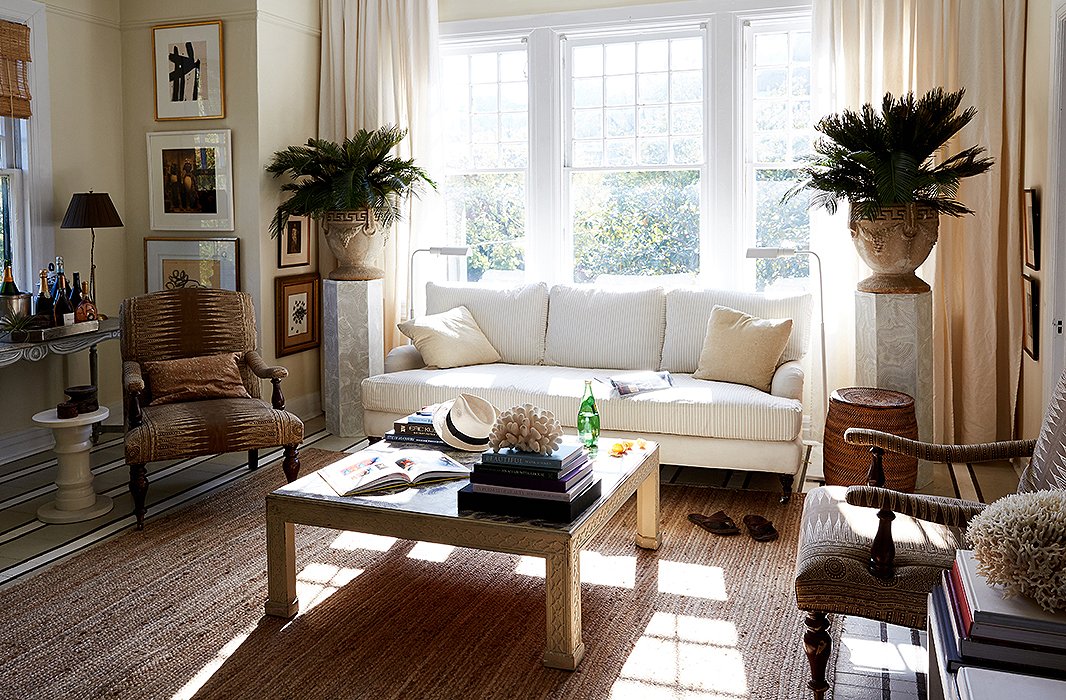
William’s favorite spot is the serene living room, which is flooded with light in the morning. “My dog, Baylor, and I usually sit in there on the sofa, and I check emails and drink my coffee,” he says. A braided jute rug defines the seating area and separates it from the dining area. William often rolls up the rug and paints canvases on the striped floor.
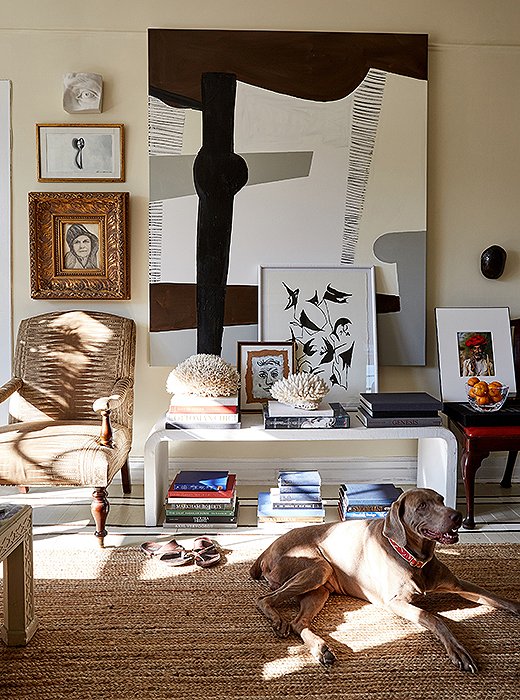
William used a graphic canvas as a focal point in the room. “I wanted to do something that was like polar opposite of what you’d expect in the space,” he says. He designed the modern bench and had it fabricated by a friend who makes paddleboards.

I don’t like for a space to look contrived or predictable. One of the things I do is just hang art wherever—on the back of a door, staggered in a gallery wall, or even leaned against a wall.
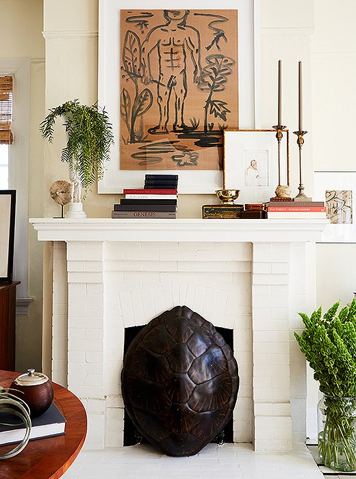
William used a tortoiseshell to hide the fireplace’s unsightly gas heater. The mantel is decorated with candlesticks he bought as a teenager and a brass vase that he updated with a coat of paint. “It’s the power of painting something white,” he says. “All of a sudden, it becomes really cool.”
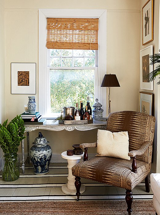
William transformed his grandmother’s console table into a chic bar that suited his style. “I’m not crazy about a mahogany Queen Anne–style feminine piece of furniture, but it’s my grandmother’s. So I painted it to look like a French Provincial antique piece.”
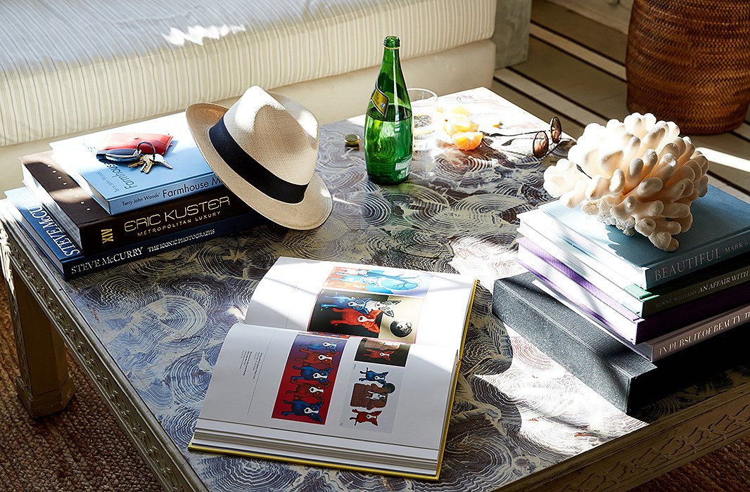
William snagged the vintage Henredon table at a thrift shop and painted a faux-malachite finish on the top. “I didn’t want to just paint the piece and have it be boring,” he says. “I wanted it to add texture to the space.” The designer keeps books at hand for constant inspirations. “I don’t have cable or internet or WiFi. A lot of my time is spent looking at books and pulling ideas and different furniture configurations and patterns.”
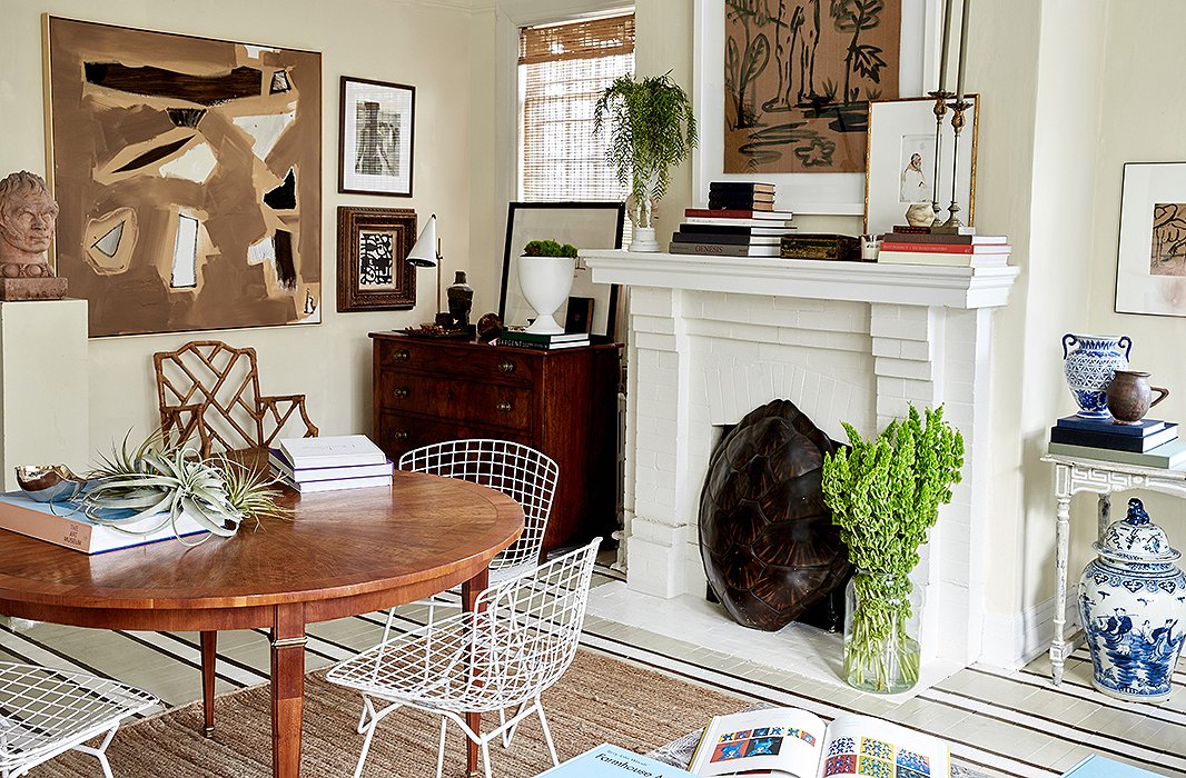
White Bertoia chairs surround the refined dining table, which also serves as a spot to display books and set keys and groceries down. “I like mixing antiques and traditional pieces with a little bit of modern,” William explains. “Everything’s much less predictable. It makes it look collected.”
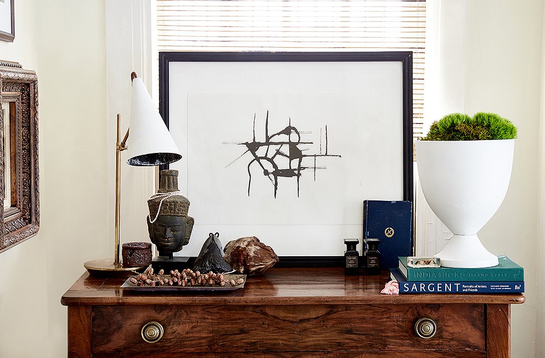
William paired one of his artworks with a modern lamp and vase for a graphic vignette atop a chest of drawers in the living room. “I don’t use overhead lighting a lot,” he says. “I have, like, a million lamps in the house.”
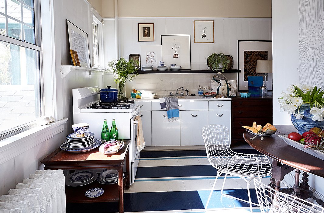
The kitchen’s linoleum floor received a bold makeover. “Painting a floor is a way to add color, pattern, and interest in a space that normally doesn’t have patterns or upholstery in it,” William says. He kept the shelving open so that he could display his china and other collections.
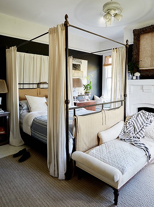
Since the bedroom gets less light and has a working fireplace, William embraced a dark and cozy mood: “I painted it black and then chose to pare everything else down.” He customized the canopy bed with fresh upholstery and placed a chaise at the end for putting on shoes.

One of the things that truly makes me happy is creating a space that I’ll live in. That fills a huge void in me like nothing else.
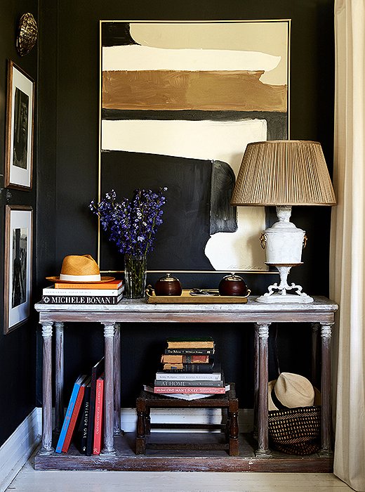
William applied lime wax to the console to soften the color and give it an aged look. The lamp was left over from a showhouse he did in New Orleans, so he whitewashed it and added a new shade. “That’s the power of an expensive shade,” he says.
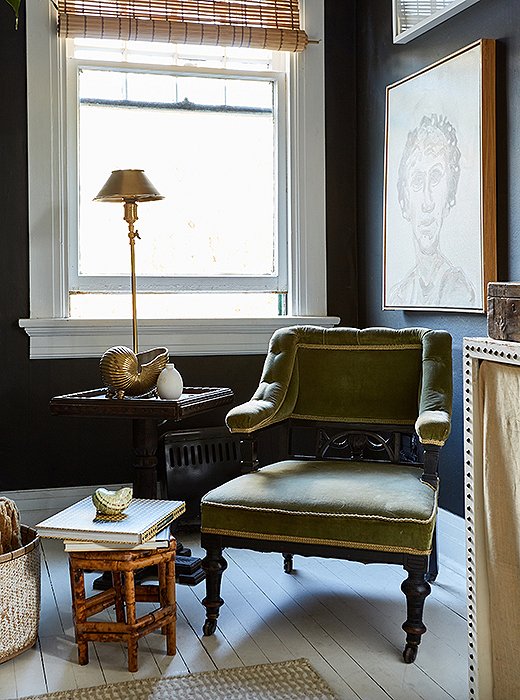
He arranged a petite seating area in the corner of the bedroom with an antique armchair (“I love all the ornamentation on it”) and a square table he found at an estate sale.
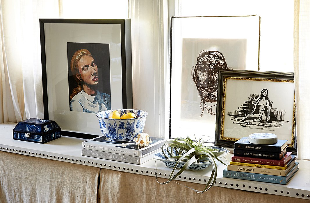
William created a radiator cover using linen and nail-head trim, transforming the windowsill into an additional spot to display art and books.
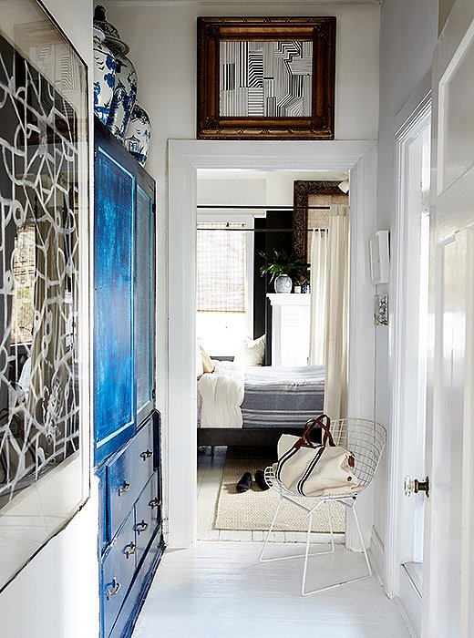
William painted the hallway’s built-in cabinet blue to make it feel more like an armoire. “It gave that space a purpose and added that statement that you needed in an area that would normally be blasé.”
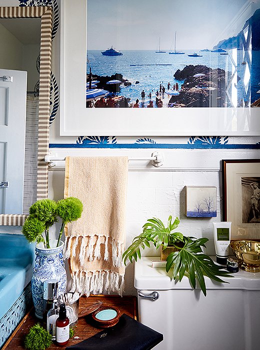
Instead of installing wallpaper, William used a stencil on the bathroom walls. “I knew I wanted to incorporate blue in the space, and I’m obsessed with block print,” he says. He also spray-painted the sink in a coordinating shade and added a skirt to hide storage for towels.
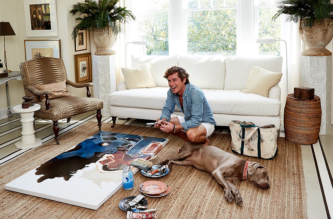
And while design still remains a focus of William’s, his passions have shifted to art. “I quit my job nine months ago as an interior designer for an architecture firm to take on being an artist full time,” he says. “In five months, thanks to the power of Instagram, I developed a commission list.”


Join the Discussion