There is something inside New Yorkers that just begs for a quiet space. Some find it in the stacks of the New York Public Library or the oft-forgotten upper galleries of the Met. Others find it in New York State’s Hudson Valley. Some lucky New Yorkers have staked their claim in this pastoral area within a two-hour drive of Manhattan, and clients of designer Kelly Mittleman are among them.
This modern-meets-bucolic Hudson Valley home isn’t quite what it appears. Built in the 1980s, it was originally a “ho-hum spec house,” Kelly says. “It had little character and was basically just a big box.” The couple who bought it had grand plans to make the house a special getaway for their young family—a relaxing paradise away from the city’s hustle and bustle where they could entertain and host family. They came to Kelly with a vision of a modern farmhouse nestled on the property’s 10 acres with breathtaking views of a pond and surrounding woods.
It’s no secret that modern farmhouse is a beloved style, but Kelly wanted to make sure the design came across as timeless and not trendy. “You don’t want to define yourself so strictly,” she says. Wary of tired trends and overused motifs, Kelly created a feeling of simplicity rather than rusticity. “If you emphasize the quiet minimalism on the inside, it gives you peace of mind, and I think that’s the way you need to feel when you’re getting away.”
First on the agenda was tearing out the “spec house” elements. Kelly ripped out the floors and replaced them with white oak. She took out decorative columns and added oak beams to bring in the cabin feel. She tore down some walls and painted the remaining ones white.
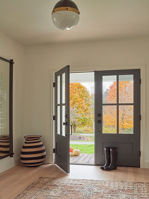
A quiet entryway sets the mood for the rest of the home. For a similar pendant, see the Hicks by Thomas O’Brien for Visual Comfort.
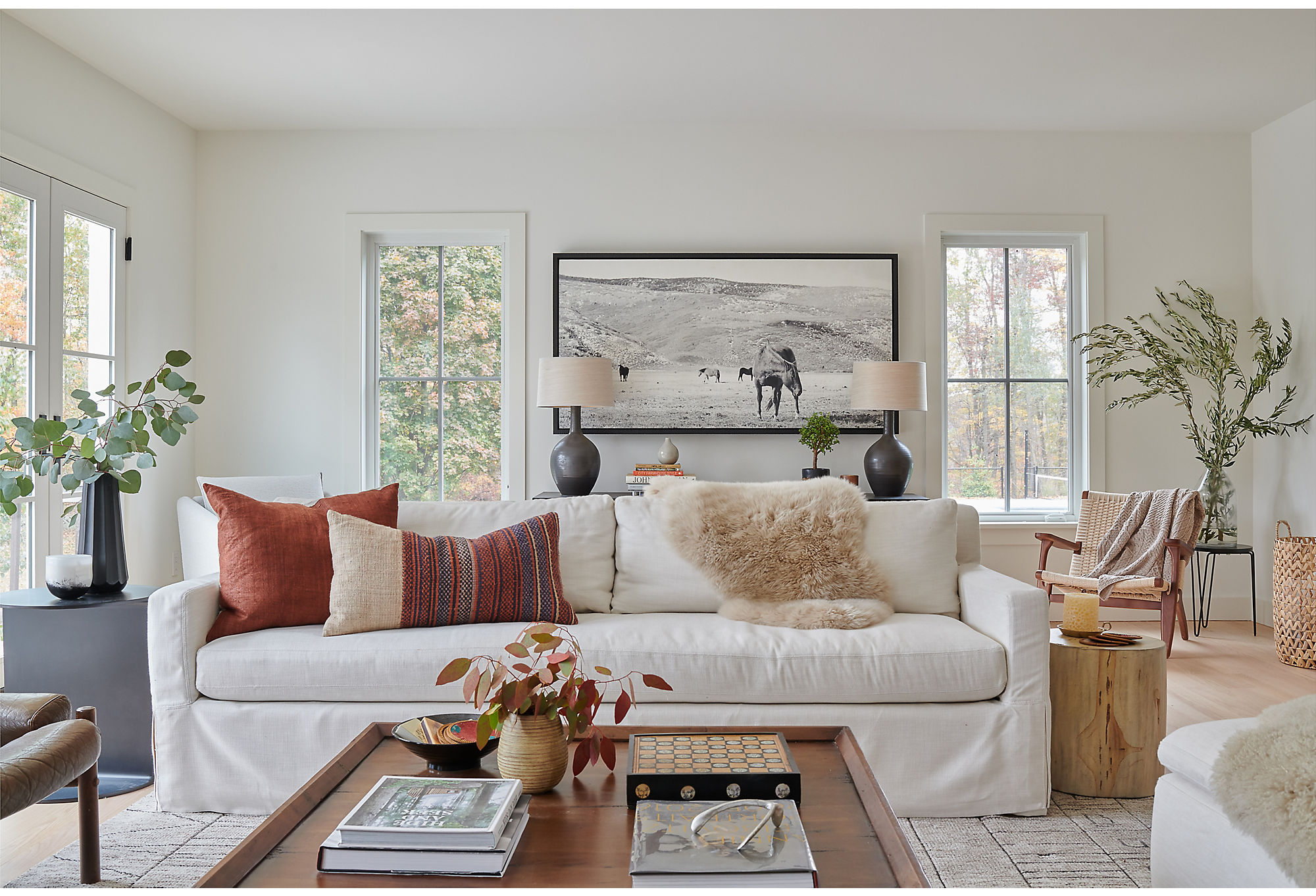
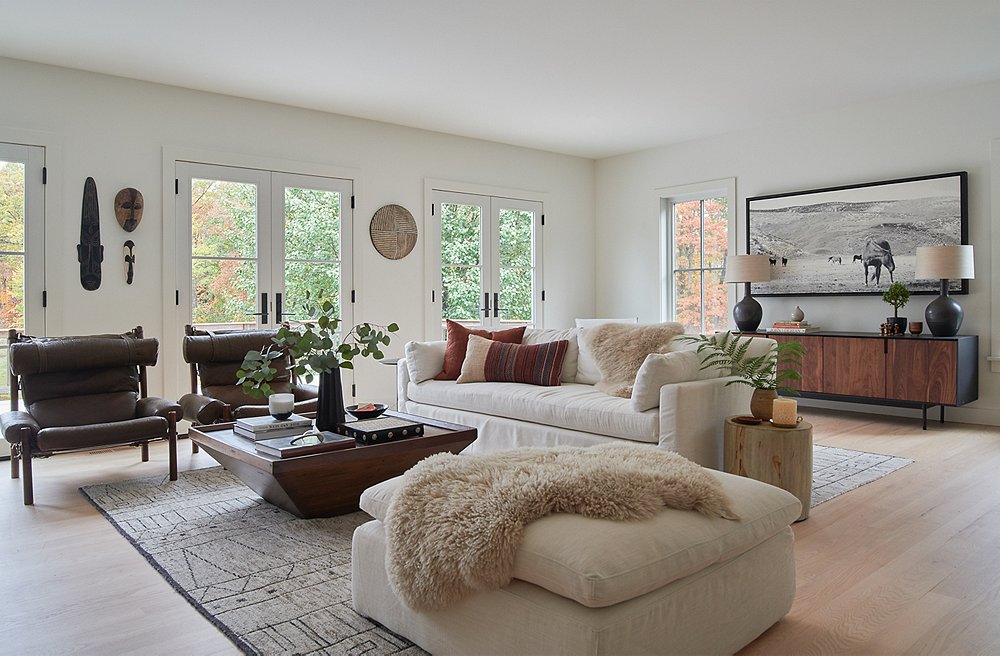
The living room is dripping in layers of texture. The clean lines of the sofa (for similar, see the Henry Slipcover Sofa) are a perfect foil for the more organic look of the pillows. A sheepskin draped over the sofa brings in a level of coziness that is balanced out by the side tables. Greenery throughout adds a touch of nature.

If you emphasize quiet minimalism on the inside, it gives you peace of mind.
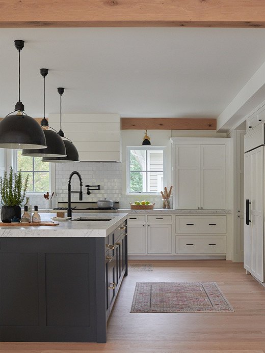
Wood beams and oversize light fixtures steal the show in the kitchen.
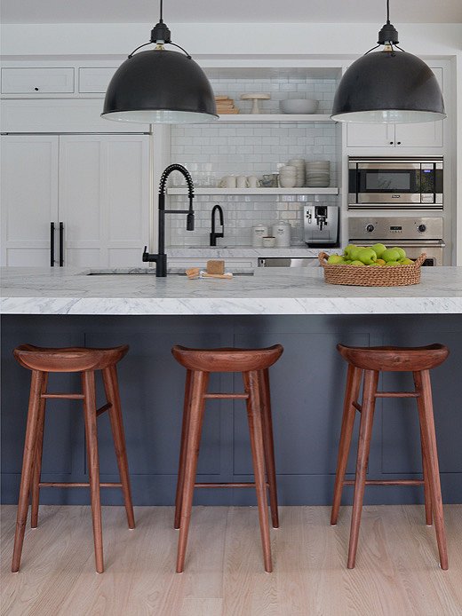
Kelly added wooden stools to the kitchen to bring a level of warmth to the space. Find similar stools here.
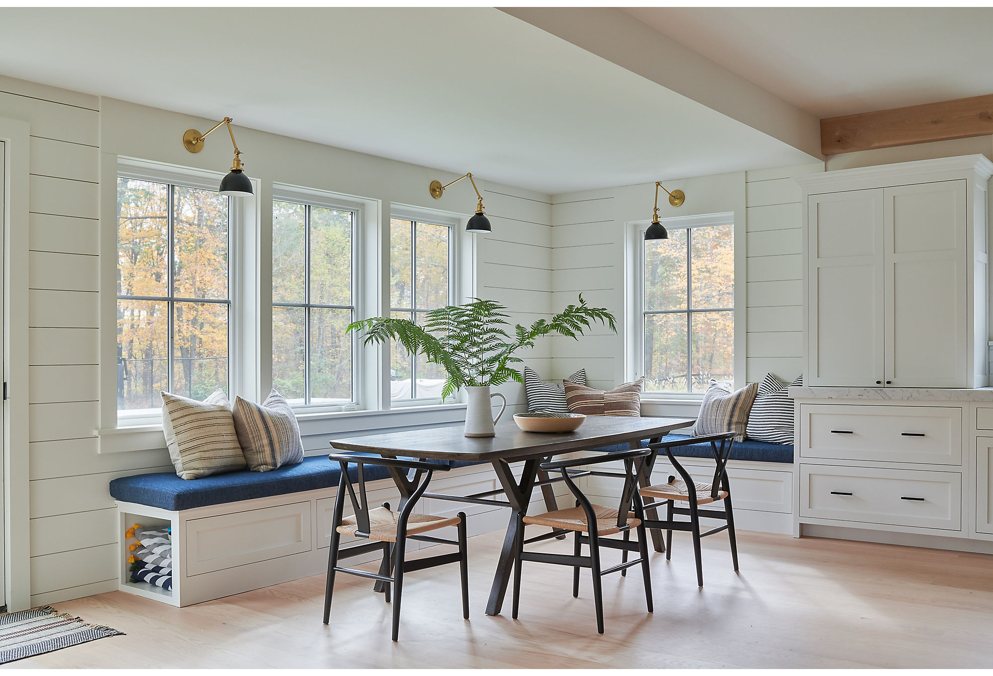
Even though the home included popular nods to modern farmhouse, like the shiplap paneling in the dining area, Kelly kept things fresh by pairing them with unexpected elements such as vintage textiles. Find similar chairs here.
When she started to design, Kelly added modern furniture mixed with well-worn accents. In the living room, for instance, she paired an oversize sofa with vintage European chairs. Pillows made from vintage textiles add texture, and natural wood hues bring depth. To give the master bedroom a feel that was both industrial and cozy, she added more vintage pillows and went with a cotton rug underfoot. In the bunk room, pops of vibrant color are reminiscent of a Wes Anderson-inspired summer camp.
Kelly wanted the house to feel like a livable gallery—a place where beauty, comfort, and family could come together. “We design so you don’t walk into a room and are scared of the one couch you’re allowed to sit on.” Bottom line: “I want it to be peaceful.”
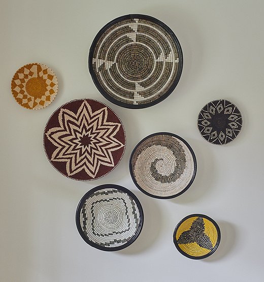
The homeowners placed art collected from their travels throughout the house. Kelly grouped these decorative bowls together to “keep the place from feeling too sterile.”
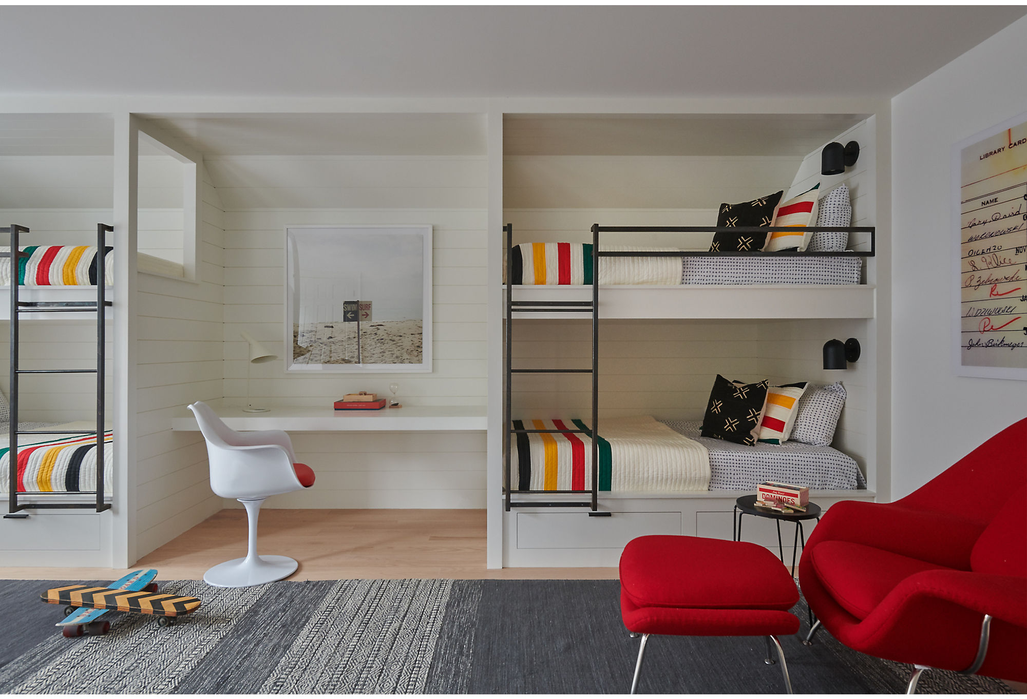
The colorful bunk room leans a bit more modern than farmhouse with a red womb chair and beach photography. Find the framed photograph, Swim/Surf by Christine Flynn, here.
Join the Discussion